So sánh định lượng: biểu đồ phân tán

Nhập môn trực quan hóa dữ liệu với Matplotlib

Ariel Rokem

Data Scientist

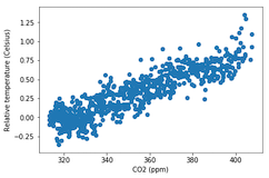
Giới thiệu biểu đồ phân tán

fig, ax = plt.subplots()

ax.scatter(climate_change["co2"], climate_change["relative_temp"])
ax.set_xlabel("CO2 (ppm)") ax.set_ylabel("Relative temperature (Celsius)") plt.show()
Nhập môn trực quan hóa dữ liệu với Matplotlib

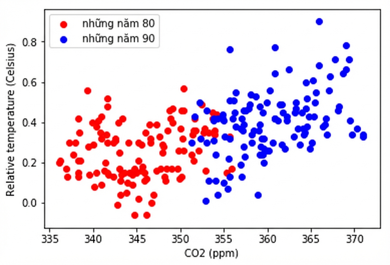
Tùy biến biểu đồ phân tán

eighties = climate_change["1980-01-01":"1989-12-31"]
nineties = climate_change["1990-01-01":"1999-12-31"]

fig, ax = plt.subplots()
ax.scatter(eighties["co2"], eighties["relative_temp"], color="red", label="eighties")
ax.scatter(nineties["co2"], nineties["relative_temp"], color="blue", label="nineties")
ax.legend() ax.set_xlabel("CO2 (ppm)") ax.set_ylabel("Relative temperature (Celsius)") plt.show()
Nhập môn trực quan hóa dữ liệu với Matplotlib

Mã hóa so sánh bằng màu sắc

Nhập môn trực quan hóa dữ liệu với Matplotlib

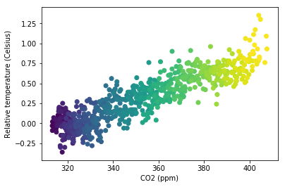
Mã hóa biến thứ ba bằng màu

fig, ax = plt.subplots()

ax.scatter(climate_change["co2"], climate_change["relative_temp"], c=climate_change.index)
ax.set_xlabel("CO2 (ppm)") ax.set_ylabel("Relative temperature (Celsius)") plt.show()
Nhập môn trực quan hóa dữ liệu với Matplotlib

Mã hóa thời gian bằng màu

Nhập môn trực quan hóa dữ liệu với Matplotlib

Thực hành tự tạo biểu đồ phân tán!

Nhập môn trực quan hóa dữ liệu với Matplotlib

Preparing Video For Download...