Tùy chỉnh biểu đồ phân tán
Giới thiệu trực quan dữ liệu với Seaborn

Content Team
DataCamp
Nhóm phụ theo kích thước điểm
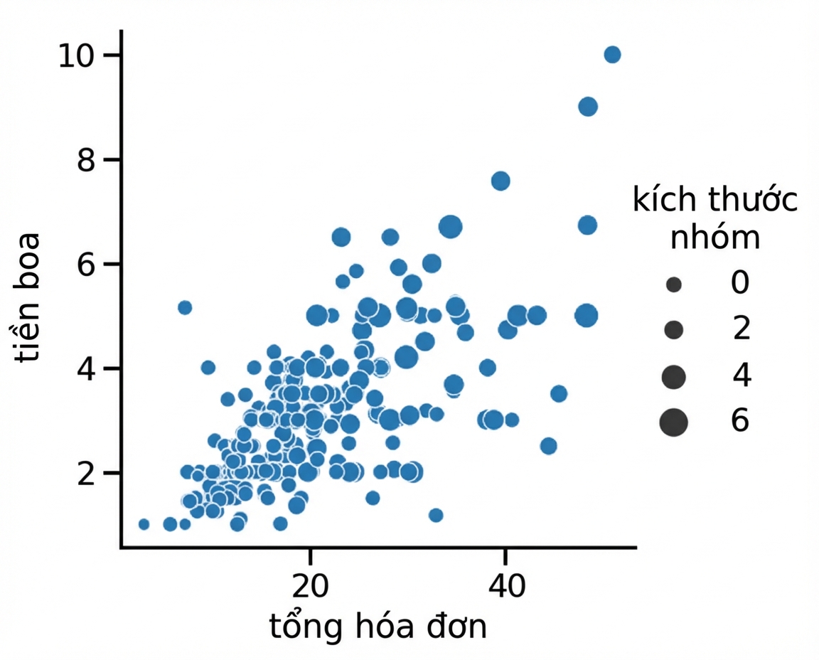
1 Waskom, M. L. (2021). seaborn: statistical data visualization. https://seaborn.pydata.org/
Kích thước điểm và hue
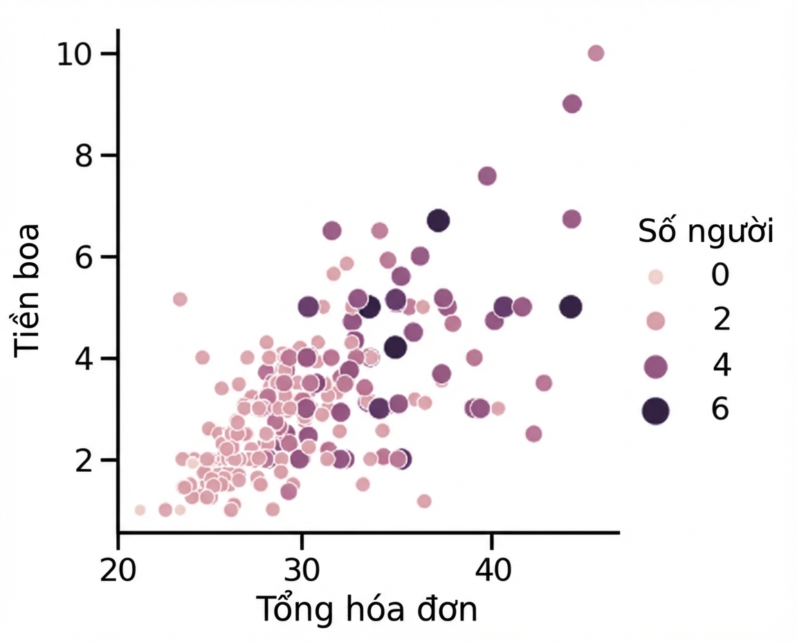
1 Waskom, M. L. (2021). seaborn: statistical data visualization. https://seaborn.pydata.org/
Nhóm phụ theo kiểu điểm
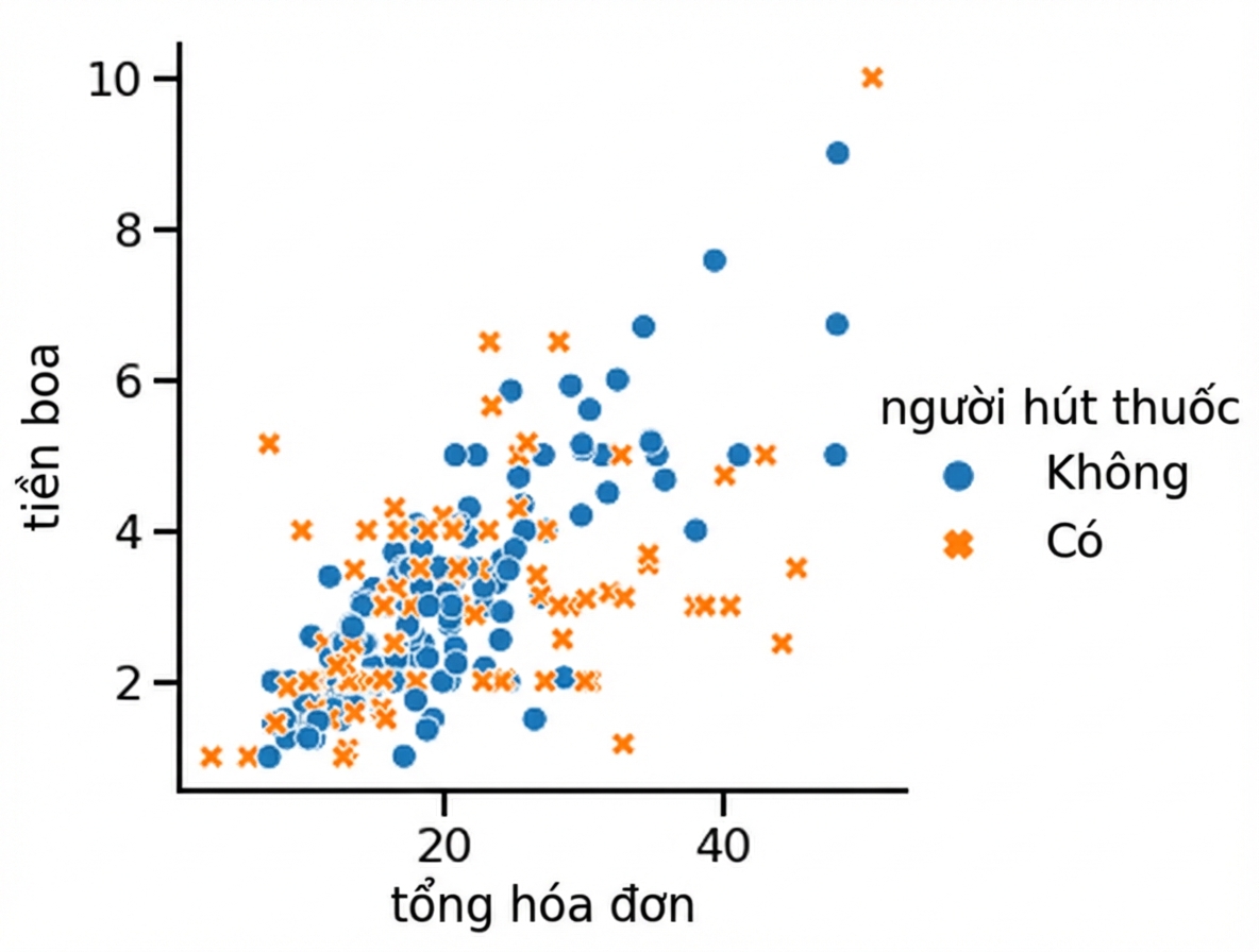
1 Waskom, M. L. (2021). seaborn: statistical data visualization. https://seaborn.pydata.org/
Thay đổi độ trong suốt điểm
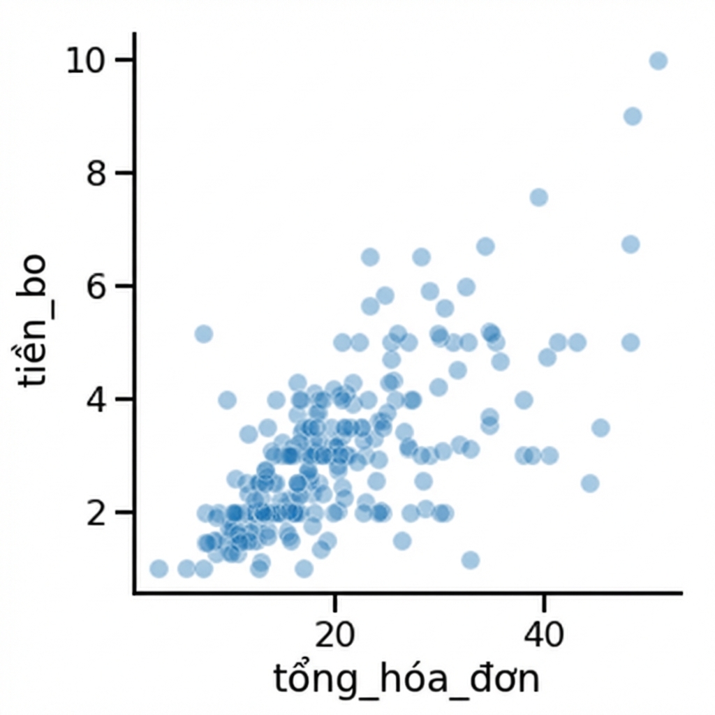
1 Waskom, M. L. (2021). seaborn: statistical data visualization. https://seaborn.pydata.org/

