Tổng hợp lại

Giới thiệu trực quan dữ liệu với Seaborn

Content Team

DataCamp

Bắt đầu

Nhập Seaborn:

import seaborn as sns

Nhập Matplotlib:

import matplotlib.pyplot as plt

Hiển thị biểu đồ:

plt.show()
Giới thiệu trực quan dữ liệu với Seaborn

Biểu đồ quan hệ

  • Thể hiện mối quan hệ giữa hai biến định lượng
  • Ví dụ: scatter plot, line plot
sns.relplot(x="x_variable_name", 
            y="y_variable_name", 
            data=pandas_df, 
            kind="scatter")
Giới thiệu trực quan dữ liệu với Seaborn

Biểu đồ phân loại

  • Thể hiện phân phối của biến định lượng theo từng nhóm của biến phân loại
  • Ví dụ: bar plot, count plot, box plot, point plot
sns.catplot(x="x_variable_name", 
            y="y_variable_name", 
            data=pandas_df, 
            kind="bar")
Giới thiệu trực quan dữ liệu với Seaborn

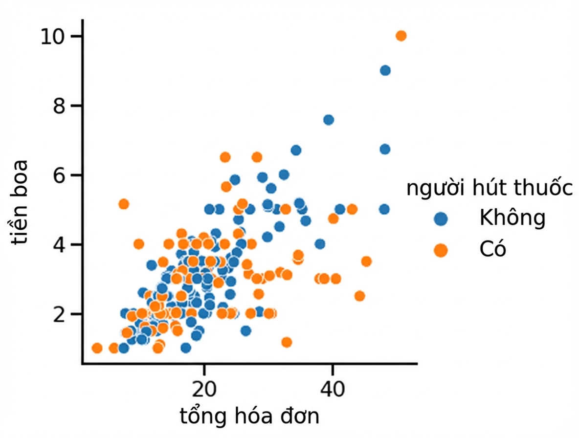
Thêm biến thứ ba (hue)

Thiết lập hue sẽ tạo các nhóm con với màu khác nhau trên cùng một biểu đồ.

Biểu đồ phân tán với hue

1 Waskom, M. L. (2021). seaborn: statistical data visualization. https://seaborn.pydata.org/
Giới thiệu trực quan dữ liệu với Seaborn

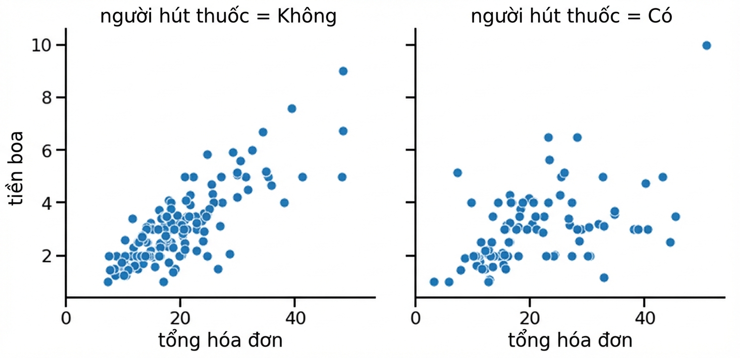
Thêm biến thứ ba (row/col)

Thiết lập row và/hoặc col trong relplot() hoặc catplot() sẽ tạo các nhóm con hiển thị trên các subplot riêng.

Biểu đồ phân tán với các subplot

1 Waskom, M. L. (2021). seaborn: statistical data visualization. https://seaborn.pydata.org/
Giới thiệu trực quan dữ liệu với Seaborn

Tùy biến

  • Đổi nền: sns.set_style()
  • Đổi màu chính: sns.set_palette()
  • Đổi tỷ lệ: sns.set_context()
Giới thiệu trực quan dữ liệu với Seaborn

Thêm tiêu đề

Object Type Plot Types Cách thêm tiêu đề
FacetGrid relplot(), catplot() g.figure.suptitle()
AxesSubplot scatterplot(), countplot(), v.v. g.set_title()
Giới thiệu trực quan dữ liệu với Seaborn

Hoàn thiện cuối

Thêm nhãn trục x và y:

g.set(xlabel="new x-axis label",
      ylabel="new y-axis label")

Xoay nhãn vạch x:

plt.xticks(rotation=90)
Giới thiệu trực quan dữ liệu với Seaborn

Ayo berlatih!

Giới thiệu trực quan dữ liệu với Seaborn

Preparing Video For Download...