Responsive design with containers

Introduction to Power Apps

Luise Freese

Azure & Power Platform Architect

Why responsive?


  • The same app opens on phones, tablets, laptops
  • A fixed layout clips on small screens, looks lost on big ones
  • Responsive = the layout adapts

$$

Phone, tablet, and laptop showing the same app adapting its layout from single-column to multi-column.

Introduction to Power Apps

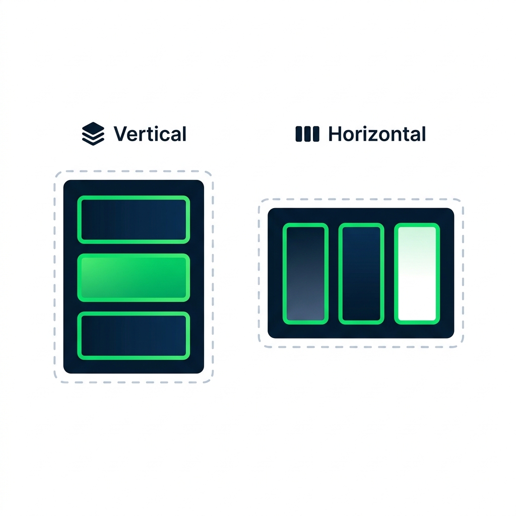
Modern layout containers

Illustration comparing vertical and horizontal Layout containers with stacked versus side-by-side child controls.


  • Vertical Layout container, stacks children top-to-bottom
  • Horizontal Layout container, lays children left-to-right
  • Modern controls flow into available space
Introduction to Power Apps

Flexible width and height


  • A control's FlexibleWidth / FlexibleHeight, on or off
  • On, the control stretches to fill its container
  • Off, the control keeps its fixed size

$$

Gallery1.FlexibleHeight = true    // stretches with screen
Gallery1.FlexibleWidth  = false   // stays at fixed reading width
Introduction to Power Apps

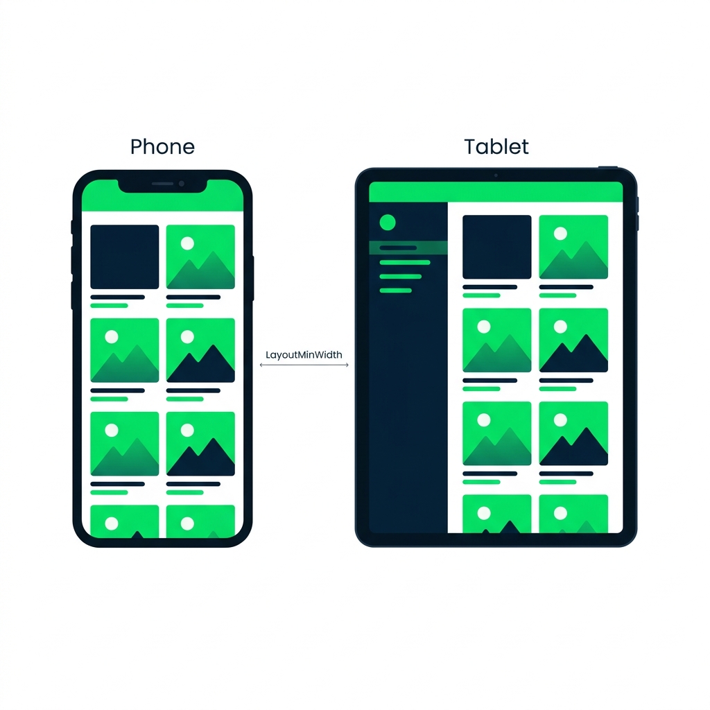
LayoutMinWidth and LayoutMinHeight


Phone vs tablet showing LayoutMinWidth as the breakpoint where layout switches from single-column to side panel plus content.


  • A container needs enough space to lay out properly
  • LayoutMinWidth = the smallest width before it rearranges
  • Triggers a different layout for phones vs. tablets
Introduction to Power Apps

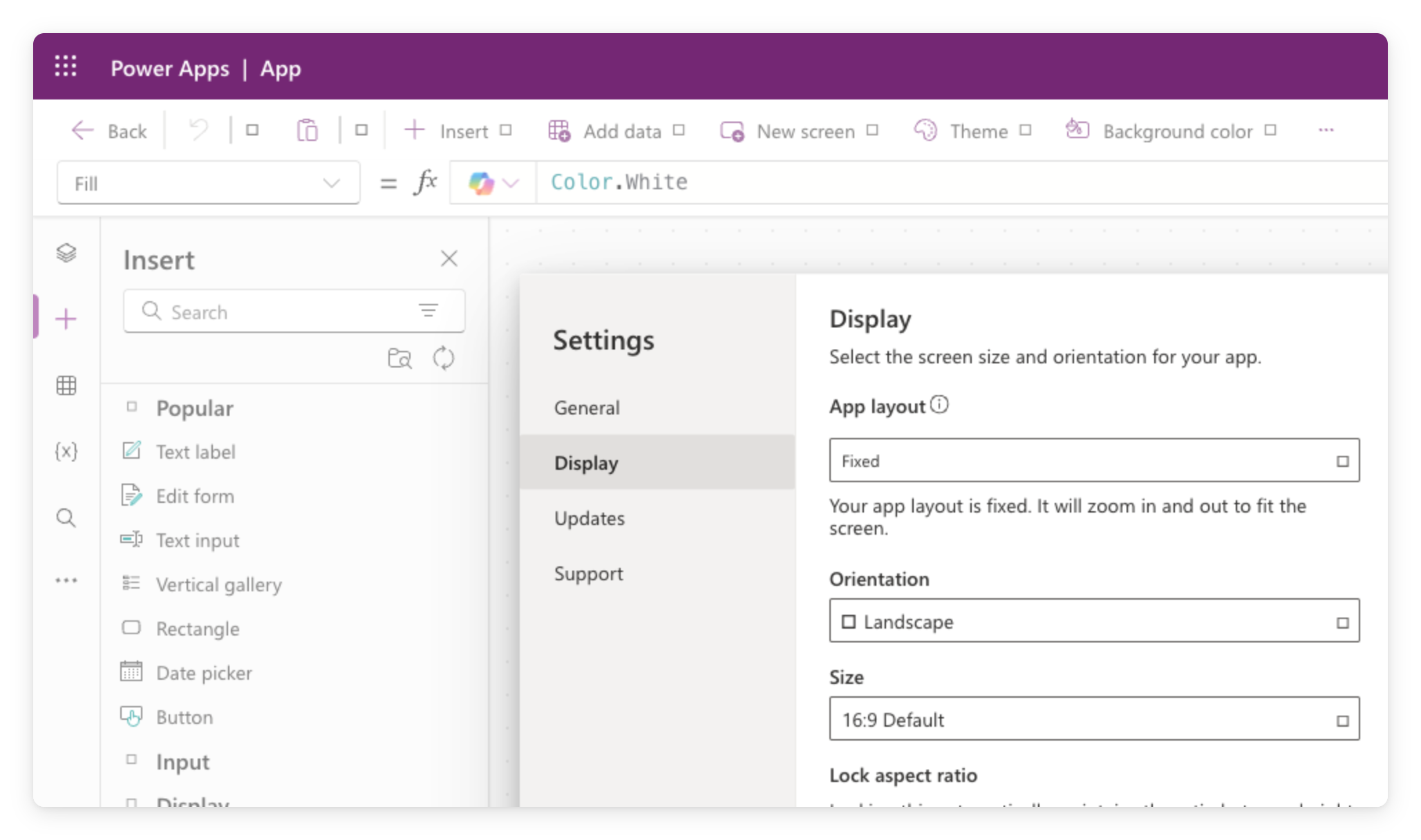
App display settings


  • Settings → Display sets orientation and size
  • Scale to fit: on zooms to a fixed ratio, off makes it responsive
  • Test at multiple sizes

$$

Power Apps Studio Settings dialog on the Display tab, showing layout, orientation, and canvas size options

Introduction to Power Apps

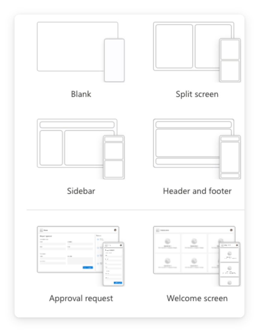
The predefined layouts

Real screenshot of the Power Apps Studio New screen flyout showing predefined layout templates: Blank, Split screen, Sidebar, Header and footer, Approval request, and Welcome screen, each with a small frame preview


  • + New screen ships with pre-built layout templates
  • Sidebar, Header and footer, Split screen, already responsive
  • Recommended starting point for your first responsive app
Introduction to Power Apps

What you'll build

$$

Wrap controls in a Layout container · Switch between device sizes · See the app respond to each

Illustration of an app on phone, tablet, and laptop, showing the gallery layout adapting to each screen size.

Introduction to Power Apps

Let's practice!

Introduction to Power Apps

Preparing Video For Download...