データのクリーニングと改善

Pythonで学ぶMachine Learningによる時系列データ解析

Chris Holdgraf

Fellow, Berkeley Institute for Data Science

データは乱雑である

  • 実世界のデータはしばしば乱雑です
  • 最も多い問題は欠損データ外れ値です
  • 人為的ミス、センサー障害、データベース障害などが原因です
  • 生データを可視化することで問題を発見しやすくなります
Pythonで学ぶMachine Learningによる時系列データ解析

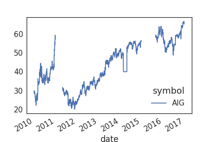
乱雑なデータの例

Pythonで学ぶMachine Learningによる時系列データ解析

補間:時間を使った欠損データの補完

  • 欠損データへの一般的な対処法は、欠損値を補間することです
  • 時系列データでは、時間を利用して補間できます
  • 補間とは、データのギャップの両側にある既知の値から欠損値を推定することです
Pythonで学ぶMachine Learningによる時系列データ解析

Pandasによる補間

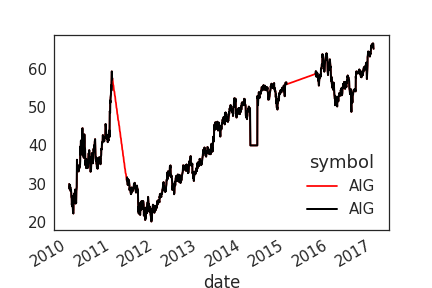
# Return a boolean that notes where missing values are
missing = prices.isna()

# Interpolate linearly within missing windows
prices_interp = prices.interpolate('linear')

# Plot the interpolated data in red and the data w/ missing values in black
ax = prices_interp.plot(c='r')
prices.plot(c='k', ax=ax, lw=2)
Pythonで学ぶMachine Learningによる時系列データ解析

補間データの可視化

Pythonで学ぶMachine Learningによる時系列データ解析

ローリングウィンドウによるデータ変換

  • ローリングウィンドウのもう一つの用途はデータの変換です
  • すでにデータの平滑化に使用しました
  • より複雑な変換にも応用できます
Pythonで学ぶMachine Learningによる時系列データ解析

分散を標準化するデータ変換

  • データの平均と分散を時間軸で標準化する変換はよく使われます
  • ここでは、各データポイントを前のウィンドウに対する変化率に変換する方法を示します
  • 絶対値が大きく変化する場合に、時点間の比較が容易になります
Pythonで学ぶMachine Learningによる時系列データ解析

Pandasで変化率に変換する

def percent_change(values):
    """Calculates the % change between the last value 
    and the mean of previous values"""
    # Separate the last value and all previous values into variables
    previous_values = values[:-1]
    last_value = values[-1]

    # Calculate the % difference between the last value 
    # and the mean of earlier values
    percent_change = (last_value - np.mean(previous_values)) \
    / np.mean(previous_values)
    return percent_change
Pythonで学ぶMachine Learningによる時系列データ解析

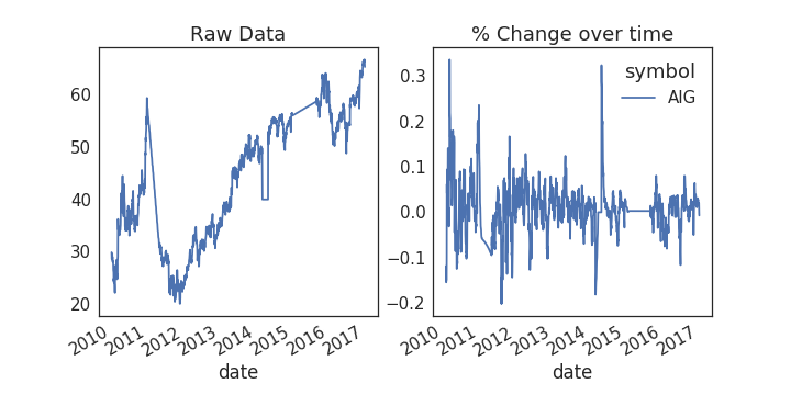
データへの適用

# Plot the raw data
fig, axs = plt.subplots(1, 2, figsize=(10, 5))
ax = prices.plot(ax=axs[0])

# Calculate % change and plot
ax = prices.rolling(window=20).aggregate(percent_change).plot(ax=axs[1])
ax.legend_.set_visible(False)
Pythonで学ぶMachine Learningによる時系列データ解析

データの外れ値の検出

  • 外れ値とは、データセットから統計的に大きく外れたデータポイントです
  • モデルの予測精度に悪影響を与え、「真の値」からバイアスが生じる可能性があります
  • 対策として、外れ値を削除するか、より代表的な値に置換します

注意が必要です — 正当な極端値と異常値の判別は難しい場合があります

Pythonで学ぶMachine Learningによる時系列データ解析

データに閾値をプロットする

fig, axs = plt.subplots(1, 2, figsize=(10, 5))
for data, ax in zip([prices, prices_perc_change], axs):
    # Calculate the mean / standard deviation for the data
    this_mean = data.mean()
    this_std = data.std()

    # Plot the data, with a window that is 3 standard deviations 
    # around the mean
    data.plot(ax=ax)
    ax.axhline(this_mean + this_std * 3, ls='--', c='r')
    ax.axhline(this_mean - this_std * 3, ls='--', c='r')
Pythonで学ぶMachine Learningによる時系列データ解析

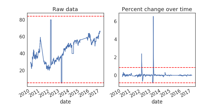
外れ値の閾値の可視化

Pythonで学ぶMachine Learningによる時系列データ解析

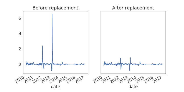
閾値を使った外れ値の置換

# Center the data so the mean is 0
prices_outlier_centered = prices_outlier_perc - prices_outlier_perc.mean()

# Calculate standard deviation
std = prices_outlier_perc.std()

# Use the absolute value of each datapoint 
# to make it easier to find outliers
outliers = np.abs(prices_outlier_centered) > (std * 3)

# Replace outliers with the median value
# We'll use np.nanmean since there may be nans around the outliers
prices_outlier_fixed = prices_outlier_centered.copy()
prices_outlier_fixed[outliers] = np.nanmedian(prices_outlier_fixed)

Pythonで学ぶMachine Learningによる時系列データ解析

結果の可視化

fig, axs = plt.subplots(1, 2, figsize=(10, 5))
prices_outlier_centered.plot(ax=axs[0])
prices_outlier_fixed.plot(ax=axs[1])
Pythonで学ぶMachine Learningによる時系列データ解析

では、練習しましょう!

Pythonで学ぶMachine Learningによる時系列データ解析

Preparing Video For Download...