ヒストグラムを描く

Pythonで学ぶ統計的思考(パート1)

Justin Bois

Teaching Professor at the California Institute of Technology

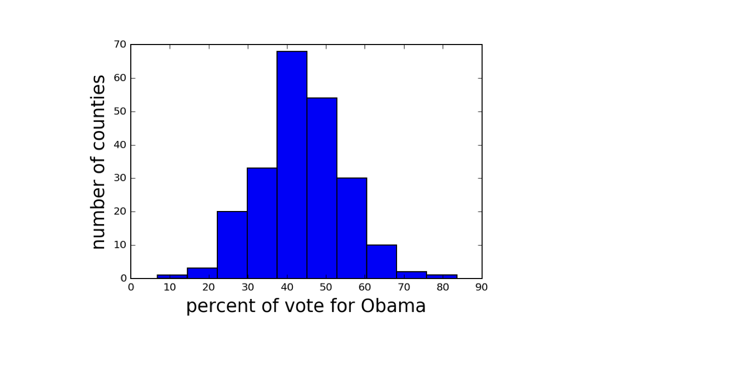
2008 年米国スイングステートの選挙結果

Data retrieved from Data.gov (https://www.data.gov/)
ch1-2.003.png

Pythonで学ぶ統計的思考(パート1)

ヒストグラムを作成する

import matplotlib.pyplot as plt
_ = plt.hist(df_swing['dem_share'])
_ = plt.xlabel('percent of vote for Obama')
_ = plt.ylabel('number of counties')
plt.show()
Pythonで学ぶ統計的思考(パート1)

常に軸にラベルを付ける

Pythonで学ぶ統計的思考(パート1)

2008 年米国スイングステートの選挙結果

Data retrieved from Data.gov (https://www.data.gov/)
ch1-2.013.png

Pythonで学ぶ統計的思考(パート1)

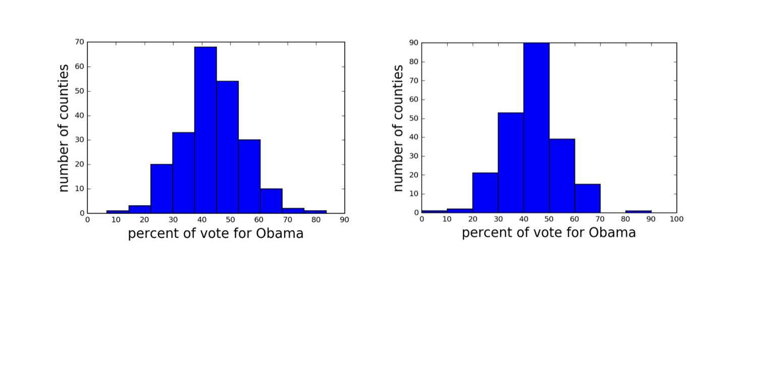
ビン幅を変えたヒストグラム

Data retrieved from Data.gov (https://www.data.gov/)
ch1-2.015.png

Pythonで学ぶ統計的思考(パート1)

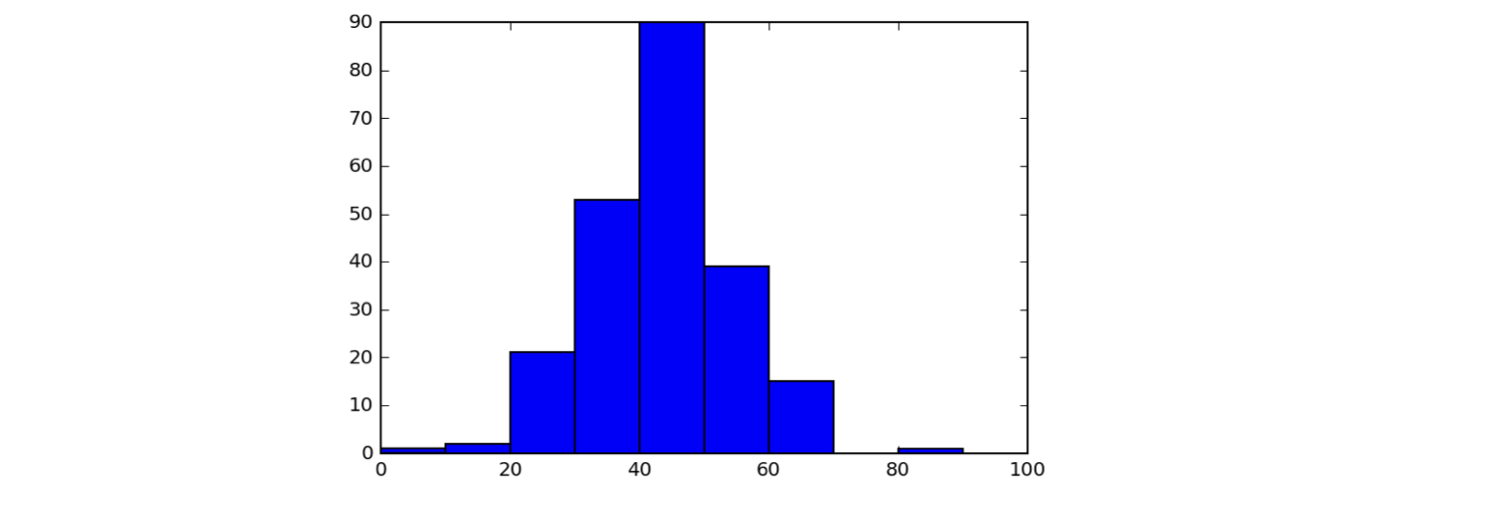
ヒストグラムのビンを設定する

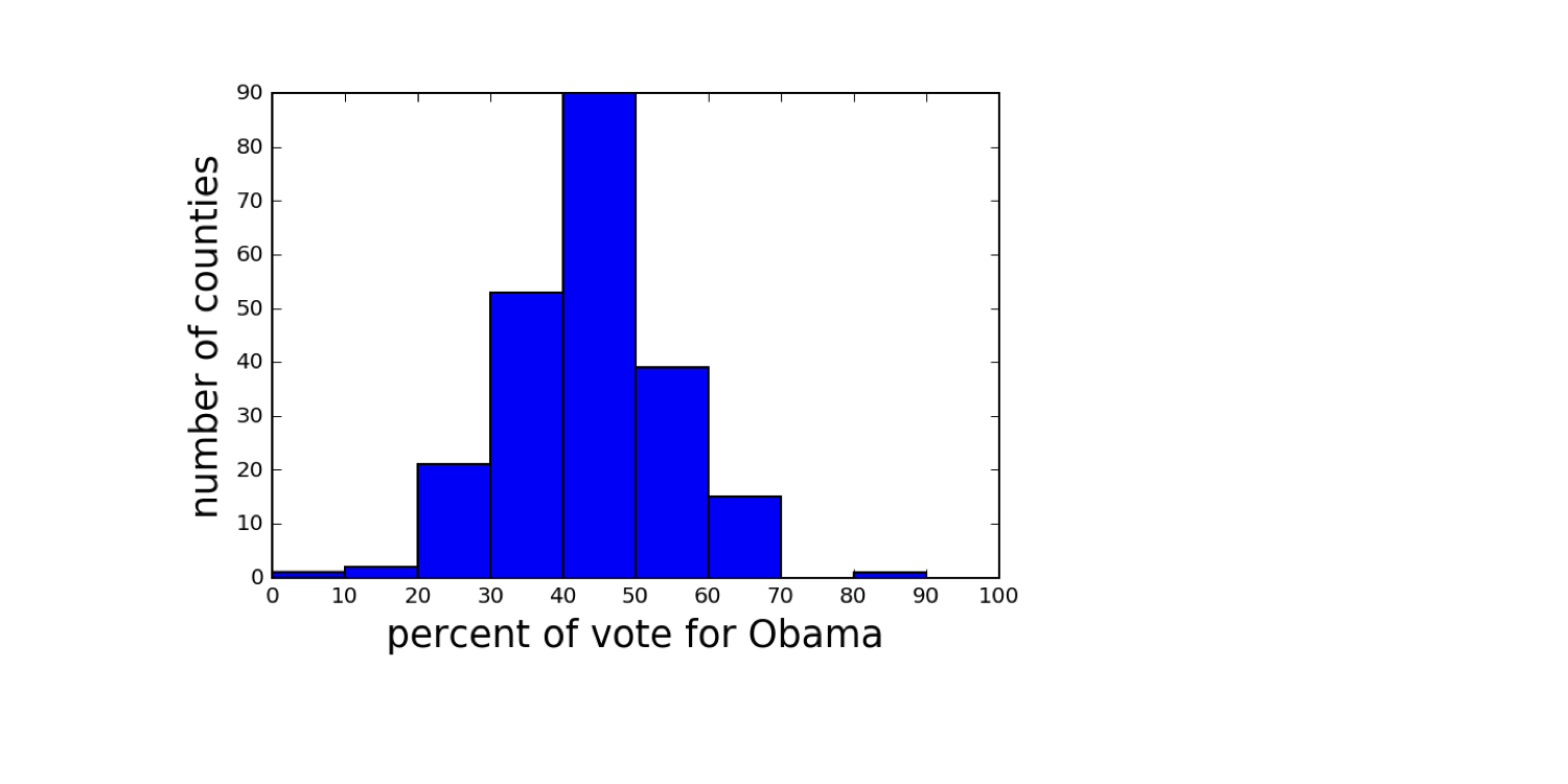
bin_edges = [0, 10, 20, 30, 40, 50,
                60, 70, 80, 90, 100]
_ = plt.hist(df_swing['dem_share'], bins=bin_edges)
plt.show()
ch1-2.022.png

Pythonで学ぶ統計的思考(パート1)

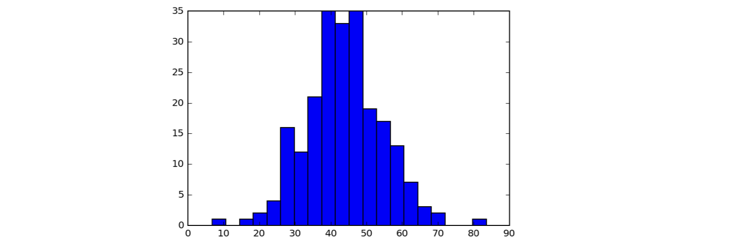
ヒストグラムのビンを設定する

_ = plt.hist(df_swing['dem_share'], bins=20)
plt.show()
ch1-2.027.png

Pythonで学ぶ統計的思考(パート1)

Seaborn

  • Michael Waskom 作の、Matplotlib ベースの優れた統計可視化ライブラリ
Pythonで学ぶ統計的思考(パート1)

Seaborn のスタイル設定

import seaborn as sns
sns.set()
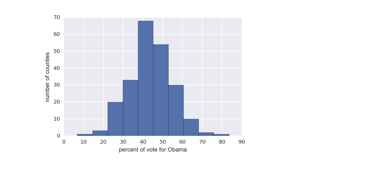
_ = plt.hist(df_swing['dem_share'])
_ = plt.xlabel('percent of vote for Obama')
_ = plt.ylabel('number of counties')
plt.show()
Pythonで学ぶ統計的思考(パート1)

Seaborn スタイルのヒストグラム

ch1-2.038.png

1 Data retrieved from Data.gov (https://www.data.gov/)
Pythonで学ぶ統計的思考(パート1)

Let's practice!

Pythonで学ぶ統計的思考(パート1)

Preparing Video For Download...