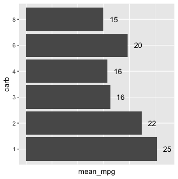
グラフの再現
tidyverse で学ぶカテゴリ型データ

Emily Robinson
Data Scientist
Labs
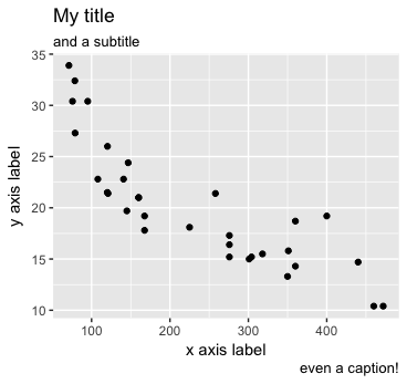
ggplot(mtcars, aes(disp, mpg)) + geom_point() +
  labs(x = "x axis label", y = "y axis label", title = "My title",
       subtitle = "and a subtitle", caption = "even a caption!")
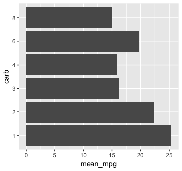
Geom_text
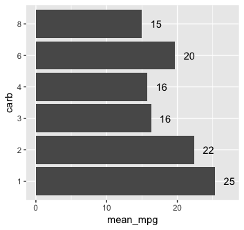
initial_plot + geom_text(aes(label = round(mean_mpg)))
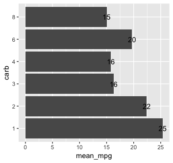
テキストの移動
initial_plot +
  geom_text(aes(label = round(mean_mpg), y = mean_mpg + 2))
テーマ
initial_plot +
  geom_text(aes(label = round(mean_mpg), y = mean_mpg + 2)) +
  theme(axis.text.x = element_blank(), axis.ticks.x = element_blank())