因子の並び替え

tidyverse で学ぶカテゴリ型データ

Emily Robinson

Data Scientist
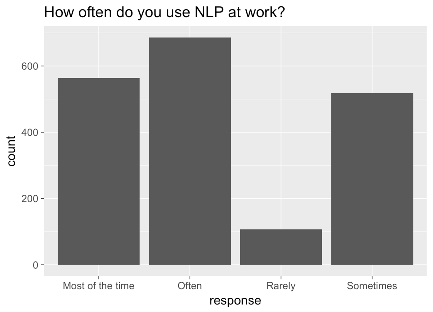
x軸に回答、y軸にカウント、タイトルに「NLPを職場でどのくらい使いますか?」と表示された棒グラフ。左から右の棒は、ほとんどの時間、頻繁に、まれに、時々の順。

tidyverse で学ぶカテゴリ型データ

修正したグラフ

ggplot(aes(nlp_frequency, 
            x = fct_relevel(response, 
            "Rarely", "Sometimes", "Often", "Most of the time"))) + 
        geom_bar()
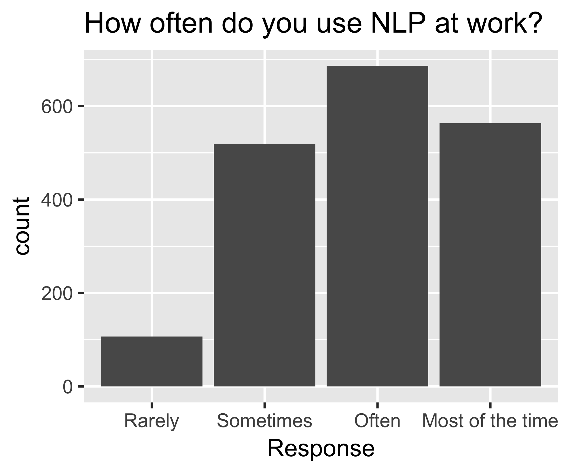
同じ棒グラフ。左から右に、まれに、時々、頻繁に、ほとんどの時間の順に並んでいる。

tidyverse で学ぶカテゴリ型データ

fct_reorder()

nlp_frequency %>%
    pull(response) %>%
    levels()
[1] "Most of the time" "Often" "Rarely" "Sometimes"       
nlp_frequency %>%
    mutate(response = fct_relevel(response, 
            "Often", "Most of the time")) %>%
    pull(response) %>%
    levels()
[1] "Often" "Most of the time" "Rarely" "Sometimes"
tidyverse で学ぶカテゴリ型データ

追加の引数

nlp_frequency %>%
    mutate(response = fct_relevel(response, 
            "Often", "Most of the time", after = 2)) %>%
            pull(response) %>%
            levels()
nlp_frequency %>%
    mutate(response = fct_relevel(response, 
            "Often", "Most of the time", after = Inf) %>%
    pull(response) %>%
    levels()
[1] "Rarely" "Sometimes" "Often" "Most of the time"
tidyverse で学ぶカテゴリ型データ

練習しましょう!

tidyverse で学ぶカテゴリ型データ

Preparing Video For Download...