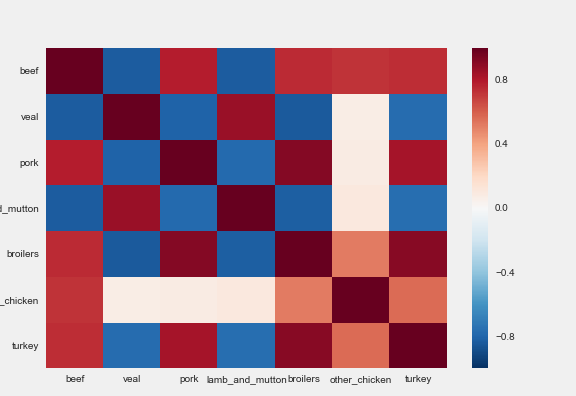
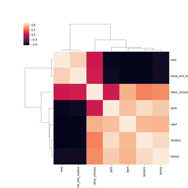
In the field of Statistics, the correlation coefficient is a measure used to determine the strength or lack of relationship between two variables:
Pearson's coefficient can be used to compute the correlation coefficient between variables for which the relationship is thought to be linear
Kendall Tau or Spearman rank can be used to compute the correlation coefficient between variables for which the relationship is thought to be non-linear
Compute correlations
from scipy.stats.stats import pearsonr
from scipy.stats.stats import spearmanr
from scipy.stats.stats import kendalltau
x = [1, 2, 4, 7]
y = [1, 3, 4, 8]
pearsonr(x, y)