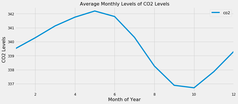
Plot aggregates of your data
Visualizing Time Series Data in Python

Thomas Vincent
Head of Data Science, Getty Images
A plot of the moving average for the CO2 data
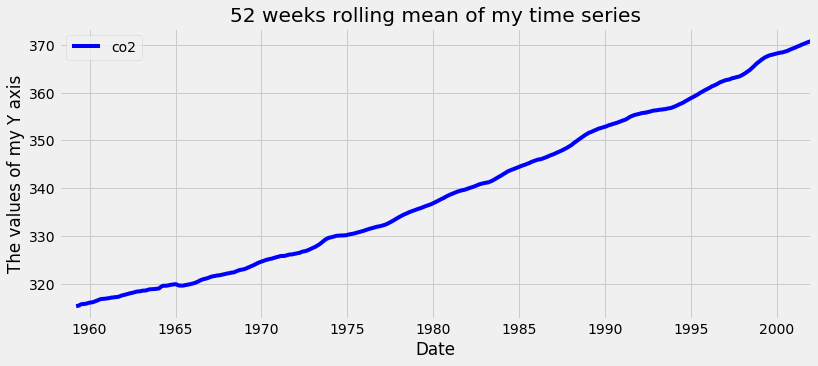
Plotting aggregate values of your time series
Visualizing Time Series Data in Python
Thomas Vincent
Head of Data Science, Getty Images

