Customize your time series plot
Visualizing Time Series Data in Python

Thomas Vincent
Head of Data Science, Getty Images
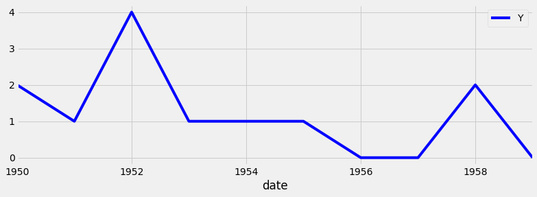
Plotting subset of your time series data
Using markers: the full code
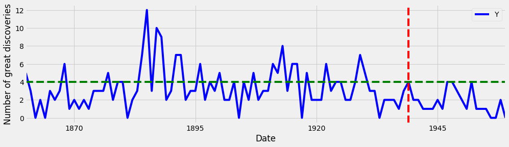
ax = discoveries.plot(color='blue') ax.set_xlabel('Date') ax.set_ylabel('Number of great discoveries')ax.axvline('1969-01-01', color='red', linestyle='--') ax.axhline(4, color='green', linestyle='--')
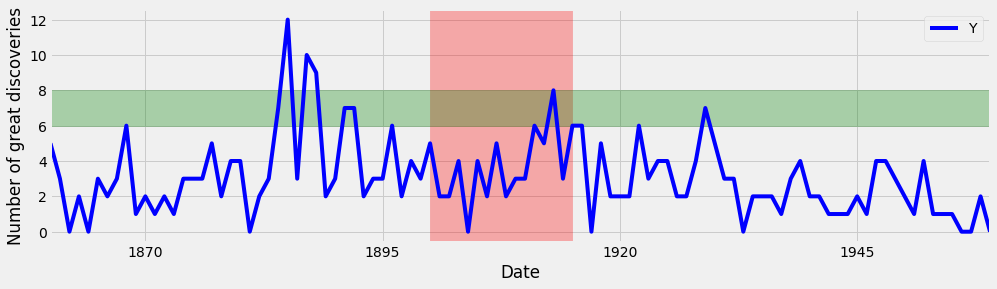
Highlighting regions of interest: the full code