co2
count  2284.000000
mean    339.657750
std      17.100899
min     313.000000
25%     323.975000
50%     337.700000
75%     354.500000
max     373.900000
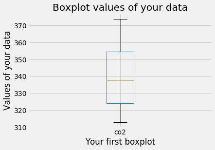
箱ひげ図によるデータの要約
ax1 = df.boxplot()
ax1.set_xlabel('Your first boxplot')
ax1.set_ylabel('Values of your data')
ax1.set_title('Boxplot values of your data')

plt.show()
CO2データの箱ひげ図
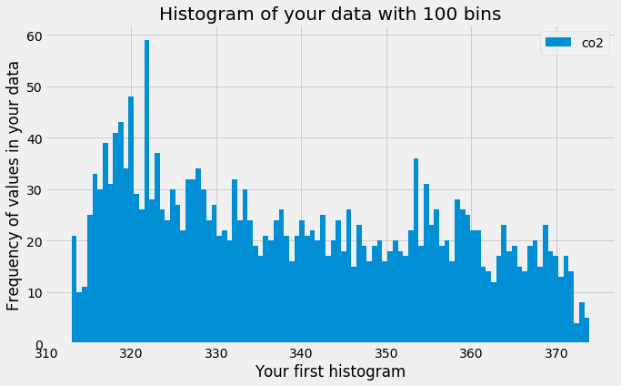
ヒストグラムによるデータの要約
ax2 = df.plot(kind='hist', bins=100)
ax2.set_xlabel('Your first histogram')
ax2.set_ylabel('Frequency of values in your data')
ax2.set_title('Histogram of your data with 100 bins')

plt.show()
CO2データのヒストグラム
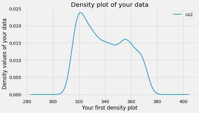
密度プロットによるデータの要約
ax3 = df.plot(kind='density', linewidth=2)
ax3.set_xlabel('Your first density plot')
ax3.set_ylabel('Density values of your data')
ax3.set_title('Density plot of your data')

plt.show()