複数の時系列をプロットする

Pythonで学ぶ時系列データの可視化

Thomas Vincent

Head of Data Science, Getty Images

わかりやすさが重要

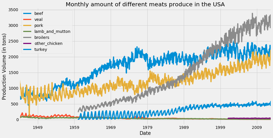
このプロットでは、matplotlib のデフォルトカラースキームにより、beefturkey の時系列に同じ色が割り当てられています。

matplotlibのカラーサイクル

Pythonで学ぶ時系列データの可視化

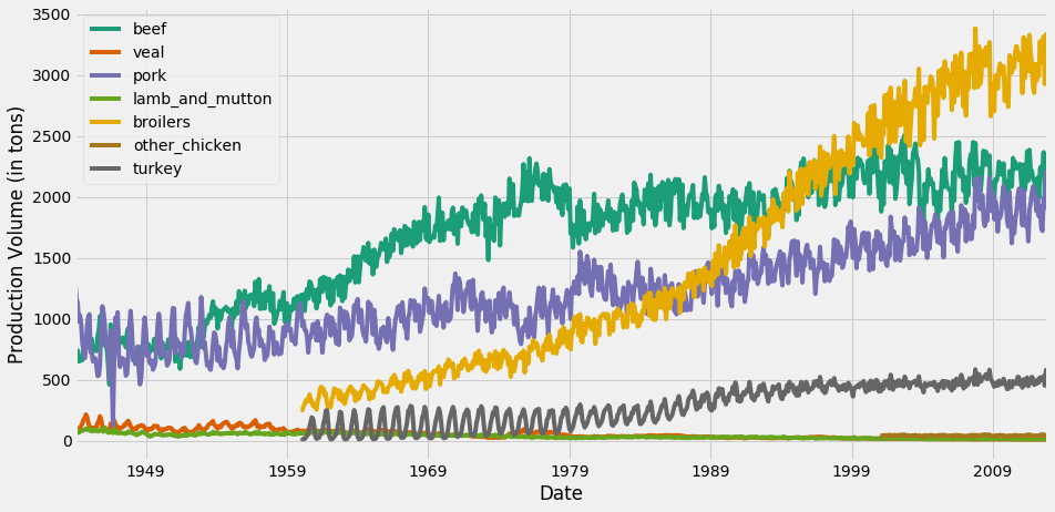
colormap引数

ax = df.plot(colormap='Dark2', figsize=(14, 7))
ax.set_xlabel('Date')
ax.set_ylabel('Production Volume (in tons)')

plt.show()

利用可能なカラーマップの一覧はこちらをご覧ください。

Pythonで学ぶ時系列データの可視化

colormap引数による線の色の変更

時系列可視化における配色の変更

Pythonで学ぶ時系列データの可視化

プロットへの情報の追加

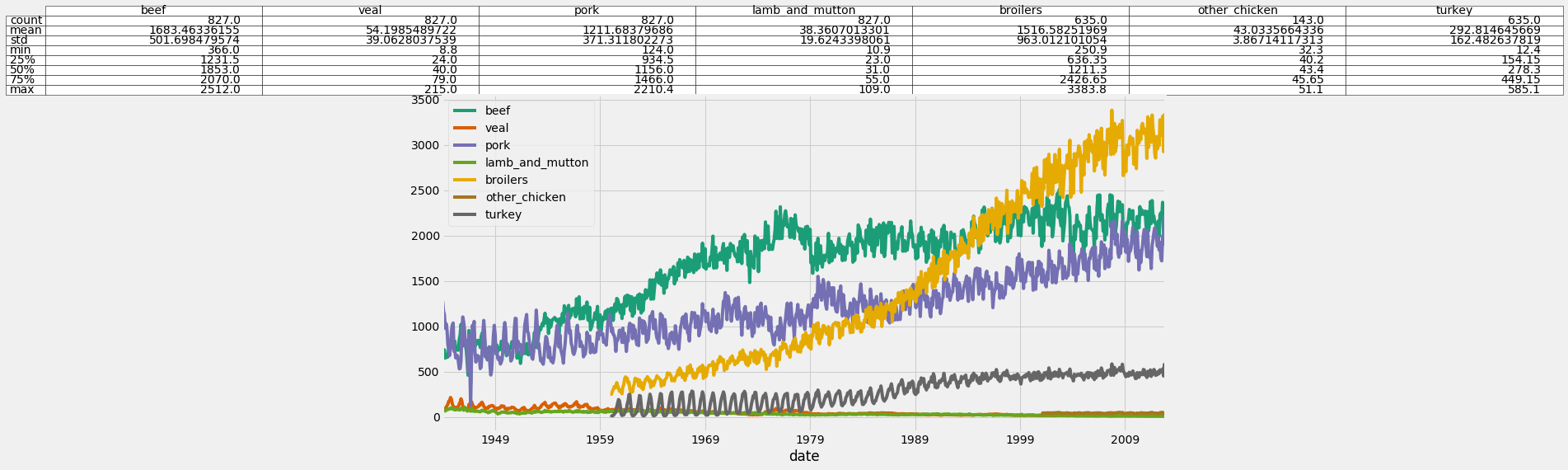
ax = df.plot(colormap='Dark2', figsize=(14, 7))

df_summary = df.describe() # Specify values of cells in the table ax.table(cellText=df_summary.values, # Specify width of the table colWidths=[0.3]*len(df.columns), # Specify row labels rowLabels=df_summary.index, # Specify column labels colLabels=df_summary.columns, # Specify location of the table loc='top') plt.show()
Pythonで学ぶ時系列データの可視化

プロットへの統計サマリーの追加

プロットへの統計サマリーの追加

Pythonで学ぶ時系列データの可視化

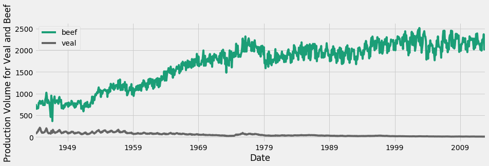
スケールの違いへの対処

牛肉と仔牛肉の時系列

Pythonで学ぶ時系列データの可視化

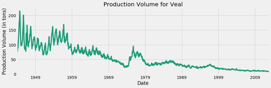
仔牛肉のみ

仔牛肉のみの時系列

Pythonで学ぶ時系列データの可視化

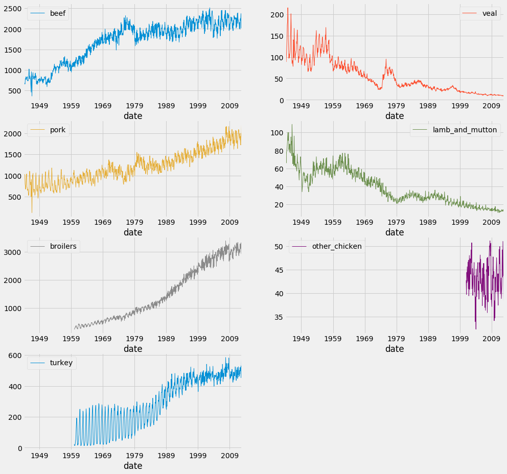
ファセットプロット

df.plot(subplots=True,
                linewidth=0.5,
                layout=(2, 4),
                figsize=(16, 10),
                sharex=False,
                sharey=False)

plt.show()
Pythonで学ぶ時系列データの可視化

ファセットプロット

Pythonで学ぶ時系列データの可視化

実践してみましょう!

Pythonで学ぶ時系列データの可視化

Preparing Video For Download...