要約統計量を超えて

Pythonで学ぶ時系列データの可視化

Thomas Vincent

Head of Data Science, Getty Images

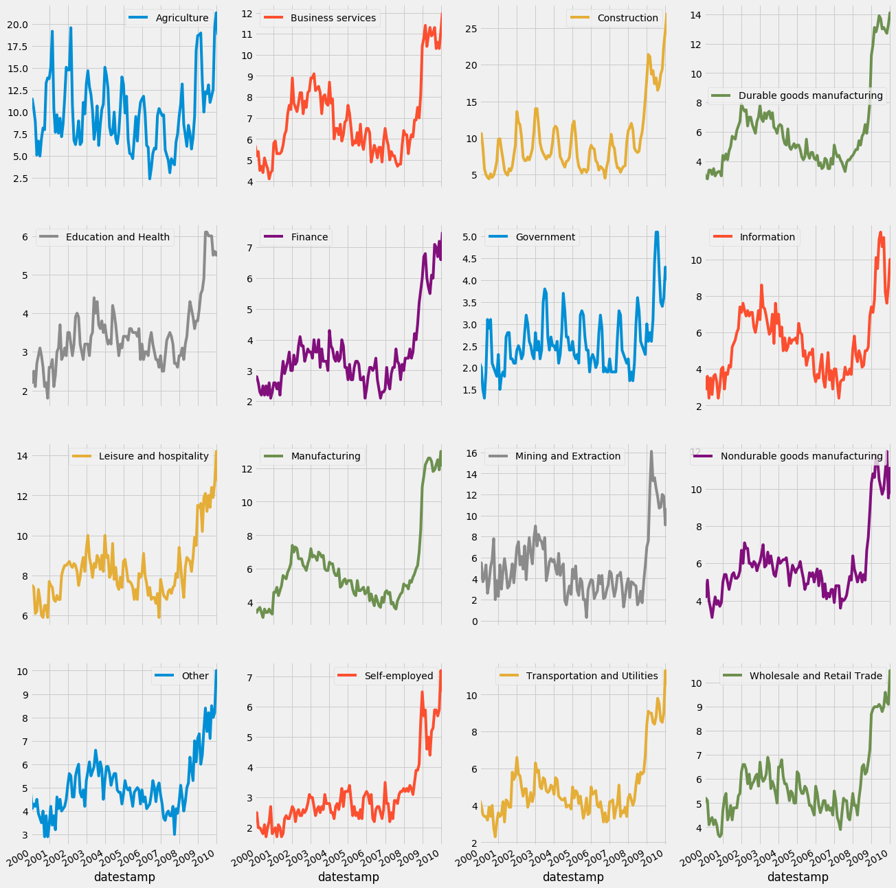
jobsデータセットのファセットプロット

jobs.plot(subplots=True,
            layout=(4, 4),
            figsize=(20, 16),
            sharex=True,
            sharey=False)

plt.show()

Pythonで学ぶ時系列データの可視化

jobsデータセットのファセットプロット

Pythonで学ぶ時系列データの可視化

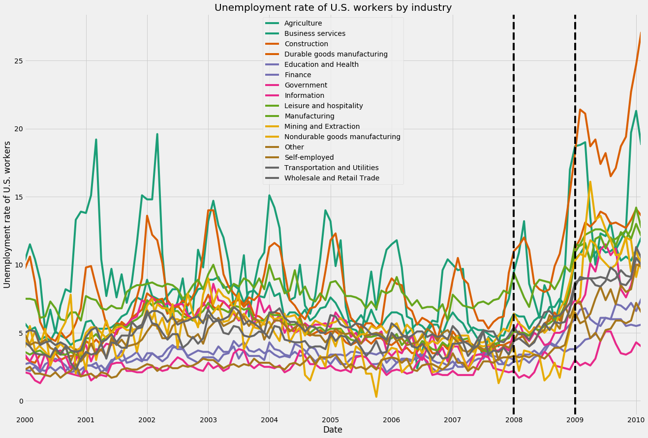
jobsデータセットへのイベント注釈

ax = jobs.plot(figsize=(20, 14), colormap='Dark2')

ax.axvline('2008-01-01', color='black', linestyle='--') ax.axvline('2009-01-01', color='black', linestyle='--')
Pythonで学ぶ時系列データの可視化

jobsデータセットのファセットプロット

Pythonで学ぶ時系列データの可視化

jobsデータセットの季節平均の算出

print(jobs.index)
DatetimeIndex(['2000-01-01', '2000-02-01', '2000-03-01', 
'2000-04-01', '2009-09-01','2009-10-01', 
'2009-11-01', '2009-12-01','2010-01-01', '2010-02-01'], 
dtype='datetime64[ns]', name='datestamp',
length=122, freq=None)
index_month = jobs.index.month
jobs_by_month = jobs.groupby(index_month).mean()
print(jobs_by_month)
datestamp    Agriculture  Business services  Construction                                        
1            13.763636           7.863636     12.909091   
2            13.645455           7.645455     13.600000   
3            13.830000           7.130000     11.290000   
4             9.130000           6.270000      9.450000   
5             7.100000           6.600000      8.120000   
...
Pythonで学ぶ時系列データの可視化

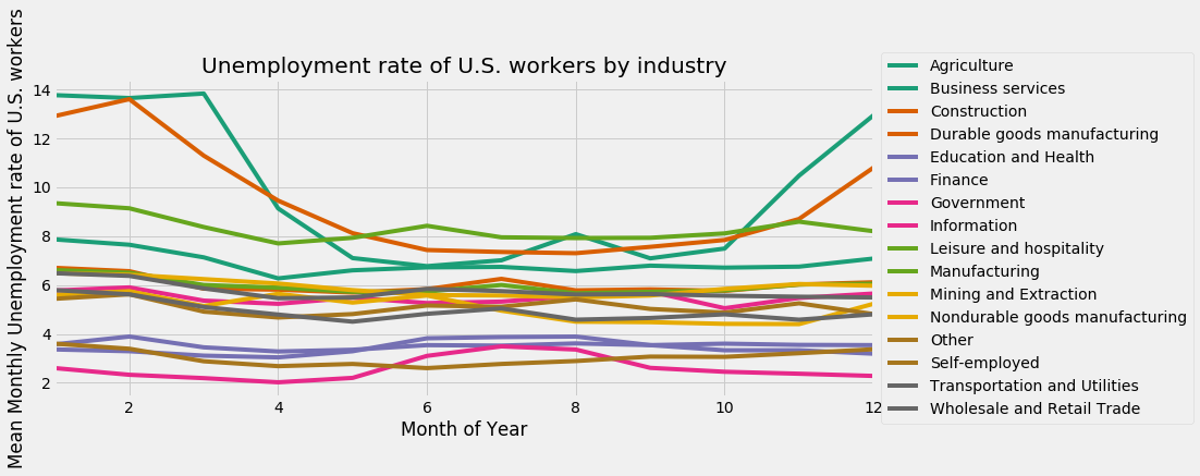
jobsデータセットの月次平均

ax = jobs_by_month.plot(figsize=(12, 5),
colormap='Dark2')
ax.legend(bbox_to_anchor=(1.0, 0.5), 
loc='center left')
Pythonで学ぶ時系列データの可視化

jobsデータセットの月次平均

jobsデータセットの月次平均

Pythonで学ぶ時系列データの可視化

練習しましょう!

Pythonで学ぶ時系列データの可視化

Preparing Video For Download...