Pythonで学ぶPlotlyによるデータ可視化入門
Alex Scriven
Data Scientist
カスタマイズ方法:
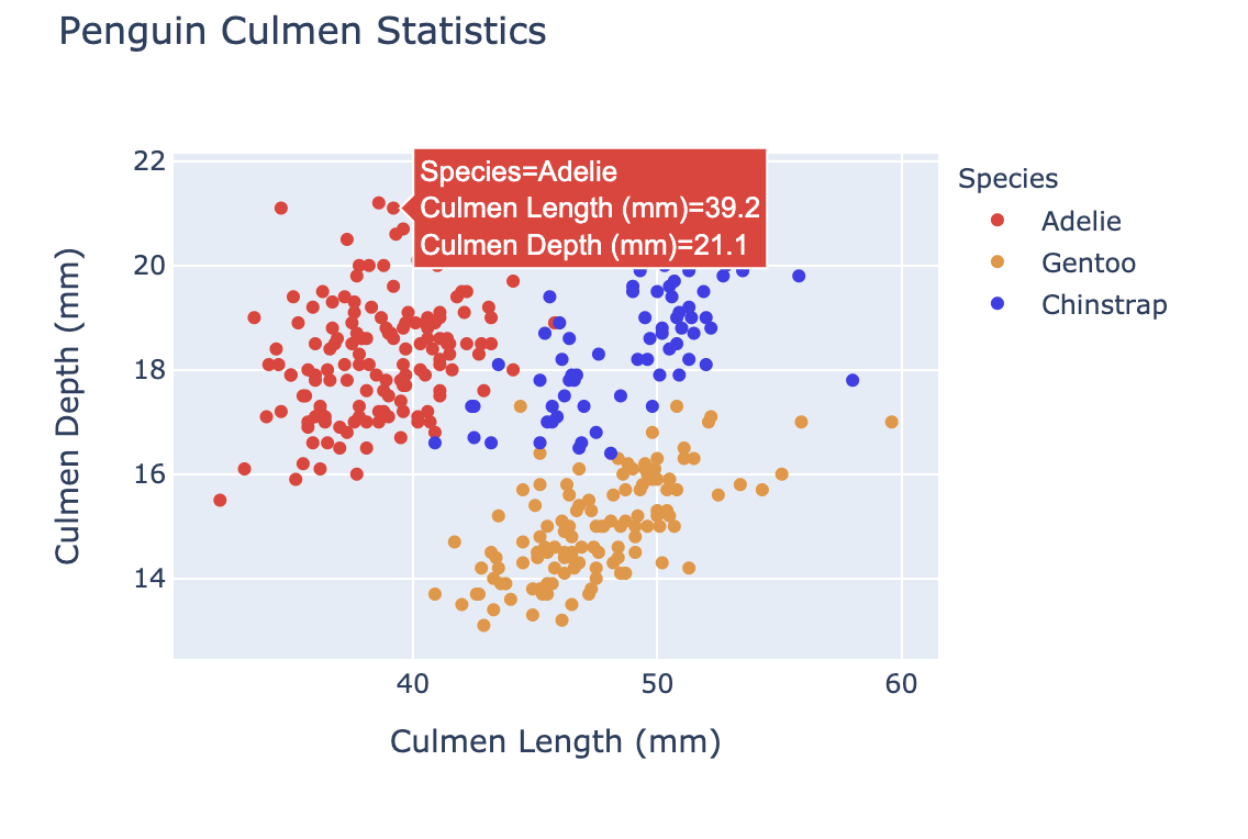
color)を使うupdate_layout() を使うfig.update_layout({"title":{"text":"A New Title"}})
色をカスタマイズすると次が可能:

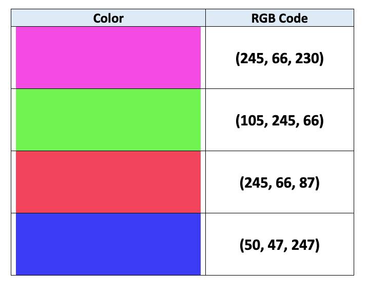
コンピュータは色を RGB で表します:
$$
$$
詳しくはこの記事をご覧ください

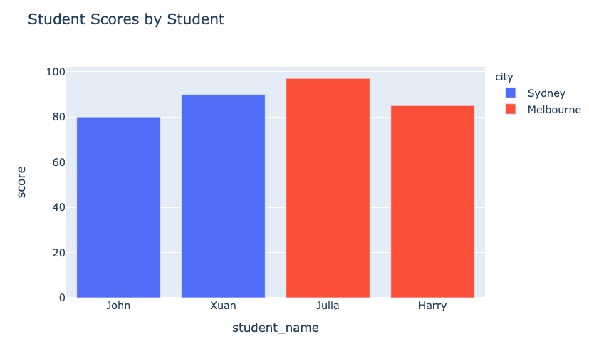
color 引数(DataFrame の列)
fig = px.bar(data_frame=student_scores,
x="student_name",
y="score",
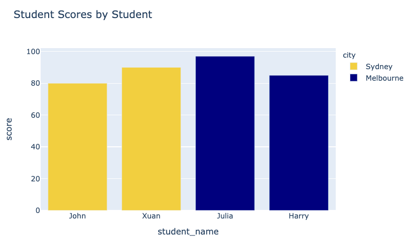
title="Student Scores by Student"
color="city")
fig.show()
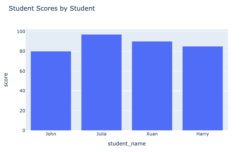
変更前のプロット:

変更後のプロット:

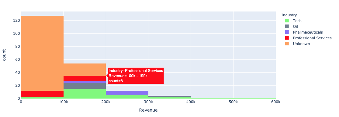
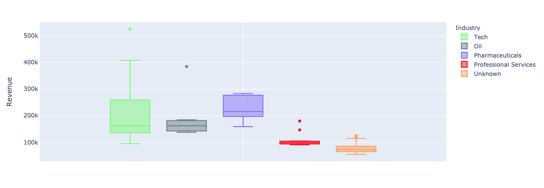
plotly.express の color 引数を単変量(棒、ヒストグラム)で使う:


color_discrete_map: カテゴリ値を色に対応付ける辞書"red", "green" など)でも指定可$$
fig = px.bar( data_frame=student_scores, x="student_name", y="score", title="Student Scores by Student",color_discrete_map={ "Melbourne": "rgb(0,0,128)", "Sydney": "rgb(235, 207, 52)"},color="city")


$$
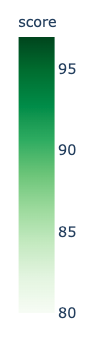
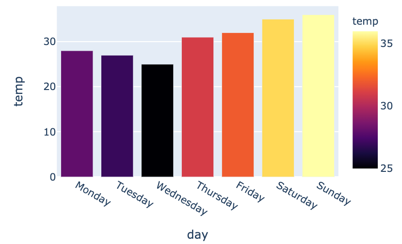
color_continuous_scale 引数で指定
fig = px.bar(data_frame=weekly_temps,
x="day", y="temp",
color="temp",
color_continuous_scale="inferno")
fig.show()
$$

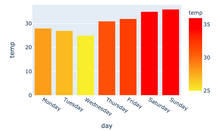
my_scale=[("rgb(242, 238, 10)"), ("rgb(242, 95, 10)"), ("rgb(255,0,0)")]fig = px.bar(data_frame=weekly_temps, x="day", y="temp",color_continuous_scale=my_scale, color="temp")

Pythonで学ぶPlotlyによるデータ可視化入門