Pythonで学ぶPlotlyによるデータ可視化入門
Alex Scriven
Data Scientist
値を切替えてプロットを更新するインタラクティブ要素
時系列の閲覧に便利
任意のグループに使用可能
$$
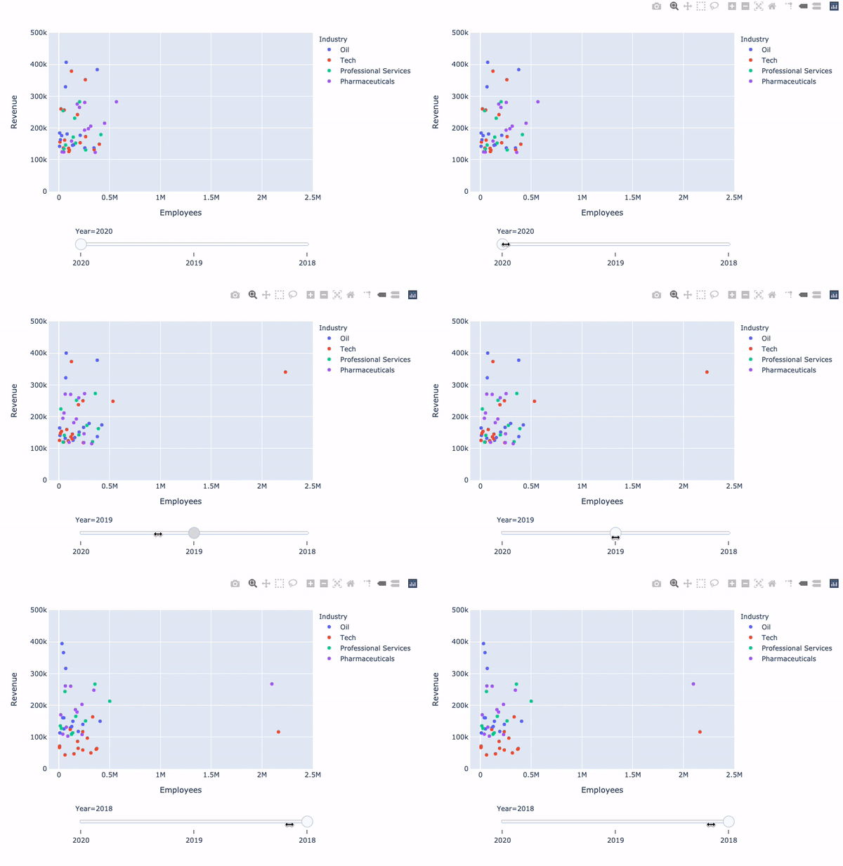
年スライダー:
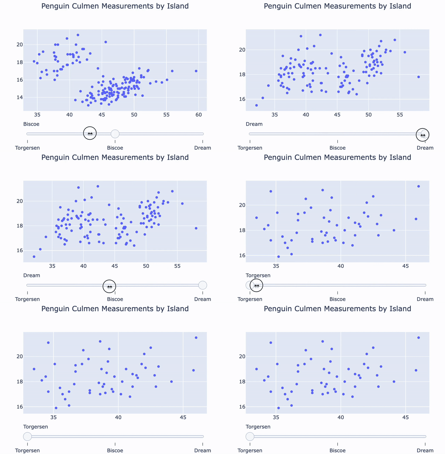
ペンギンの島スライダー:
animation_frame
Year
Island
animation_group
fig = px.scatter(
  data_frame=revenues,
  y='Revenue',
  x='Employees',
  color='Industry',

  animation_frame='Year',
  animation_group='Company')


fig.update_layout({
  'yaxis': {'range': [0, 500000]},
  'xaxis': {'range': [-100000, 2500000]}
})


fig['layout'].pop('updatemenus')
fig.show()
fig = px.scatter( data_frame=revenues, y='Revenue', x='Employees', color='Industry',
animation_frame='Year', animation_group='Company')
fig.update_layout({ 'yaxis': {'range': [0, 500000]}, 'xaxis': {'range': [-100000, 2500000]} })
fig['layout'].pop('updatemenus') fig.show()
plotly.express は animate メソッドでスライダーを実装します
plotly.express
animate
fig['layout']['sliders'][0].steps[0]['method']
fig = go.Figure()

for island in ['Torgersen', 'Biscoe', 'Dream']:
    df = penguins[penguins.Island == island]

    temp_trace = px.scatter(df, x="Culmen Length (mm)", y="Culmen Depth (mm)")
    fig.add_trace(temp_trace.data[0])
fig = go.Figure()
for island in ['Torgersen', 'Biscoe', 'Dream']: df = penguins[penguins.Island == island]
temp_trace = px.scatter(df, x="Culmen Length (mm)", y="Culmen Depth (mm)") fig.add_trace(temp_trace.data[0])
sliders = [
  {'steps':[

    {'method': 'update', 'label': 'Torgersen',

    'args': [{'visible': [True, False, False]}]},

    {'method': 'update', 'label': 'Bisco',

    'args': [{'visible': [False, True, False]}]},

    {'method': 'update', 'label': 'Dream',

    'args': [{'visible': [False, False, True]}]}

  ]}
]
sliders = [ {'steps':[
{'method': 'update', 'label': 'Torgersen',
'args': [{'visible': [True, False, False]}]},
{'method': 'update', 'label': 'Bisco',
'args': [{'visible': [False, True, False]}]},
{'method': 'update', 'label': 'Dream',
'args': [{'visible': [False, False, True]}]}
]} ]
詳細な書式設定はドキュメントを参照
fig.update_layout({'sliders': sliders})
fig.show()