Pythonで学ぶPlotlyによるデータ可視化入門
Alex Scriven
Data Scientist
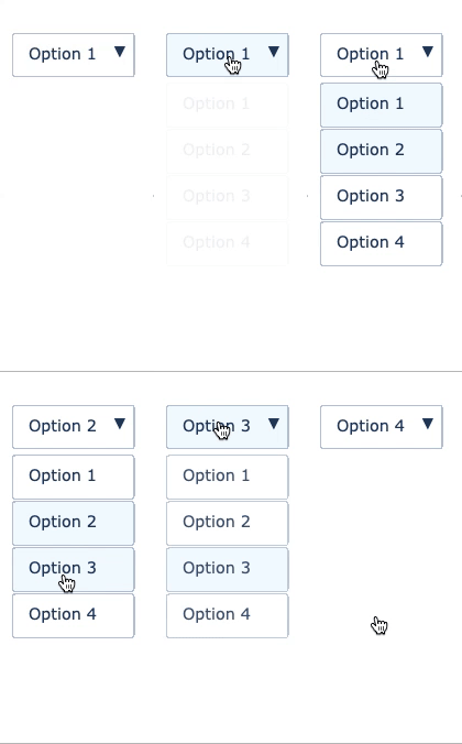
複数の選択肢から選べます
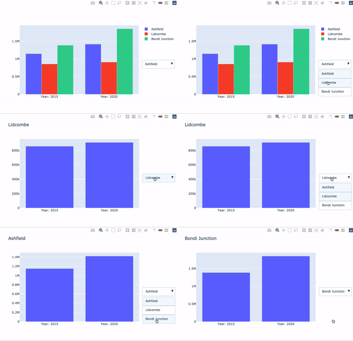
データやレイアウト要素を更新します
$$
fig = go.Figure()

for suburb in ['Ashfield', 'Lidcombe', 'Bondi Junction']:
    df = syd_houses[syd_houses.Suburb == suburb]

    fig.add_trace(
    px.bar(df, x='Year', y='Median House Price').data[0])
fig = go.Figure()
for suburb in ['Ashfield', 'Lidcombe', 'Bondi Junction']: df = syd_houses[syd_houses.Suburb == suburb]
fig.add_trace( px.bar(df, x='Year', y='Median House Price').data[0])
visible
True
False
args
args:[{'visible': [True, False, False]}]
# Create the dropdown
dropdown_buttons = [
  {'label': 'Ashfield', 'method': 'update',

   'args': [{'visible': [True, False, False]},
           {'title': 'Ashfield'}]},

  {'label': 'Lidcombe', 'method': 'update',

  'args': [{'visible': [False, True, False]},
          {'title': 'Lidcombe'}]},

  {'label': 'Bondi Junction', 'method': 'update',

  'args': [{'visible': [False, False, True]},
          {'title': 'Bondi Junction'}]}

]
# Create the dropdown dropdown_buttons = [ {'label': 'Ashfield', 'method': 'update',
'args': [{'visible': [True, False, False]}, {'title': 'Ashfield'}]},
{'label': 'Lidcombe', 'method': 'update',
'args': [{'visible': [False, True, False]}, {'title': 'Lidcombe'}]},
{'label': 'Bondi Junction', 'method': 'update',
'args': [{'visible': [False, False, True]}, {'title': 'Bondi Junction'}]}
]
fig.update_layout({
  'updatemenus':[{
    'type': "dropdown",
    'x': 1.3,
    'y': 0.5,
    'showactive': True,
    'active': 0,
    'buttons': dropdown_buttons}]
})
fig.show()