社内分析のための比率の可視化

Pythonで学ぶ財務諸表分析

Rohan Chatterjee

Risk modeler

財務比率の可視化

  • 棒グラフは次に有用です:
    • 企業の平均的な財務比率の可視化
    • 業界平均に対する相対的なパフォーマンス評価

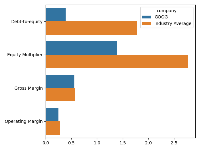
この画像は、Googleの財務比率をテック業界平均と棒グラフで比較したものです。

Pythonで学ぶ財務諸表分析

プロット用データの準備

  • 企業別の平均比率をpivot_tableで計算:
    avg_company_ratio = plot_dat.pivot_table(index=["comp_type",
                                                    "company"],
                          values=["Gross Margin", "Operating Margin",
                                  "Debt-to-equity", "Equity Multiplier"],
                                            aggfunc="mean").reset_index()
    
  • print(avg_company_ratio.head())

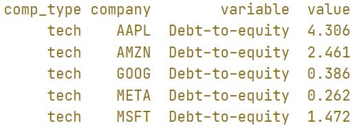
この画像はDataFrame avg_company_ratio の先頭5行を示します。注目列は粗利益率と営業利益率で、各社の平均値が表示されています。

Pythonで学ぶ財務諸表分析

プロット用データの準備

  • 業界別の平均比率をpivot_tableで計算:
    avg_industry_ratio = plot_dat.pivot_table(index="comp_type",
                          values=["Gross Margin", "Operating Margin",
                                  "Debt-to-equity", 
                                  "Equity Multiplier"],
                                            aggfunc="mean").reset_index()
    
  • print(avg_industry_ratio.head())

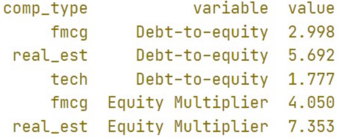
この画像はDataFrame avg_industry_ratio の先頭5行を示します。注目列は粗利益率と営業利益率で、各業界の平均値が表示されています。

Pythonで学ぶ財務諸表分析

プロット用データの準備

  • ```python
    molten_plot_company = pd.melt(avg_company_ratio, id_vars=["comp_type",
                                                              "company"])
    molten_plot_industry = pd.melt(avg_industry_ratio,
                                   id_vars=["comp_type"])
    
Pythonで学ぶ財務諸表分析
  • print(molten_plot_company.head())

この画像はDataFrame molten_plot_industry の先頭5行を示します。average_industry_ratio を縦長にした点が重要です。variable 列が比率名、value 列がその値です。

  • print(molten_plot_industry.head())

この画像はDataFrame molten_plot_industry の先頭5行を示します。average_company_ratio を縦長にした点が重要です。variable 列が比率名、value 列がその値です。

Pythonで学ぶ財務諸表分析

プロット用データの準備

  • Seaborn では、描画する全データを1つのDataFrameにまとめる必要があります
  • pd.concatmolten_plot_companymolten_plot_industryを連結します
  • molten_plot_industryには業界全体の平均のみがあり、company列がありません
  • pd.concatは列一致が必要なため、molten_plot_industrycompany列を追加します
molten_plot_industry["company"] = "Industry Average"
molten_plot = pd.concat([molten_plot_company, molten_plot_industry])
Pythonで学ぶ財務諸表分析

棒グラフを作成する

sns.barplot(data=molten_plot, y="variable", x="value", hue="company", ci=None)
plt.xlabel(""), plt.ylabel("")
plt.show()

この画像は本動画のスライド2と同一です。Googleの財務比率とテック業界平均を棒グラフで比較しています。

Pythonで学ぶ財務諸表分析

練習してみましょう!

Pythonで学ぶ財務諸表分析

Preparing Video For Download...