アニメーション入門

R で学ぶ中級インタラクティブ可視化(plotly)

Adam Loy

Statistician, Carleton College
CO2排出量と所得

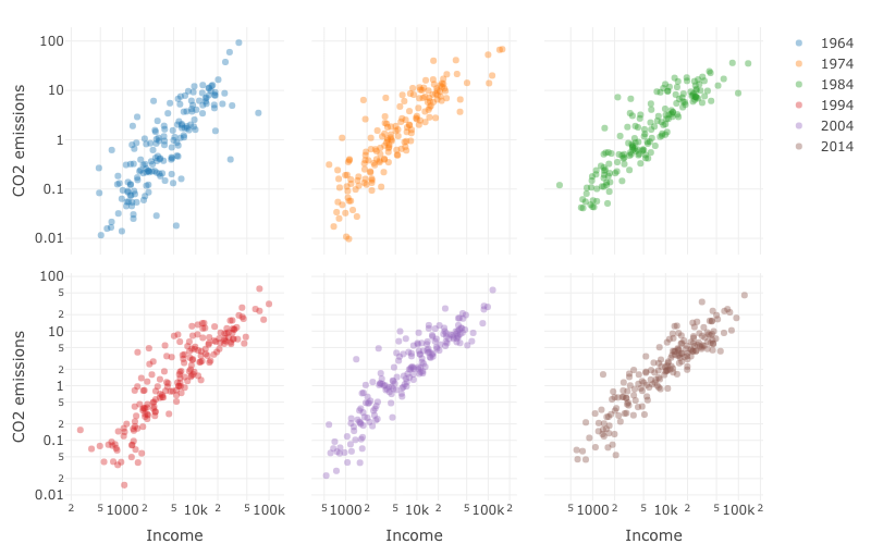
【質問】二酸化炭素排出量と所得の関係は、時間とともに変化しましたか?

world_indicators
# A tibble: 11,387 x 11
  country  year income     co2 military population  urban life_expectancy four_regions
  <chr>   <dbl>  <dbl>   <dbl>    <dbl>      <dbl>  <dbl>           <dbl> <chr>       
1 Afghan…  1960   1210  0.0461       NA    9000000 7.56e5            38.6 asia        
2 Albania  1960   2790  1.24         NA    1640000 4.94e5            62.7 europe      
3 Algeria  1960   6520  0.554        NA   11100000 3.39e6            52   africa      
4 Andorra  1960  15200 NA            NA      13400 7.84e3            NA   europe      
5 Angola   1960   3860  0.0975       NA    5640000 5.89e5            42.4 africa      
# … with 1.138e+04 more rows, and 2 more variables: eight_regions <chr>, six_regions <chr>
R で学ぶ中級インタラクティブ可視化(plotly)

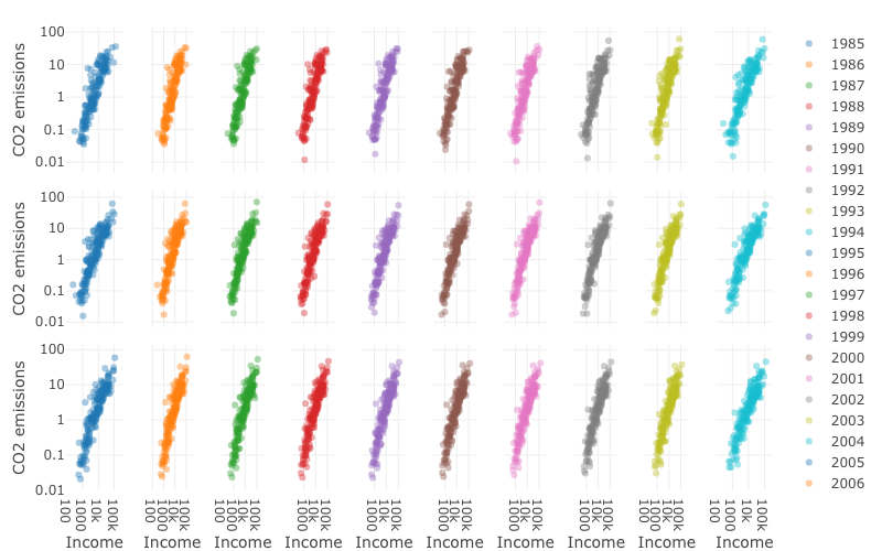
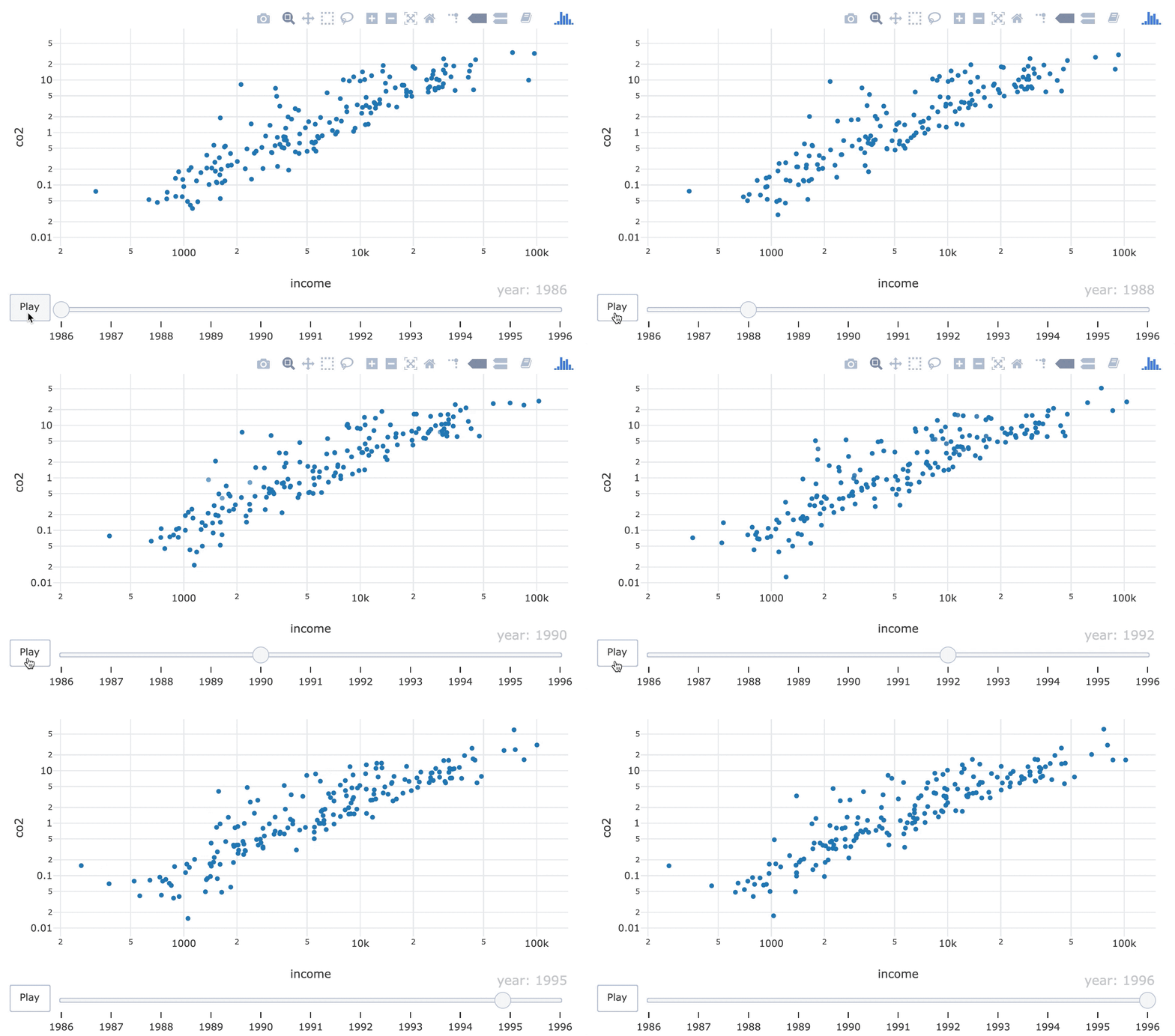
6年分の1人当たりGDPに対するCO2排出量の散布図。

R で学ぶ中級インタラクティブ可視化(plotly)

1989–2014年の1人当たりGDPに対するCO2排出量の散布図。

R で学ぶ中級インタラクティブ可視化(plotly)

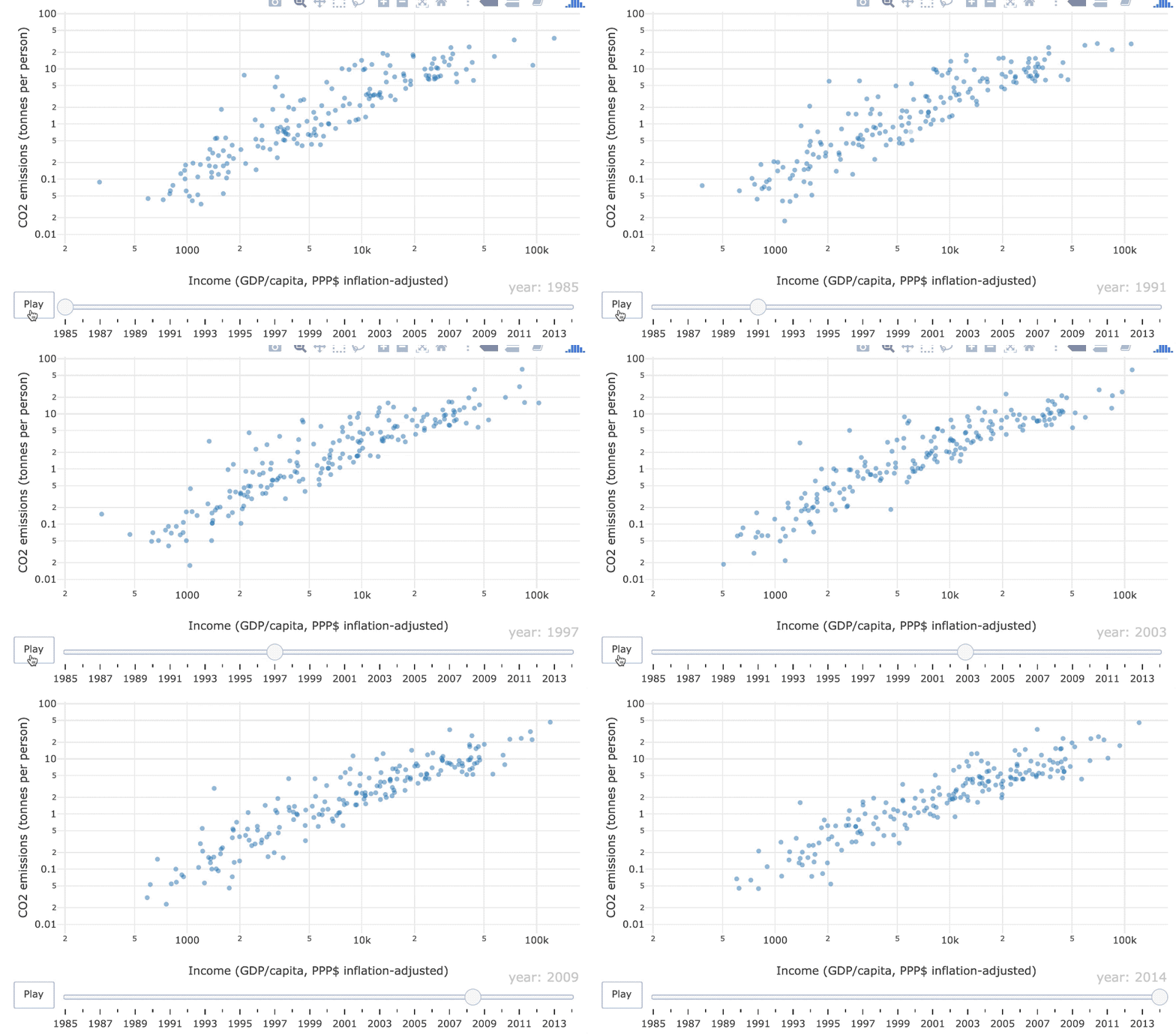
1985–2014年の1人当たりGDPに対するCO2排出量のアニメーション散布図

R で学ぶ中級インタラクティブ可視化(plotly)

キーフレーム・アニメーション

フレーム = 特定時点のプロット

散布図のフィルムストリップ。

R で学ぶ中級インタラクティブ可視化(plotly)

frame 美的属性

world_indicators %>%
  plot_ly(x = ~income, y = ~co2) %>%
  add_markers(frame = ~year, showlegend = FALSE) %>%
  layout(xaxis = list(type = "log"), yaxis = list(type = "log"))
R で学ぶ中級インタラクティブ可視化(plotly)

オブジェクトの一貫性

グラフィック要素(例: グリフ)は、特定のデータ点(例: ベルギー)を表すべきです。
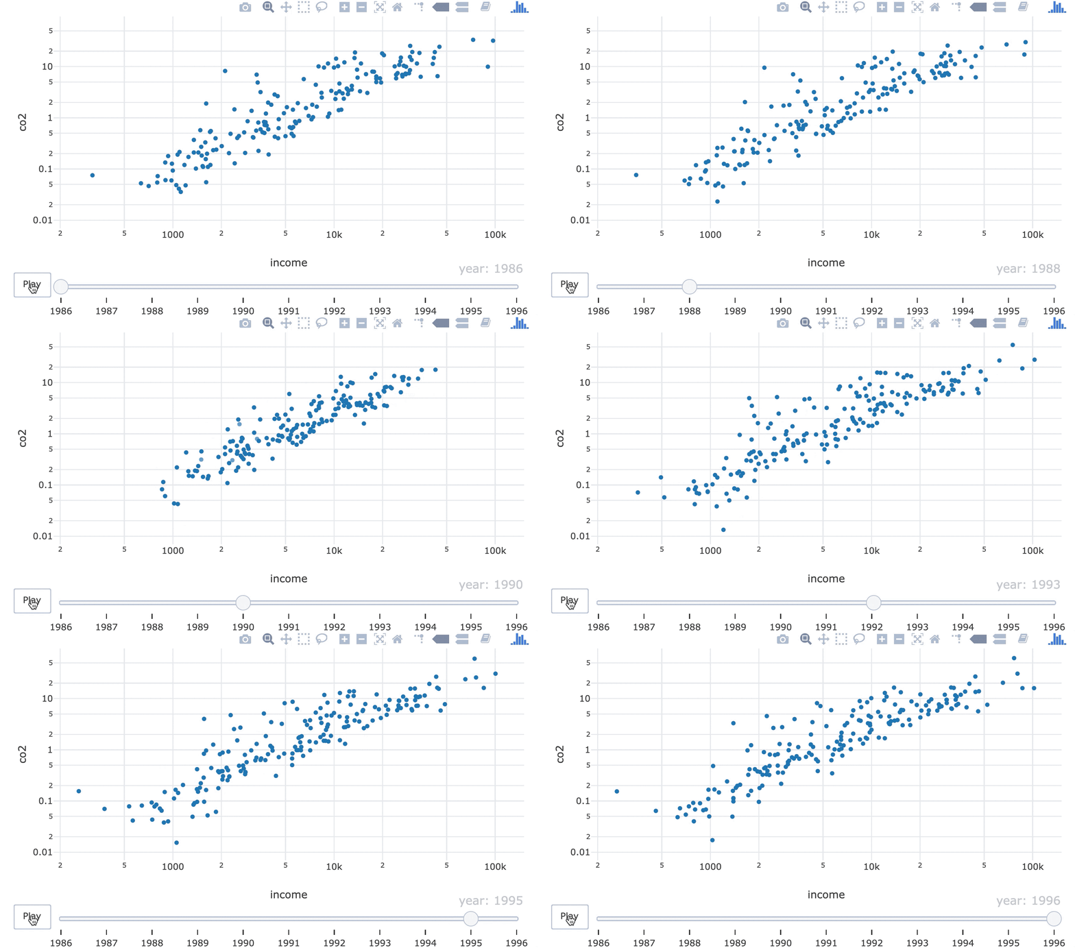
1990年代に点の順位が入れ替わるGIF。

R で学ぶ中級インタラクティブ可視化(plotly)

ids 美的属性

world_indicators %>%
  plot_ly(x = ~income, y = ~co2) %>%
  add_markers(frame = ~year, ids = ~country, showlegend = FALSE) %>%
  layout(xaxis = list(type = "log"), yaxis = list(type = "log"))
21-object-constancy-fixed.gif

R で学ぶ中級インタラクティブ可視化(plotly)

練習しましょう!

R で学ぶ中級インタラクティブ可視化(plotly)

Preparing Video For Download...