はじめに

R で学ぶ中級インタラクティブ可視化(plotly)

Adam Loy

Statistician, Carleton College

動機
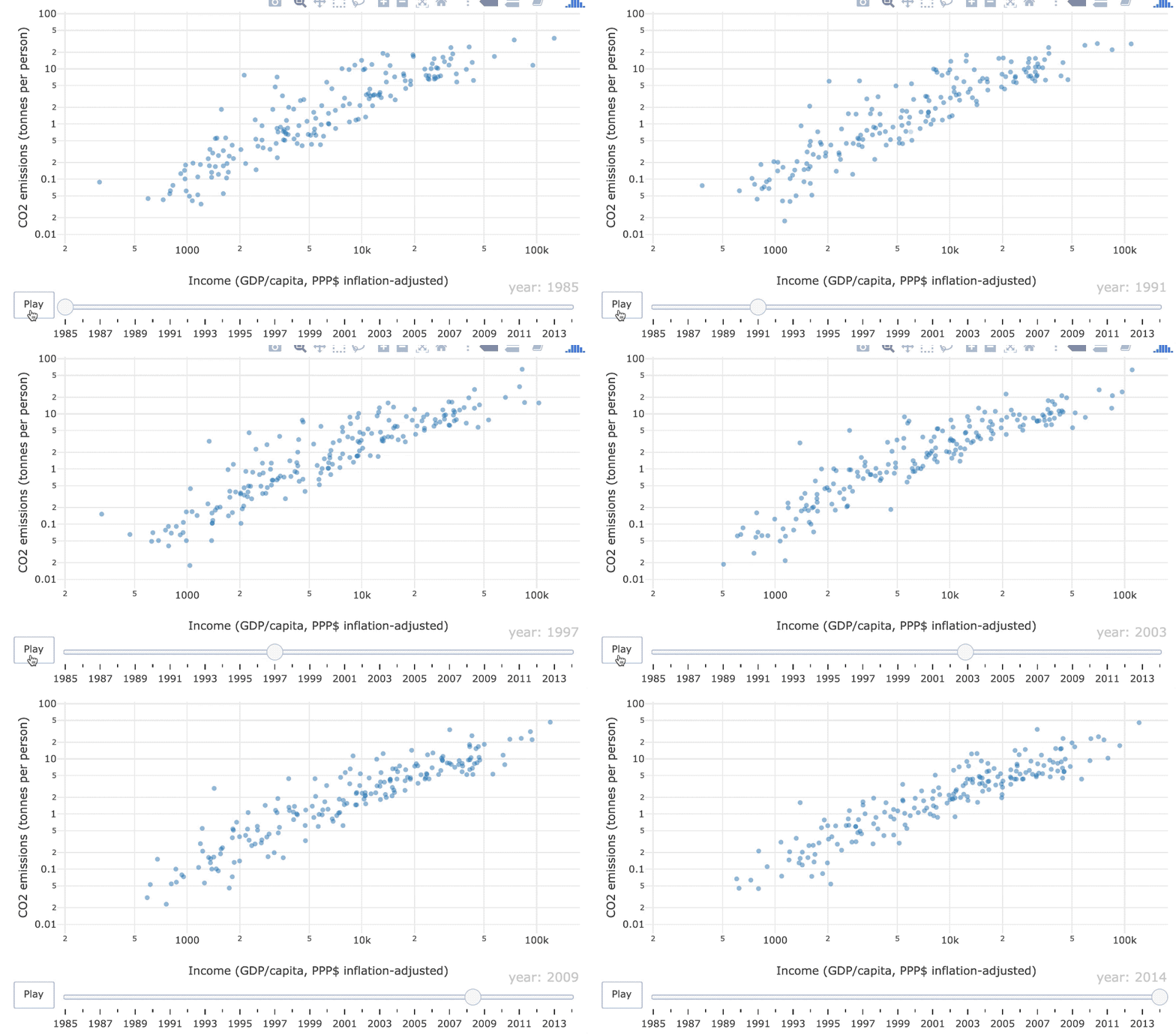
1985〜2014年の一人当たりGDPに対するCO2排出量の散布図アニメーション

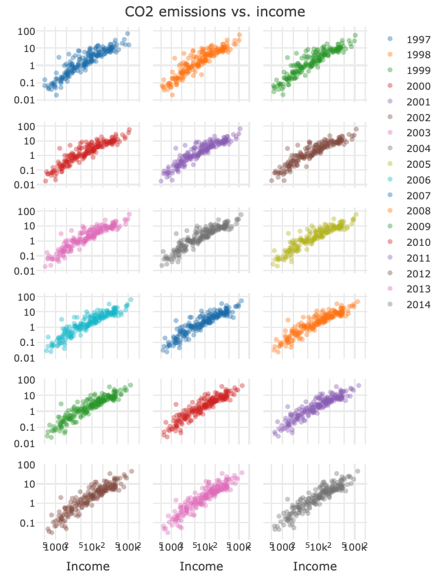
アニメーションとファセット表示、どちらが時間的変化を把握しやすいですか?

ch1_1_motivation.png

R で学ぶ中級インタラクティブ可視化(plotly)

plotly

  • インタラクティブおよび動的なWebグラフィック向けの可視化ライブラリ

  • 現在も活発に開発中

R で学ぶ中級インタラクティブ可視化(plotly)

グラフィックの種類

  • 静的

  • インタラクティブ

  • 動的

R で学ぶ中級インタラクティブ可視化(plotly)

静的グラフィック

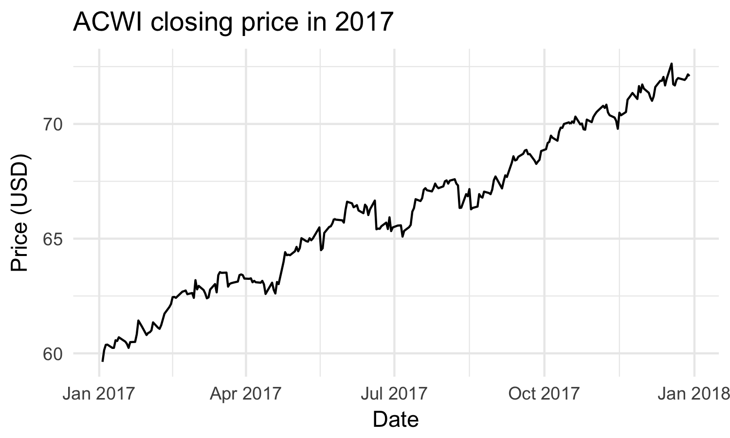
静的グラフィックは、作成後に固定されたまま変化しません

2017年のACWIの時系列プロット

R で学ぶ中級インタラクティブ可視化(plotly)

インタラクティブグラフィック

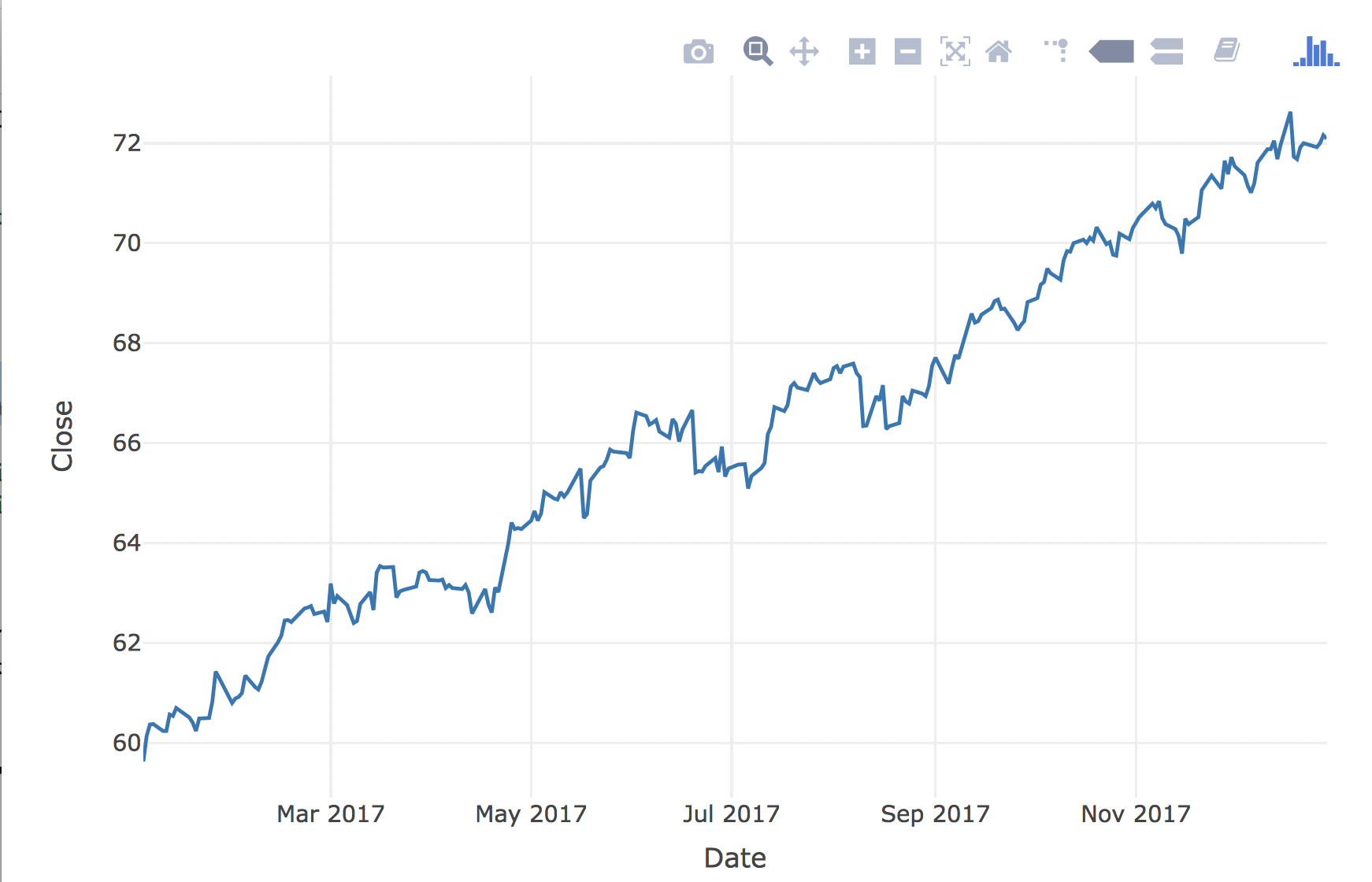
インタラクティブグラフィックは、ユーザーの操作に応じて変化します
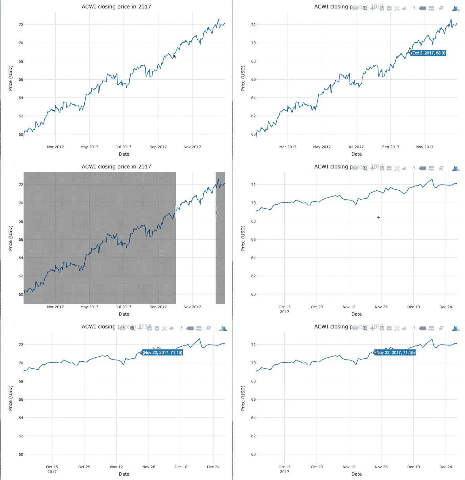
ホバーとズームの操作例

R で学ぶ中級インタラクティブ可視化(plotly)

動的グラフィック

動的グラフィックは、ユーザー操作なしに定期的に変化します
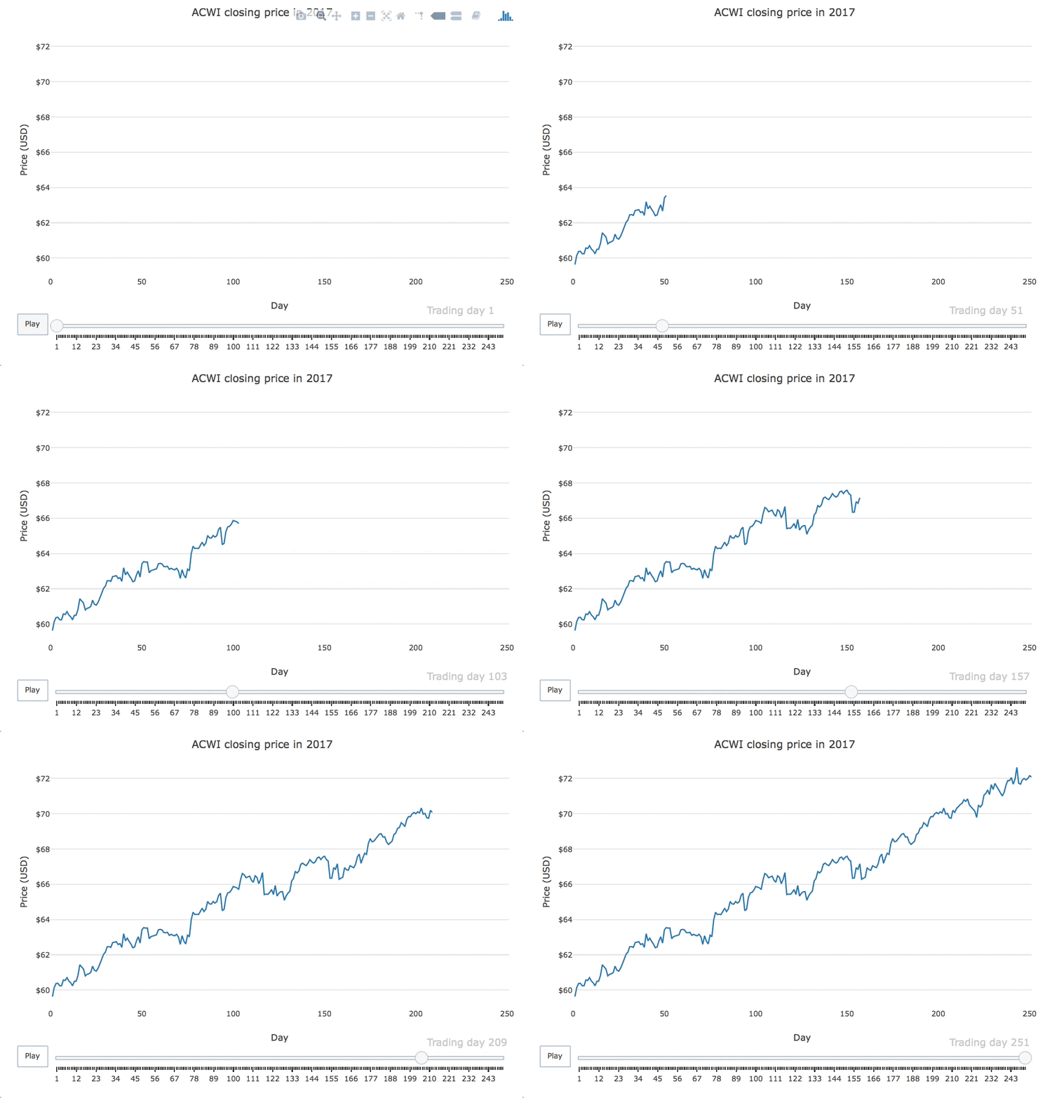
2017年のACWI終値の時系列アニメーションプロット

R で学ぶ中級インタラクティブ可視化(plotly)

plotlyの復習

msci
# A tibble: 251 x 7
   Date        Open  High   Low Close Volume Adjusted
   <date>     <dbl> <dbl> <dbl> <dbl>  <int>    <dbl>
 1 2017-01-03  79.8  79.8  78.4  78.7 646000     77.4
 2 2017-01-04  79.1  81.1  79.1  80.7 849200     79.3
 3 2017-01-05  80.4  81.8  80.4  81.6 557500     80.2
 4 2017-01-06  81.8  83.9  81.8  83.4 597800     82.0
 5 2017-01-09  83.1  83.5  82.6  82.7 668100     81.3
 6 2017-01-10  82.3  82.6  81.1  81.5 558900     80.1
 7 2017-01-11  81.2  81.6  80.8  81.5 365500     80.1
# ... with 244 more rows
R で学ぶ中級インタラクティブ可視化(plotly)

plotlyの復習

library(plotly)

msci %>% plot_ly(x = ~Date, y = ~Close) %>% add_lines()
R で学ぶ中級インタラクティブ可視化(plotly)

インタラクティブ時系列プロット

R で学ぶ中級インタラクティブ可視化(plotly)

練習しましょう!

R で学ぶ中級インタラクティブ可視化(plotly)

Preparing Video For Download...