より魅力的なチャートにする

R で学ぶ中級インタラクティブ可視化(plotly)

Adam Loy

Statistician, Carleton College

shiny なしのアプリ
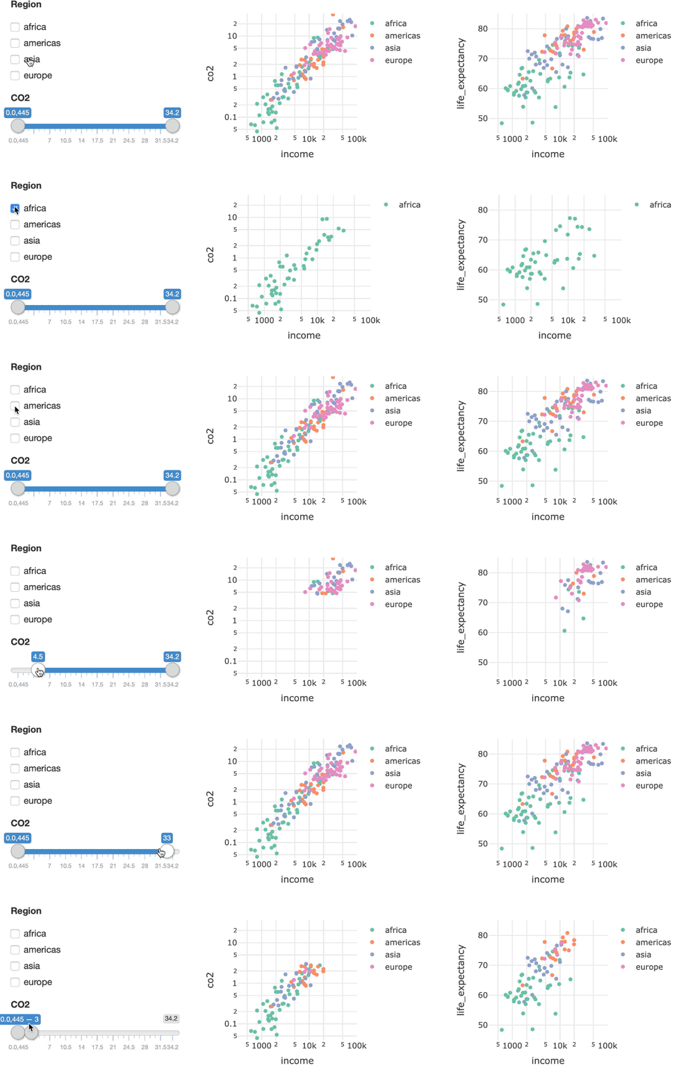
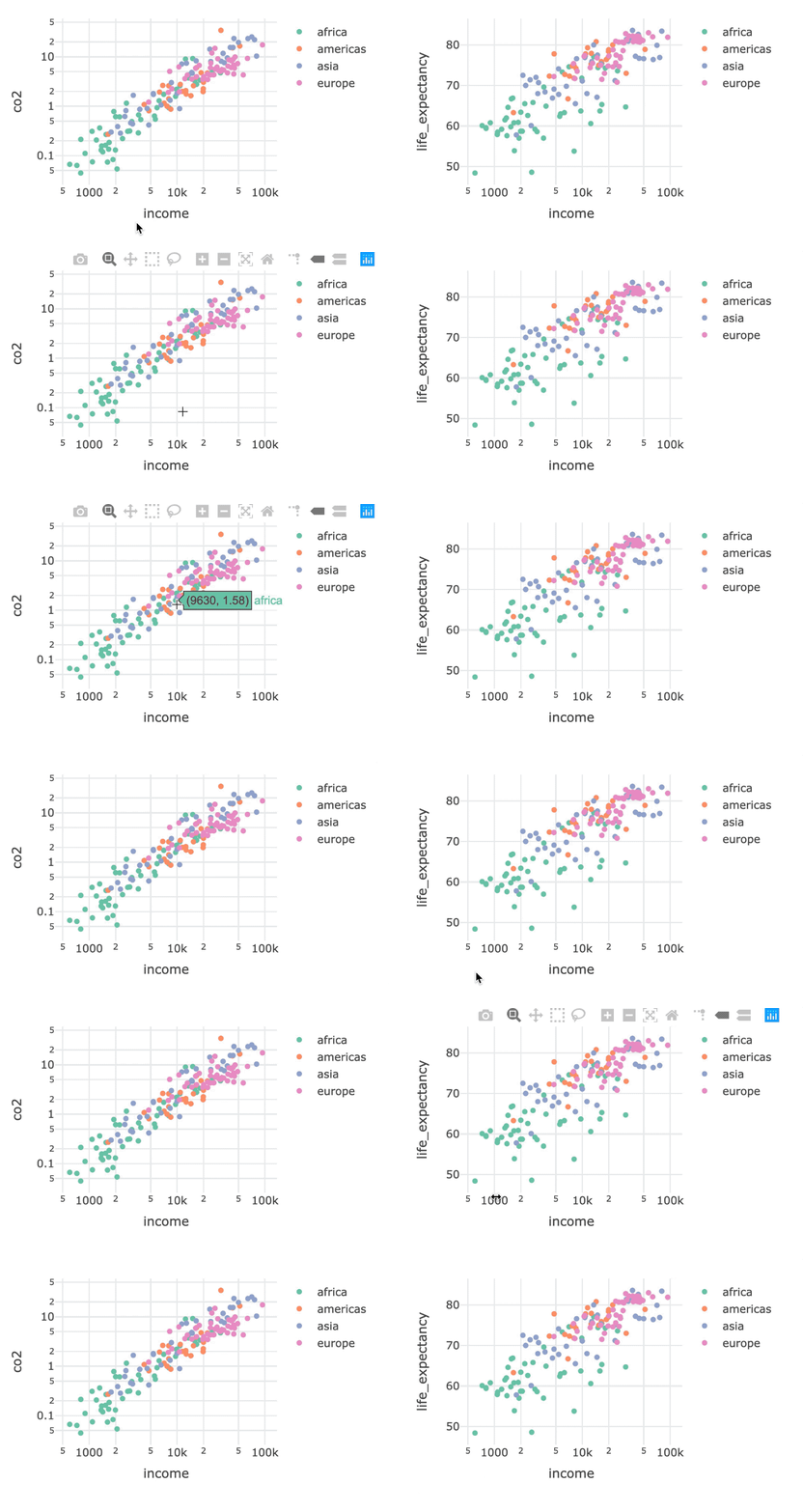
bscols の例

R で学ぶ中級インタラクティブ可視化(plotly)

列レイアウトのための bscols()

library(plotly)
library(crosstalk)
shared_data <- world2014 %>% SharedData$new()

p1 <- shared_data %>% plot_ly(x=~income, y = ~co2, color = ~four_regions) %>% add_markers() %>% layout(xaxis = list(type = "log"), yaxis = list(type = "log")) p2 <- shared_data %>% plot_ly(x=~income, y = ~life_expectancy, color = ~four_regions) %>% add_markers() %>% layout(xaxis = list(type = "log")))
bscols(p1, p2)
R で学ぶ中級インタラクティブ可視化(plotly)

列レイアウトのための bscols()

bscols の手順 1

R で学ぶ中級インタラクティブ可視化(plotly)

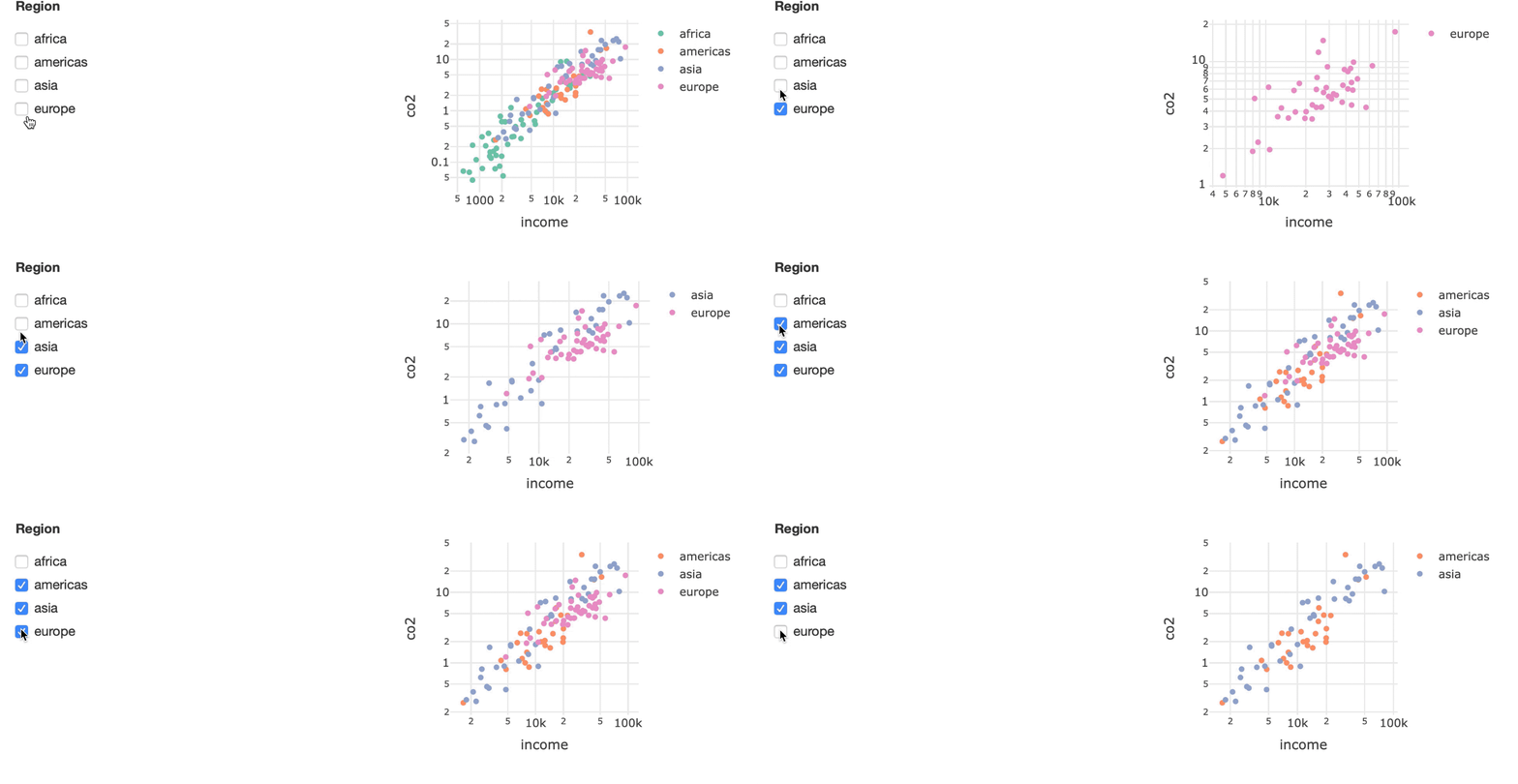
フィルターを追加:チェックボックス

チェックボックスを使った bscols の例

bscols(filter_checkbox(id = "four_regions", label = "Region", 
                       sharedData = shared_data, group = ~four_regions),
       p1)
R で学ぶ中級インタラクティブ可視化(plotly)

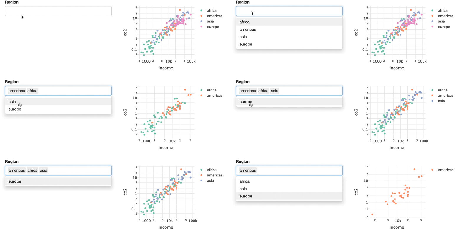
フィルターを追加:セレクトボックス

セレクトボックスを使った bscols の例

bscols(filter_select(id = "four_regions", label = "Region", 
                sharedData = shared_data, group = ~four_regions),
       p1)
R で学ぶ中級インタラクティブ可視化(plotly)

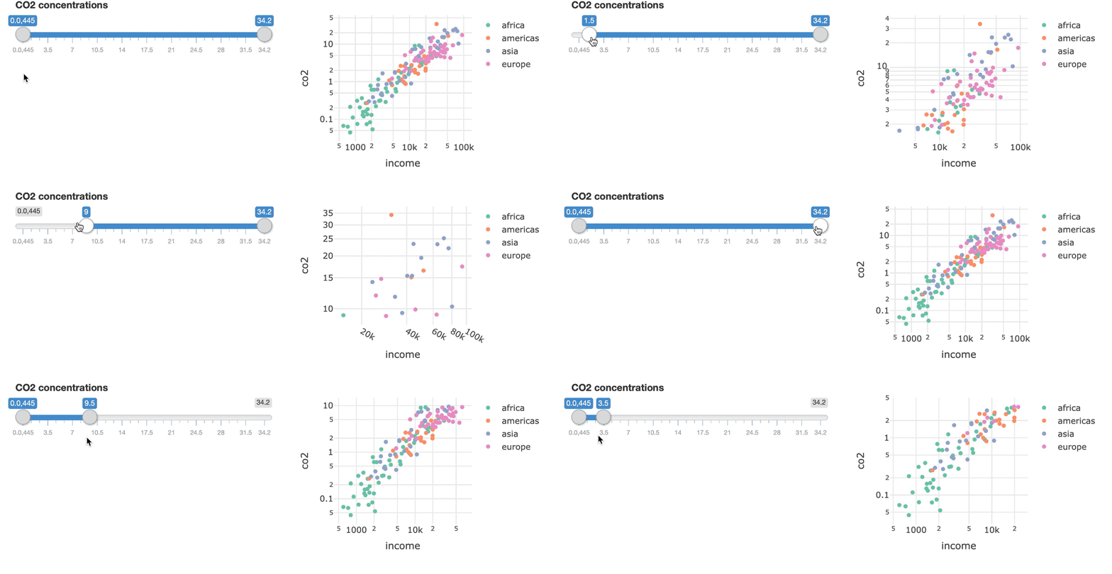
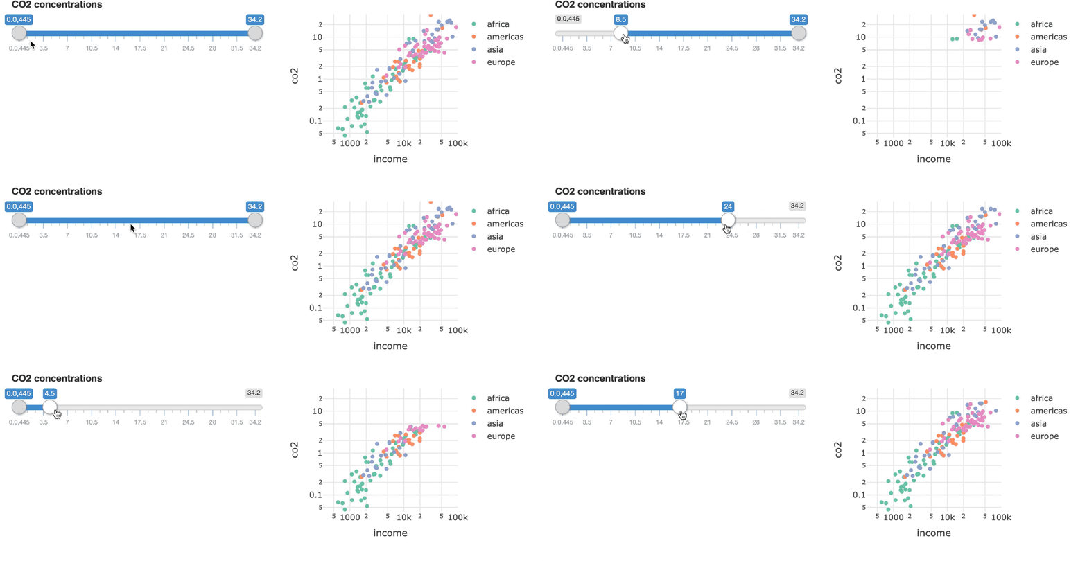
フィルターを追加:スライダー

スライダーを使った bscols の例

bscols(filter_slider(id = "co2", label = "CO2 concentrations", 
                     sharedData = shared_data, column = ~co2),
       p1)
R で学ぶ中級インタラクティブ可視化(plotly)

軸レンジを固定する

固定レンジの例

bscols(filter_slider(id = "co2", label = "CO2 concentrations", 
                     sharedData = shared_data, column = ~co2),
        p1 %>% layout(xaxis = list(range = c(2.5, 5)), 
                      yaxis = list(range = c(-1.4, 1.55)))
)
R で学ぶ中級インタラクティブ可視化(plotly)

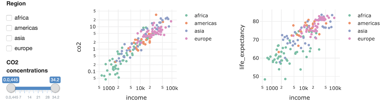
組み合わせる

bscols(widths = c(2, 5, 5),
  list(
    filter_checkbox(
      id = "four_regions", label = "Region", 
      sharedData = shared_data, group = ~four_regions
    ),
    filter_slider(
      id = "co2", label = "CO2 concentrations", 
      sharedData = shared_data, column = ~co2
    )
  ),
  p1,
  p2
)
R で学ぶ中級インタラクティブ可視化(plotly)

組み合わせる

最終レイアウトの静止画

R で学ぶ中級インタラクティブ可視化(plotly)

演習に進みましょう

R で学ぶ中級インタラクティブ可視化(plotly)

Preparing Video For Download...