カテゴリーデータの可視化

Bokehで学ぶインタラクティブ・データビジュアライゼーション

George Boorman

Core Curriculum Manager, DataCamp

カテゴリーデータ

  • カテゴリーデータは、選択肢やラベルが固定のデータです。

    • 例: 性別、出生国。
  • 因子はカテゴリ変数の別名です

print(nba[["position", "team", "conference"]].head())
    position    team    conference
0   PG          OKC     West
1   PG          HOU     West
2   PG          BOS     East
3   C           NO      West
4   SG          TOR     East
Bokehで学ぶインタラクティブ・データビジュアライゼーション

ソート

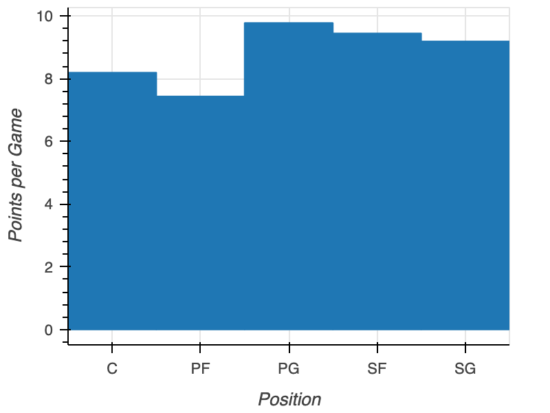
未ソートの棒グラフ

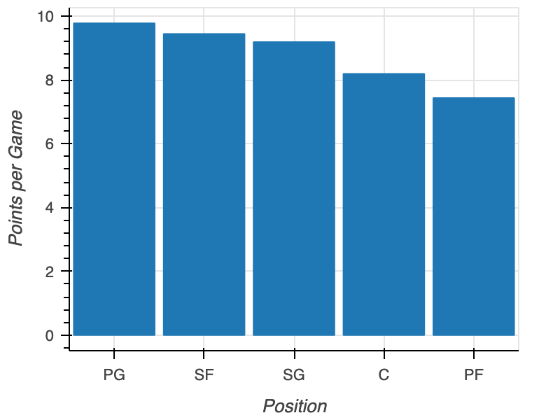
pos = nba.groupby("position")["points"].mean()
pos = pos.sort_values("points", ascending=False)

fig = figure(x_range=pos["position"], x_axis_label="Position", y_axis_label="Points per Game") fig.vbar(x=pos["position"], top=pos["points"]) output_file(filename="sorted_plot.html") show(fig)
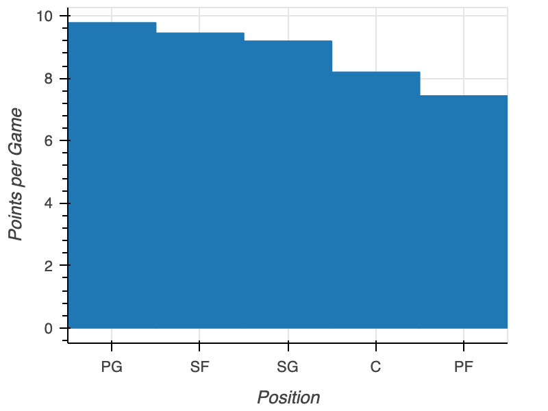
ソート済み棒グラフ

Bokehで学ぶインタラクティブ・データビジュアライゼーション

パディング

fig = figure(x_range=nba["position"], 
             x_axis_label="Position", 
             y_axis_label="Points per Game")
fig.vbar(x=nba["position"], top=nba["points"],

width=0.9)
output_file(filename="padded_plot.html") show(fig)

余白付きソート棒グラフ

Bokehで学ぶインタラクティブ・データビジュアライゼーション

向き

fig = figure(x_range=nba['position'], 
             x_axis_label="Position", 
             y_axis_label="Points per Game")
fig.vbar(x=nba["position"], top=nba["points"], width=0.9)

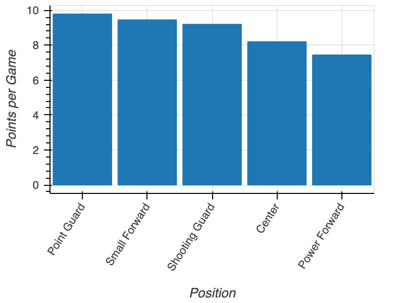
fig.xaxis.major_label_orientation = 45
output_file(filename="rotated_x_label_plot.html") show(fig)
Bokehで学ぶインタラクティブ・データビジュアライゼーション

x軸ラベルの回転

回転したx軸ラベルの棒グラフ

Bokehで学ぶインタラクティブ・データビジュアライゼーション

入れ子のカテゴリ

positions = ["Point Guard", "Shooting Guard", 
            "Small Forward", "Power Forward", "Center"]
conferences = ["East", "West"]

factors = [("Point Guard", "East"), ("Point Guard", "West"), ("Shooting Guard", "East"), ("Shooting Guard", "West"), ("Small Forward", "East"), ("Small Forward", "West"), ("Power Forward", "East"), ("Power Forward", "West"), ("Center", "East"), ("Center", "West")]
Bokehで学ぶインタラクティブ・データビジュアライゼーション

グループ化棒グラフの作成

from bokeh.models import FactorRange

fig = figure(x_range=FactorRange(*factors), y_axis_label="Points per Game")
fig.vbar(x=factors, top=nba["points"], width=0.9)
output_file(filename="grouped_bar_plot.html") show(fig)
Bokehで学ぶインタラクティブ・データビジュアライゼーション

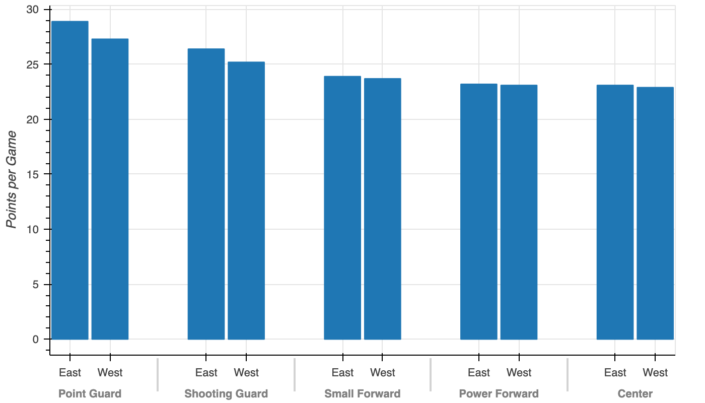
グループ化棒グラフ

グループ化棒グラフ

Bokehで学ぶインタラクティブ・データビジュアライゼーション

練習しましょう!

Bokehで学ぶインタラクティブ・データビジュアライゼーション

Preparing Video For Download...