Juliaで学ぶデータ可視化入門
Gustavo Vieira Suñe
Data Analyst
using Statistics
# 製品ごとにグループ化
grouped = groupby(product, :Product)

# 平均価格を計算
mean_prices = combine(
    grouped,
    :Price => mean
)

# 高い順に並べ替え
sorted_mean_prices = sort(
    mean_prices,
    :Price_mean,
    rev=true
)
# 製品ごとにグループ化 grouped = groupby(product, :Product)
# 平均価格を計算 mean_prices = combine( grouped, :Price => mean )
# 高い順に並べ替え sorted_mean_prices = sort( mean_prices, :Price_mean, rev=true )
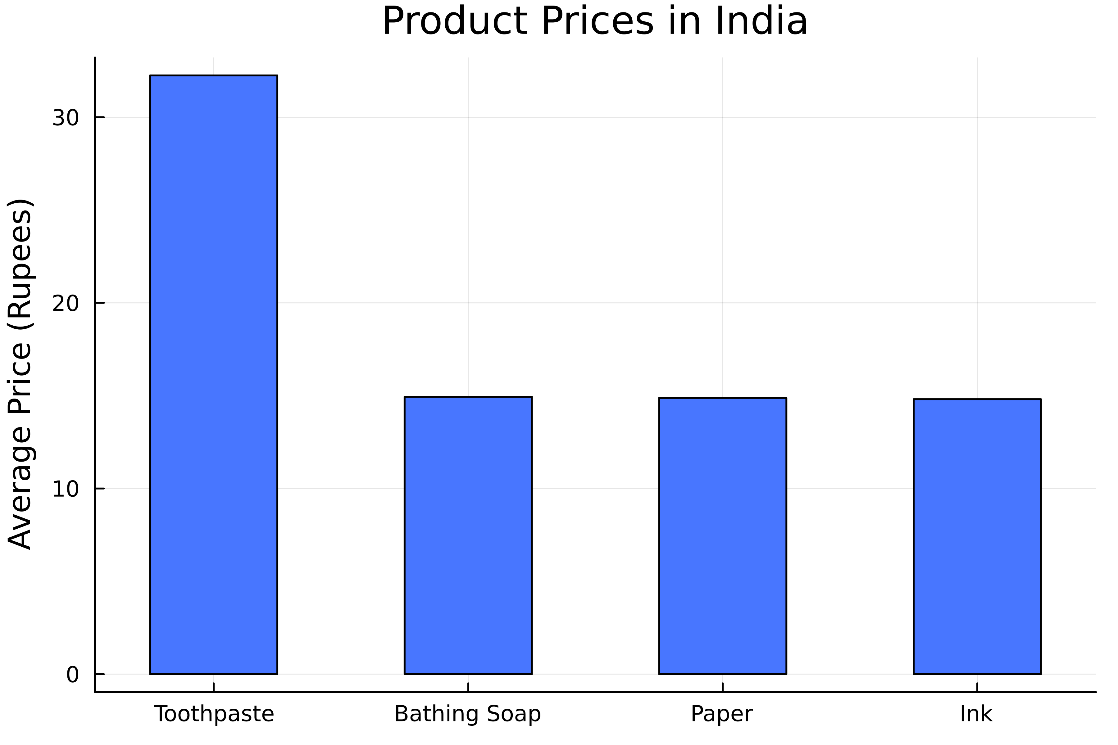
# 棒グラフを作成
bar(
    # x軸のカテゴリ
    sorted_mean_prices.Product,
    # y軸の値
    sorted_mean_prices.Price_mean,

    # 棒の幅を設定
    bar_width=0.5

    label=false,
    color=:royalblue1,
 )
title!("インドの製品価格")
ylabel!("平均価格(ルピー)")
# 棒グラフを作成 bar( # x軸のカテゴリ sorted_mean_prices.Product, # y軸の値 sorted_mean_prices.Price_mean,
# 棒の幅を設定 bar_width=0.5
label=false, color=:royalblue1, ) title!("インドの製品価格") ylabel!("平均価格(ルピー)")
# 棒グラフを作成
bar(
    # y軸の値
    sorted_mean_prices.Product,
    # x軸の値
    sorted_mean_prices.Price_mean,

    # 水平に設定
    permute=(:x, :y),

    label=false,
    color=:royalblue1,
)
title!("インドの製品価格")
xlabel!("平均価格(ルピー)")
# 棒グラフを作成 bar( # y軸の値 sorted_mean_prices.Product, # x軸の値 sorted_mean_prices.Price_mean,
# 水平に設定 permute=(:x, :y),
label=false, color=:royalblue1, ) title!("インドの製品価格") xlabel!("平均価格(ルピー)")
filtered_product = filter(
    row -> row.State in ["Maharashtra", "Goa", "Gujarat"],
    product)
# 州と製品でグループ化
filtered_grouped = groupby(filtered_product, [:State, :Product])

# 平均価格を計算
filtered_mean_prices = combine(
    filtered_grouped, :Price => mean
)
# 州と製品でグループ化 filtered_grouped = groupby(filtered_product, [:State, :Product])
# 平均価格を計算 filtered_mean_prices = combine( filtered_grouped, :Price => mean )
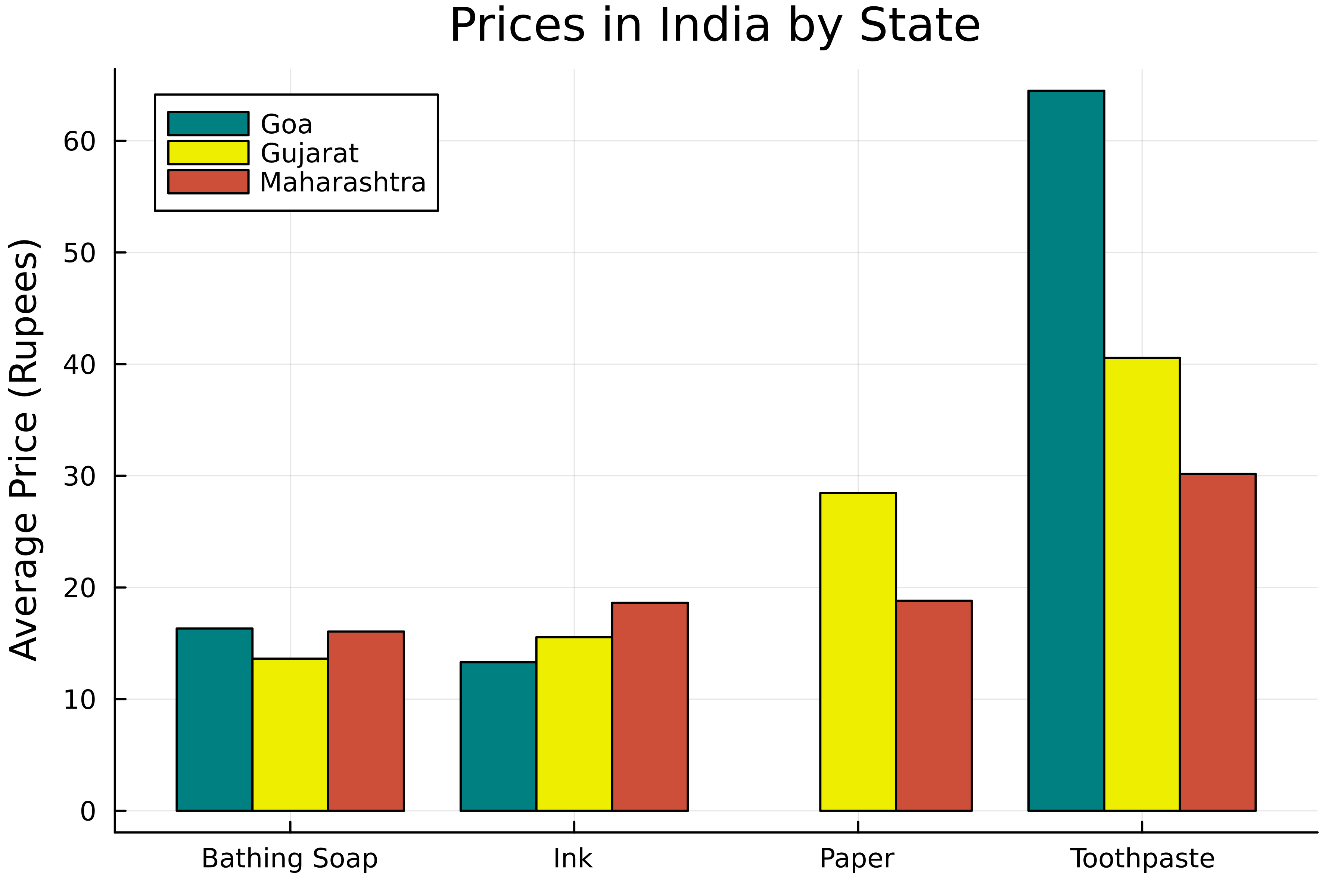
# 積み上げなしのグループ化棒グラフを作成
groupedbar(
    # x軸のカテゴリ
    filtered_mean_prices.Commodity,
    # y軸の値
    filtered_mean_prices.Price_mean,

    # グループを指定
    group=filtered_mean_prices.State,

    color=[:teal :yellow2 :tomato3]
)
title!("インドの州別価格")
ylabel!("平均価格(ルピー)")
# 積み上げなしのグループ化棒グラフを作成 groupedbar( # x軸のカテゴリ filtered_mean_prices.Commodity, # y軸の値 filtered_mean_prices.Price_mean,
# グループを指定 group=filtered_mean_prices.State,
color=[:teal :yellow2 :tomato3] ) title!("インドの州別価格") ylabel!("平均価格(ルピー)")
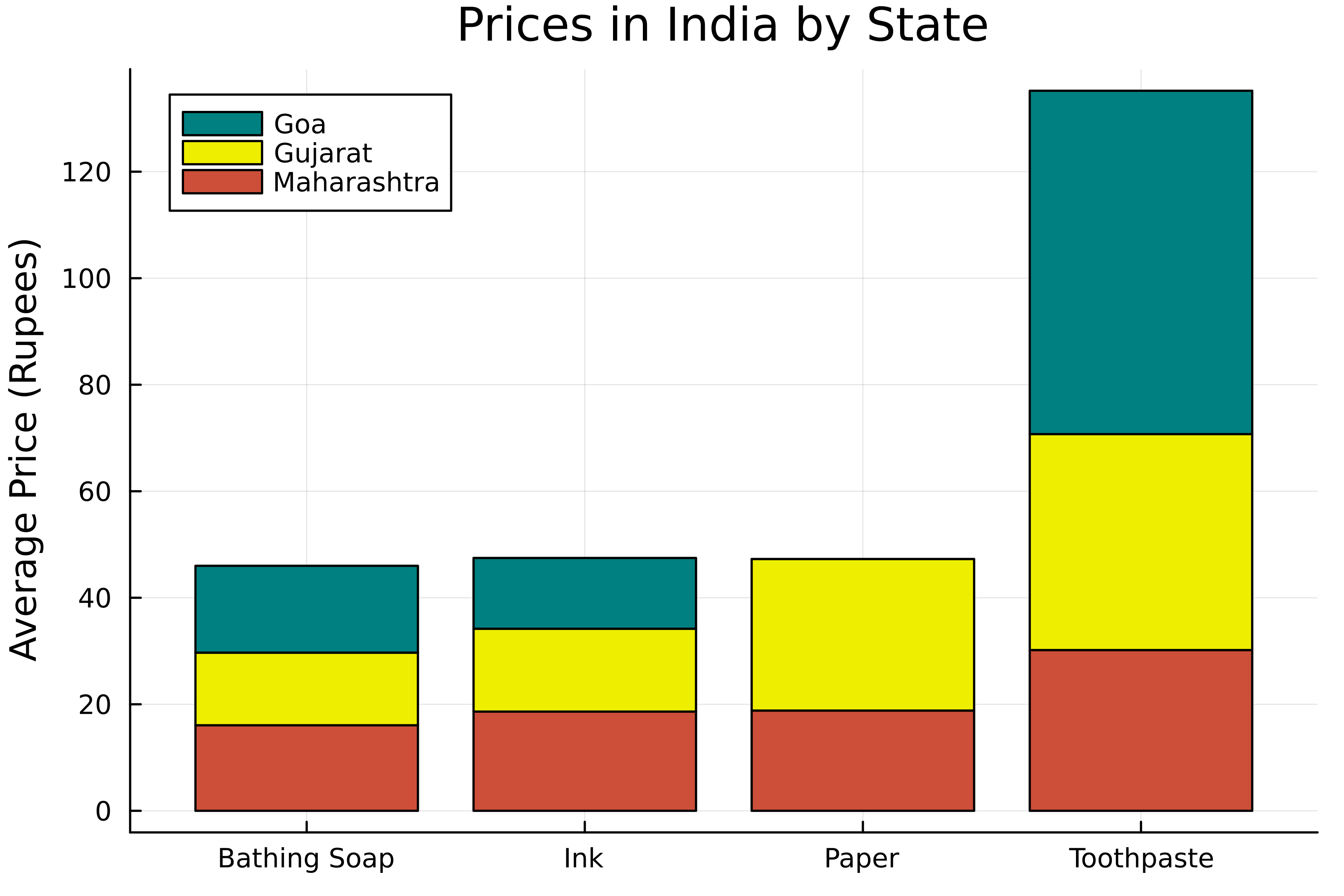
# グループ化棒グラフを作成
groupedbar(
    # x軸のカテゴリ
    filtered_mean_prices.Commodity,
    # y軸の値
    filtered_mean_prices.Price_mean,
    # グループを指定
    group=filtered_mean_prices.State,
    color=[:teal :snow2 :tomato3],

    # 棒を積み上げ
    bar_position=:stack

)
title!("インドの州別製品価格")
ylabel!("平均価格(ルピー)")
# グループ化棒グラフを作成 groupedbar( # x軸のカテゴリ filtered_mean_prices.Commodity, # y軸の値 filtered_mean_prices.Price_mean, # グループを指定 group=filtered_mean_prices.State, color=[:teal :snow2 :tomato3],
# 棒を積み上げ bar_position=:stack
) title!("インドの州別製品価格") ylabel!("平均価格(ルピー)")