Juliaで学ぶデータ可視化入門
Gustavo Vieira Suñe
Data Analyst
using Plots
# テーマ設定
theme(thm::Symbol; kwargs...)
thm): :default, :dark, :ggplot2, :juno, ...kwargs: 既定属性を設定例: theme(:juno, linecolor=:red, linewidth=5)
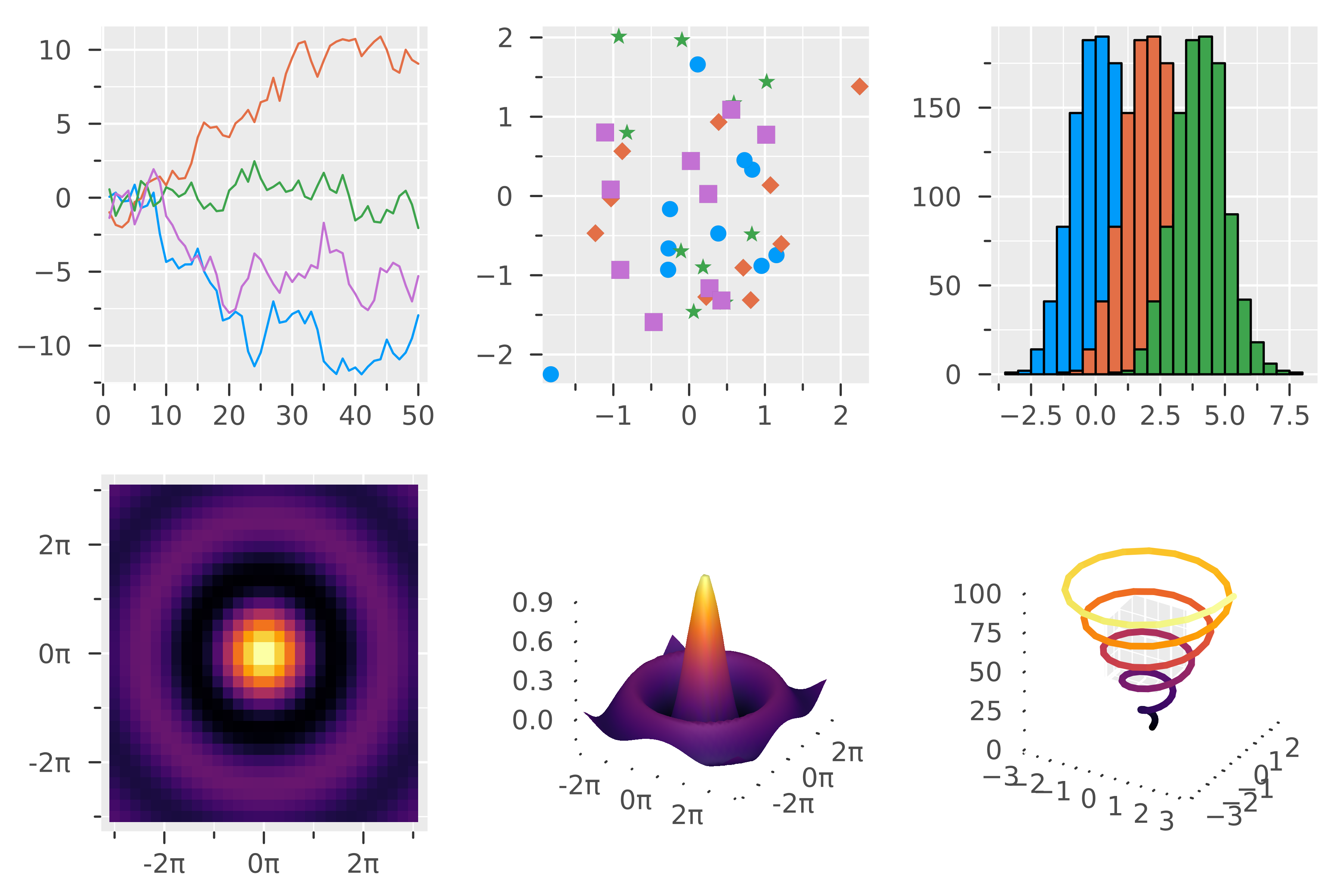
showtheme(:ggplot2)

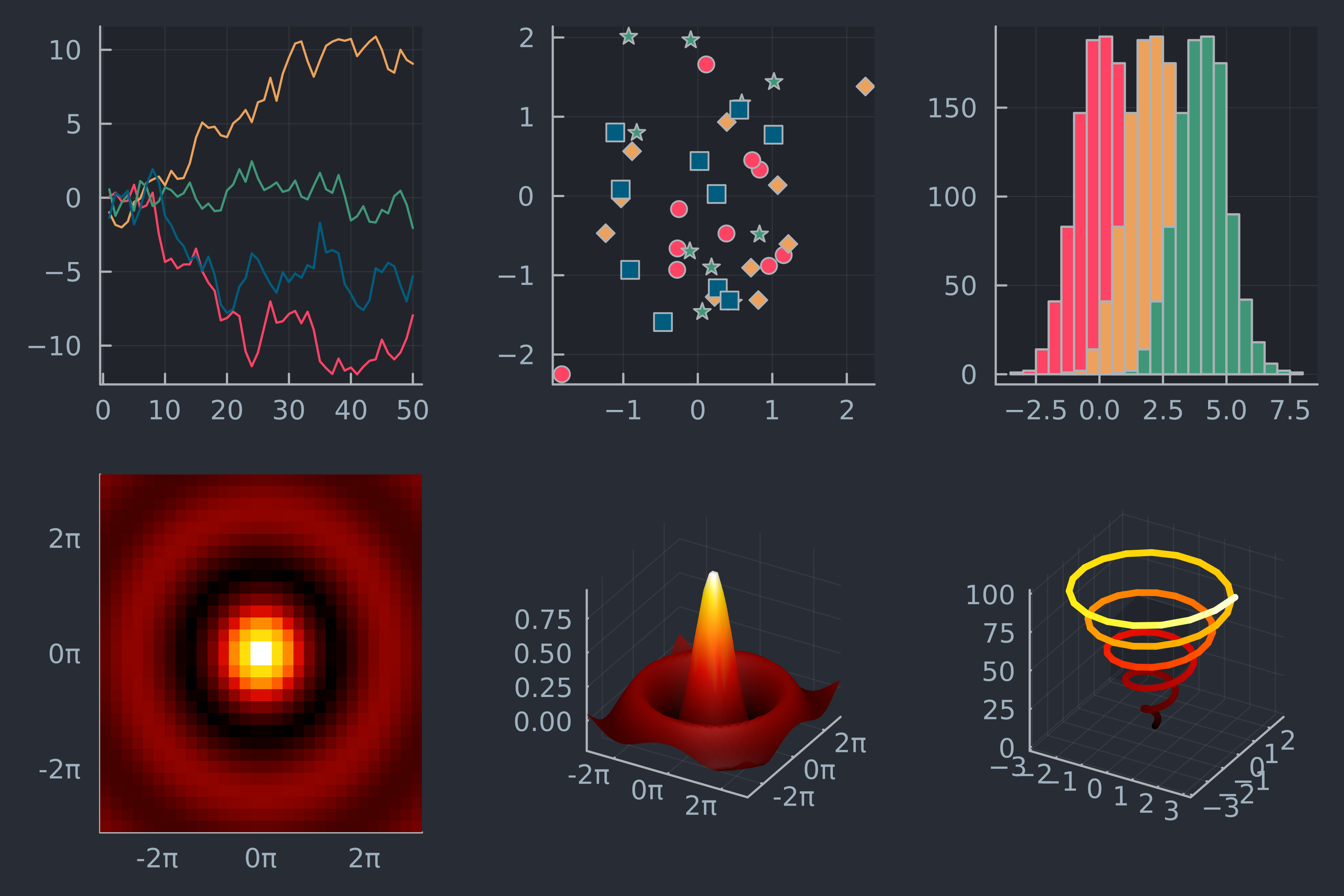
showtheme(:juno)

using DataFrames, CSV, Plots # データ読み込み streaming = DataFrame(CSV.File("streaming.csv"))# ジャンルでグループ化 grouped = groupby(streaming, "Fav genre") # ジャンル数を集計 counts = combine(grouped, nrow => :count)
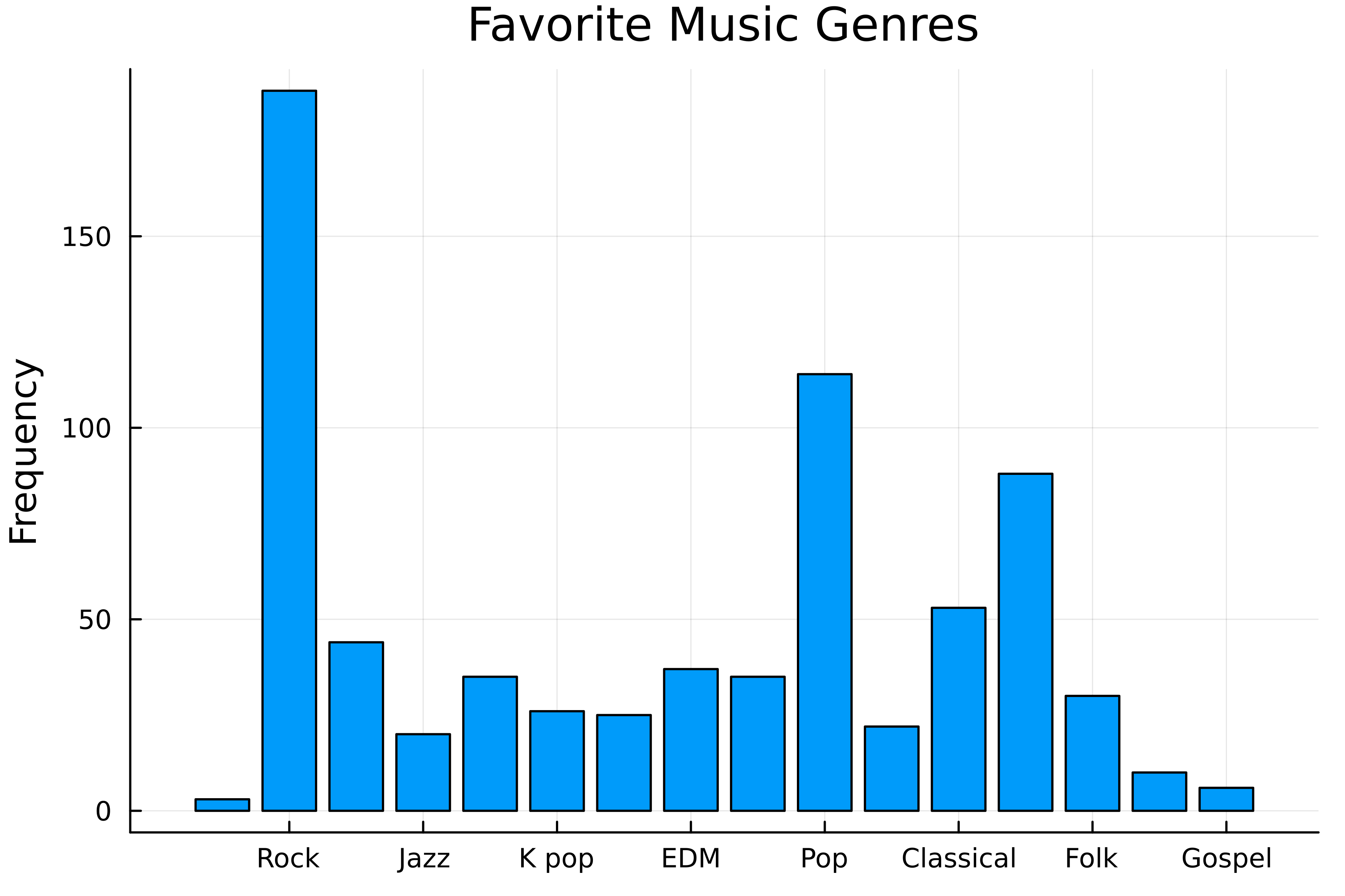
# :default の棒グラフ bar( counts[!, "Fav genre"], counts.count,title="Favorite Music Genres" ylabel="Frequency", label=false, )

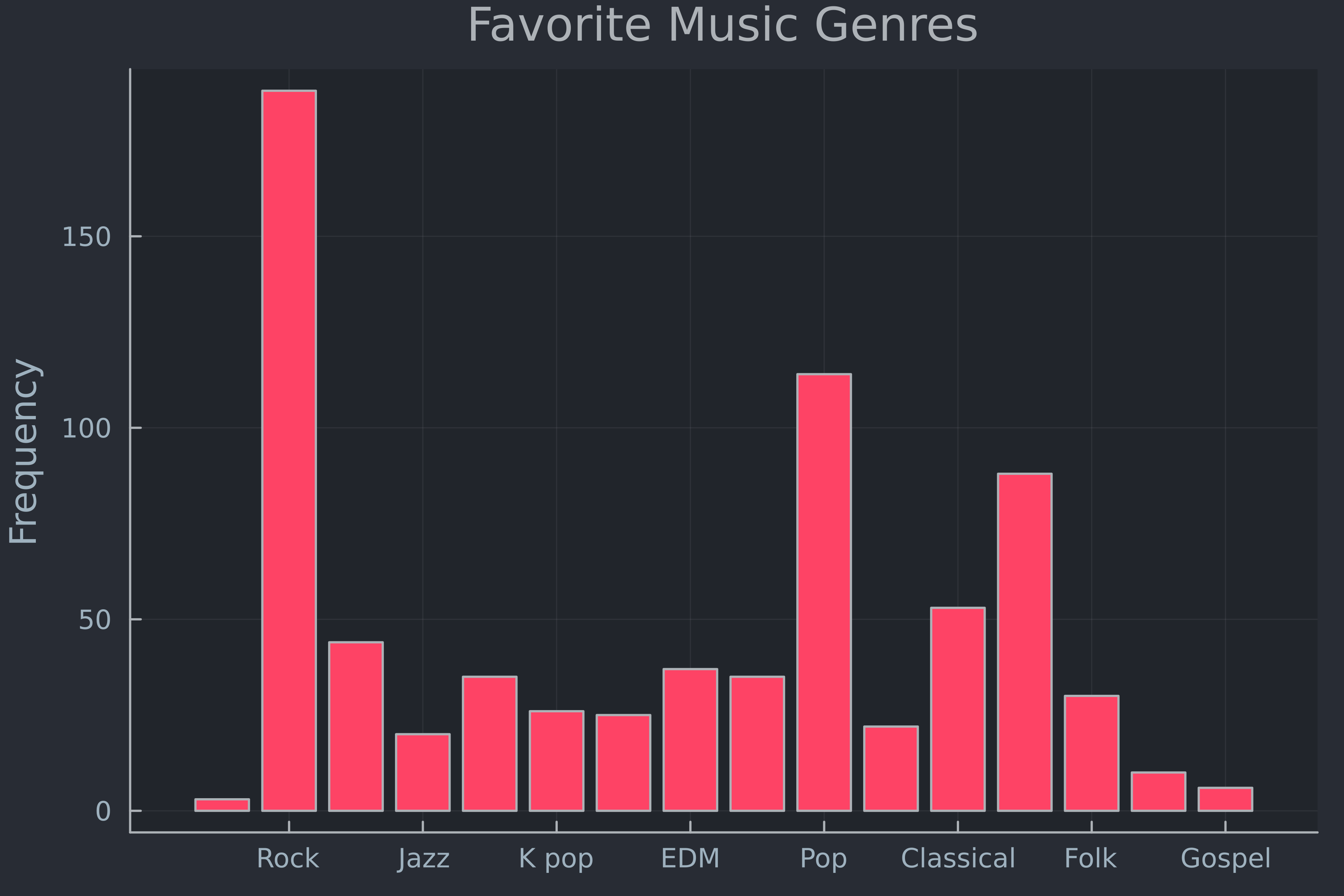
# テーマを設定 theme(:juno)# :juno の棒グラフ bar( counts[!, "Fav genre"], counts.count, label=false, ylabel="Frequency", title="Favorite Music Genres" )

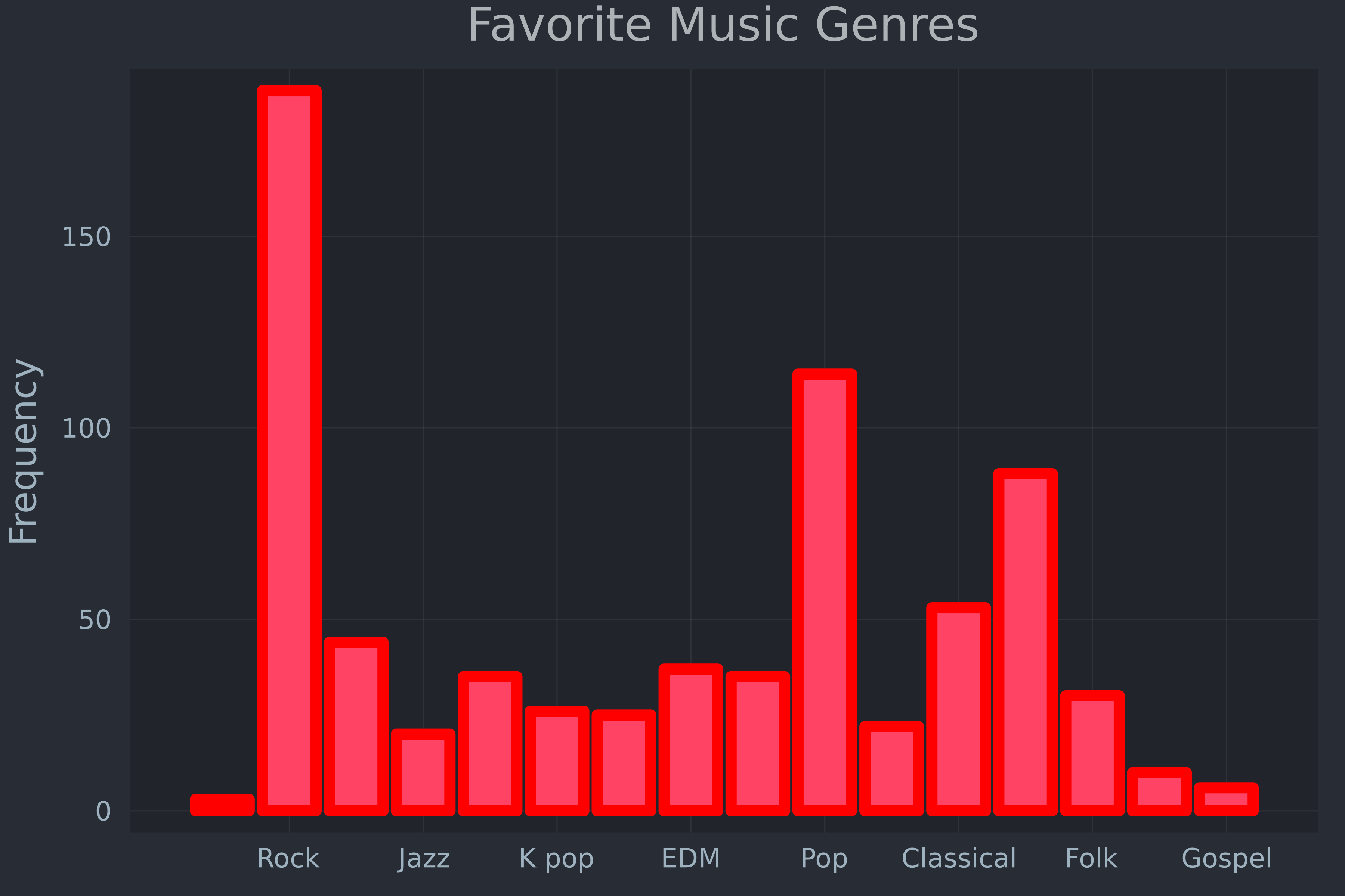
theme( :juno,# 既定の線色と太さ linecolor=:red, linewidth=5,# 枠線を非表示 framestyle=:grid )bar( counts[!, "Fav genre"], counts.count, label=false, ylabel="Frequency", title="Favorite Music Genres" )

savefig("genres.png")Juliaで学ぶデータ可視化入門