Juliaで学ぶデータ可視化入門
Gustavo Vieira Suñe
Data Analyst
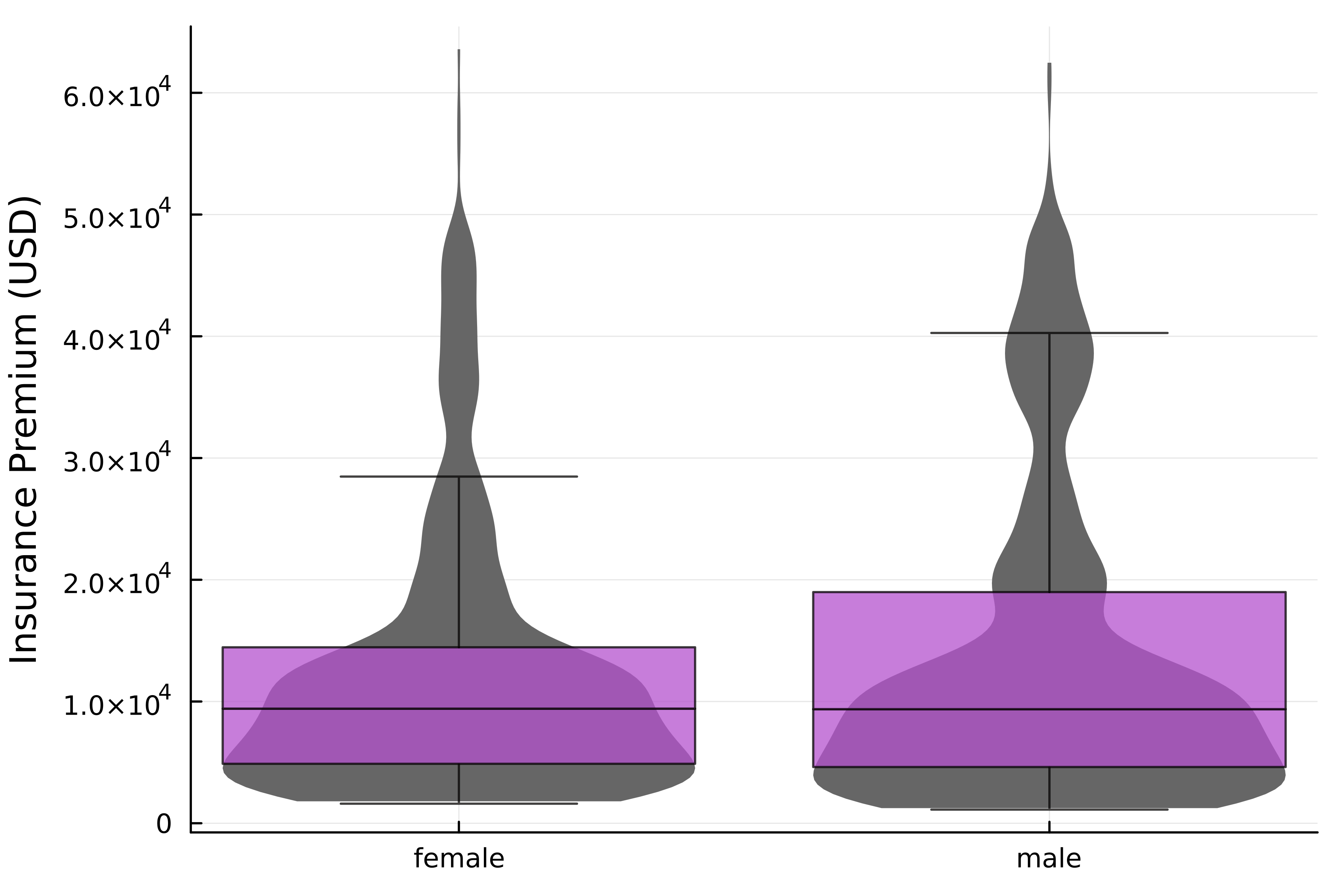
# バイオリンプロット @df insurance violin( :Sex, :Charges, label=false, linewidth=0, fillcolor=:grey40 )# 箱ひげ図を追加 @df insurance boxplot!( :Sex, :Charges, label=false, alpha=0.75, fillcolor=:mediumorchid3, outliers=false, ) ylabel!("Insurance Premium (USD)")

insurance DataFrame| Age | Sex | BMI | Children | Smoker | Region | Charges |
|---|---|---|---|---|---|---|
| 19 | female | 27.90 | 0 | yes | southwest | 16884.90 |
| 18 | male | 33.77 | 1 | no | southeast | 1725.55 |
| 28 | male | 33.00 | 3 | no | southeast | 4449.46 |
| ... | ... | ... | ... | ... | ... | ... |
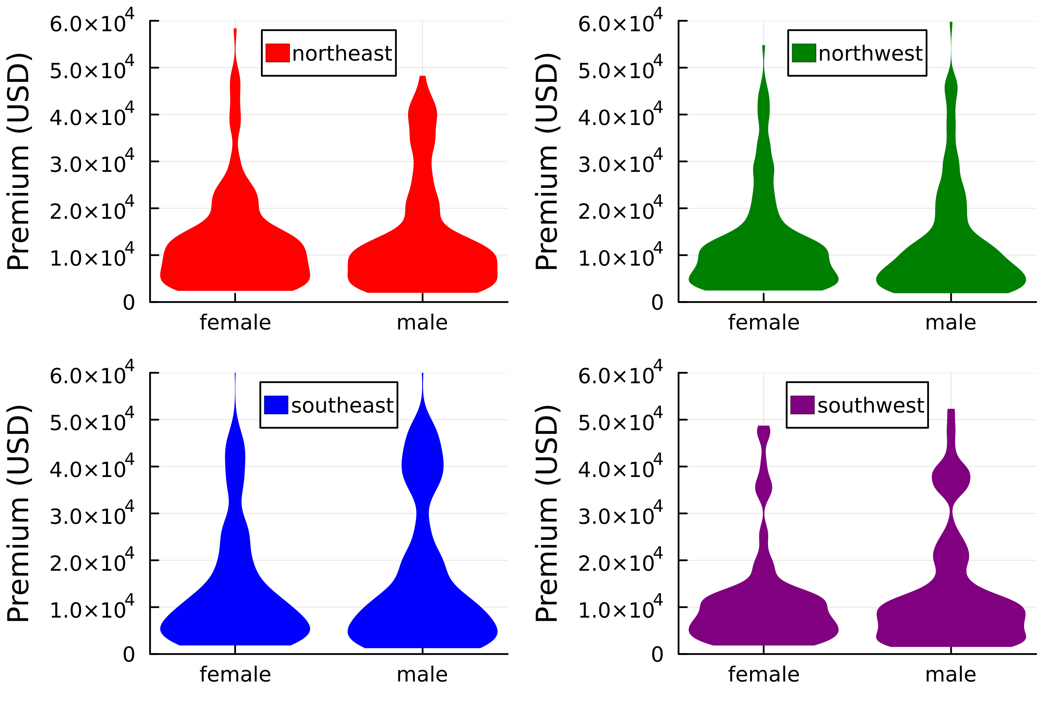
@df レシピは layout 引数と互換!@df insurance violin( :Sex, :Charges, group=:Region, linewidth=0, color=[:red :green :blue :purple], legend_position=:top,# レイアウト指定 layout=(2,2)) ylims!(0, 6*10^4) ylabel!("Premium (USD)")

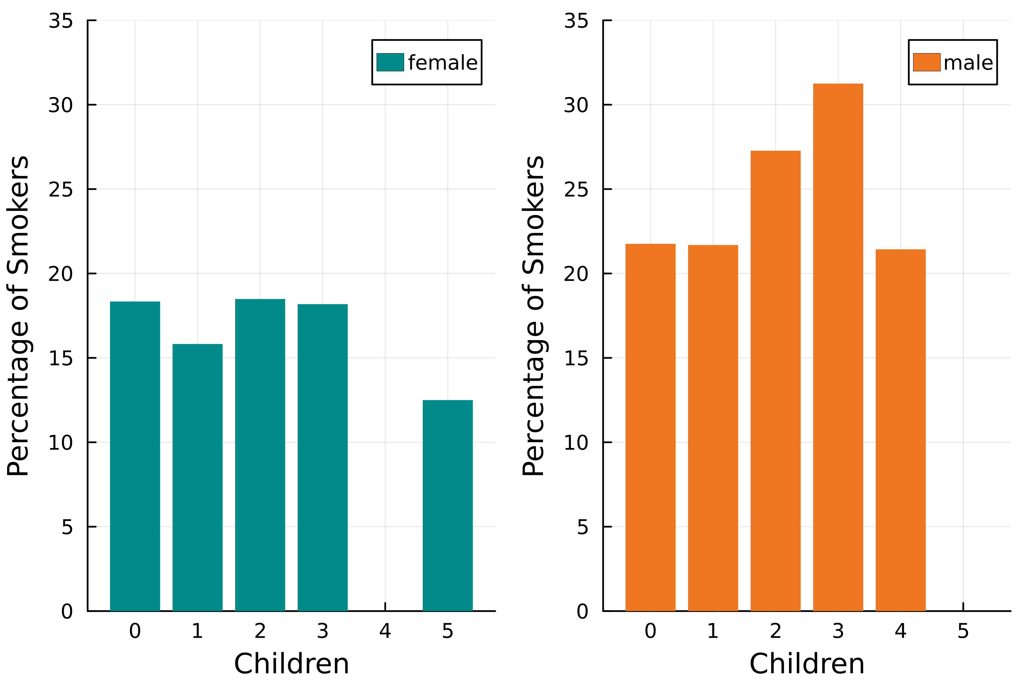
@chain insurance begin # Smoker列を数値化 transform(:Smoker => ByRow(x -> x == "yes" ? 100 : 0) => :Smoker)groupby([:Sex, :Children]) combine(:Smoker => mean)@df bar(:Children, :Smoker_mean, group=:Sex, linewidth=0, fillcolor=[:cyan4 :chocolate2], # レイアウト指定 layout=2)end ylims!(0, 35) xlabel!("Children") ylabel!("Percentage of Smokers")


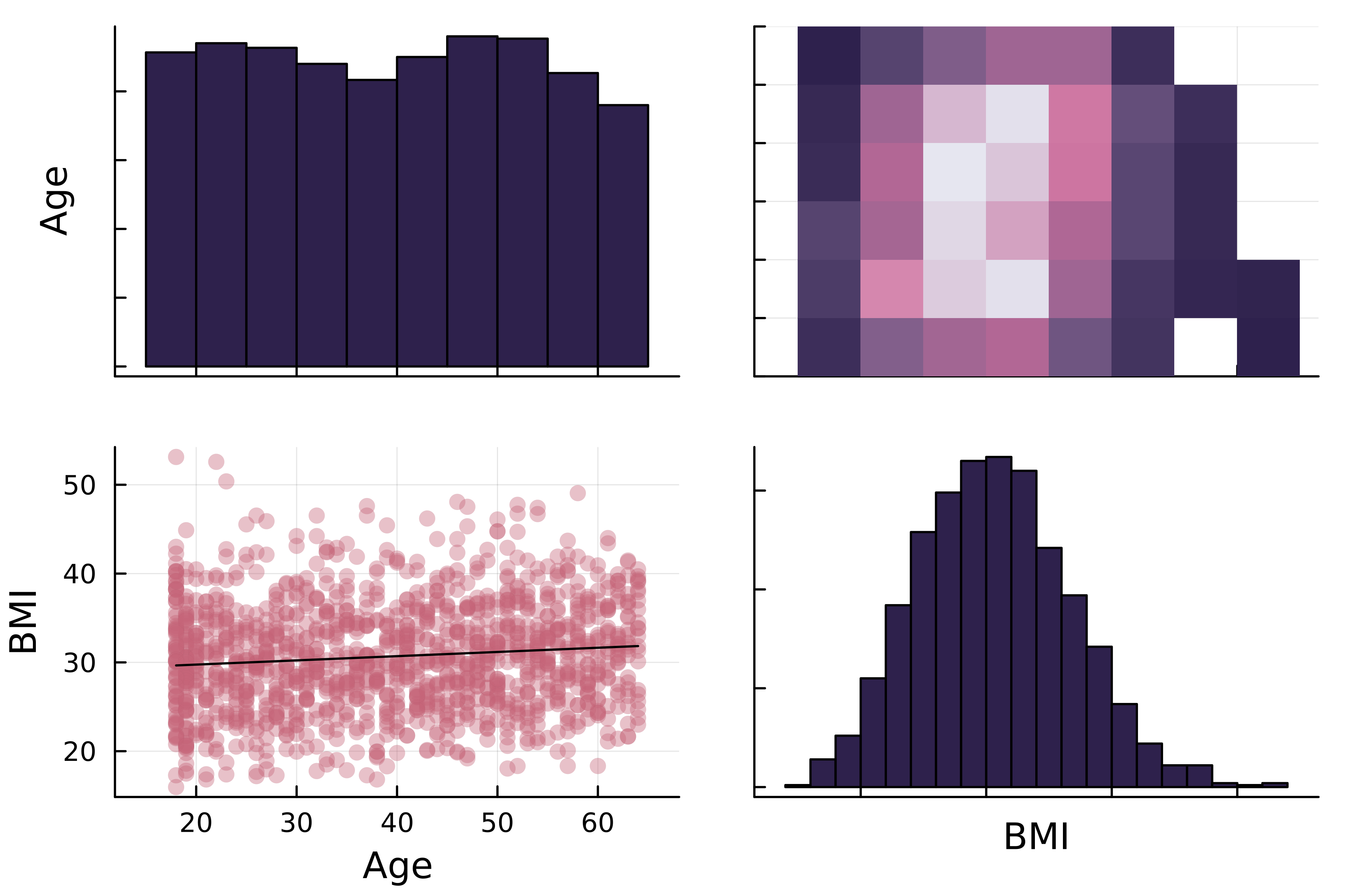
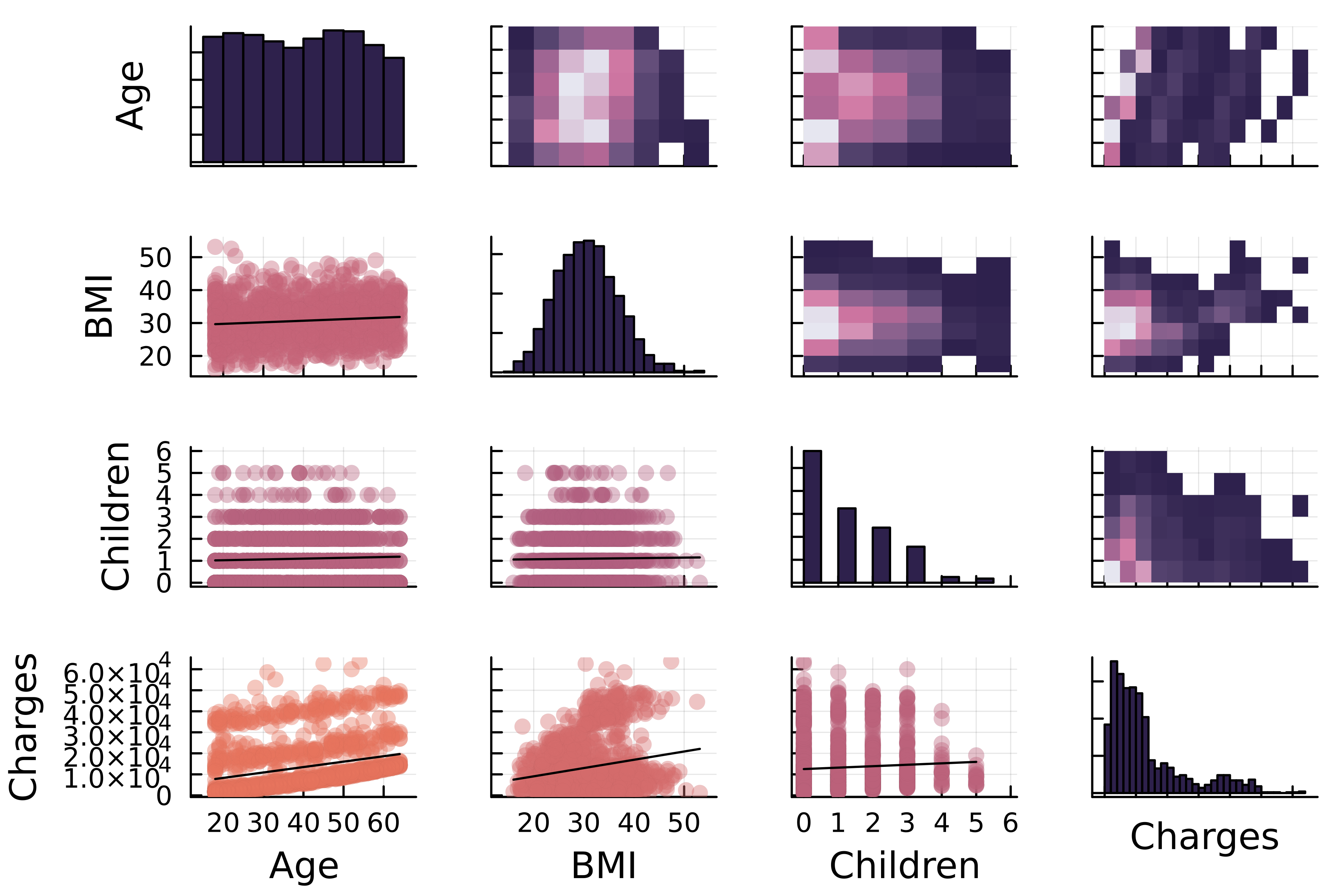
対角
対角の上
対角の下
# DataFramesレシピを使用 @df insurance corrplot(# 数値列 [:Age :BMI],# カスタマイズ markercolor=:thermal, fillcolor=:acton )

# DataFramesレシピを使用 @df insurance corrplot( # 数値列 [:Age :BMI :Children :Charges],# カスタマイズ markercolor=:thermal, fillcolor=:acton )

Juliaで学ぶデータ可視化入門