プロット属性とカラーパレット

Juliaで学ぶデータ可視化入門

Gustavo Vieira Suñe

Data Analyst

カラーパレット

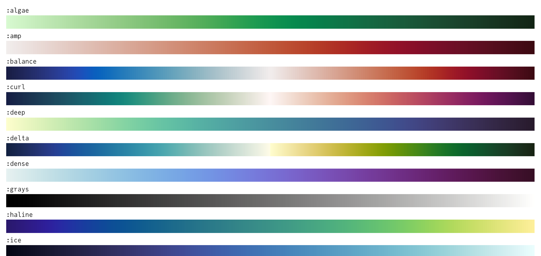
  • 多数のカラーパレット、例:

Juliaの各種カラーパレットのプレビュー。

1 https://juliagraphics.github.io/ColorSchemes.jl/stable/catalogue/
Juliaで学ぶデータ可視化入門

パレットの使用

# Set the theme
theme(:bright)


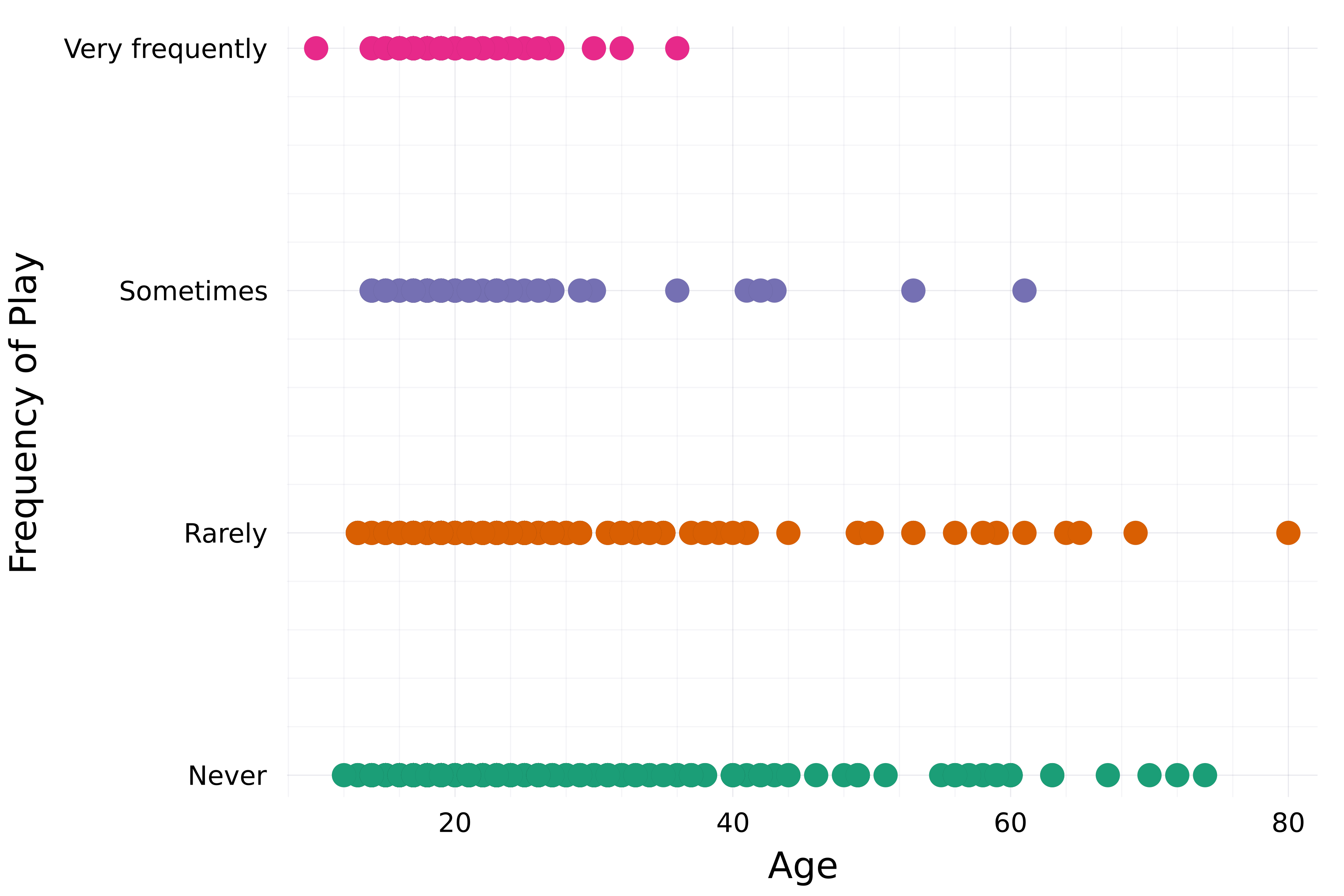
# Create a scatter plot scatter( streaming.Age, streaming."Frequency [K pop]", group=streaming."Frequency [K pop]", label=false,
# Set color palette palette=:Dark2_5 )
xlabel!("Age") ylabel!("Frequency of Play")

回答者の年齢に対するK-Pop再生頻度を示す散布図。

Juliaで学ぶデータ可視化入門

プロット属性

以前に扱った属性:

  • title, xlabel, ylabel
  • xticks, yticks
  • color
  • linecolor, linewidth
  • markercolor
  • framestyle

さらに多数:

  • xlims, ylims
  • alpha
  • linestyle
  • legend_title, legend_position
  • markersize, markershape

...

1 https://docs.juliaplots.org/stable/attributes/#attributes
Juliaで学ぶデータ可視化入門

マーカー属性

theme(:bright)

scatter(
    streaming.Age,
    streaming."Frequency [K pop]",
    group=streaming."Frequency [K pop]",
    label=false,
    palette=:Dark2_5

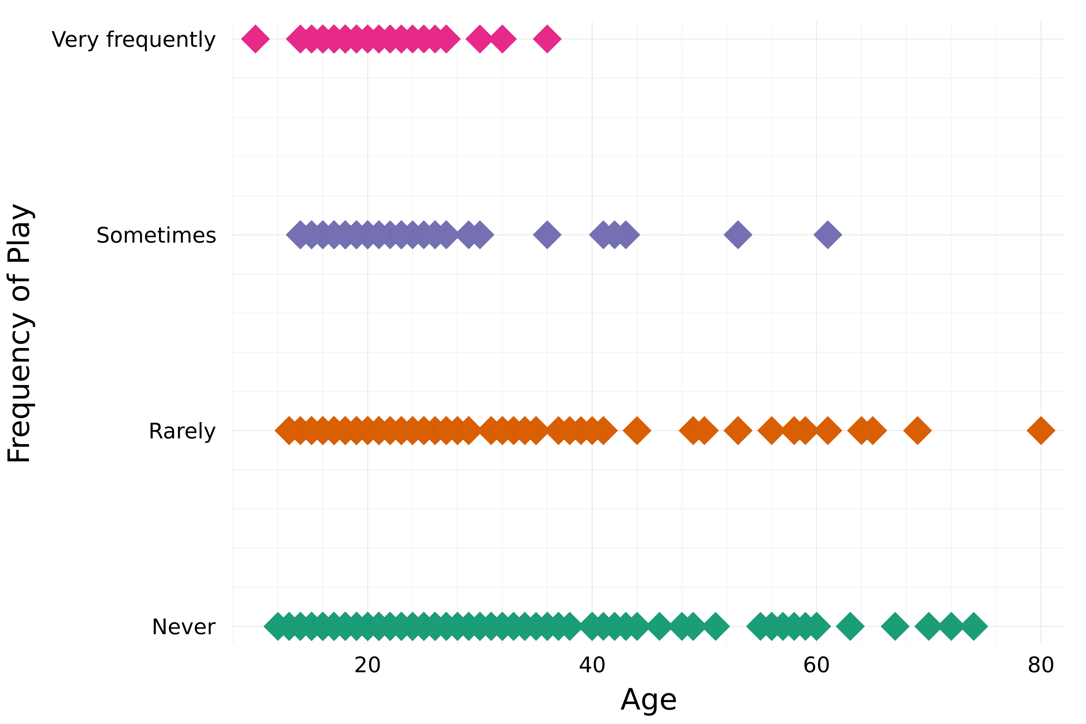
# Marker attributes markershape=:diamond, markersize=8, )
xlabel!("Age") ylabel!("Frequency of Play")

回答者の年齢に対するK-Pop再生頻度を示す散布図。大きなひし形マーカー。

Juliaで学ぶデータ可視化入門

不透明度/透明度

theme(:bright)

scatter(
    streaming.Age,
    streaming."Frequency [K pop]",
    group=streaming."Frequency [K pop]",
    label=false,
    palette=:Dark2_5
    markershape=:diamond,
    markersize=8,

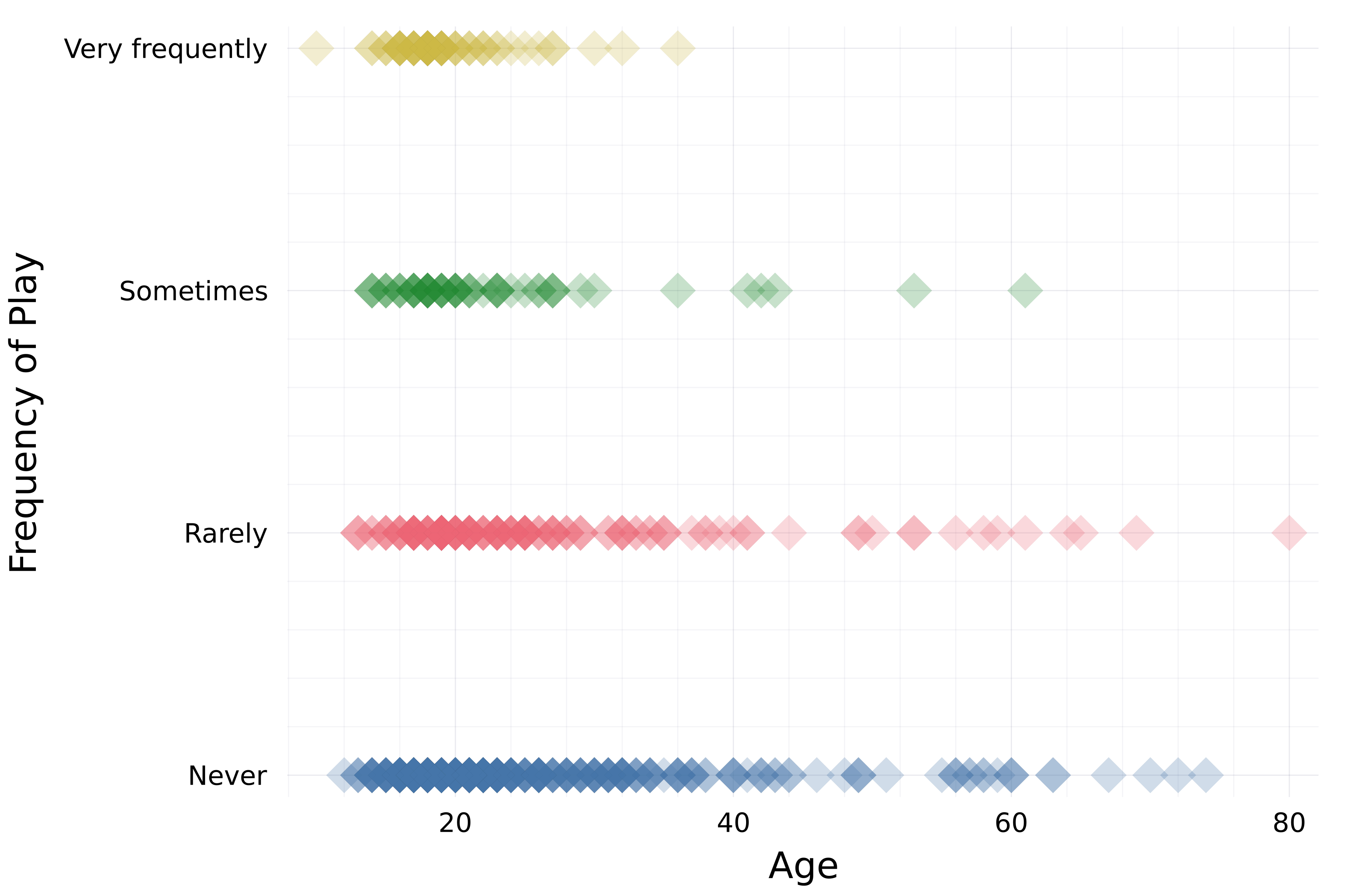
# Opacity alpha=0.25 )
xlabel!("Age") ylabel!("Frequency of Play")

回答者の年齢に対するK-Pop再生頻度を示す散布図。大きなひし形マーカーで一部透明。

Juliaで学ぶデータ可視化入門

線の属性

# Set theme and default line width
theme(:dao, linewidth=4)

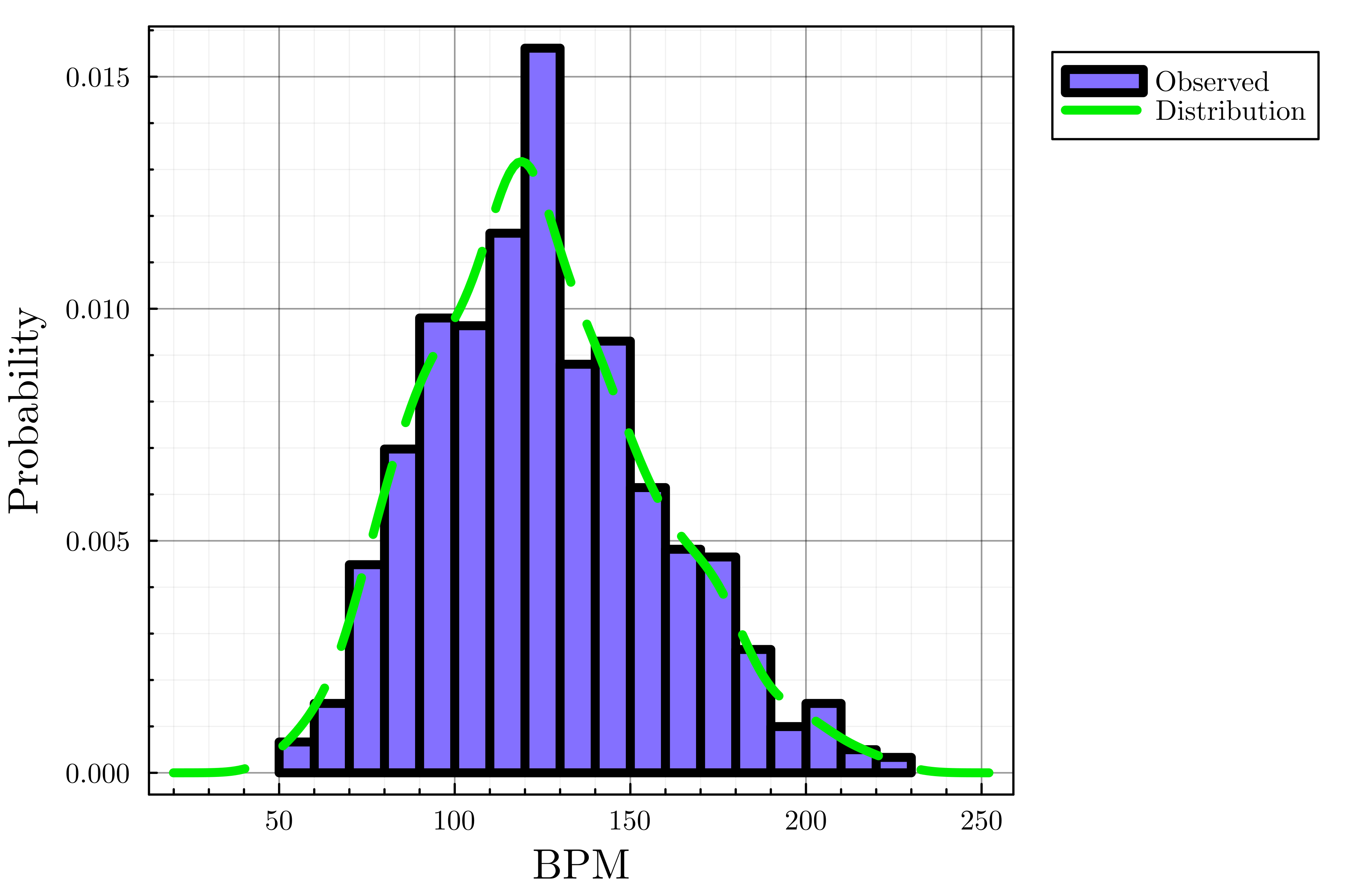
# Create histogram histogram(streaming.BPM, label="Observed", color=:lightslateblue, normalize=true)
# Add density plot density!(streaming.BPM, label="Distribution", linecolor=:green2,
# Line style linestyle=:dash)
xlabel!("BPM") ylabel!("Probability")

回答者の好みのBPMを正規化ヒストグラムで示し、推定分布を表す密度曲線を重ねた図。

Juliaで学ぶデータ可視化入門

軸範囲と凡例属性

theme(:dao, linewidth=4)

histogram(streaming.BPM, label="Observed", 
    color=:lightslateblue, normalize=true)
density!(streaming.BPM, label="Distribution",
    linecolor=:green2, linestyle=:dash

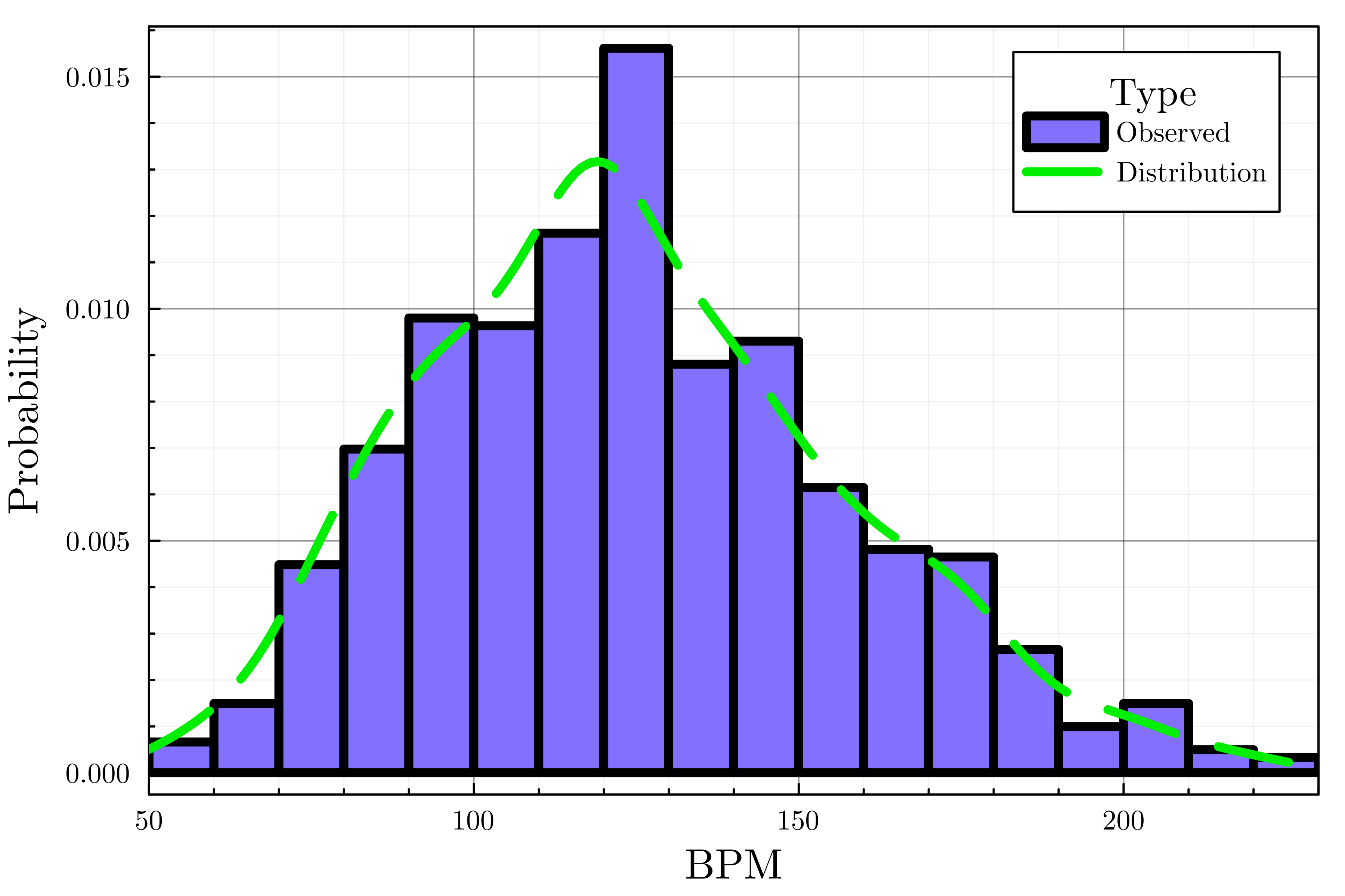
# Customize legend legend_title="Type", legend_position=:topright)
# Set the x-axis bounds xlims!(50, 230)
xlabel!("BPM") ylabel!("Probability")

回答者の好みのBPMを正規化ヒストグラムで示し、推定分布を表す密度曲線を重ねた図。

Juliaで学ぶデータ可視化入門

チートシート

  • カラーパレット
    • plot(..., palette=palette_symbol)
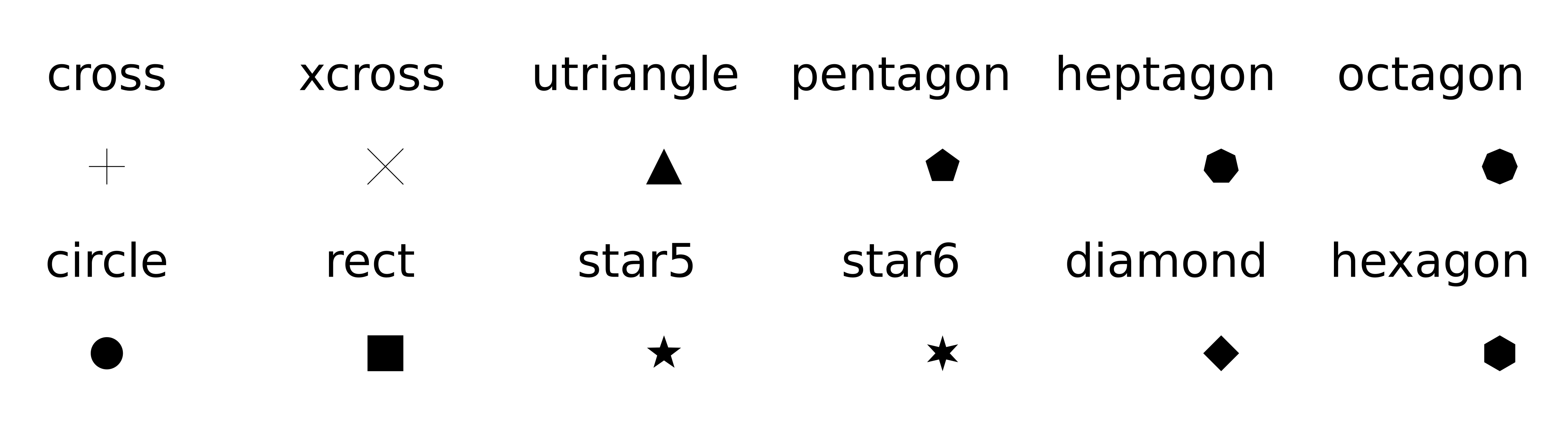
  • マーカー属性
    • markersize
    • markershape

Plots.jlで利用可能なマーカー形状のプレビュー。

  • 不透明度: alpha=opacity_value
  • 軸範囲: xlims!(), ylims!()
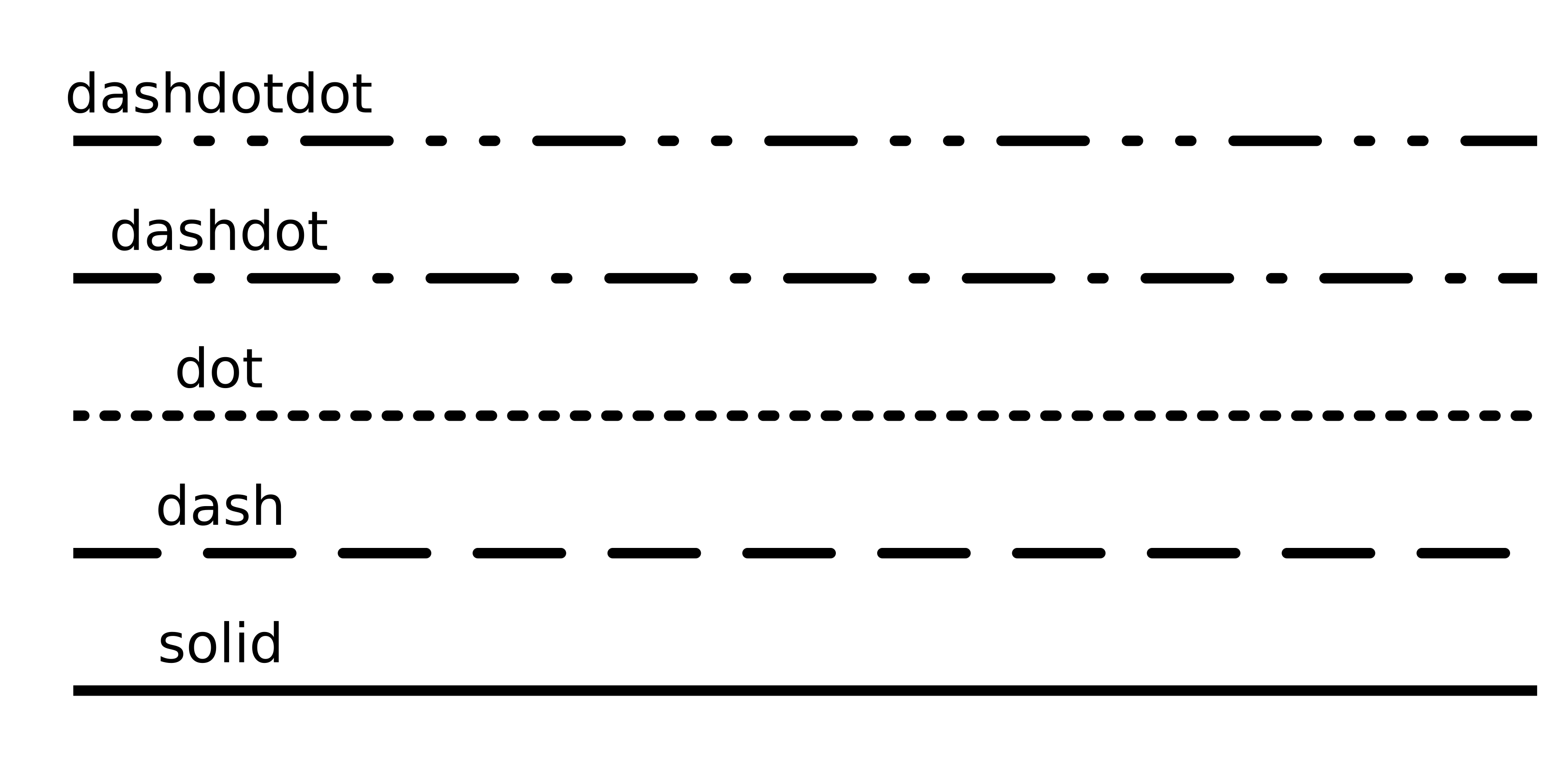
  • 線の属性: linetyle Plots.jlで利用可能な線種のプレビュー。

  • 凡例属性

    • legend_title
    • legend_position (:right, :left, :top, :bottom, :topright, :topleft, ...)
Juliaで学ぶデータ可視化入門

Passons à la pratique !

Juliaで学ぶデータ可視化入門

Preparing Video For Download...