Juliaで学ぶデータ可視化入門
Gustavo Vieira Suñe
Data Analyst
kerala
# ヒストグラムを描画
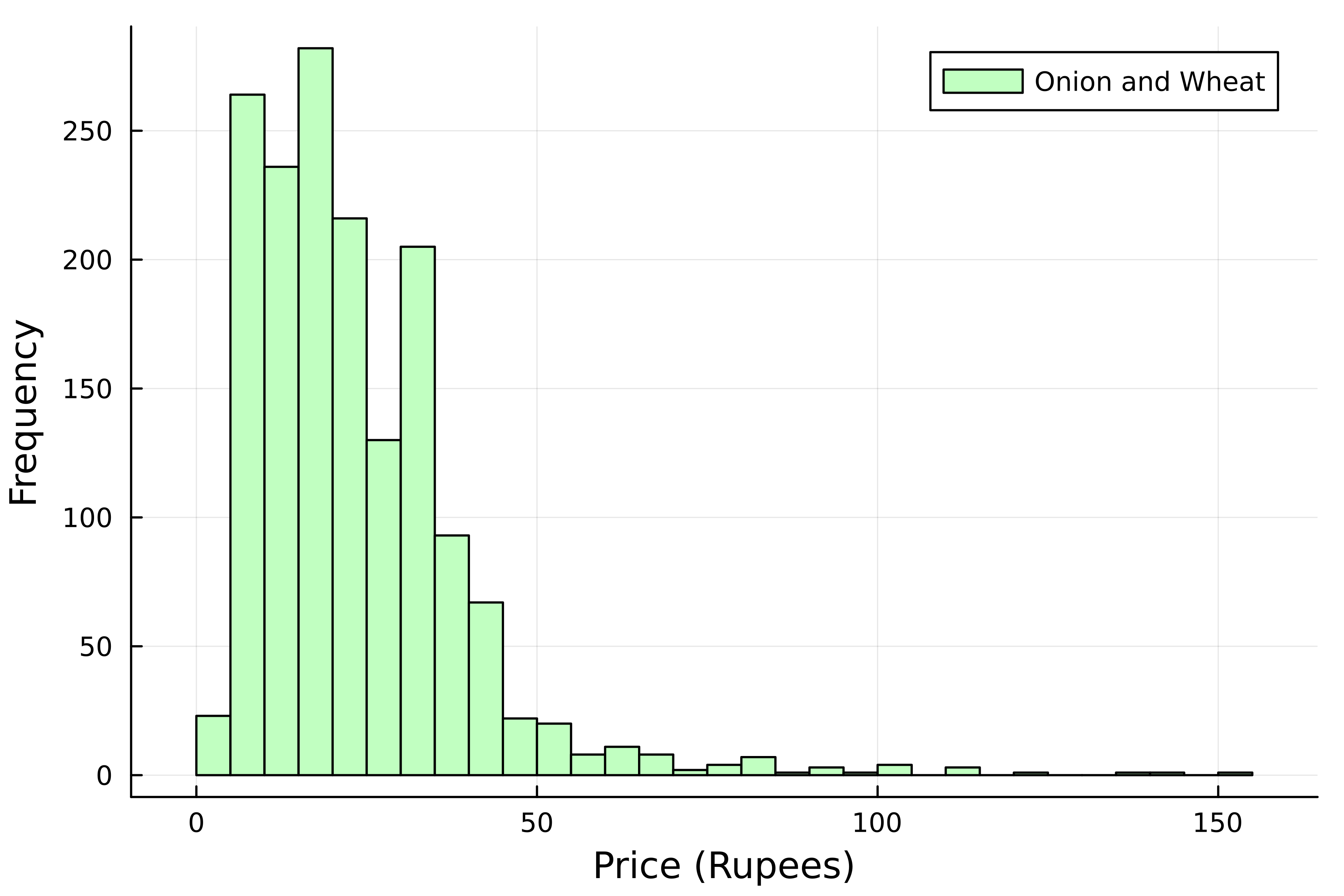
histogram(
    kerala[:, :Price],

    # ラベルを追加
    label="Onion and Wheat",
    # 棒の色
    color=:darkseagreen1,
)

# 軸ラベル
xlabel!("Price (Rupees)")
ylabel!("Frequency")
# ヒストグラムを描画 histogram( kerala[:, :Price],
# ラベルを追加 label="Onion and Wheat", # 棒の色 color=:darkseagreen1, )
# 軸ラベル xlabel!("Price (Rupees)") ylabel!("Frequency")
# ヒストグラムを描画
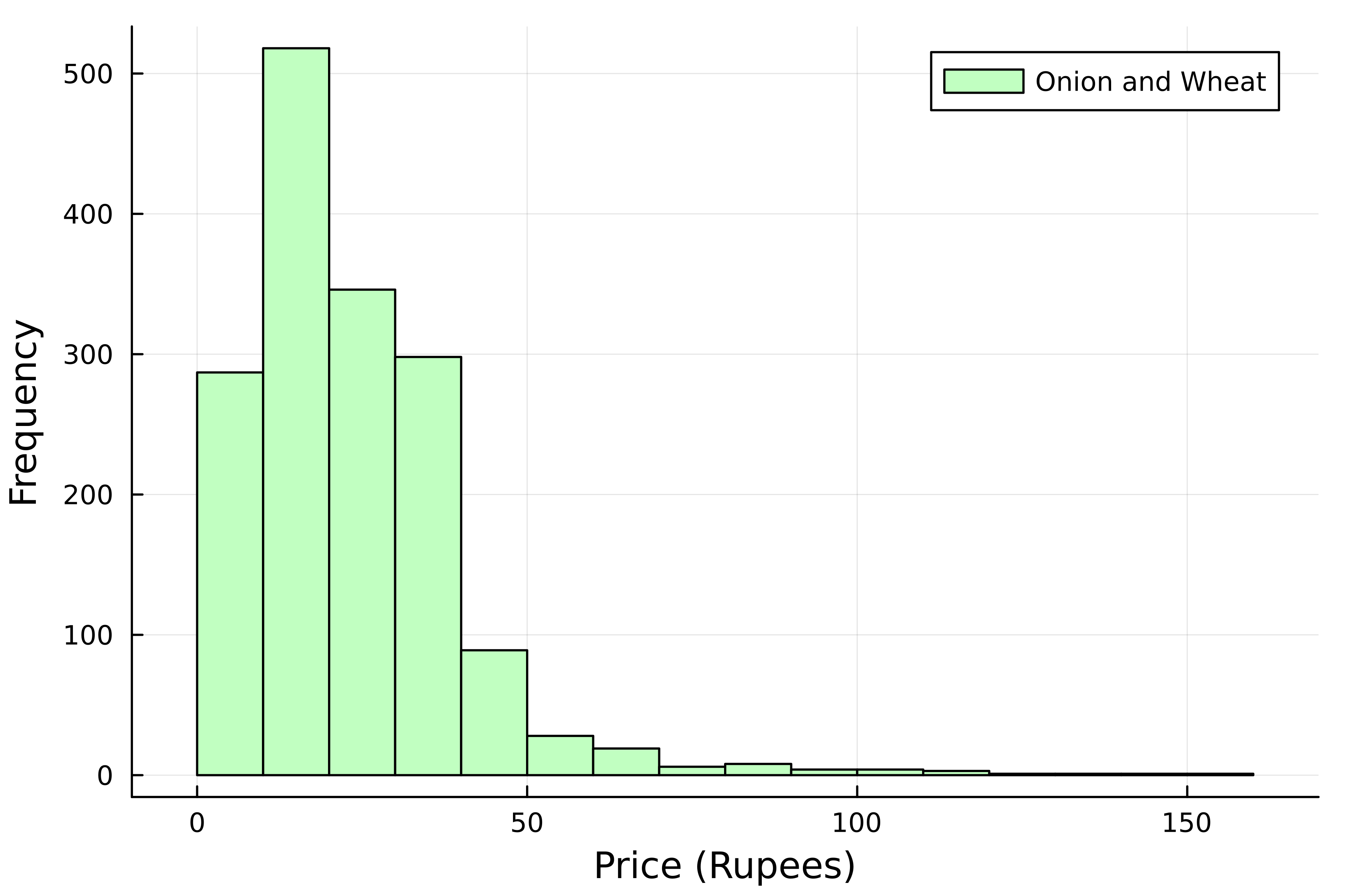
histogram(
    kerala[:, :Price],
    # ラベルを追加
    label="Onion and Wheat",
    # 棒の色
    color=:darkseagreen1,

    # ビン数
    bins=20,
)
# 軸ラベル
xlabel!("Price (Rupees)")
ylabel!("Frequency")
# ヒストグラムを描画 histogram( kerala[:, :Price], # ラベルを追加 label="Onion and Wheat", # 棒の色 color=:darkseagreen1,
# ビン数 bins=20, ) # 軸ラベル xlabel!("Price (Rupees)") ylabel!("Frequency")
# ヒストグラムを描画
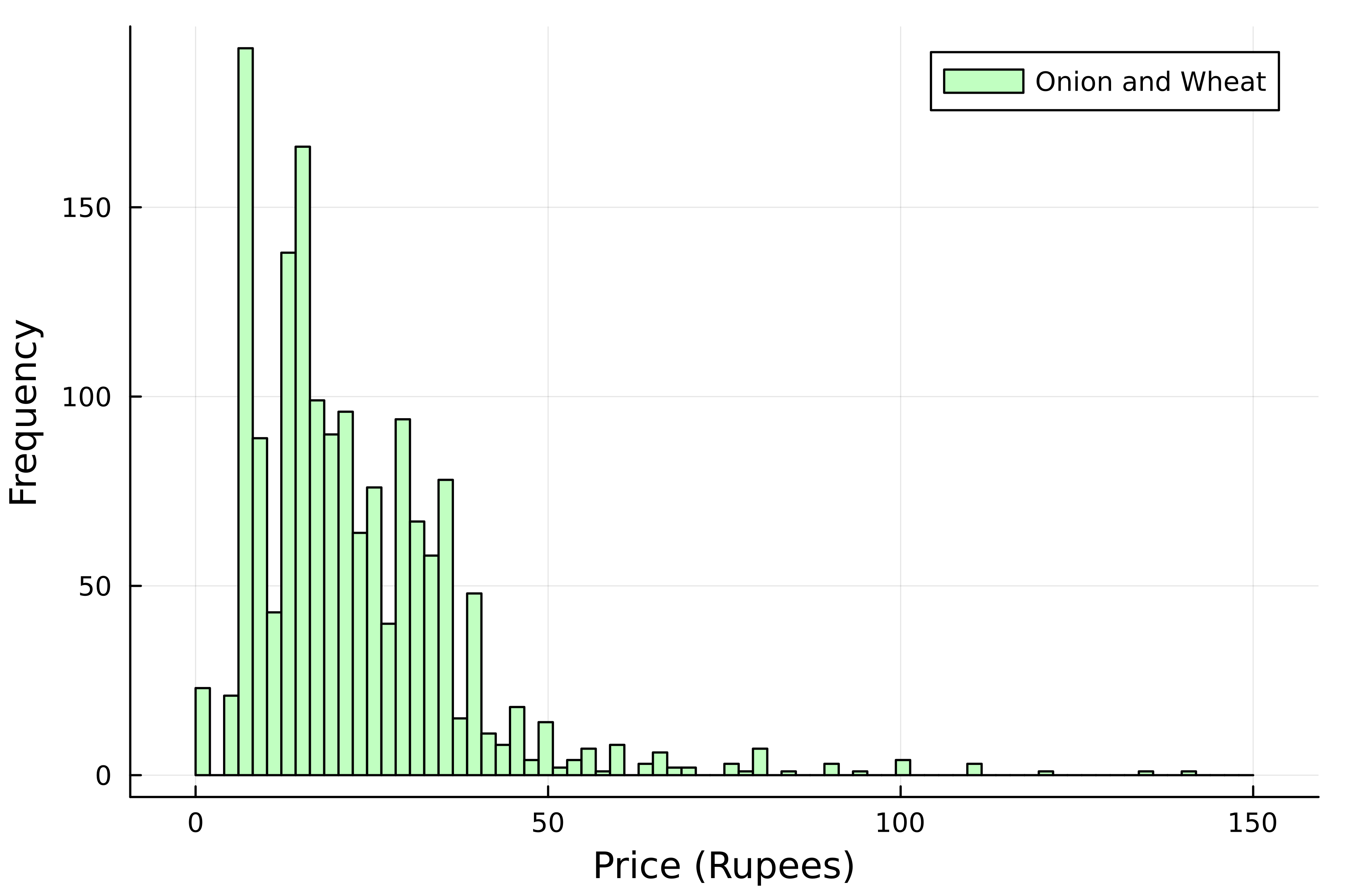
histogram(
    kerala[:, :Price],
    # ラベルを追加
    label="Onion and Wheat",
    # 棒の色
    color=:darkseagreen1,
    # ビン数
    bins=range(0, 150, 75),
)
# 軸ラベル
xlabel!("Price (Rupees)")
ylabel!("Frequency")
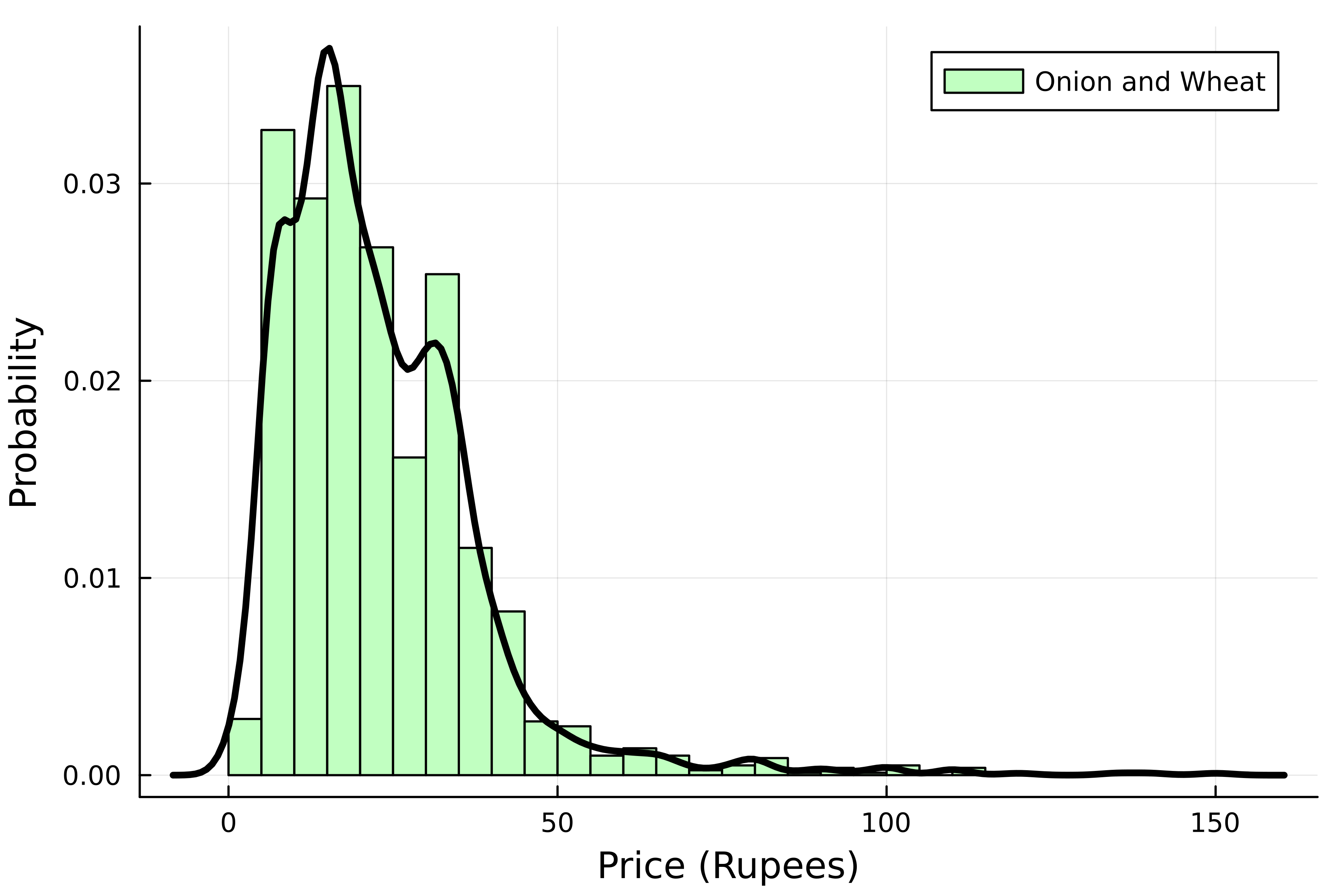
# 正規化したヒストグラム
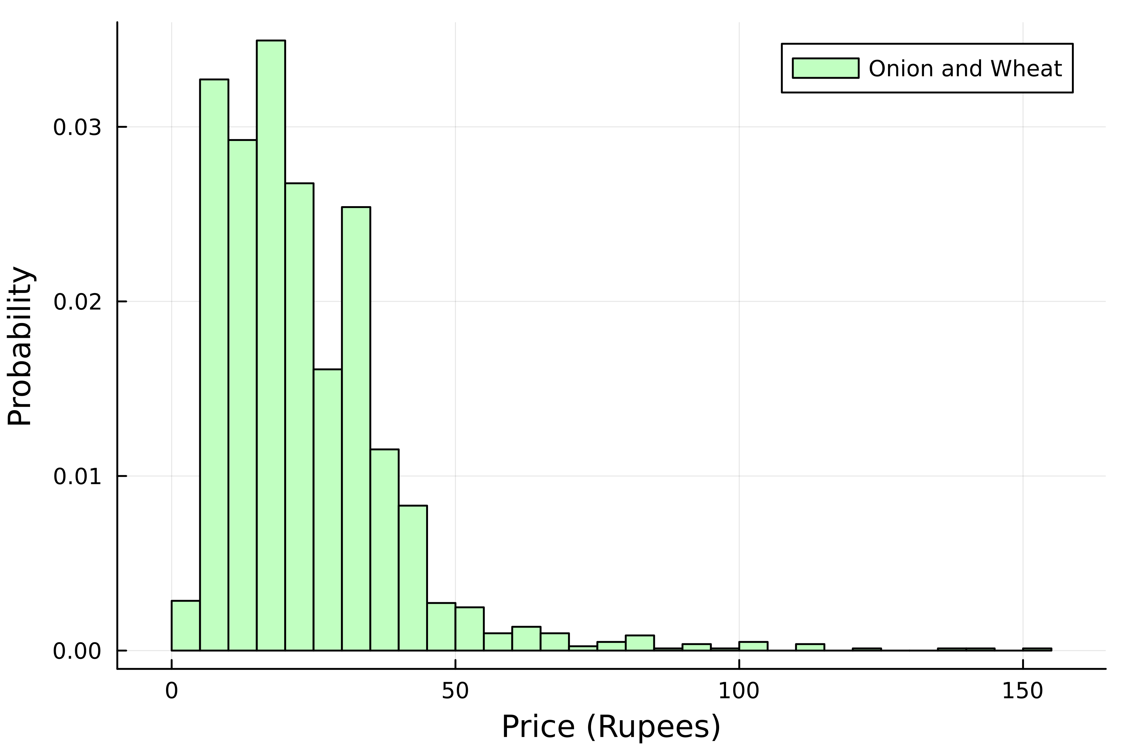
histogram(
    kerala[:, :Price],
    # ラベルを追加
    label="Onion and Wheat",
    # 棒の色
    color=:darkseagreen1,

    # 正規化
    normalize=true,
)
# 軸ラベル
xlabel!("Price (Rupees)")
ylabel!("Probability")
# 正規化したヒストグラム histogram( kerala[:, :Price], # ラベルを追加 label="Onion and Wheat", # 棒の色 color=:darkseagreen1,
# 正規化 normalize=true, ) # 軸ラベル xlabel!("Price (Rupees)") ylabel!("Probability")
using StatsPlots


density!(
    kerala[:, :Price],
    color=:black,
    linewidth=3,
    label=false
)
using StatsPlots
density!( kerala[:, :Price], color=:black, linewidth=3, label=false )
using StatsPlots

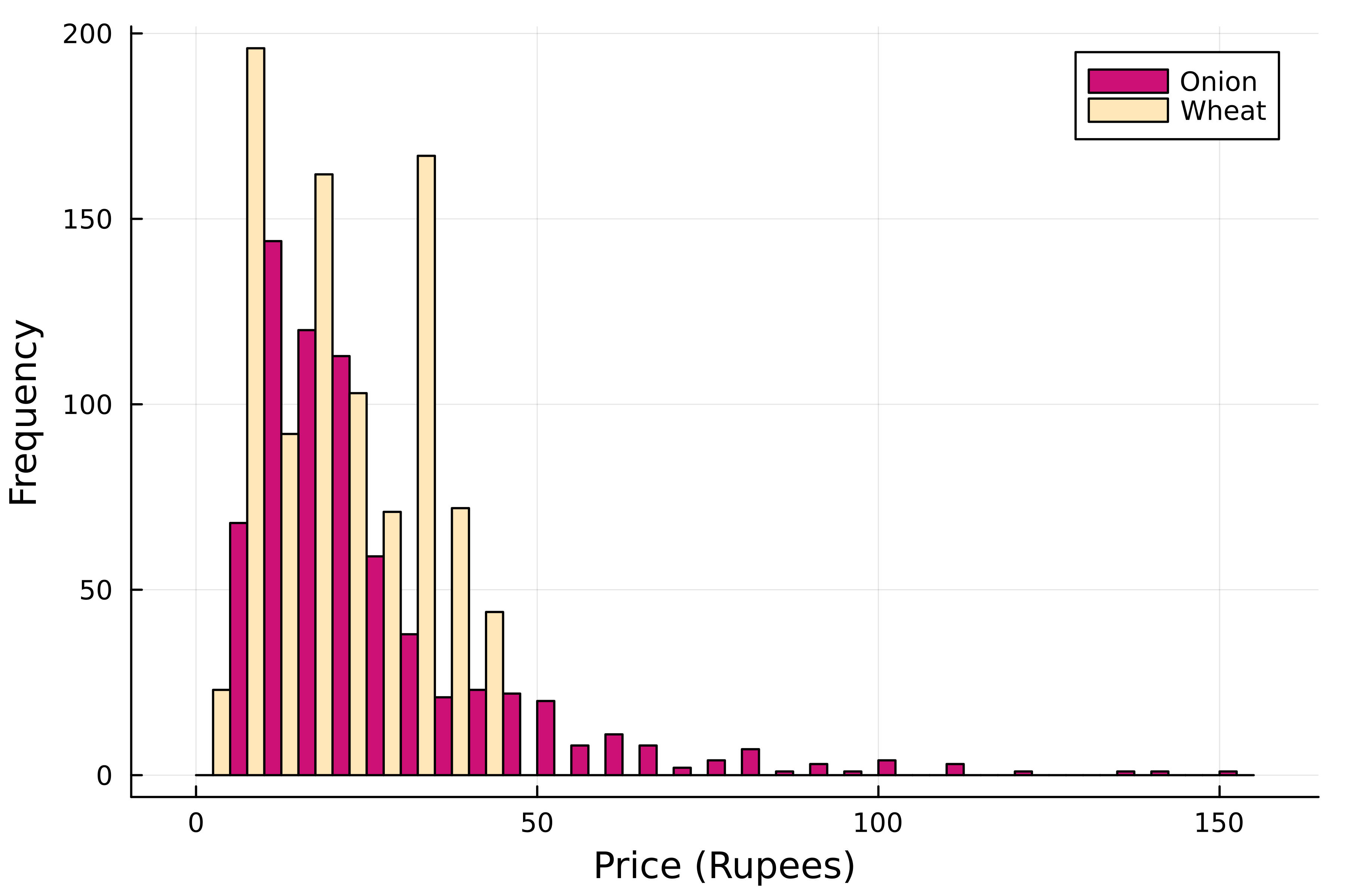
# グループ化ヒストグラム
groupedhist(
    kerala[:, :Price],

    # 品目でグループ化
    group=kerala[:, "Commodity"],

    # 色を指定
    color=[:deeppink3 :wheat2]
)
xlabel!("Price (Rupees)")
ylabel!("Frequency")
using StatsPlots # グループ化ヒストグラム groupedhist( kerala[:, :Price],
# 品目でグループ化 group=kerala[:, "Commodity"],
# 色を指定 color=[:deeppink3 :wheat2] ) xlabel!("Price (Rupees)") ylabel!("Frequency")
using StatsPlots

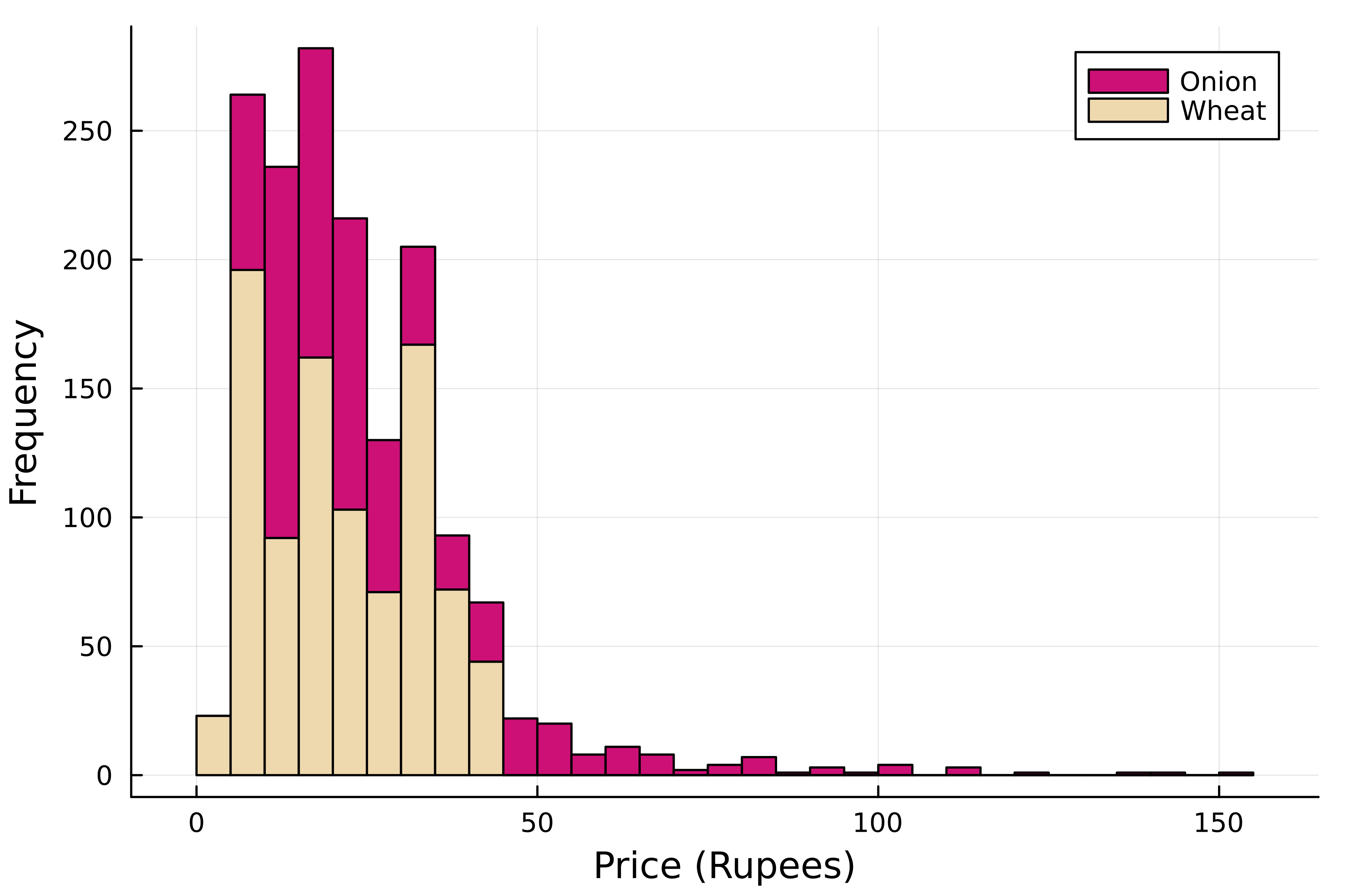
# 積み上げヒストグラム
groupedhist(
    kerala[:, :Price],
    # 品目でグループ化
    group=kerala[:, "Commodity"],
    # 色を指定
    color=[:deeppink3 :wheat2]

    # 棒を積み上げ
    bar_position=:stack,
)

xlabel!("Price (Rupees)")
ylabel!("Frequency")
using StatsPlots # 積み上げヒストグラム groupedhist( kerala[:, :Price], # 品目でグループ化 group=kerala[:, "Commodity"], # 色を指定 color=[:deeppink3 :wheat2]
# 棒を積み上げ bar_position=:stack, )
xlabel!("Price (Rupees)") ylabel!("Frequency")