Juliaで学ぶデータ可視化入門
Gustavo Vieira Suñe
Data Analyst

layout)
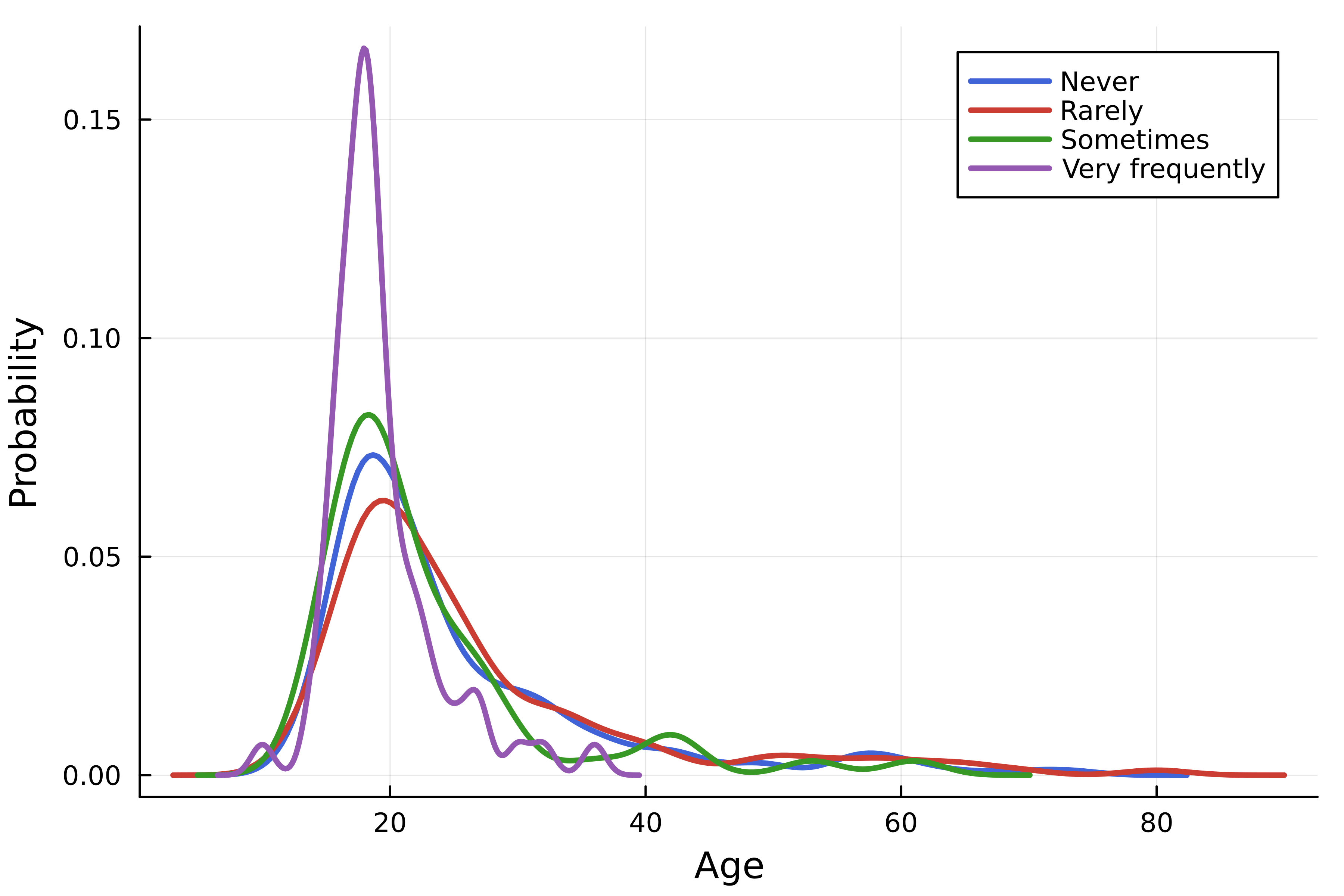
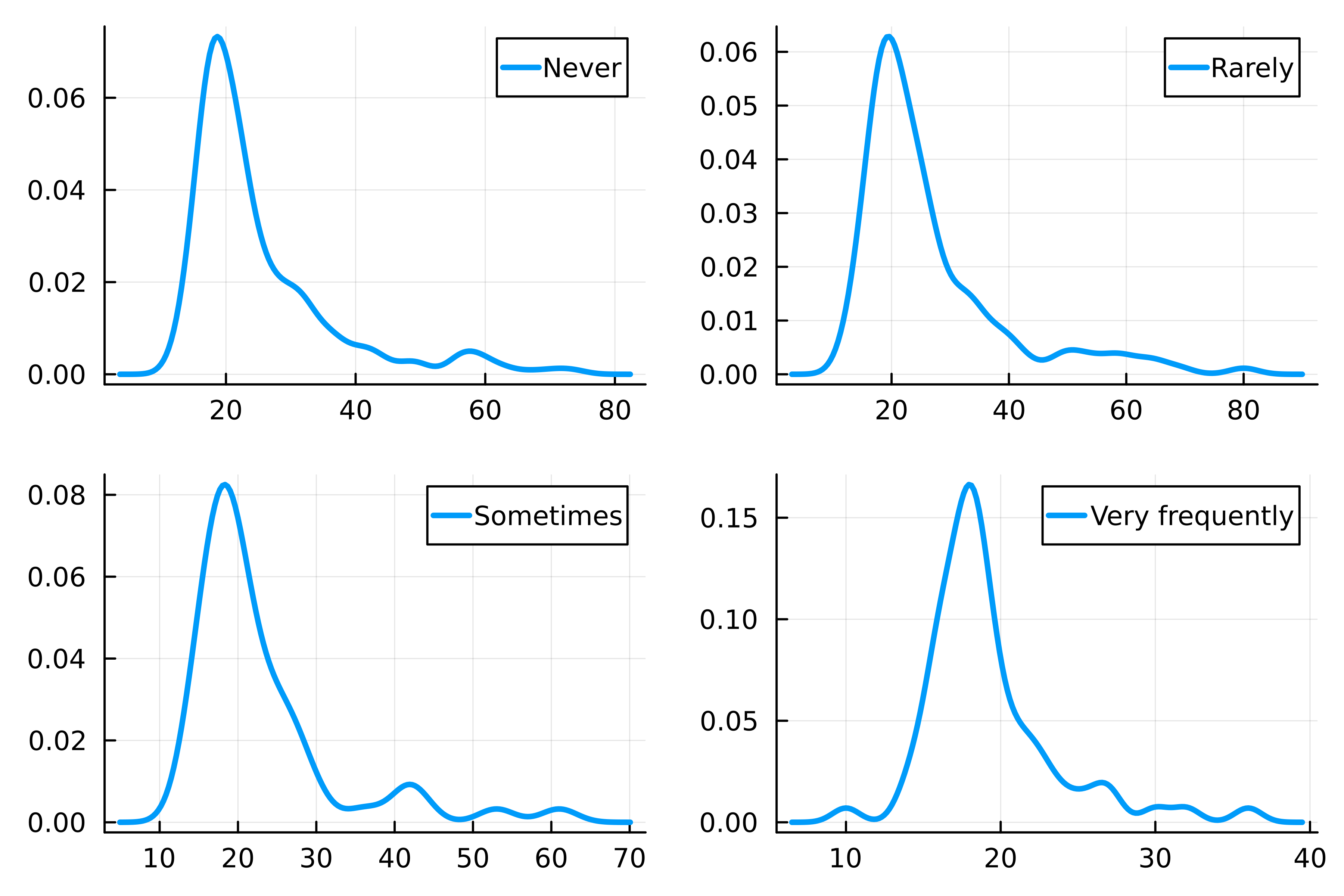
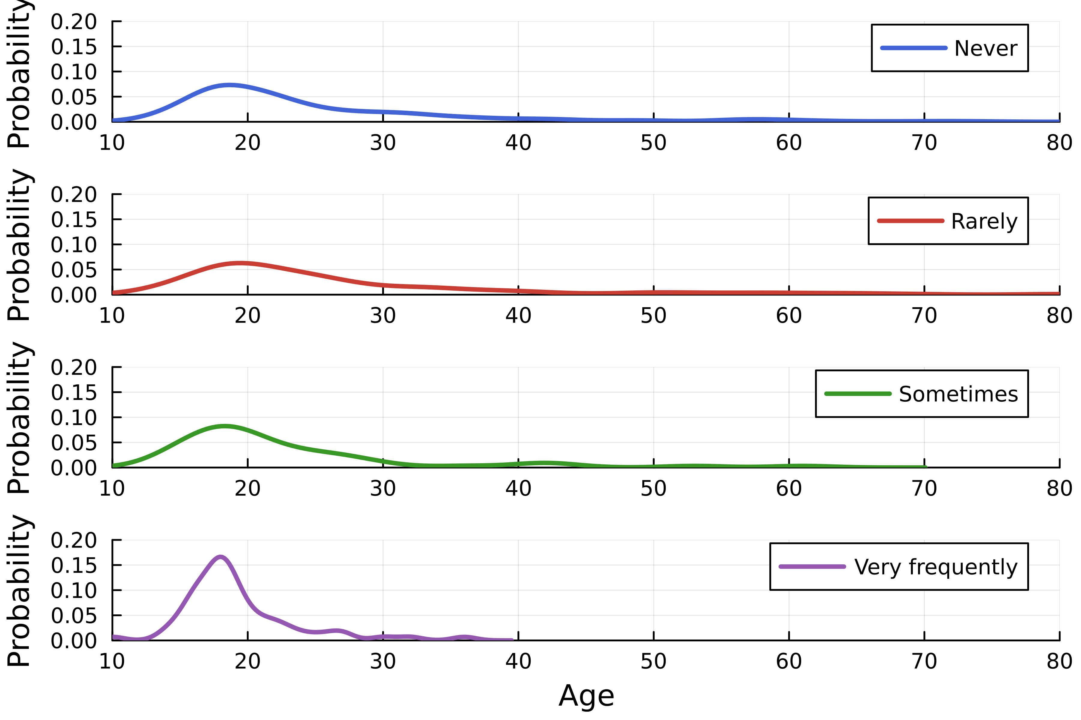
using StatsPlots, DataFrames, CSV # データセットを読み込む streaming = DataFrame( CSV.File("streaming.csv") )# 密度プロットを作成 density( streaming.Age, group=streaming."Frequency [K pop]", linewidth=2.5,# レイアウトを指定 layout=4, )

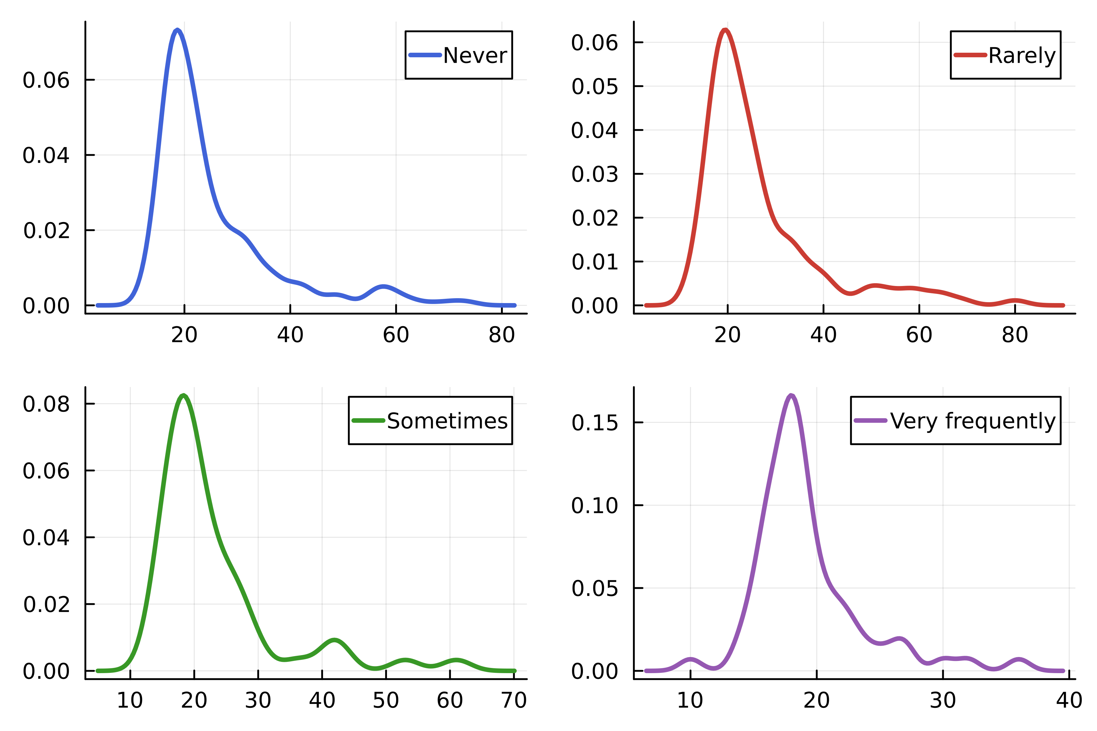
using Colors # Julia ロゴの色 logocolors = Colors.JULIA_LOGO_COLORS colors = [logocolors.blue logocolors.red logocolors.green logocolors.purple]density( streaming.Age, group=streaming."Frequency [K pop]", linewidth=2.5, layout=4, # 線色 linecolor=colors, )

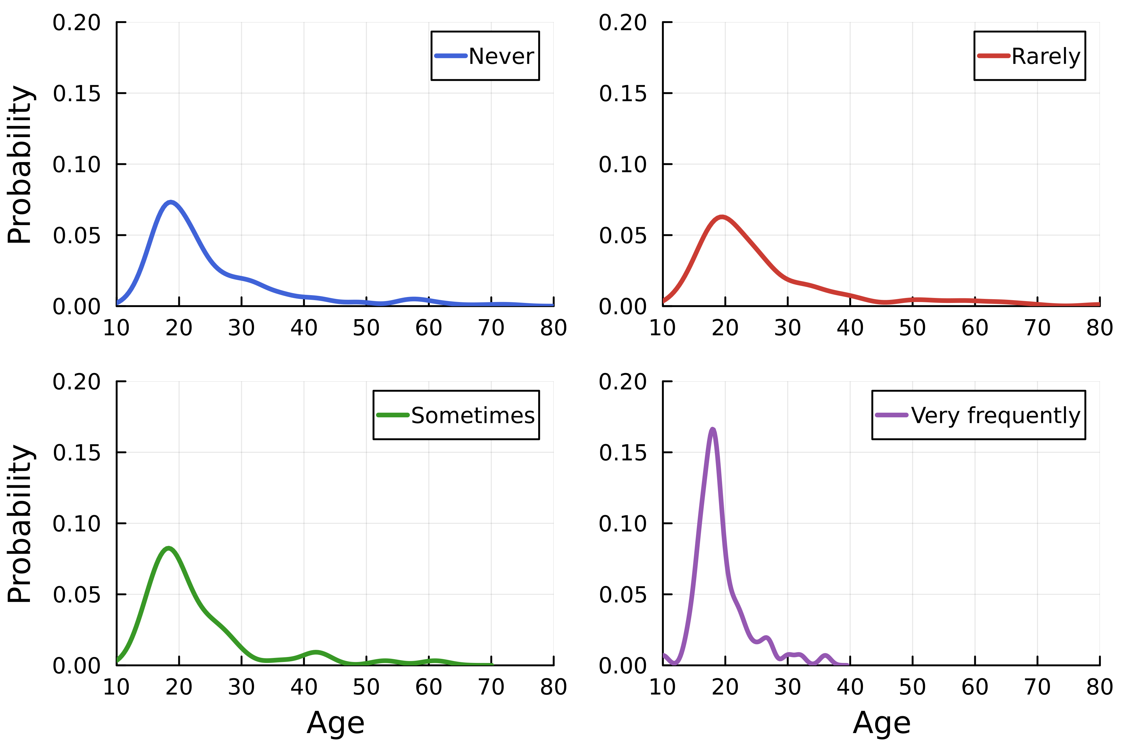
density( streaming.Age, group=streaming."Frequency [K pop]", linewidth=2.5, linecolor=colors,# レイアウトの行列数 layout=(4, 1),# 軸ラベル xlabel=["" "" "" "Age"], ylabel="Probability", )# 軸範囲 xlims!(10, 80) ylims!(0, 0.2)


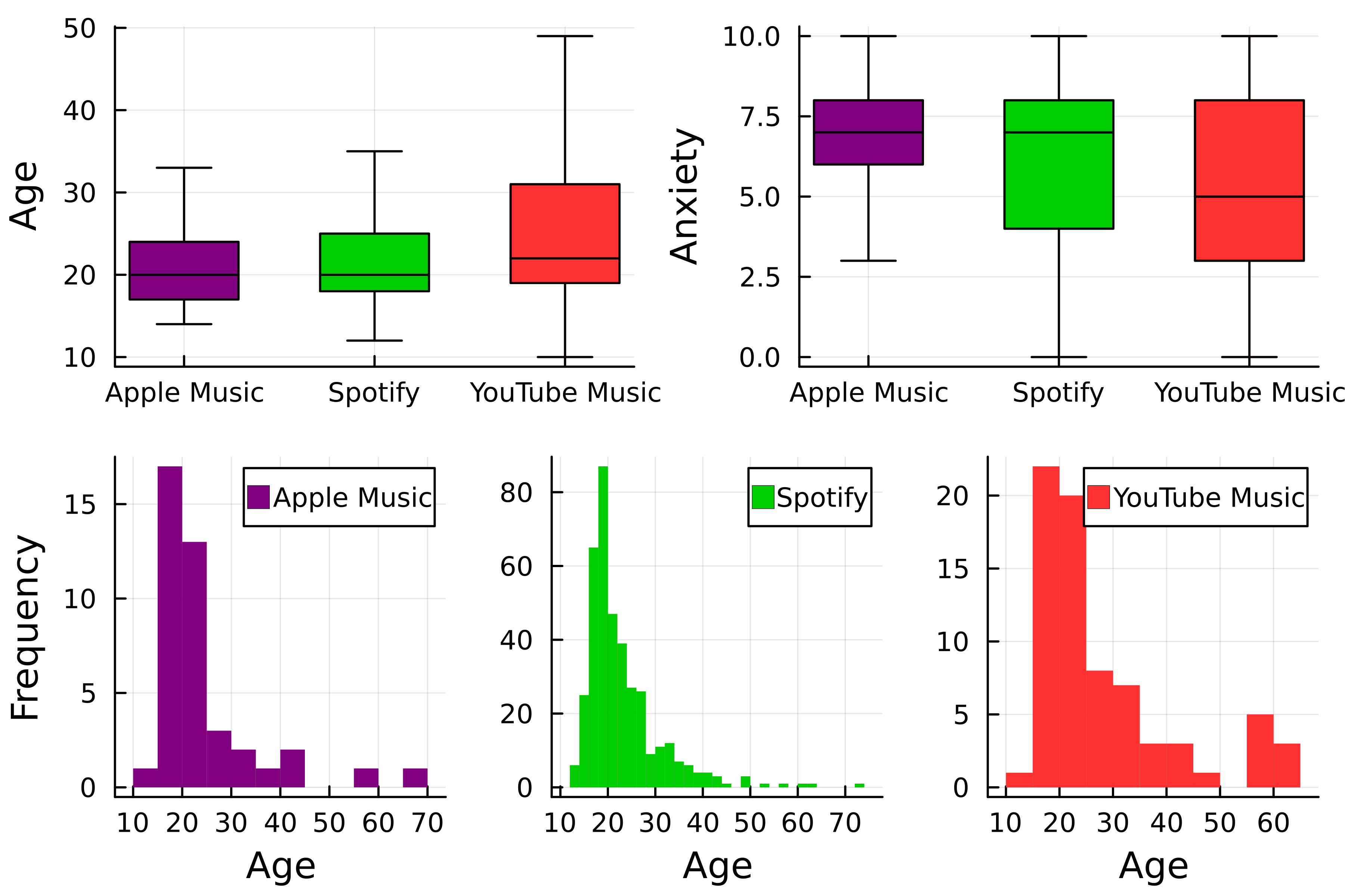
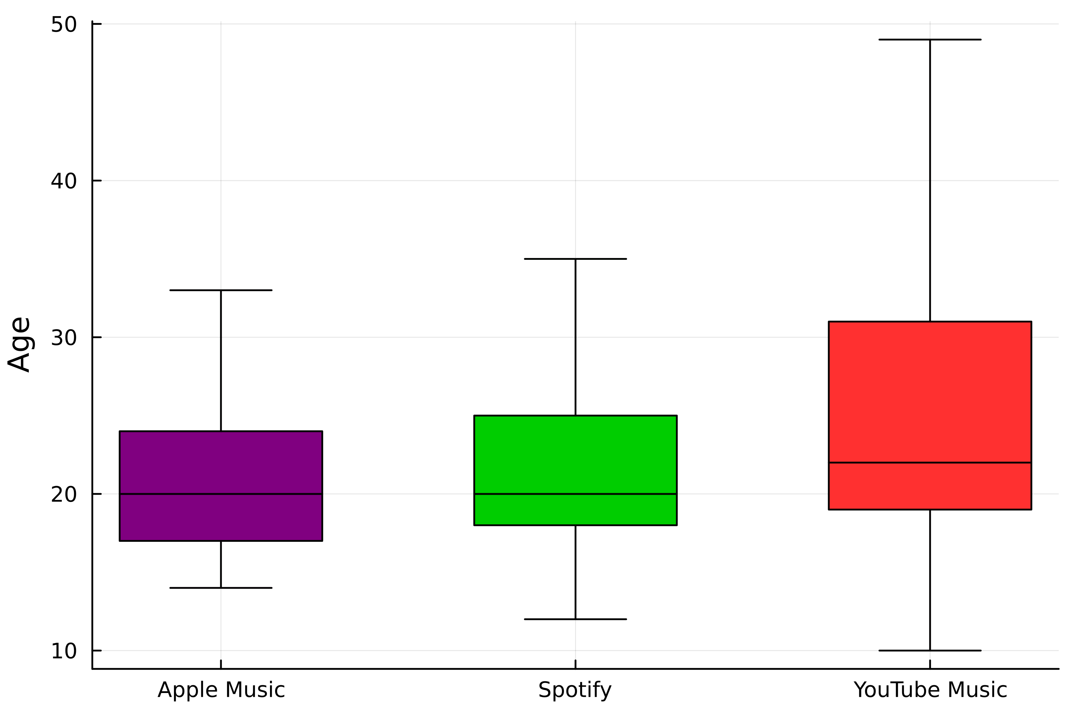
theme(:wong) # 色を選択 colors = [:purple :green3 :firebrick1]# 1つ目の箱ひげ図 p1 = boxplot(streaming."Streaming service", streaming.Age,# サービス別にグループ化 group=streaming."Streaming service", color=colors,label=false, ylabel="Age", # 外れ値を非表示 outliers=false)

# 2つ目の箱ひげ図
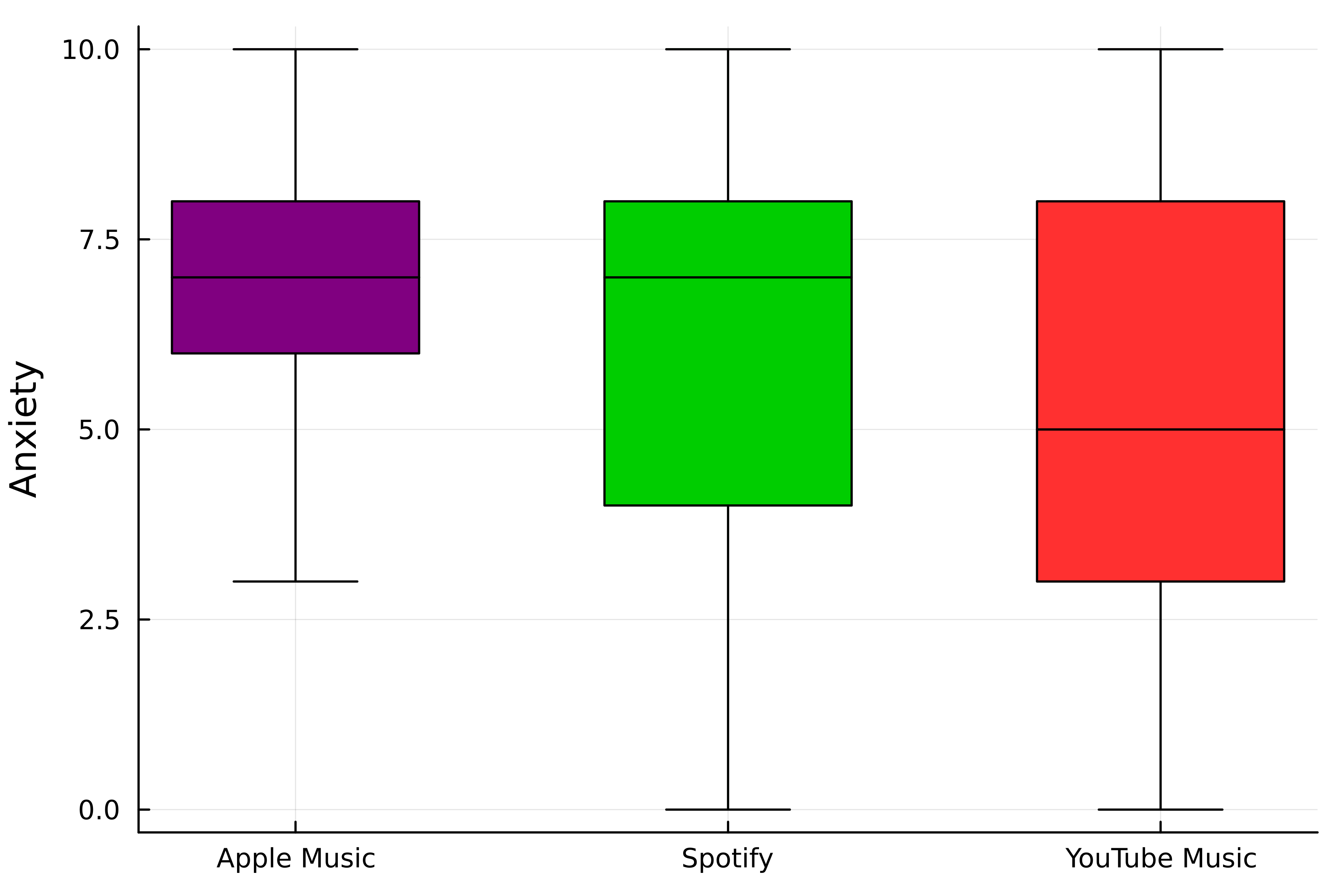
p2 = boxplot(
streaming."Streaming service",
streaming.Anxiety,
# サービス別にグループ化
group=streaming."Streaming service",
color=colors,
label=false,
ylabel="Anxiety",
# 外れ値を非表示
outliers=false,
)

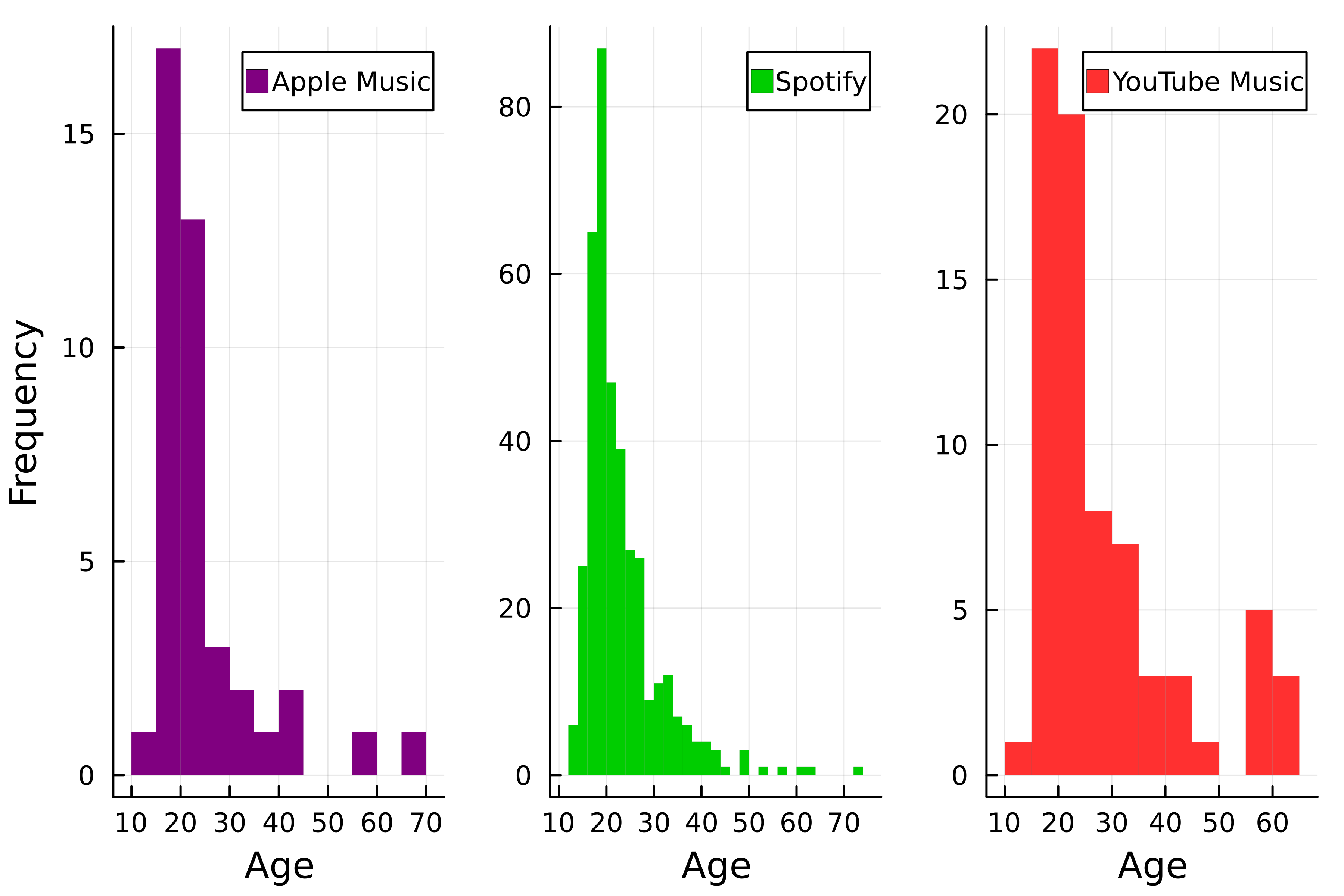
# ヒストグラム p3 = histogram( streaming.Age, group=streaming."Streaming service", color=colors, # 線を削除 linewidth=0,# レイアウトを指定 layout=(1, 3),xlabel="Age", # y軸ラベルを設定 ylabel=["Frequency" "" ""] )

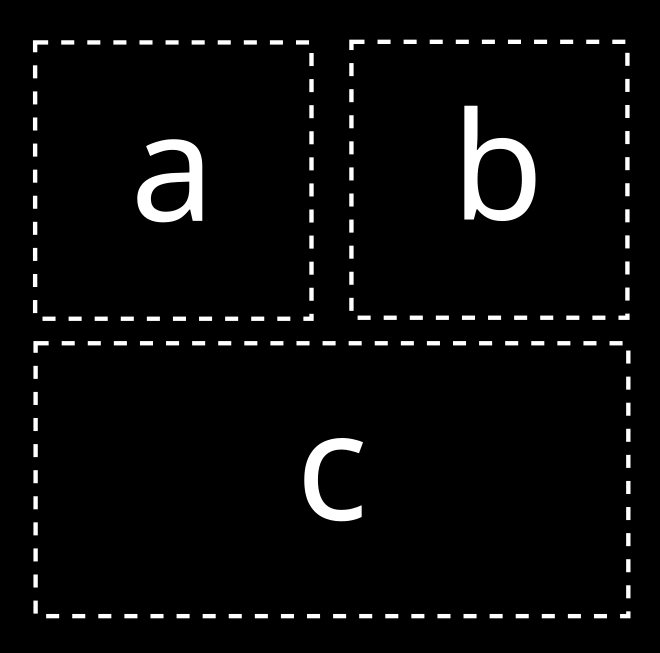
# レイアウトを選択
layout = @layout [a b; c]

# プロットを結合
plot(p1, p2, p3, layout=layout)

Juliaで学ぶデータ可視化入門