Relationships between continuous variables

Phân tích Khám phá Dữ liệu trong Power BI

Maarten Van den Broeck

Content Developer at DataCamp

What are scatter plots?
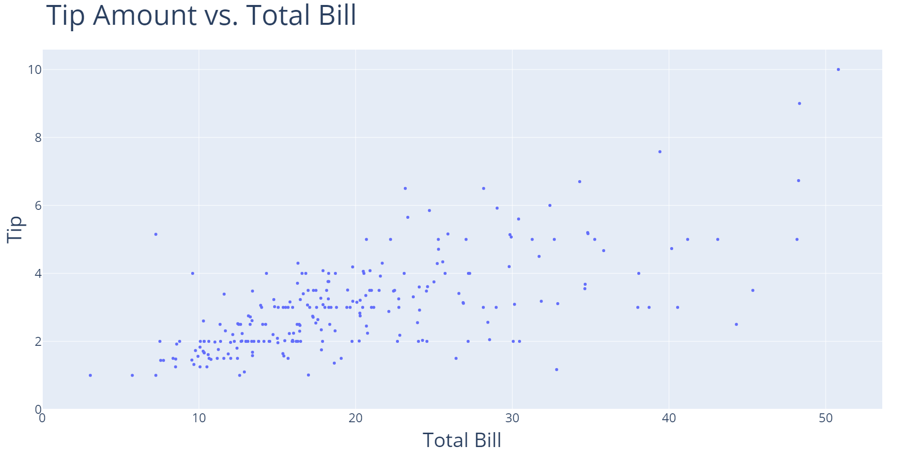
A scatter plot with "Total Bill" on the x-axis and "Tip" on the y-axis.

Phân tích Khám phá Dữ liệu trong Power BI

What are scatter plots?

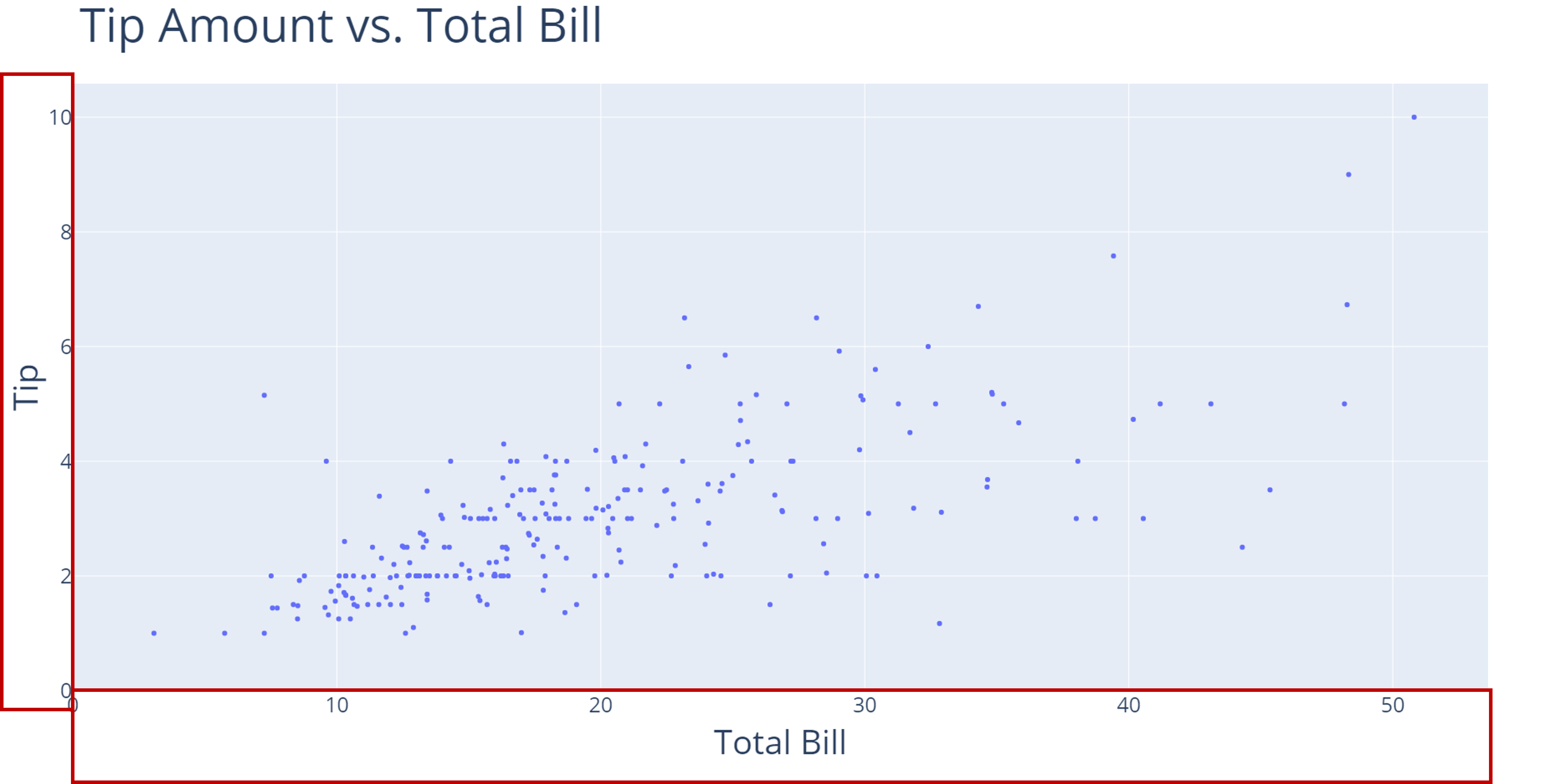
A scatter plot with "Total Bill" on the x-axis and "Tip" on the y-axis. Two red rectangles are highlighting the x- and y- axis.

Phân tích Khám phá Dữ liệu trong Power BI

What are scatter plots?

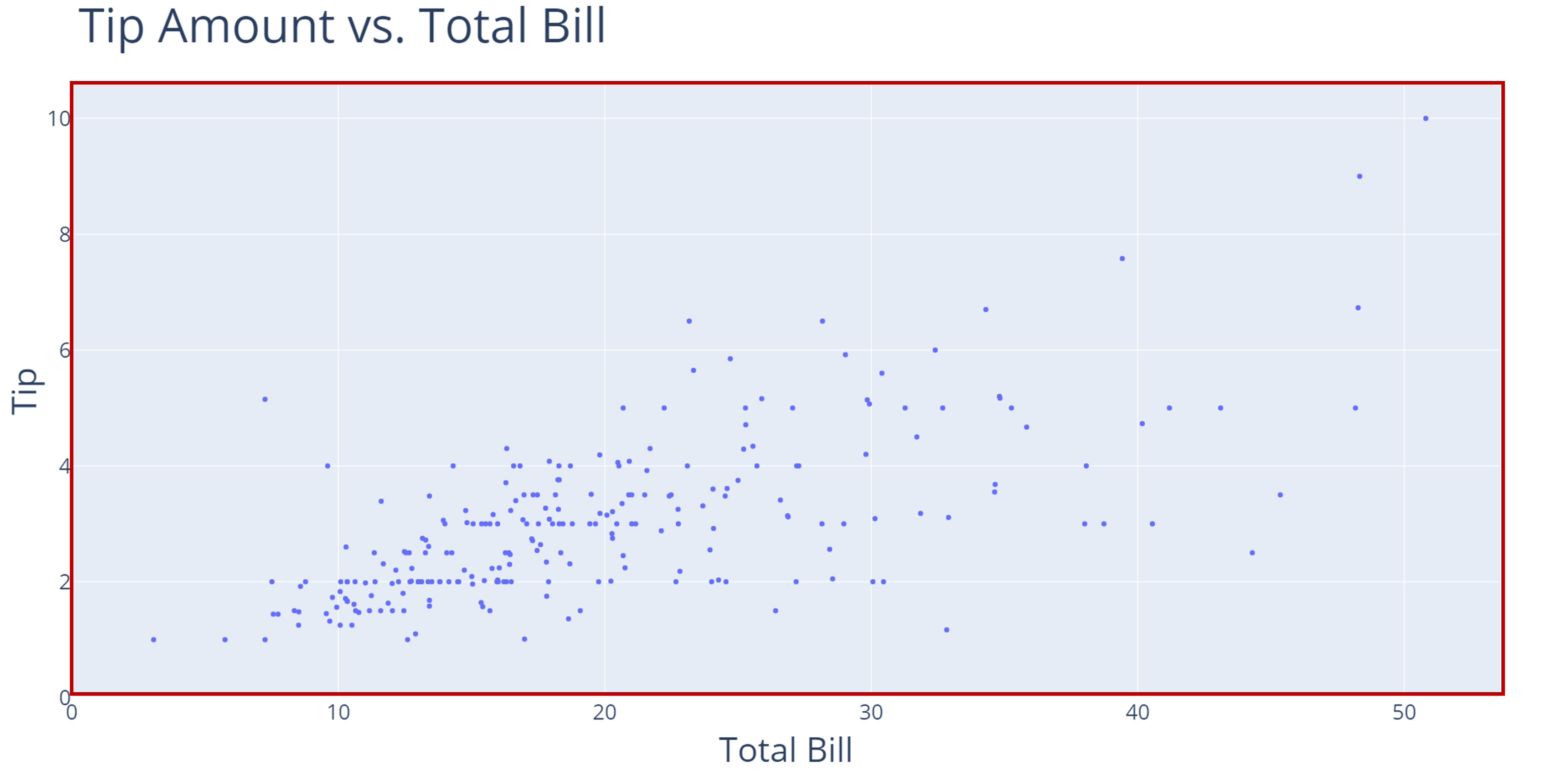
A scatter plot with "Total Bill" on the x-axis and "Tip" on the y-axis. A red rectangle is highlighting the chart area and data points.

Phân tích Khám phá Dữ liệu trong Power BI

Interpreting a scatter plot

A scatter plot with "Total Bill" on the x-axis and "Tip" on the y-axis. The dots representing each observation are tightly clustered towards the origin and disperse more for higher values of "Total Bill" and "Tip".

Phân tích Khám phá Dữ liệu trong Power BI

Interpreting a scatter plot

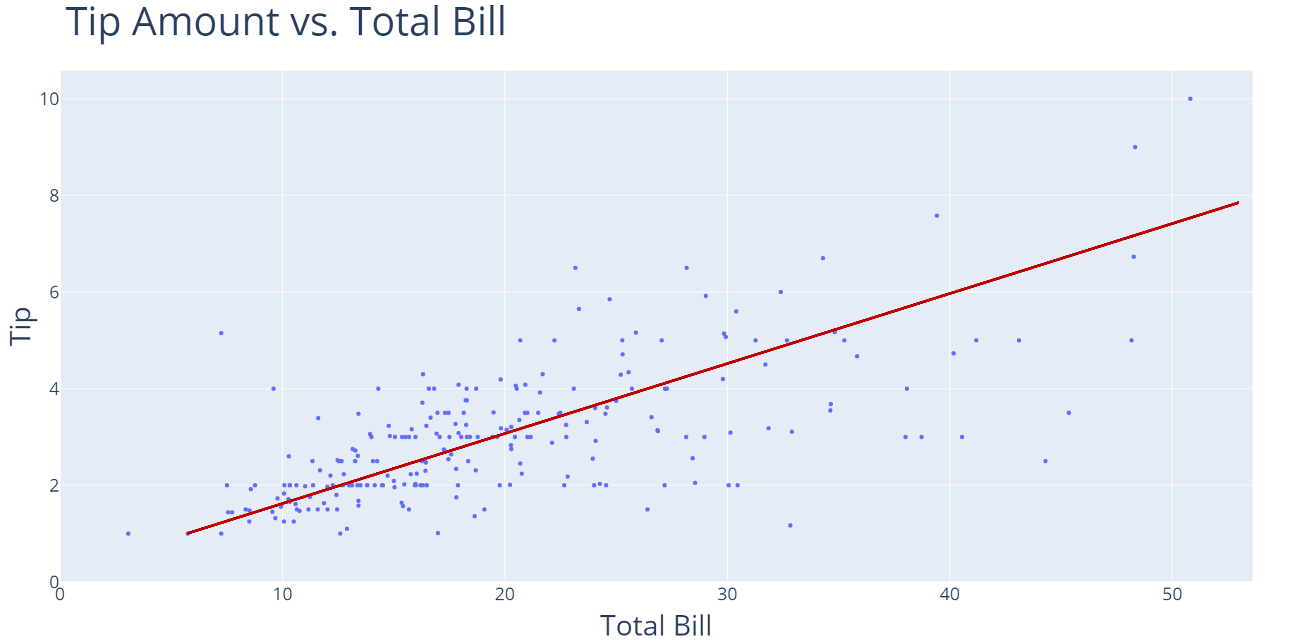
A scatter plot with "Total Bill" on the x-axis and "Tip" on the y-axis. A red line dissects through the cluster of data points to show a general increasing trend.

Phân tích Khám phá Dữ liệu trong Power BI

Interpreting a scatter plot

A scatter plot with "Total Bill" on the x-axis and "Tip" on the y-axis. The dots representing each observation are tightly clustered towards the origin and disperse more for higher values of "Total Bill" and "Tip".

Phân tích Khám phá Dữ liệu trong Power BI

Interpreting a scatter plot

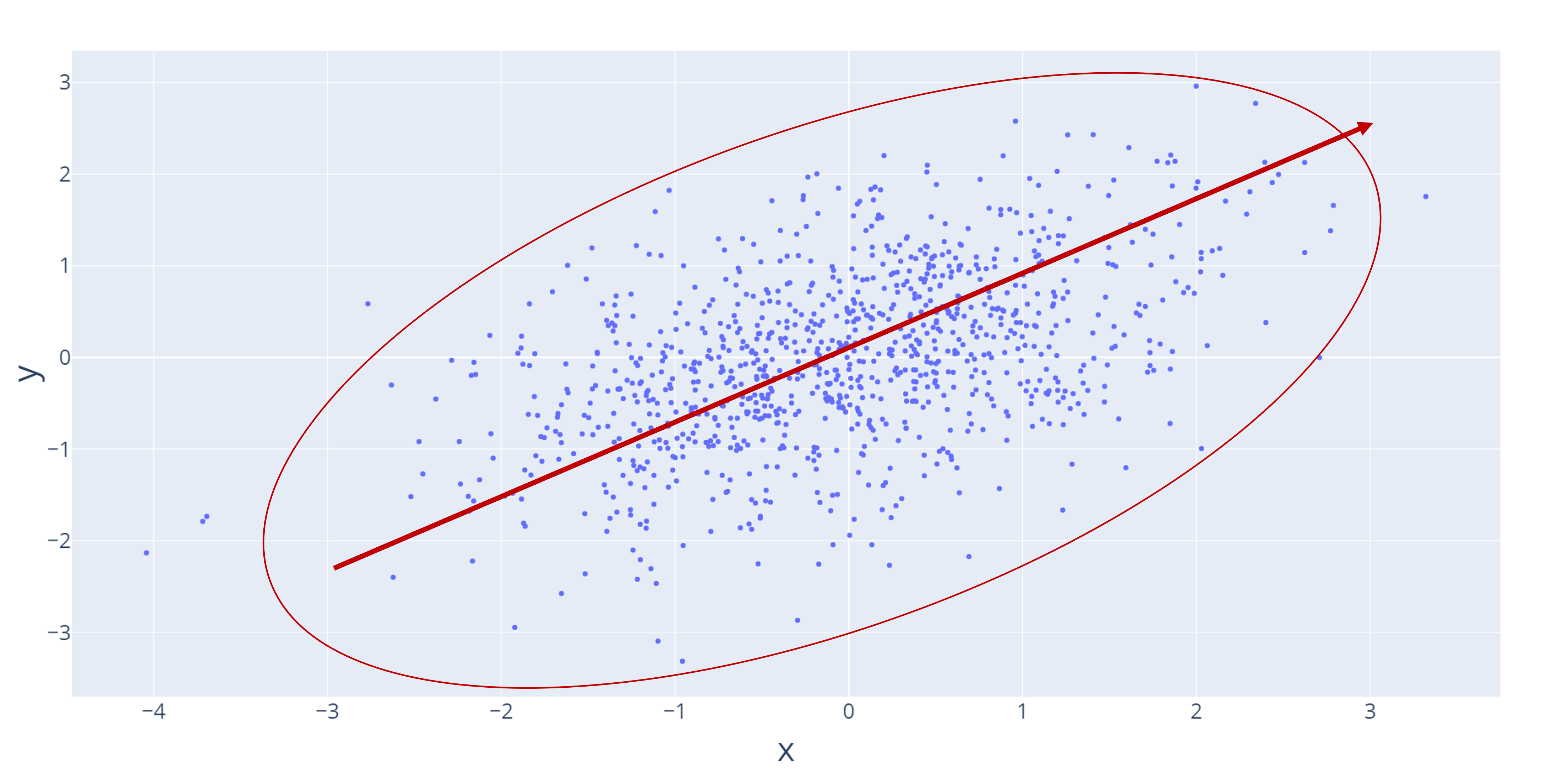
Strong-positive
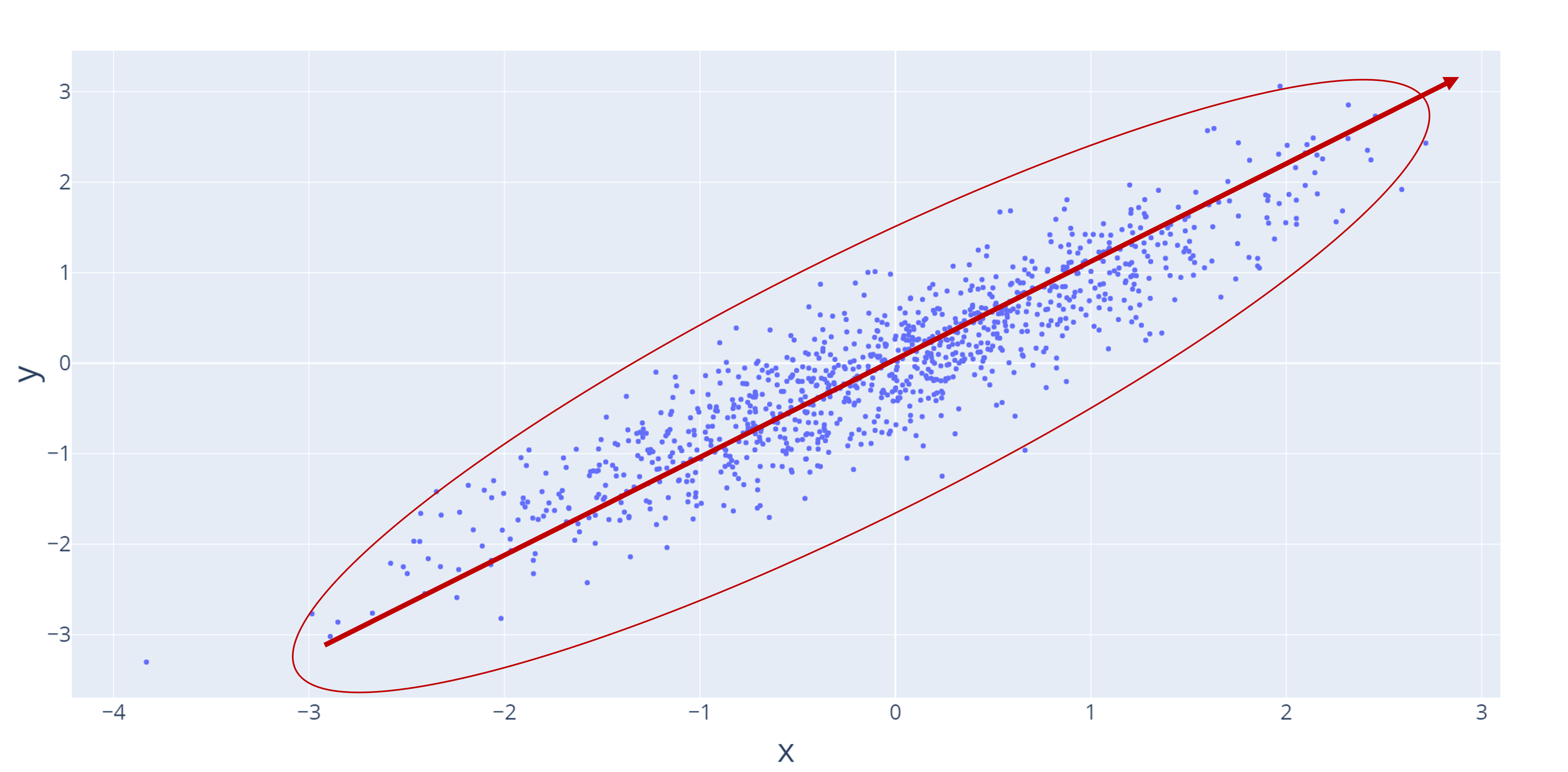
A scatter plot with a red line showing a positive, increasing relationship. A red circle highlights the data points and shows they are tightly clustered together.

Strong-negative

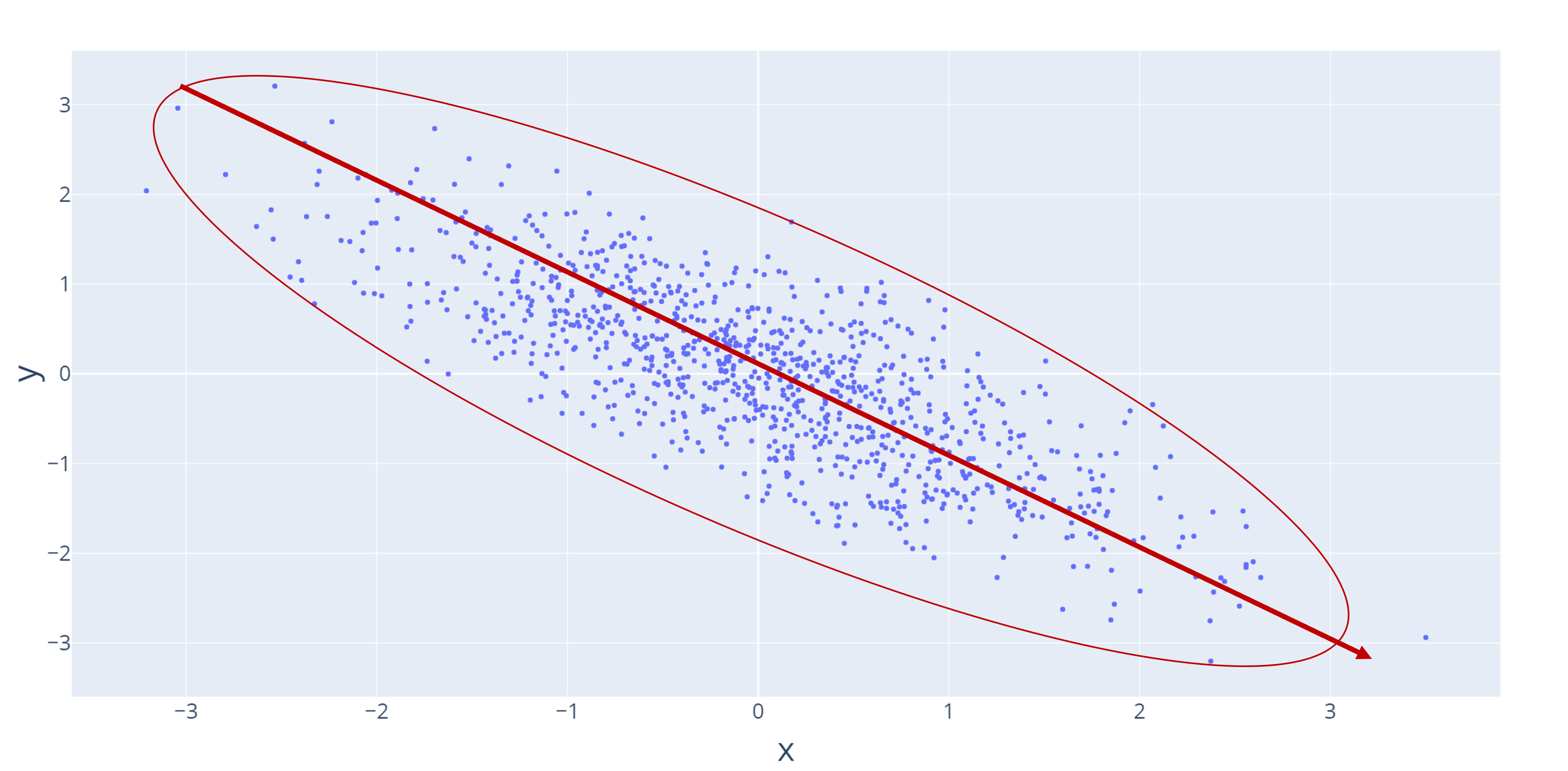
A scatter plot with a red line showing a negative, decreasing relationship. A red circle highlights the data points and shows they are tightly clustered together.

Weak-positive

A scatter plot with a red line showing a positive, increasing relationship. A red circle highlights the data points and shows they are more dispersed and therefore a weak relationship.

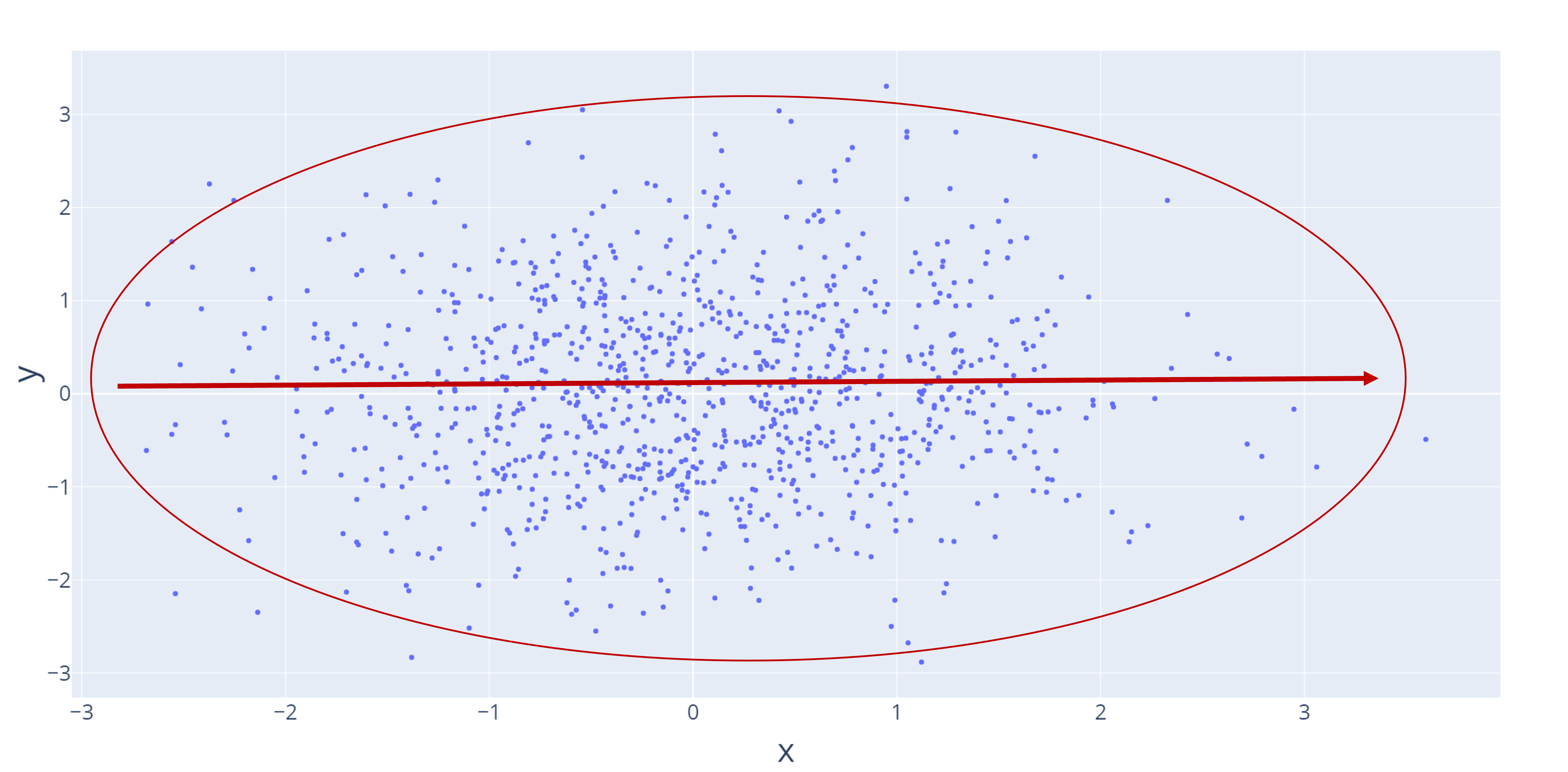
No relationship

A scatter plot with a red line showing a flat, or no, relationship. A red circle highlights the data points and shows they are more dispersed and therefore a weak relationship.

Phân tích Khám phá Dữ liệu trong Power BI

Correlation coefficient

  • Used to quantify the relationship
  • Represented by the letter, r

$$

r = Relationship description
-1 Strong-negative
0 No relationship
1 Strong-positive

$$

Calculating the correlation coefficient is beyond the scope of this course

Phân tích Khám phá Dữ liệu trong Power BI

Correlation coefficient and scatter plots

Strong-positive r=0.9

A scatter plot with a red line showing a positive, increasing relationship. A red circle highlights the data points and shows they are tightly clustered together.

Strong-negative r=-0.9

A scatter plot with a red line showing a negative, decreasing relationship. A red circle highlights the data points and shows they are tightly clustered together.

Weak-positive r=0.35

A scatter plot with a red line showing a positive, increasing relationship. A red circle highlights the data points and shows they are more dispersed and therefore a weak relationship.

No relationship r=0.0

A scatter plot with a red line showing a flat, or no, relationship. A red circle highlights the data points and shows they are more dispersed and therefore a weak relationship.

Phân tích Khám phá Dữ liệu trong Power BI

Adding context to a scatter plot

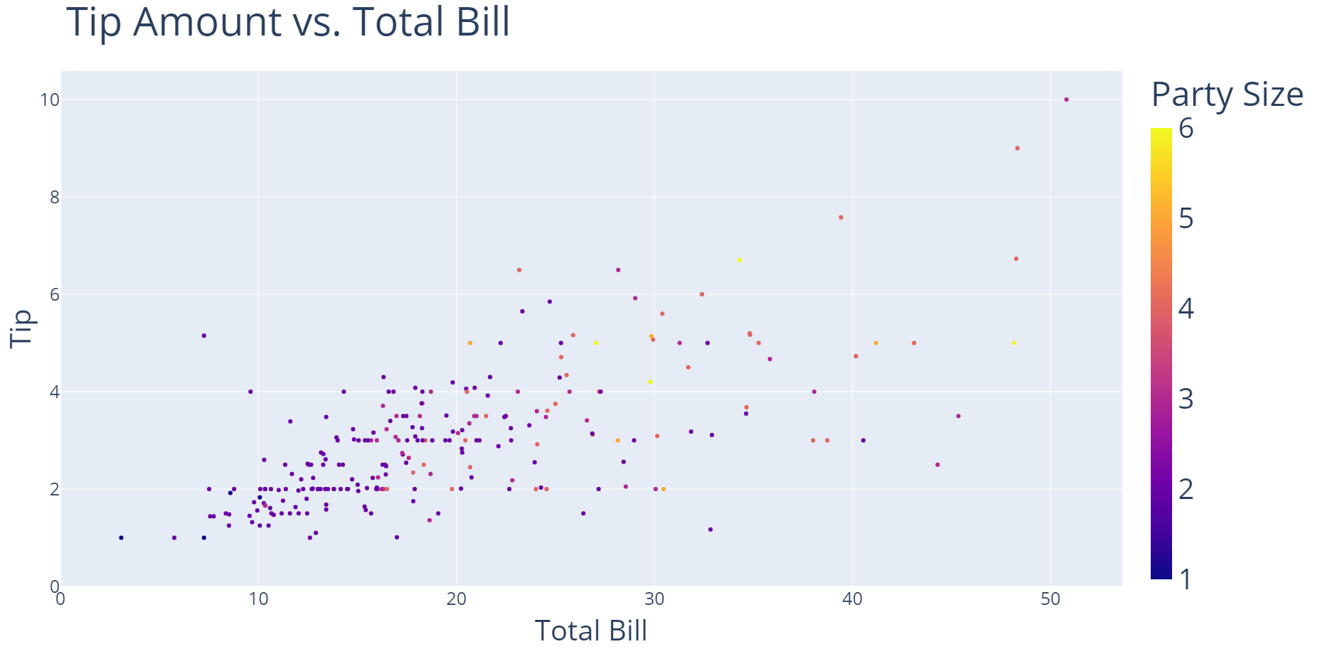
A scatter plot with "Total Bill" on the x-axis and "Tip" on the y-axis. "Party Size" is used to color the data points based on the value. For example, a party size of 1 are dark blue and a party size of 6 are bright yellow.

Phân tích Khám phá Dữ liệu trong Power BI

Let's practice!

Phân tích Khám phá Dữ liệu trong Power BI

Preparing Video For Download...