Časové řady ve vyšších dimenzích
Visualizing Time Series Data in R

Arnaud Amsellem
Quantitative Trader and creator of the R Trader blog
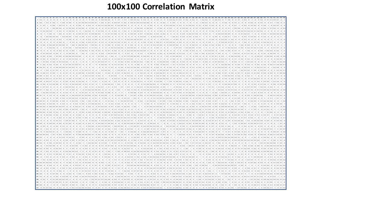
Korelační matice 100 x 100
cor_mat
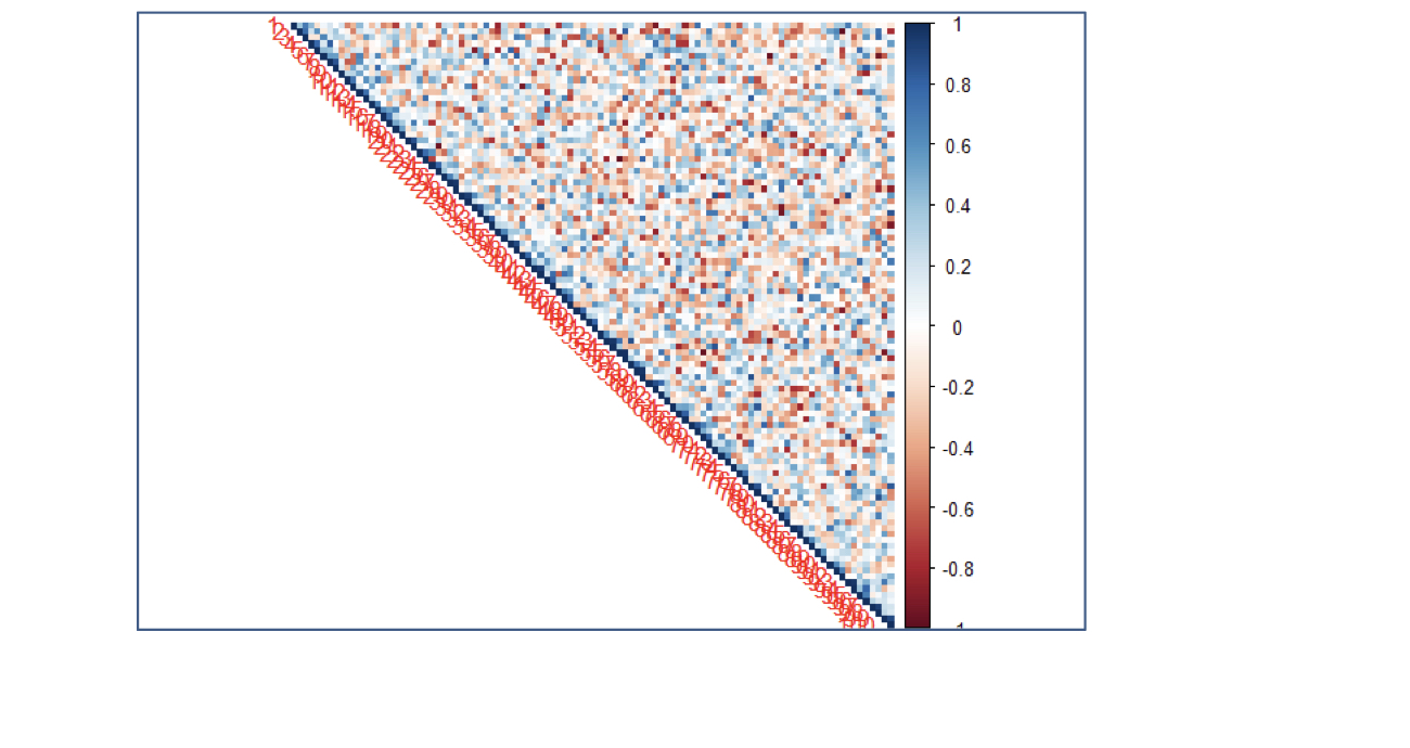
Korelační matice jako teplotní mapa
corrplot(cor_mat, method = "color", type = "upper")