Vlastní graf pro zdůraznění změny

Komunikace s daty v Tidyverse

Timo Grossenbacher

Data Journalist
Komunikace s daty v Tidyverse

Tečkový graf

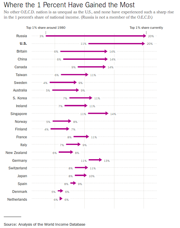
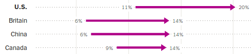
1 New York Times (https://www.nytimes.com/2017/11/17/upshot/income-inequality-united-states.html){{0}}
Komunikace s daty v Tidyverse

Tečkové grafy v ggplot2

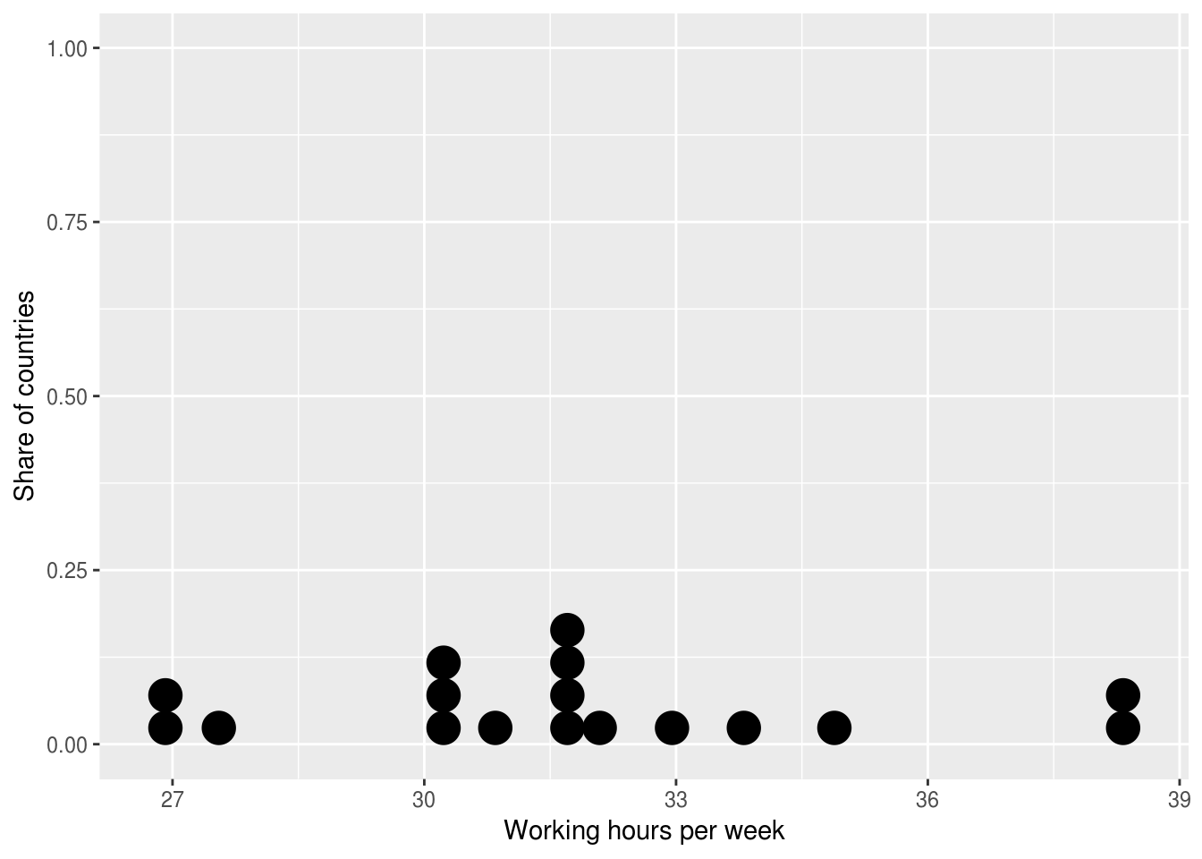
ggplot((ilo_data %>% filter(year == 2006))) +
  geom_dotplot(aes(x = working_hours)) +
  labs(x = "Working hours per week",
       y = "Share of countries")
Komunikace s daty v Tidyverse

Funkce geom_path()

?geom_path

geom_path() spojuje pozorování v pořadí, v jakém se vyskytují v datech.

ilo_data %>% 
    arrange(country)
# A tibble: 34 x 4
     country   year hourly_compensation working_hours
       <fct>  <fct>               <dbl>         <dbl>
1    Austria   1996               24.75      31.99808
2    Austria   2006               30.46      31.81731
3    Belgium   1996               25.25      31.65385
4    Belgium   2006               31.85      30.21154
5 Czech Rep.   1996                2.94      39.72692
# ... with 29 more rows
Komunikace s daty v Tidyverse

Tečkové grafy v `ggplot2`: funkce `geom_path()`

ggplot() +
    geom_path(aes(x = numeric_variable, y = numeric_variable))
ggplot() +
    geom_path(aes(x = numeric_variable, y = factor_variable))
ggplot() +
    geom_path(aes(x = numeric_variable, y = factor_variable),
                arrow = arrow(___))
Komunikace s daty v Tidyverse

Vyzkoušejme geom_path!

Komunikace s daty v Tidyverse

Preparing Video For Download...