Přeřazování úrovní faktorů

Kategorická data v Tidyverse

Emily Robinson

Data Scientist
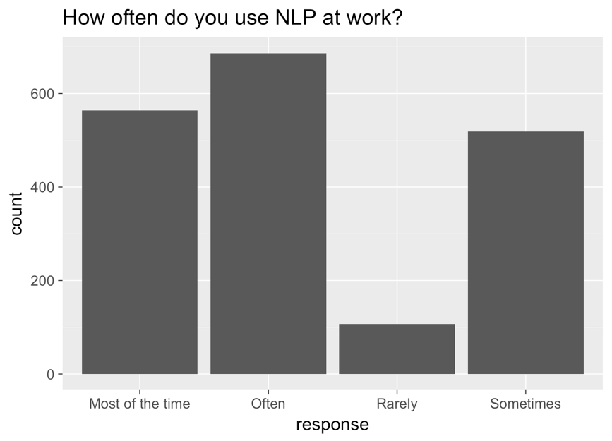
Sloupcový graf s odpovědí na ose x, počtem na ose y a názvem „Jak často používáte NLP v práci?" Sloupce jsou zleva doprava: most of the time, often, rarely, sometimes.

Kategorická data v Tidyverse

Opravený graf

ggplot(aes(nlp_frequency, 
            x = fct_relevel(response, 
            "Rarely", "Sometimes", "Often", "Most of the time"))) + 
        geom_bar()
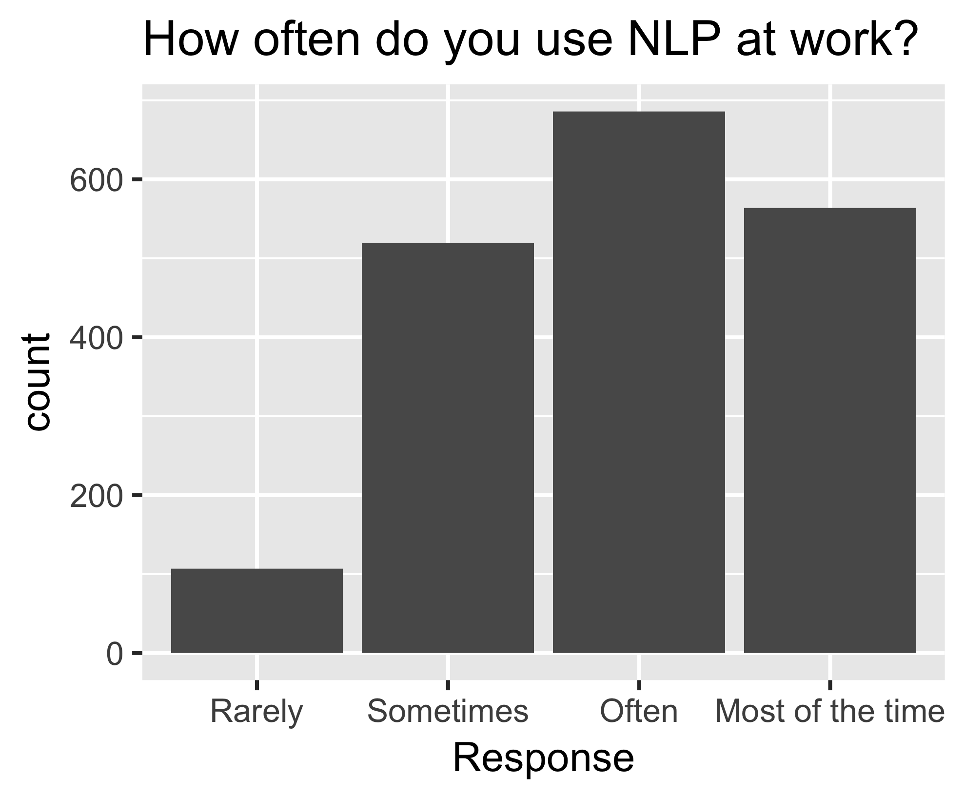
Stejný sloupcový graf jako předtím, nyní seřazený zleva doprava: rarely, sometimes, often, most of the time.

Kategorická data v Tidyverse

fct_reorder()

nlp_frequency %>%
    pull(response) %>%
    levels()
[1] "Most of the time" "Often" "Rarely" "Sometimes"       
nlp_frequency %>%
    mutate(response = fct_relevel(response, 
            "Often", "Most of the time")) %>%
    pull(response) %>%
    levels()
[1] "Often" "Most of the time" "Rarely" "Sometimes"
Kategorická data v Tidyverse

Další argumenty

nlp_frequency %>%
    mutate(response = fct_relevel(response, 
            "Often", "Most of the time", after = 2)) %>%
            pull(response) %>%
            levels()
nlp_frequency %>%
    mutate(response = fct_relevel(response, 
            "Often", "Most of the time", after = Inf) %>%
    pull(response) %>%
    levels()
[1] "Rarely" "Sometimes" "Often" "Most of the time"
Kategorická data v Tidyverse

Pojďme cvičit!

Kategorická data v Tidyverse

Preparing Video For Download...