Úvod do animace

Intermediate Interactive Data Visualization with plotly in R

Adam Loy

Statistician, Carleton College
Emise CO2 a příjmy

Otázka: Změnil se vztah mezi emisemi oxidu uhličitého a příjmy v čase?

world_indicators
# A tibble: 11,387 x 11
  country  year income     co2 military population  urban life_expectancy four_regions
  <chr>   <dbl>  <dbl>   <dbl>    <dbl>      <dbl>  <dbl>           <dbl> <chr>       
1 Afghan…  1960   1210  0.0461       NA    9000000 7.56e5            38.6 asia        
2 Albania  1960   2790  1.24         NA    1640000 4.94e5            62.7 europe      
3 Algeria  1960   6520  0.554        NA   11100000 3.39e6            52   africa      
4 Andorra  1960  15200 NA            NA      13400 7.84e3            NA   europe      
5 Angola   1960   3860  0.0975       NA    5640000 5.89e5            42.4 africa      
# … with 1.138e+04 more rows, and 2 more variables: eight_regions <chr>, six_regions <chr>
Intermediate Interactive Data Visualization with plotly in R

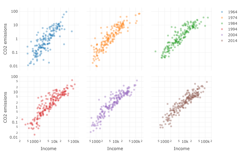
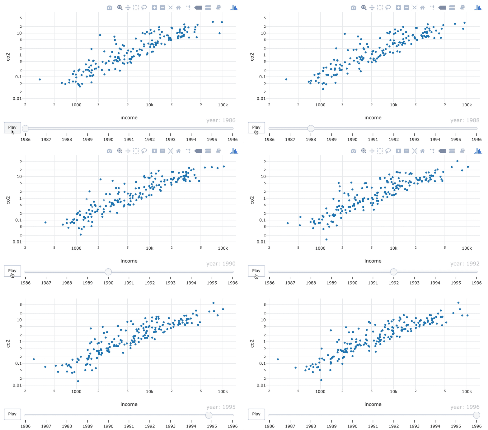
Bodové grafy emisí CO2 vůči HDP na obyvatele pro šest let.

Intermediate Interactive Data Visualization with plotly in R

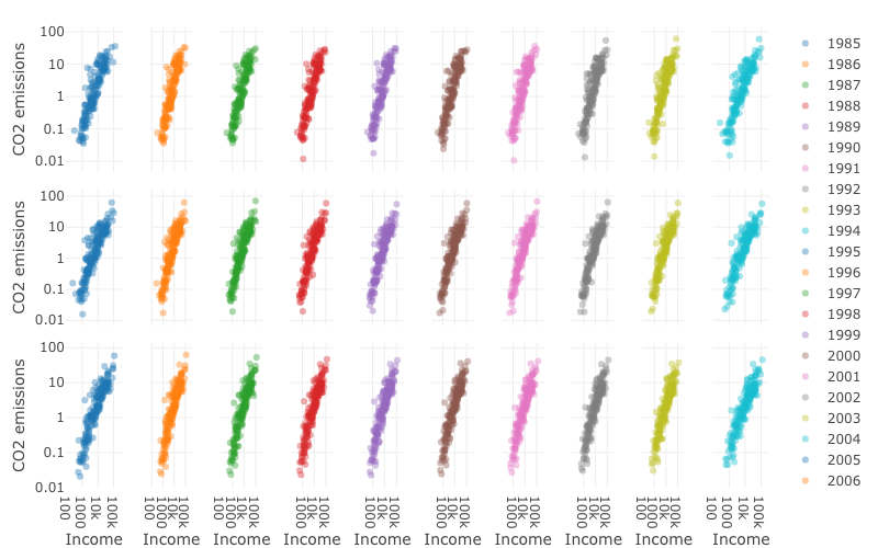
Bodové grafy emisí CO2 vůči HDP na obyvatele pro roky 1989–2014.

Intermediate Interactive Data Visualization with plotly in R

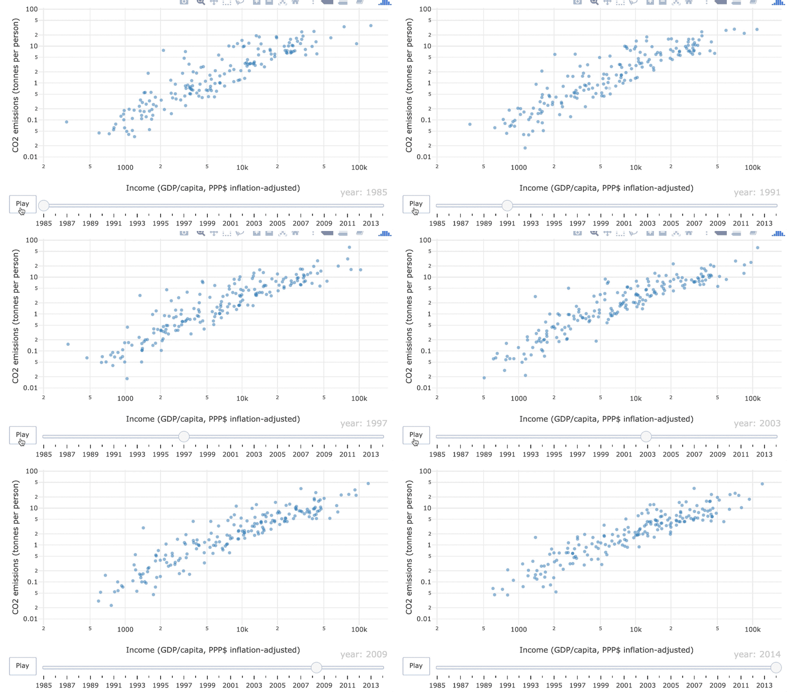
Animovaný bodový graf emisí CO2 vůči HDP na obyvatele pro roky 1985–2014

Intermediate Interactive Data Visualization with plotly in R

Animace klíčových snímků

Frame = graf v jednom časovém bodě

Filmový pás bodových grafů.

Intermediate Interactive Data Visualization with plotly in R

Estetika frame

world_indicators %>%
  plot_ly(x = ~income, y = ~co2) %>%
  add_markers(frame = ~year, showlegend = FALSE) %>%
  layout(xaxis = list(type = "log"), yaxis = list(type = "log"))
Intermediate Interactive Data Visualization with plotly in R

Stálost objektů

Grafický prvek (např. bod) by měl reprezentovat konkrétní datový bod (např. Belgii)
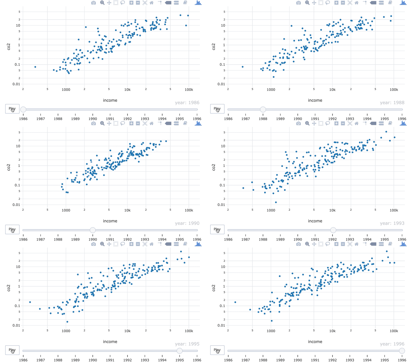
GIF s body měnícími pořadí v 90. letech.

Intermediate Interactive Data Visualization with plotly in R

Estetika ids

world_indicators %>%
  plot_ly(x = ~income, y = ~co2) %>%
  add_markers(frame = ~year, ids = ~country, showlegend = FALSE) %>%
  layout(xaxis = list(type = "log"), yaxis = list(type = "log"))
21-object-constancy-fixed.gif

Intermediate Interactive Data Visualization with plotly in R

Pojďme si to procvičit!

Intermediate Interactive Data Visualization with plotly in R

Preparing Video For Download...