Zkoumání dat pomocí vizualizací

Manipulace s daty v Julii

Katerina Zahradova

Instructor

Proč vizualizujeme?
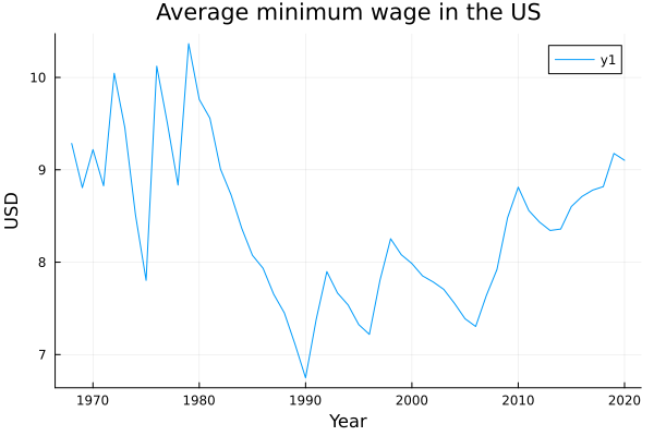
Row year   mean_min_wage_2020_dollars
    Int64  Float64
________________________________
1   1968   9.28529
2   1969   8.80667
3   1970   9.21882
4   1971   8.82686
5   1972   10.0457
...

Průměrná reálná mzda v dolarech roku 2020

Manipulace s daty v Julii

Histogram

# Make a histogram with default bins
wages_2015 = filter(wages.year == 2015, wages)
histogram(wages_2015.eff_min_wage_2020_dollars)
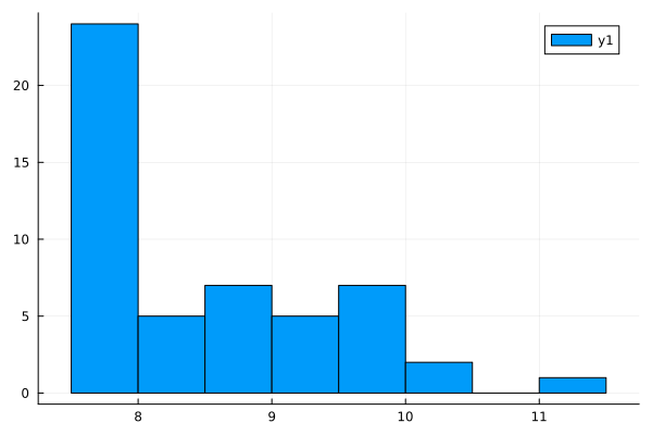
Histogram minimální mzdy upravené o inflaci v roce 2015

# Specifying the number of bins
wages_2015 = filter(wages.year == 2015, wages)
histogram(wages_2015.eff_min_wage_2020_dollars,
          bins = 25)
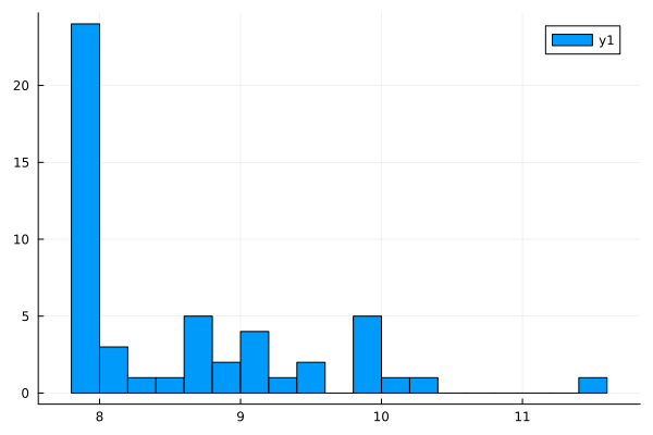
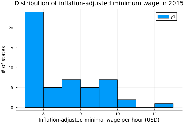
Histogram minimální mzdy upravené o inflaci v roce 2015 s popisky

Manipulace s daty v Julii

Popis grafu

# Make histogram
wages_2015 = filter(wages.year == 2015, wages)
histogram(wages_2015.eff_min_wage_2020_dollars)

# Include x label xlabel!("Inflation-adjusted minimal wage per hour (USD)")
# Include y label ylabel!("# of states")
# Make title title!("Distribution of inflation-adjusted minimum wage in 2015")

Histogram minimální mzdy s popisky

Manipulace s daty v Julii

Bodový graf

# Scatter plot
scatter(penguins.body_mass_g, 
        penguins.flipper_length_mm)

# Labels
xlabel!("Body mass [g]")
ylabel!("Flipper length [mm]")
title!("Flipper length vs. 
        body mass in peguins")

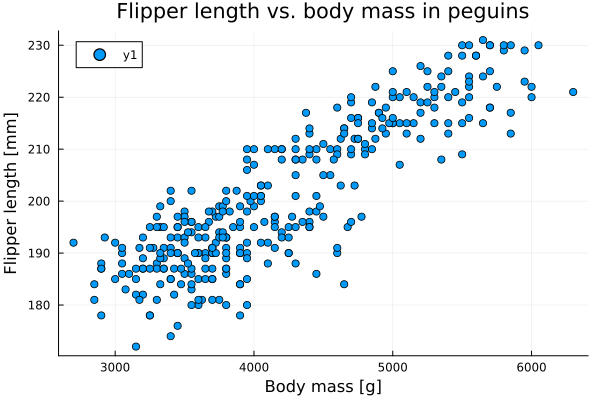
Bodový graf délky ploutve vs. hmotnosti tučňáků

Manipulace s daty v Julii

Čárový graf

# Number of Adelie penguins over time
plot(observations.days, 
    observations.adelie)

# Labels
xlabel!("Days")
ylabel!("Number of penguins")
title!("Number of observed 
        penguins over time")

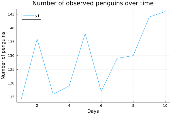
Čárový graf zobrazující trendy v počtech tučňáků

Manipulace s daty v Julii

Více čar

# Plot the first line
plot(observations.day, observations.adelie)


# Adding and modifying with new lines plot!(observations.day, observations.chinstrap) plot!(observations.day, observations.gentoo)
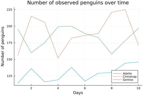
# Labels xlabel!("Days") ylabel!("Number of penguins") title!("Number of observed penguins over time")

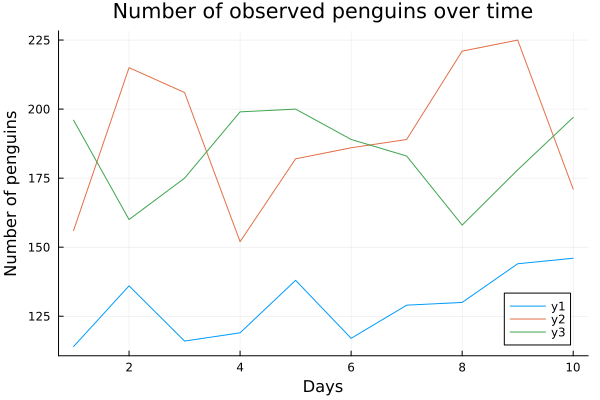
Čárový graf trendů počtu tučňáků pro různé druhy

Manipulace s daty v Julii

Více čar s legendou

# Make a plot
plot(observations.day, observatations.adelie, 
    label = "Adelie" )
plot!(observations.day, observations.chinstrap, 
    label = "Chinstrap")
plot!(observations.day, observations.gentoo, 
    label = "Gentoo")

# Labels
xlabel!("Days")
ylabel!("Number of penguins")
title!("Number of observed penguins over time")

Čárový graf trendů počtu tučňáků pro různé druhy s legendou

Manipulace s daty v Julii

Přehled příkazů

Typy grafů:

  • Histogram – rozložení numerické proměnné histogram(df.n1, label = "n1")

  • Bodový graf – vztah dvou numerických proměnných scatter(df.x, df.y, label = "y")

  • Čárový graf – časový vývoj numerické proměnné plot(df.x, df.y, label = "y")

Přidání další čáry do existujícího grafu:

  • histogram!(df.n2, label = "n2")
  • scatter!(df.x2, df.y2, label = "y2")
  • plot!(df.x2, df.y2, label = "y2")

Popisky:

  • xlabel!("Text of your x label")
  • ylabel!("Text of your y label")
  • title!("Text of your title")
Manipulace s daty v Julii

Pojďme cvičit!

Manipulace s daty v Julii

Preparing Video For Download...