Úvod do relačních grafů a podgrafů
Úvod do vizualizace dat se Seabornem

Content Team
DataCamp
Otázky o kvantitativních proměnných
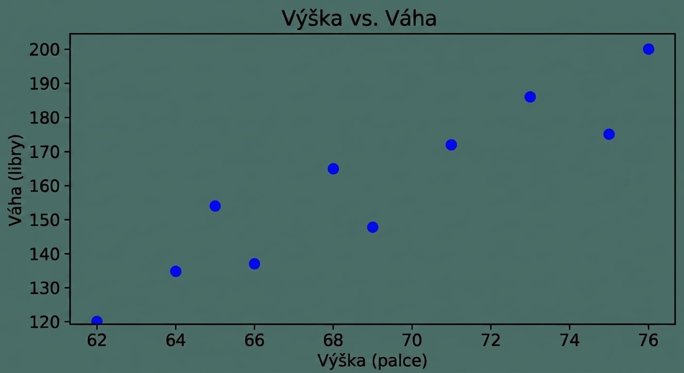
Otázky o kvantitativních proměnných
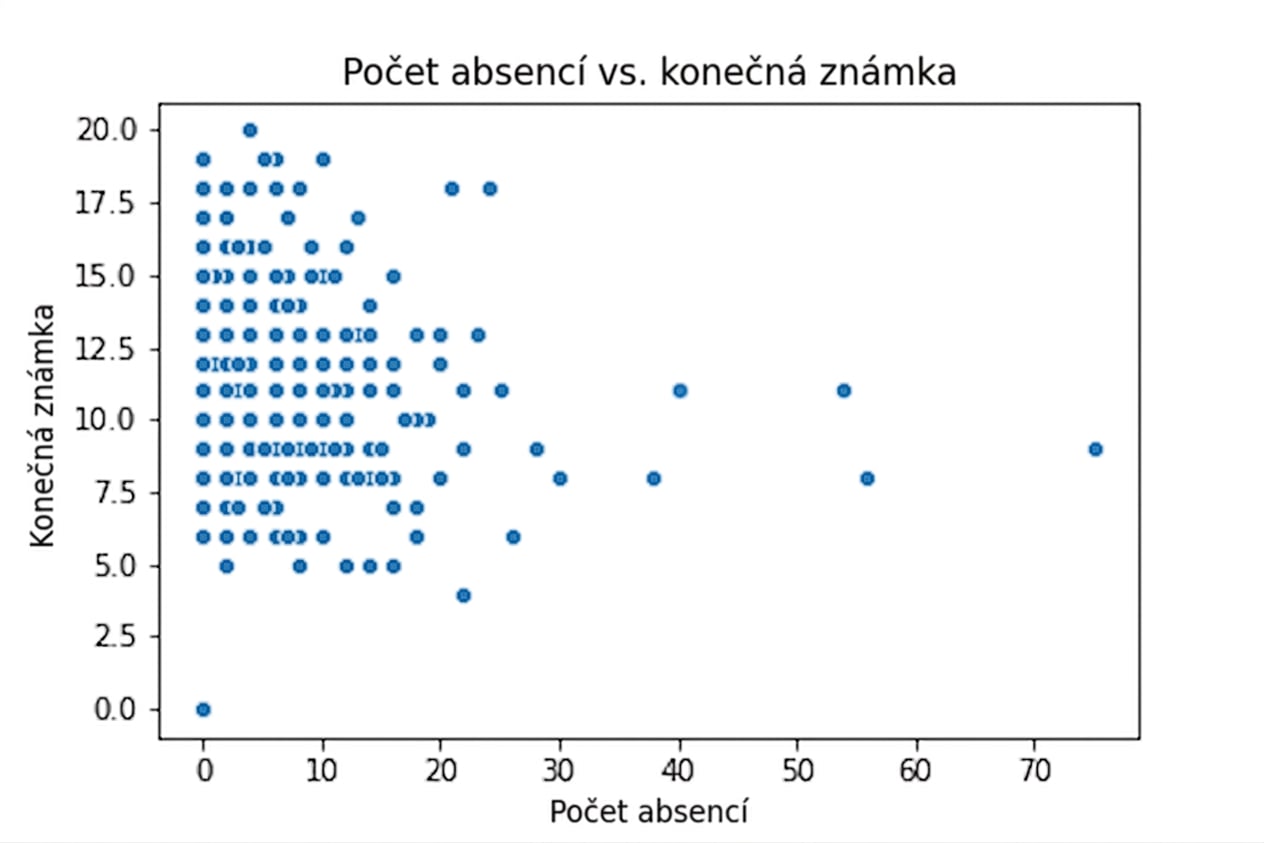
Otázky o kvantitativních proměnných
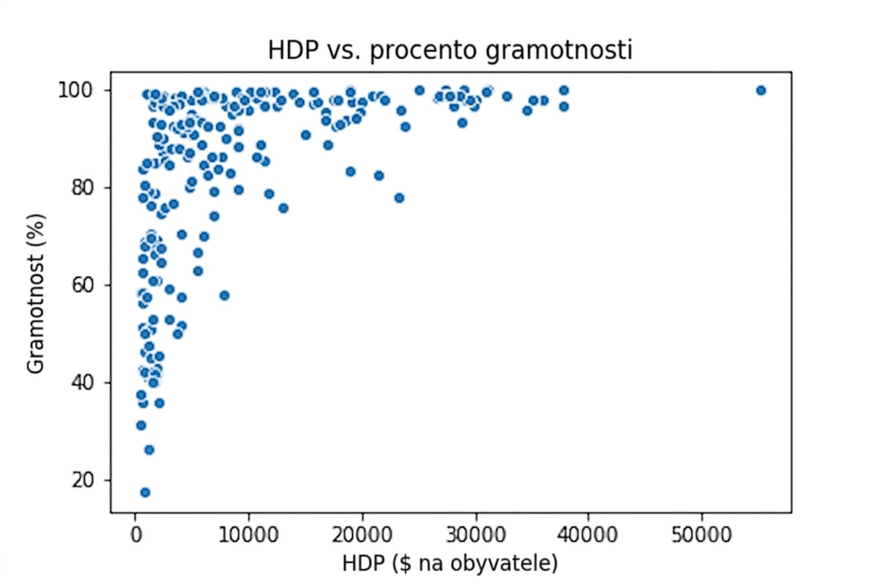
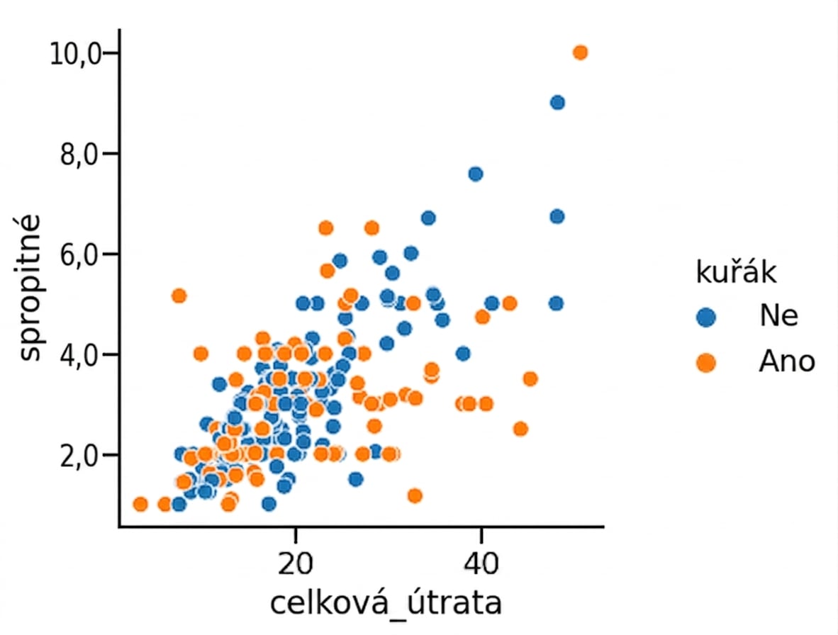
1 Waskom, M. L. (2021). seaborn: statistical data visualization. https://seaborn.pydata.org/
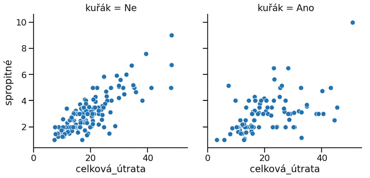
1 Waskom, M. L. (2021). seaborn: statistical data visualization. https://seaborn.pydata.org/
Podgrafy ve sloupcích
1 Waskom, M. L. (2021). seaborn: statistical data visualization. https://seaborn.pydata.org/
Podgrafy v řádcích
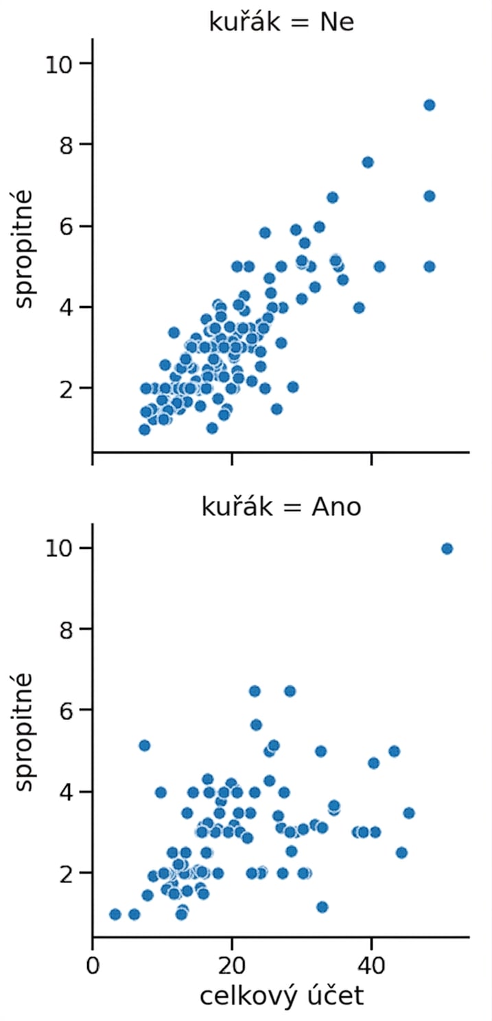
1 Waskom, M. L. (2021). seaborn: statistical data visualization. https://seaborn.pydata.org/
Podgrafy v řádcích a sloupcích
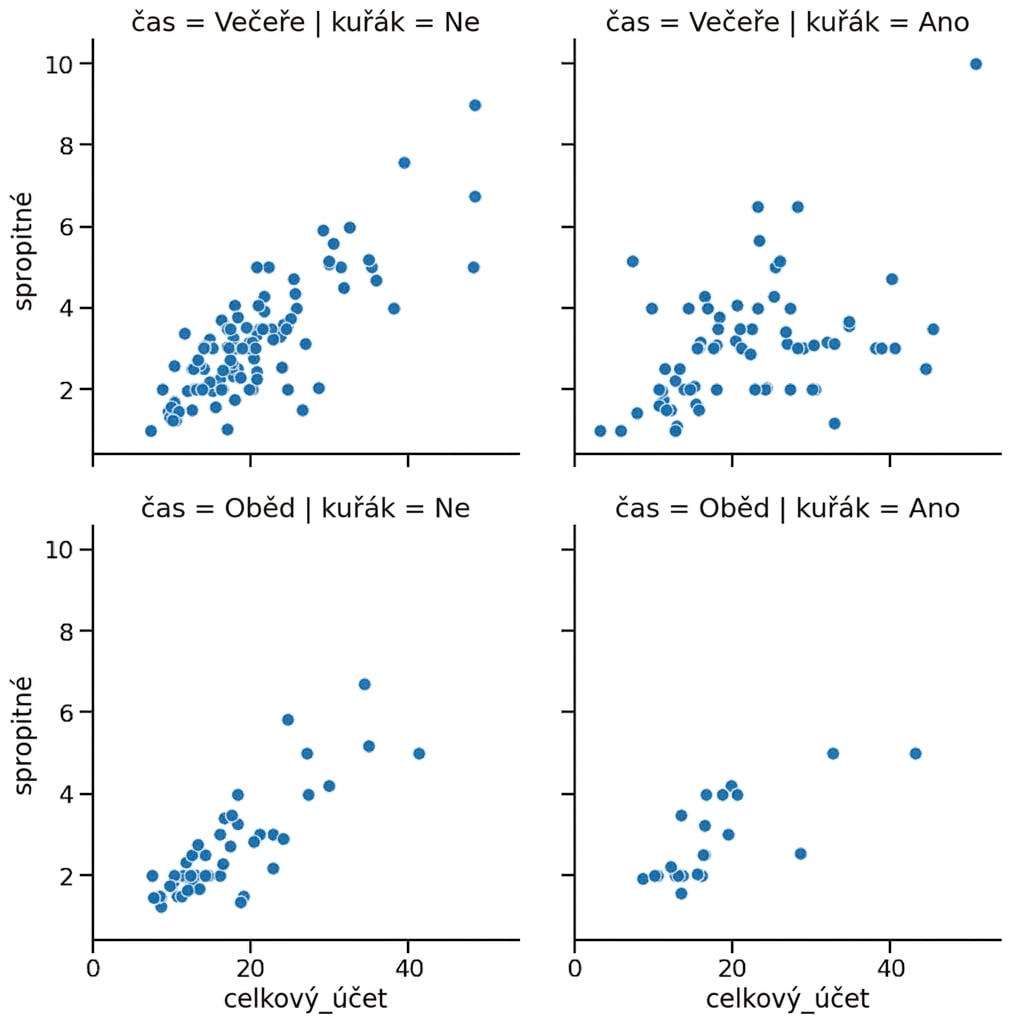
1 Waskom, M. L. (2021). seaborn: statistical data visualization. https://seaborn.pydata.org/
Podskupiny pro dny v týdnu
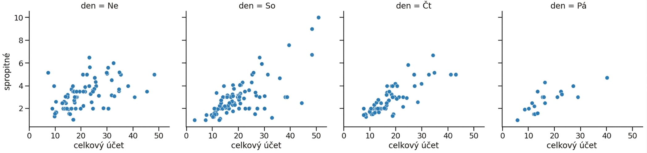
1 Waskom, M. L. (2021). seaborn: statistical data visualization. https://seaborn.pydata.org/
Zalamování sloupců
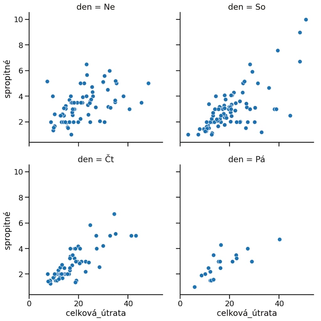
1 Waskom, M. L. (2021). seaborn: statistical data visualization. https://seaborn.pydata.org/
Řazení sloupců
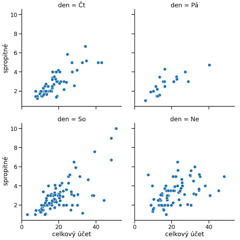
1 Waskom, M. L. (2021). seaborn: statistical data visualization. https://seaborn.pydata.org/

