Statistické grafy

Introduction to Data Visualization with Matplotlib

Ariel Rokem

Data Scientist

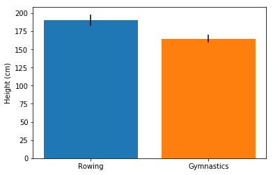
Přidání chybových úseček do sloupcových grafů

fig, ax = plt.subplots()

ax.bar("Rowing",
       mens_rowing["Height"].mean(),
       yerr=mens_rowing["Height"].std())

ax.bar("Gymnastics",
       mens_gymnastics["Height"].mean(),
       yerr=mens_gymnastics["Height"].std())

ax.set_ylabel("Height (cm)")

plt.show()
Introduction to Data Visualization with Matplotlib

Chybové úsečky ve sloupcovém grafu

Introduction to Data Visualization with Matplotlib

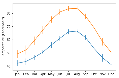
Přidání chybových úseček do grafů

fig, ax = plt.subplots()

ax.errorbar(seattle_weather["MONTH"],
            seattle_weather["MLY-TAVG-NORMAL"],
            yerr=seattle_weather["MLY-TAVG-STDDEV"])

ax.errorbar(austin_weather["MONTH"],
            austin_weather["MLY-TAVG-NORMAL"],
            yerr=austin_weather["MLY-TAVG-STDDEV"])

ax.set_ylabel("Temperature (Fahrenheit)")

plt.show()
Introduction to Data Visualization with Matplotlib

Chybové úsečky v grafech

Introduction to Data Visualization with Matplotlib

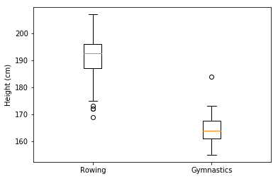
Přidání krabicových grafů

fig, ax = plt.subplots()

ax.boxplot([mens_rowing["Height"], mens_gymnastics["Height"]])
ax.set_xticklabels(["Rowing", "Gymnastics"]) ax.set_ylabel("Height (cm)") plt.show()
Introduction to Data Visualization with Matplotlib

Interpretace krabicových grafů

Introduction to Data Visualization with Matplotlib

Vyzkoušejte si to!

Introduction to Data Visualization with Matplotlib

Preparing Video For Download...