Malé násobky

Introduction to Data Visualization with Matplotlib

Ariel Rokem

Data Scientist

Přidání dat

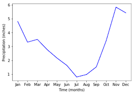
ax.plot(seattle_weather["MONTH"], 
        seattle_weather["MLY-PRCP-NORMAL"], 
        color='b')
ax.set_xlabel("Time (months)")
ax.set_ylabel("Precipitation (inches)")
plt.show()
Introduction to Data Visualization with Matplotlib

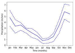
Přidání dalších dat

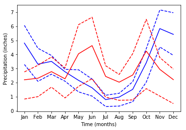
ax.plot(seattle_weather["MONTH"], seattle_weather["MLY-PRCP-25PCTL"], 
        linestyle='--', color='b')
ax.plot(seattle_weather["MONTH"], seattle_weather["MLY-PRCP-75PCTL"], 
        linestyle='--', color=color)
plt.show()
Introduction to Data Visualization with Matplotlib

A ještě více dat

ax.plot(austin_weather["MONTH"], austin_weather["MLY-PRCP-NORMAL"],
        color='r')
ax.plot(austin_weather["MONTH"], austin_weather["MLY-PRCP-25PCTL"], 
        linestyle='--', color='r')
ax.plot(austin_weather["MONTH"], austin_weather["MLY-PRCP-75PCTL"], 
        linestyle='--', color='r')
plt.show()
Introduction to Data Visualization with Matplotlib

Příliš mnoho dat!

Introduction to Data Visualization with Matplotlib

Malé násobky s plt.subplots

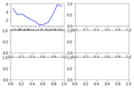
fig, ax = plt.subplots()
fig, ax = plt.subplots(3, 2)

plt.show()

Introduction to Data Visualization with Matplotlib

Přidání dat do podgrafů

ax.shape
(3, 2)
ax[0, 0].plot(seattle_weather["MONTH"], 
              seattle_weather["MLY-PRCP-NORMAL"], 
              color='b')

plt.show()

Introduction to Data Visualization with Matplotlib

Podgrafy s daty

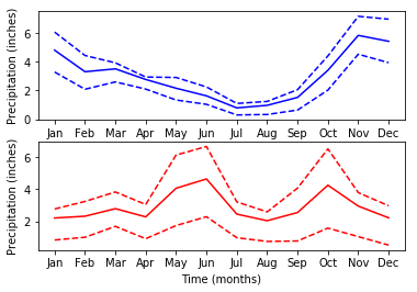
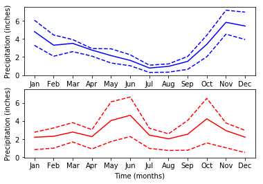
fig, ax = plt.subplots(2, 1)

ax[0].plot(seattle_weather["MONTH"], seattle_weather["MLY-PRCP-NORMAL"], color='b') ax[0].plot(seattle_weather["MONTH"], seattle_weather["MLY-PRCP-25PCTL"], linestyle='--', color='b') ax[0].plot(seattle_weather["MONTH"], seattle_weather["MLY-PRCP-75PCTL"], linestyle='--', color='b')
ax[1].plot(austin_weather["MONTH"], austin_weather["MLY-PRCP-NORMAL"], color='r') ax[1].plot(austin_weather["MONTH"], austin_weather["MLY-PRCP-25PCTL"], linestyle='--', color='r') ax[1].plot(austin_weather["MONTH"], austin_weather["MLY-PRCP-75PCTL"], linestyle='--', color='r')
ax[0].set_ylabel("Precipitation (inches)") ax[1].set_ylabel("Precipitation (inches)")
ax[1].set_xlabel("Time (months)")
plt.show()
Introduction to Data Visualization with Matplotlib

Podgrafy s daty

Introduction to Data Visualization with Matplotlib

Sdílení rozsahu osy y

fig, ax = plt.subplots(2, 1, sharey=True)
Introduction to Data Visualization with Matplotlib

Procvičte tvorbu podgrafů!

Introduction to Data Visualization with Matplotlib

Preparing Video For Download...