Kvantitativní srovnání: bodové grafy

Introduction to Data Visualization with Matplotlib

Ariel Rokem

Data Scientist

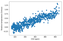
Úvod do bodových grafů

fig, ax = plt.subplots()

ax.scatter(climate_change["co2"], climate_change["relative_temp"])
ax.set_xlabel("CO2 (ppm)") ax.set_ylabel("Relative temperature (Celsius)") plt.show()
Introduction to Data Visualization with Matplotlib

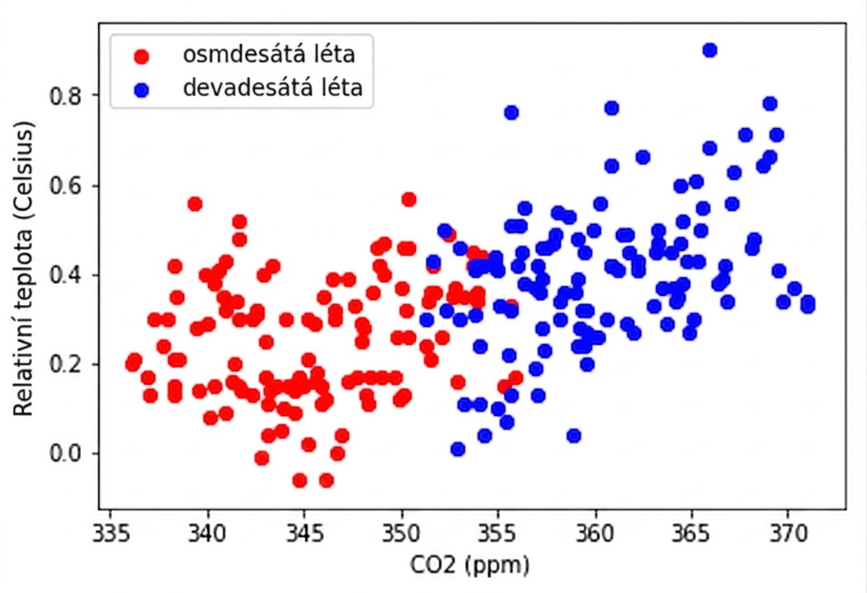
Přizpůsobení bodových grafů

eighties = climate_change["1980-01-01":"1989-12-31"]
nineties = climate_change["1990-01-01":"1999-12-31"]

fig, ax = plt.subplots()
ax.scatter(eighties["co2"], eighties["relative_temp"], color="red", label="eighties")
ax.scatter(nineties["co2"], nineties["relative_temp"], color="blue", label="nineties")
ax.legend() ax.set_xlabel("CO2 (ppm)") ax.set_ylabel("Relative temperature (Celsius)") plt.show()
Introduction to Data Visualization with Matplotlib

Kódování srovnání barvou

Introduction to Data Visualization with Matplotlib

Kódování třetí proměnné barvou

fig, ax = plt.subplots()

ax.scatter(climate_change["co2"], climate_change["relative_temp"], c=climate_change.index)
ax.set_xlabel("CO2 (ppm)") ax.set_ylabel("Relative temperature (Celsius)") plt.show()
Introduction to Data Visualization with Matplotlib

Kódování času barvou

Introduction to Data Visualization with Matplotlib

Procvičte si tvorbu bodových grafů!

Introduction to Data Visualization with Matplotlib

Preparing Video For Download...