Wprowadzenie do wizualizacji danych z Matplotlib
Ariel Rokem
Data Scientist
,Gold, Silver, Bronze
United States, 137, 52, 67
Germany, 47, 43, 67
Great Britain, 64, 55, 26
Russia, 50, 28, 35
China, 44, 30, 35
France, 20, 55, 21
Australia, 23, 34, 25
Italy, 8, 38, 24
Canada, 4, 4, 61
Japan, 17, 13, 34
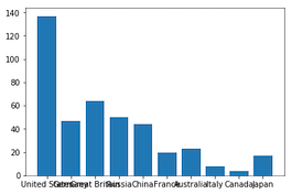
medals = pd.read_csv('medals_by_country_2016.csv', index_col=0)fig, ax = plt.subplots()ax.bar(medals.index, medals["Gold"]) plt.show()
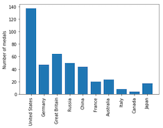
fig, ax = plt.subplots() ax.bar(medals.index, medals["Gold"])ax.set_xticklabels(medals.index, rotation=90) ax.set_ylabel("Number of medals")plt.show()
fig, ax = plt.subplots ax.bar(medals.index, medals["Gold"])ax.bar(medals.index, medals["Silver"], bottom=medals["Gold"])ax.set_xticklabels(medals.index, rotation=90) ax.set_ylabel("Number of medals") plt.show()
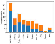
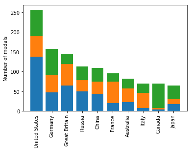
fig, ax = plt.subplots ax.bar(medals.index, medals["Gold"]) ax.bar(medals.index, medals["Silver"], bottom=medals["Gold"])ax.bar(medals.index, medals["Bronze"], bottom=medals["Gold"] + medals["Silver"])ax.set_xticklabels(medals.index, rotation=90) ax.set_ylabel("Number of medals") plt.show()

fig, ax = plt.subplots
ax.bar(medals.index, medals["Gold"])
ax.bar(medals.index, medals["Silver"], bottom=medals["Gold"])
ax.bar(medals.index, medals["Bronze"],
bottom=medals["Gold"] + medals["Silver"])
ax.set_xticklabels(medals.index, rotation=90)
ax.set_ylabel("Number of medals")
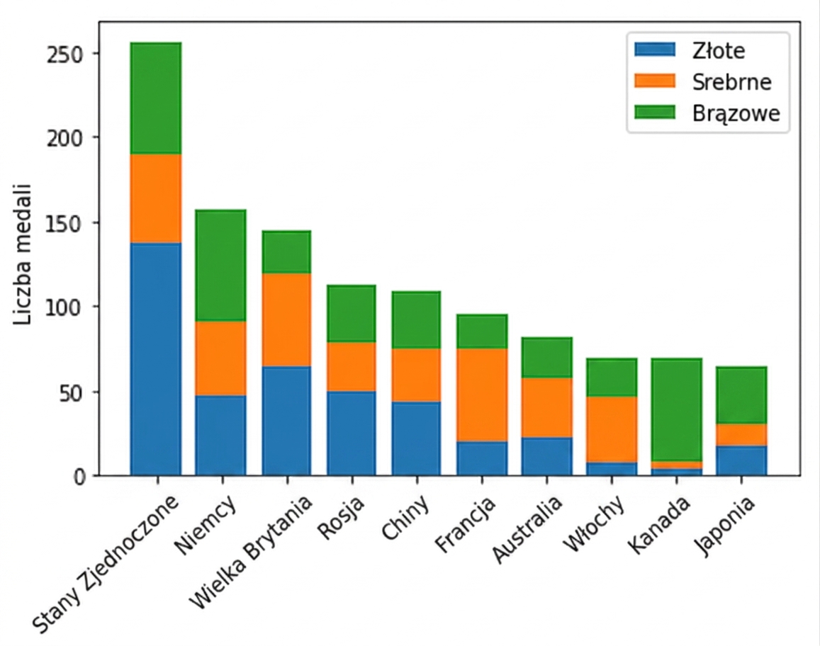
fig, ax = plt.subplots ax.bar(medals.index, medals["Gold"], label="Gold") ax.bar(medals.index, medals["Silver"], bottom=medals["Gold"], label="Silver") ax.bar(medals.index, medals["Bronze"], bottom=medals["Gold"] + medals["Silver"], label="Bronze") ax.set_xticklabels(medals.index, rotation=90) ax.set_ylabel("Number of medals")ax.legend() plt.show()

Wprowadzenie do wizualizacji danych z Matplotlib