Wprowadzenie do Pythona dla finansów
Adina Howe
Professor
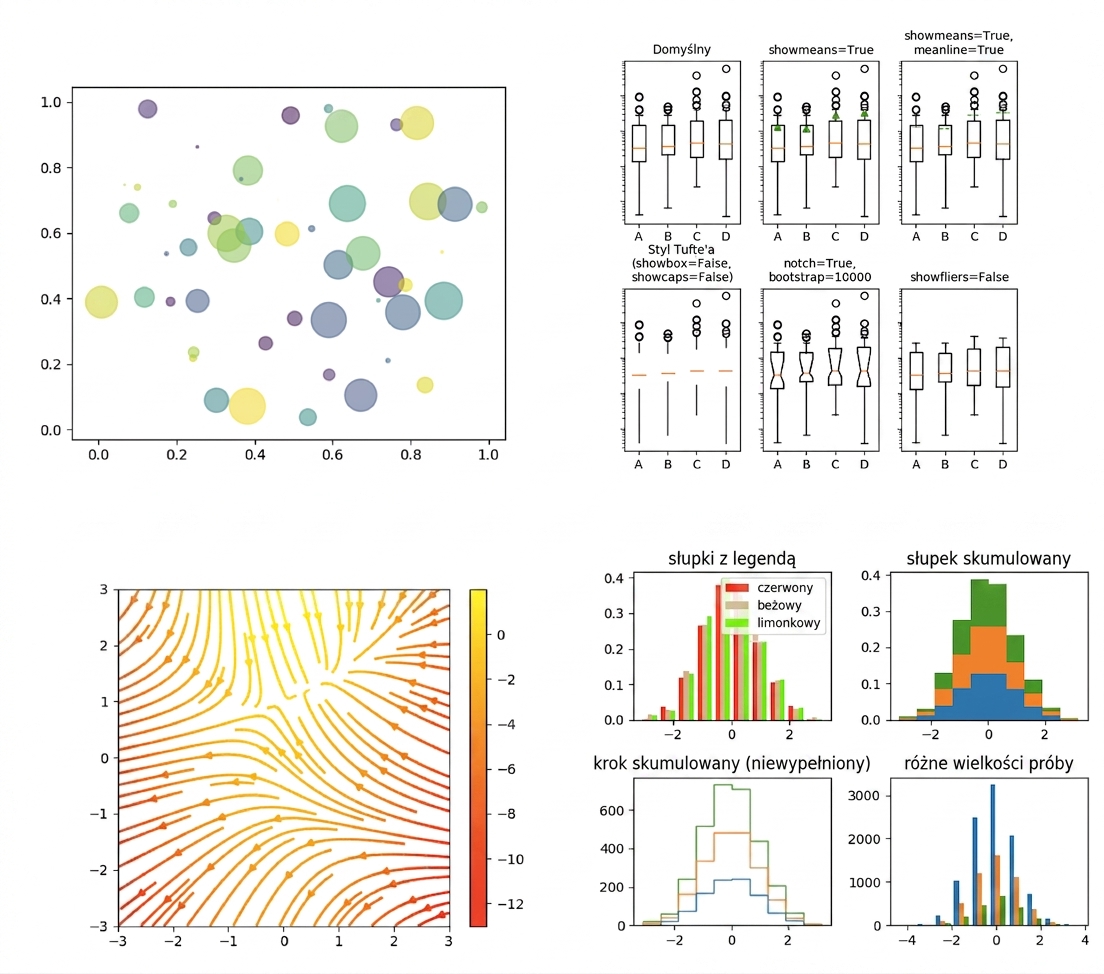
Galeria Matplotlib dostępna jest pod tym linkiem.
import matplotlib.pyplot as plt
plt.plot()
plt.show()
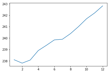
import matplotlib.pyplot as plt
plt.plot(months, prices)
plt.show()

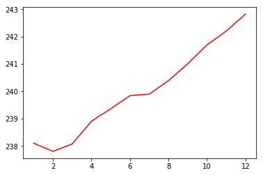
import matplotlib.pyplot as plt
plt.plot(months, prices, color = 'red')
plt.show()

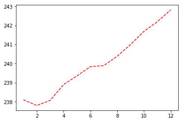
import matplotlib.pyplot as plt
plt.plot(months, prices, color = 'red', linestyle = '--')
plt.show()

| color | |
|---|---|
| 'green' | zielony |
| 'red' | czerwony |
| 'cyan' | cyjan |
| 'blue' | niebieski |
| linestyle | |
|---|---|
| '-' | linia ciągła |
| '--' | linia przerywana |
| '-.' | linia przerywana z kropką |
| ':' | linia kropkowana |
Więcej informacji o kolorach i liniach znajdziesz tutaj.
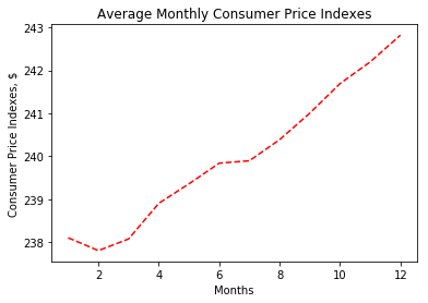
import matplotlib.pyplot as plt
plt.plot(months, prices, color = 'red', linestyle = '--')
# Add labels
plt.xlabel('Months')
plt.ylabel('Consumer Price Indexes, $')
plt.title('Average Monthly Consumer Price Indexes')
# Show plot
plt.show()

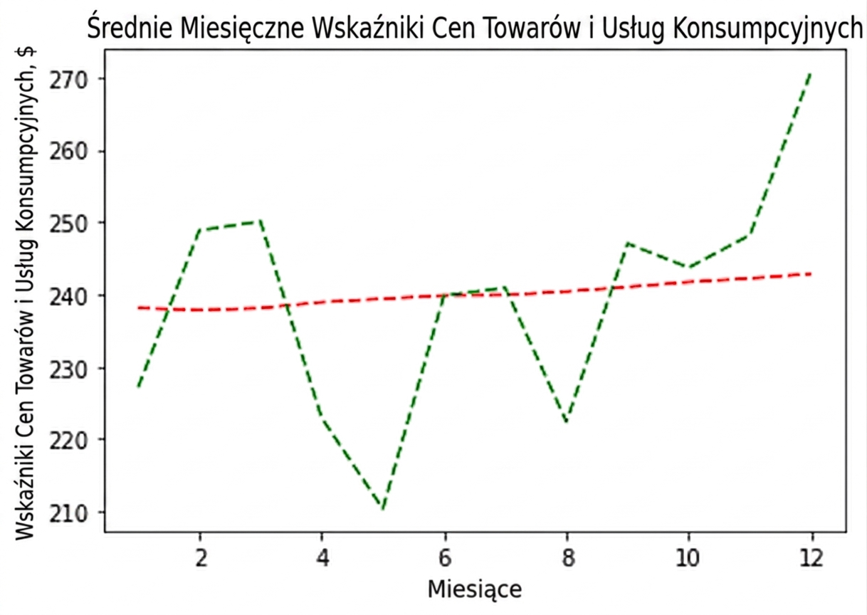
import matplotlib.pyplot as plt
plt.plot(months, prices, color = 'red', linestyle = '--')
# adding an additional line
plt.plot(months, prices_new, color = 'green', linestyle = '--')
plt.xlabel('Months')
plt.ylabel('Consumer Price Indexes, $')
plt.title('Average Monthly Consumer Price Indexes')
plt.show()

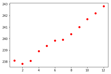
import matplotlib.pyplot as plt
plt.scatter(x = months, y = prices, color = 'red')
plt.show()

Wprowadzenie do Pythona dla finansów