Wykresy i figury Plotly
Tworzenie dashboardów z Dash i Plotly

Alex Scriven
Data Scientist
Plotly i Dash
Nasze dane e-commerce

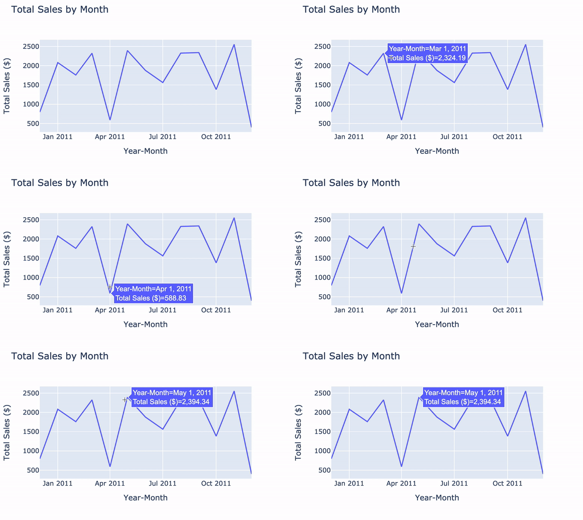
Wykresy liniowe z plotly.express
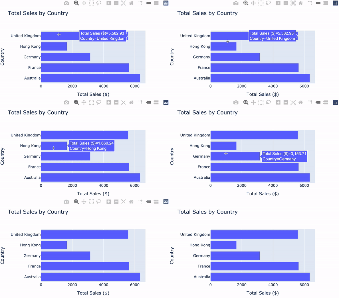
Wykresy słupkowe z plotly.express
Dostosowywanie wykresów Plotly

Tworzenie dashboardów z Dash i Plotly
Alex Scriven
Data Scientist

