Wizualizacja danych szeregów czasowych w Pythonie
Thomas Vincent
Head of Data Science, Getty Images
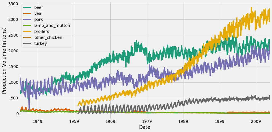
Na tym wykresie domyślny schemat kolorów matplotlib przypisuje ten sam kolor do szeregów czasowych beef i turkey.
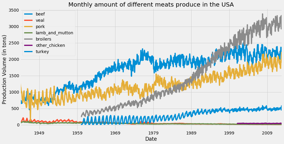
ax = df.plot(colormap='Dark2', figsize=(14, 7))
ax.set_xlabel('Date')
ax.set_ylabel('Production Volume (in tons)')
plt.show()
Pełna lista dostępnych map kolorów znajduje się tutaj.

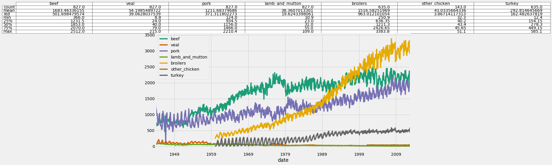
ax = df.plot(colormap='Dark2', figsize=(14, 7))df_summary = df.describe() # Specify values of cells in the table ax.table(cellText=df_summary.values, # Specify width of the table colWidths=[0.3]*len(df.columns), # Specify row labels rowLabels=df_summary.index, # Specify column labels colLabels=df_summary.columns, # Specify location of the table loc='top') plt.show()


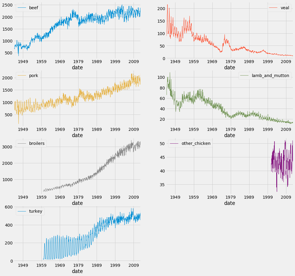
df.plot(subplots=True,
linewidth=0.5,
layout=(2, 4),
figsize=(16, 10),
sharex=False,
sharey=False)
plt.show()

Wizualizacja danych szeregów czasowych w Pythonie