Modelowanie z tidymodels w R
David Svancer
Data Scientist
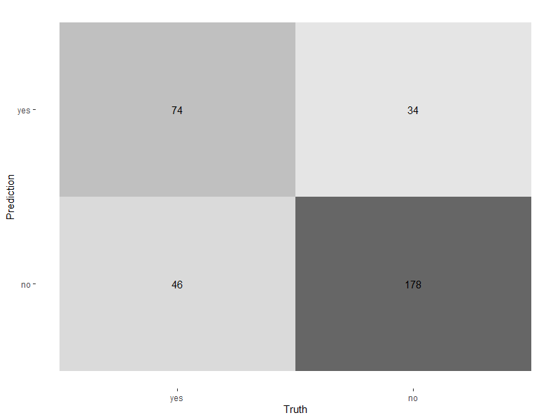
Mapa cieplna z autoplot()
autoplot()type na 'heatmap'
conf_mat(leads_results, truth = purchased, estimate = .pred_class) %>%autoplot(type = 'heatmap')

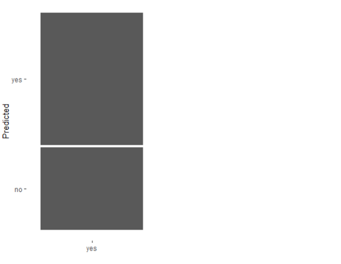
Mozaika z autoplot()
type na 'mosaic'
conf_mat(leads_results,
truth = purchased,
estimate = .pred_class) %>%
autoplot(type = 'mosaic')

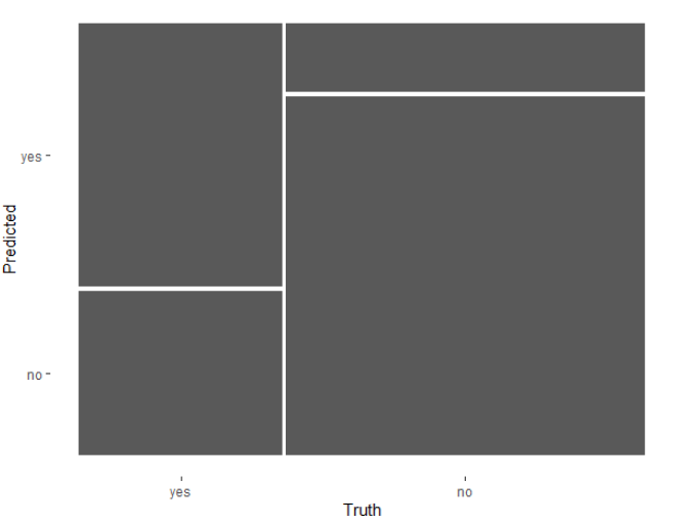
Mozaika z autoplot()
type na 'mosaic'conf_mat(leads_results,
truth = purchased,
estimate = .pred_class) %>%
autoplot(type = 'mosaic')

Domyślny próg prawdopodobieństwa w klasyfikacji binarnej wynosi 0,5
leads_results
.pred_yes jest większe lub równe 0,5, funkcja predict() w tidymodels ustawia .pred_class na 'yes'leads_results
# A tibble: 332 x 4
purchased .pred_class .pred_yes .pred_no
<fct> <fct> <dbl> <dbl>
1 no no 0.134 0.866
2 yes yes 0.729 0.271
3 no no 0.133 0.867
4 no no 0.0916 0.908
5 yes yes 0.598 0.402
6 no no 0.128 0.872
7 yes no 0.112 0.888
8 no no 0.169 0.831
9 no no 0.158 0.842
10 yes yes 0.520 0.480
# ... with 322 more rows
Jak model klasyfikacji działa dla różnych progów?
.pred_yes wyników zbioru testowego
| próg | swoistość | czułość |
|---|---|---|
| 0 | 0 | 1 |
| 0,11 | 0,01 | 0,98 |
| 0,15 | 0,05 | 0,97 |
| ... | ... | ... |
| 0,84 | 0,89 | 0,08 |
| 0,87 | 0,94 | 0,02 |
| 0,91 | 0,99 | 0 |
| 1 | 1 | 0 |
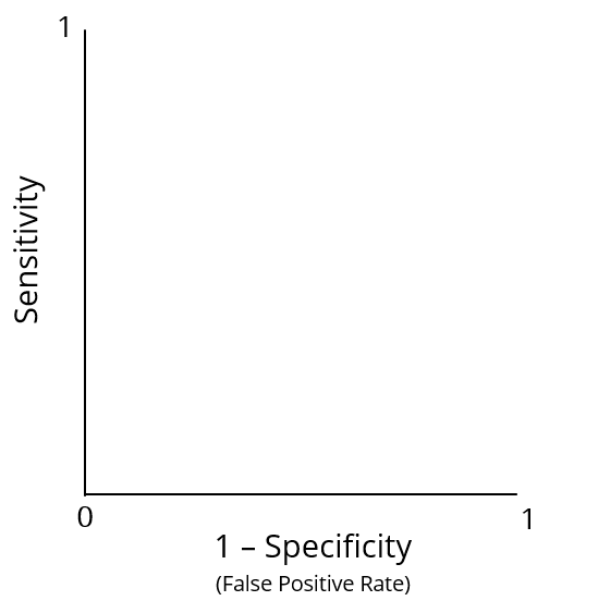
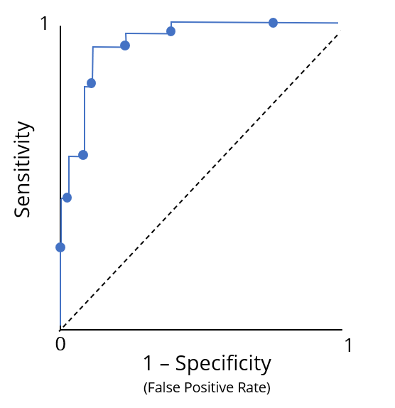
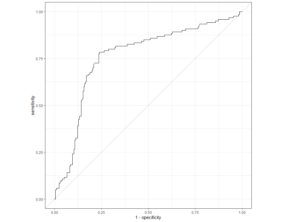
Krzywa charakterystyki operacyjnej odbiornika (ROC)

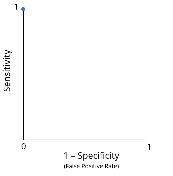
Optymalna wydajność odpowiada punktowi (0, 1)
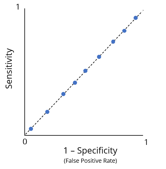
Słaba wydajność

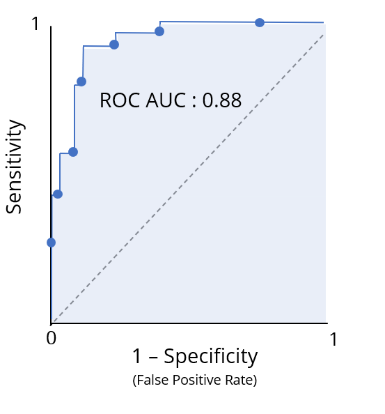
Pole pod krzywą ROC (ROC AUC) ujmuje informacje z krzywej ROC w jednej liczbie
Przydatna interpretacja jako ocena klasyfikacji

Funkcja roc_curve()
truth z rzeczywistymi kategoriami wyników.pred_yes w tibble leads_results
.pred_yesleads_results %>%
roc_curve(truth = purchased, .pred_yes)
# A tibble: 331 x 3
.threshold specificity sensitivity
<dbl> <dbl> <dbl>
1 -Inf 0 1
2 0.0871 0 1
3 0.0888 0.00472 1
4 0.0893 0.00943 1
5 0.0896 0.0142 1
6 0.0902 0.0142 0.992
7 0.0916 0.0142 0.983
8 0.0944 0.0189 0.983
# ... with 323 more rows
Przekazanie wyników roc_curve() do funkcji autoplot() generuje wykres krzywej ROC
leads_results %>%
roc_curve(truth = purchased, .pred_yes) %>%
autoplot()

Funkcja roc_auc() z pakietu yardstick oblicza ROC AUC
truthroc_auc(leads_results,
truth = purchased,
.pred_yes)
# A tibble: 1 x 3
.metric .estimator .estimate
<chr> <chr> <dbl>
1 roc_auc binary 0.763
Modelowanie z tidymodels w R