点图
Seaborn 数据可视化入门

Content Team
DataCamp
什么是点图?
1 Waskom, M. L. (2021). seaborn: statistical data visualization. https://seaborn.pydata.org/
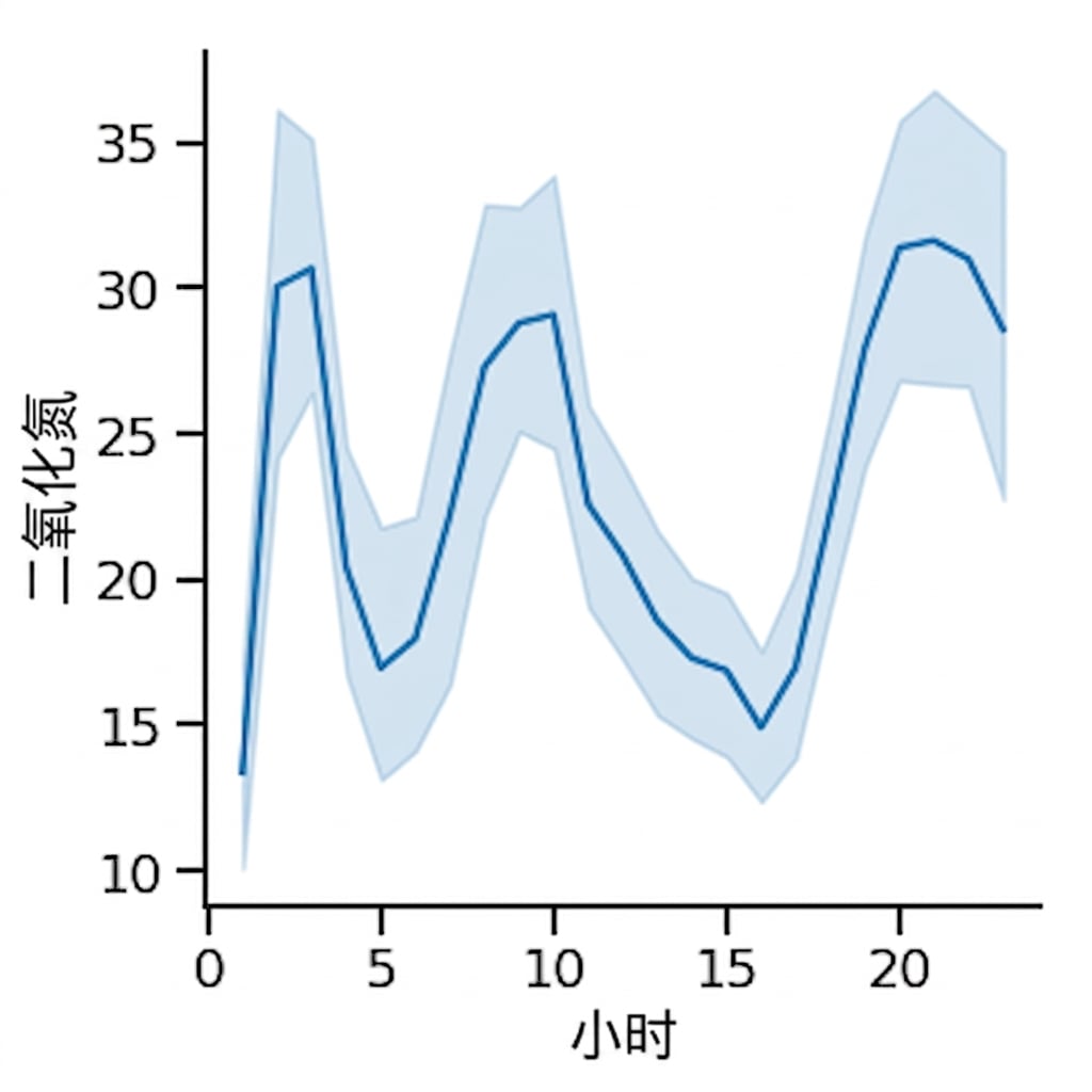
折线图:二氧化氮随时间的平均水平
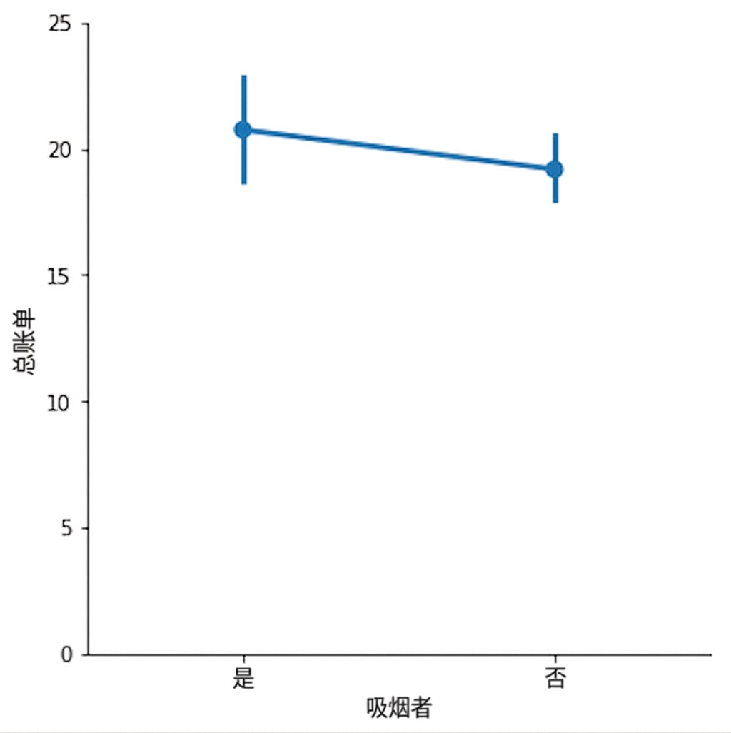
点图:吸烟者与非吸烟者的平均餐厅账单
1 Waskom, M. L. (2021). seaborn: statistical data visualization. https://seaborn.pydata.org/
点图 vs. 条形图
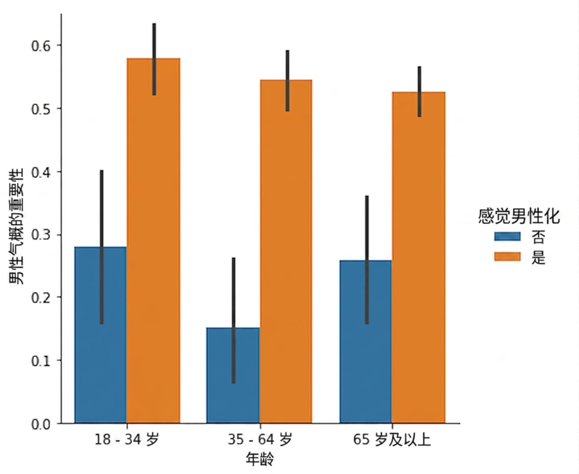
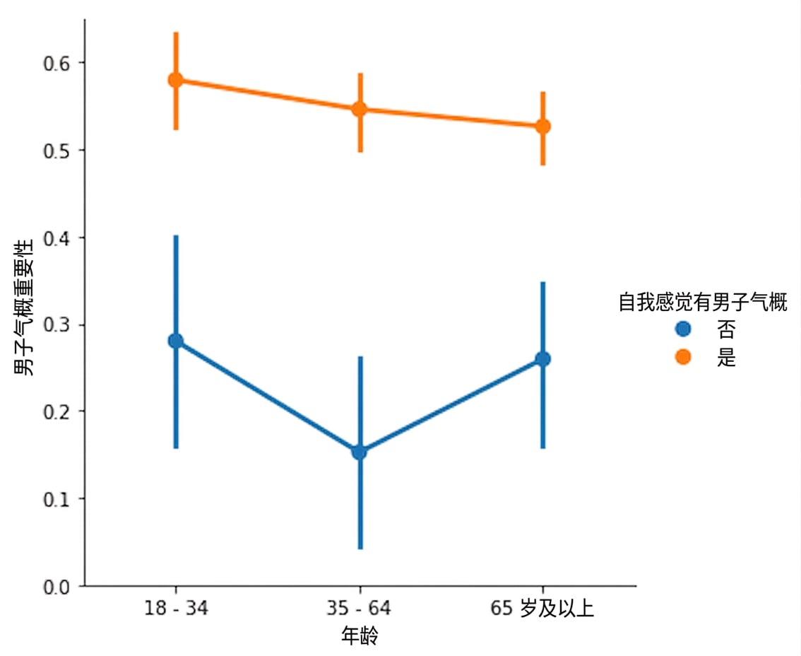
创建点图
断开点的连线
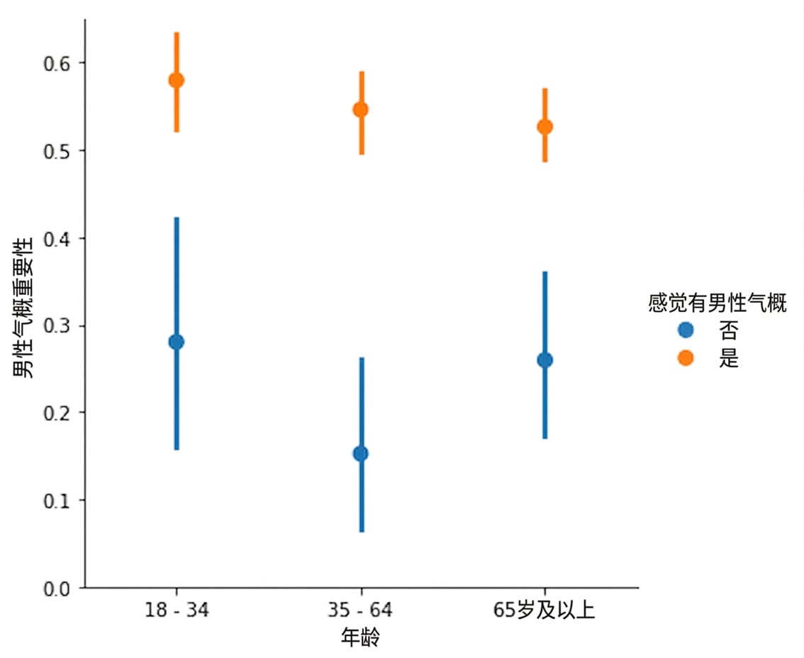
显示中位数
1 Waskom, M. L. (2021). seaborn: statistical data visualization. https://seaborn.pydata.org/
显示中位数

1 Waskom, M. L. (2021). seaborn: statistical data visualization. https://seaborn.pydata.org/
自定义置信区间
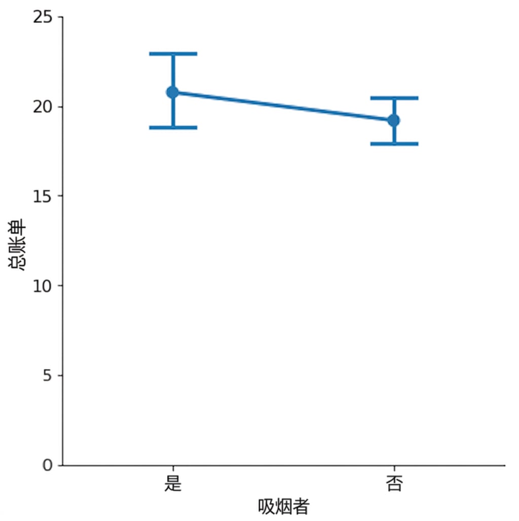
1 Waskom, M. L. (2021). seaborn: statistical data visualization. https://seaborn.pydata.org/
关闭置信区间
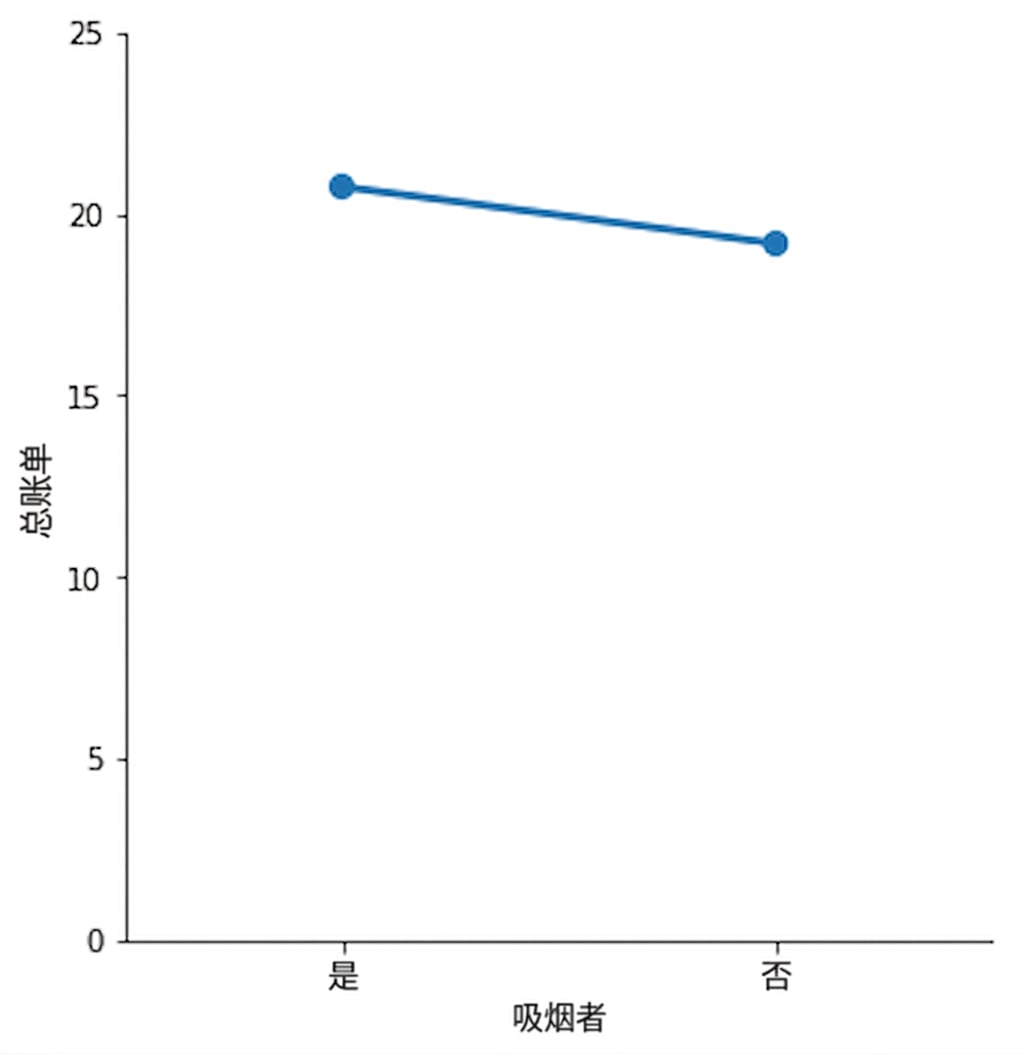
1 Waskom, M. L. (2021). seaborn: statistical data visualization. https://seaborn.pydata.org/

