Seaborn 简介

Seaborn 数据可视化入门

Content Team

DataCamp

什么是 Seaborn?
  • Python 数据可视化库
  • 轻松创建常见图表类型

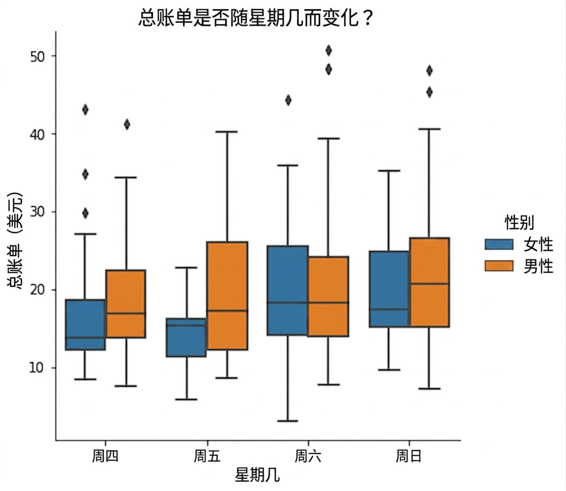
按周几的总账单箱线图,按男女分组

1 Waskom, M. L. (2021). seaborn: statistical data visualization. https://seaborn.pydata.org/
Seaborn 数据可视化入门

为什么 Seaborn 有用?

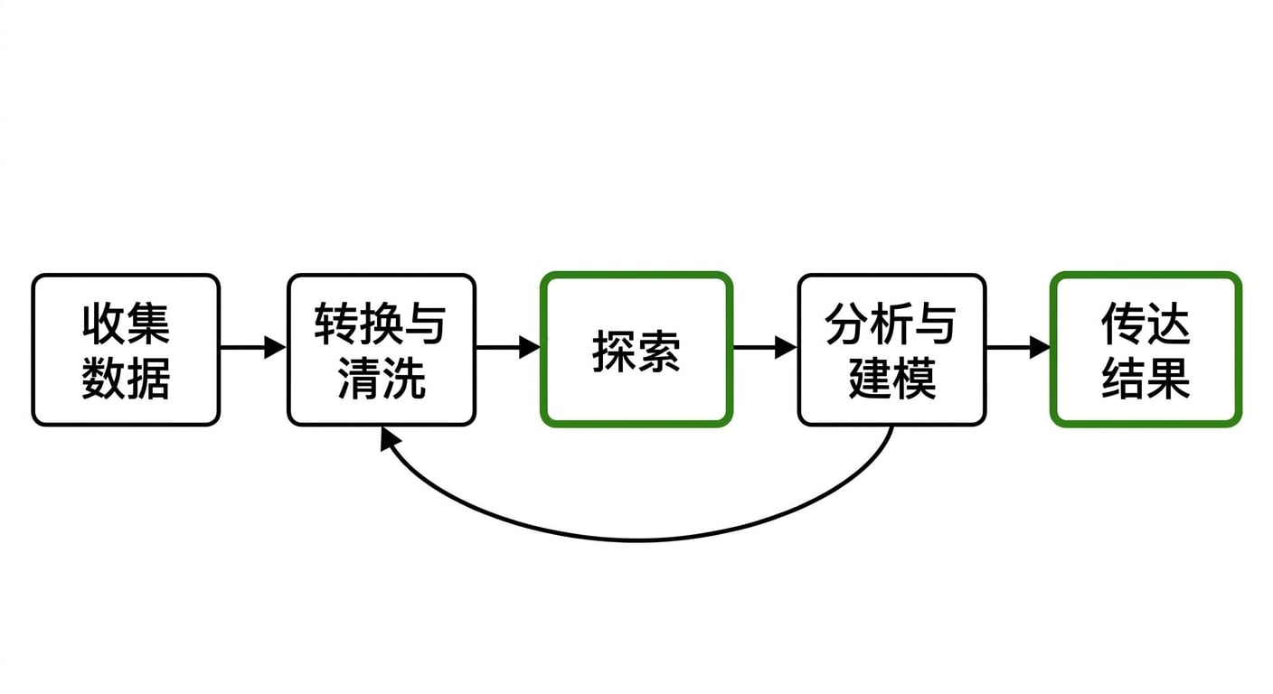
数据分析工作流示意图

Seaborn 数据可视化入门

Seaborn 的优点

  • 易用
  • pandas 数据结构配合良好
  • 构建于 matplotlib 之上
Seaborn 数据可视化入门

开始使用

import seaborn as sns

import matplotlib.pyplot as plt

Samuel Norman Seaborn(sns

  • 电视剧《白宫风云》
Seaborn 数据可视化入门

示例 1:散点图

import seaborn as sns
import matplotlib.pyplot as plt

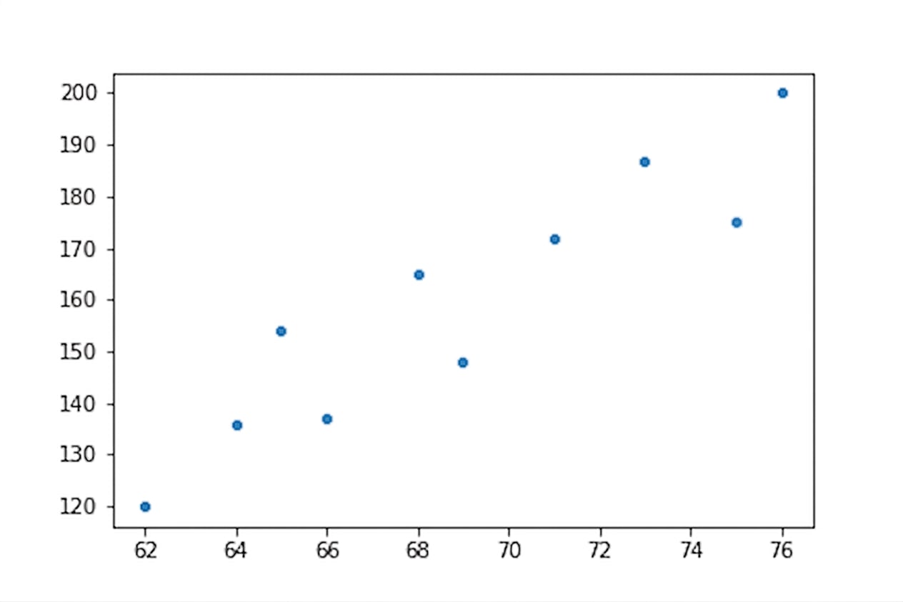
height = [62, 64, 69, 75, 66, 68, 65, 71, 76, 73] weight = [120, 136, 148, 175, 137, 165, 154, 172, 200, 187]
sns.scatterplot(x=height, y=weight)
plt.show()

身高与体重的散点图

Seaborn 数据可视化入门

示例 2:创建计数图

import seaborn as sns
import matplotlib.pyplot as plt

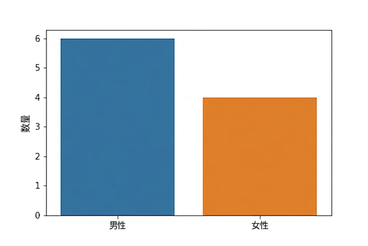
gender = ["Female", "Female", "Female", "Female", "Male", "Male", "Male", "Male", "Male", "Male"]
sns.countplot(x=gender)
plt.show()

性别计数图

Seaborn 数据可视化入门

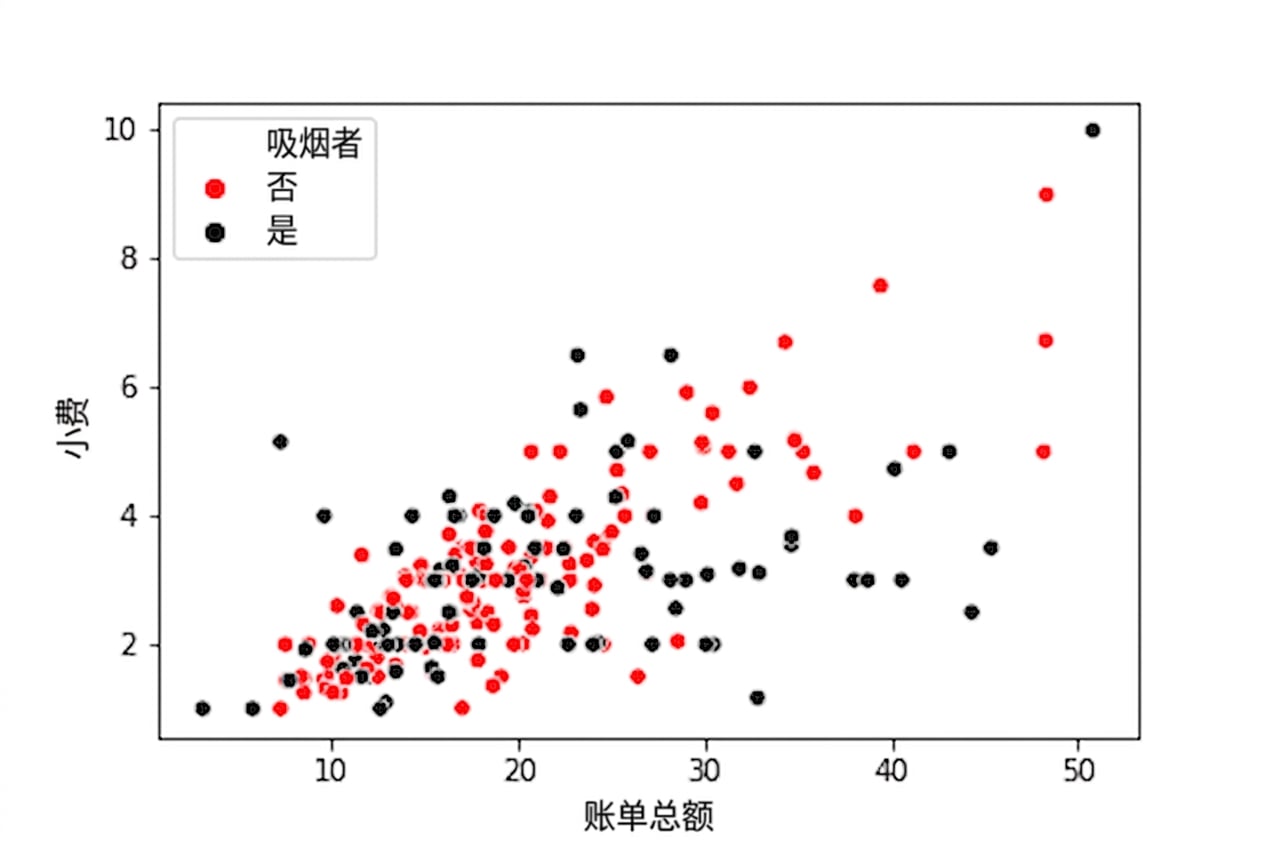
使用黑色和红色色相的散点图

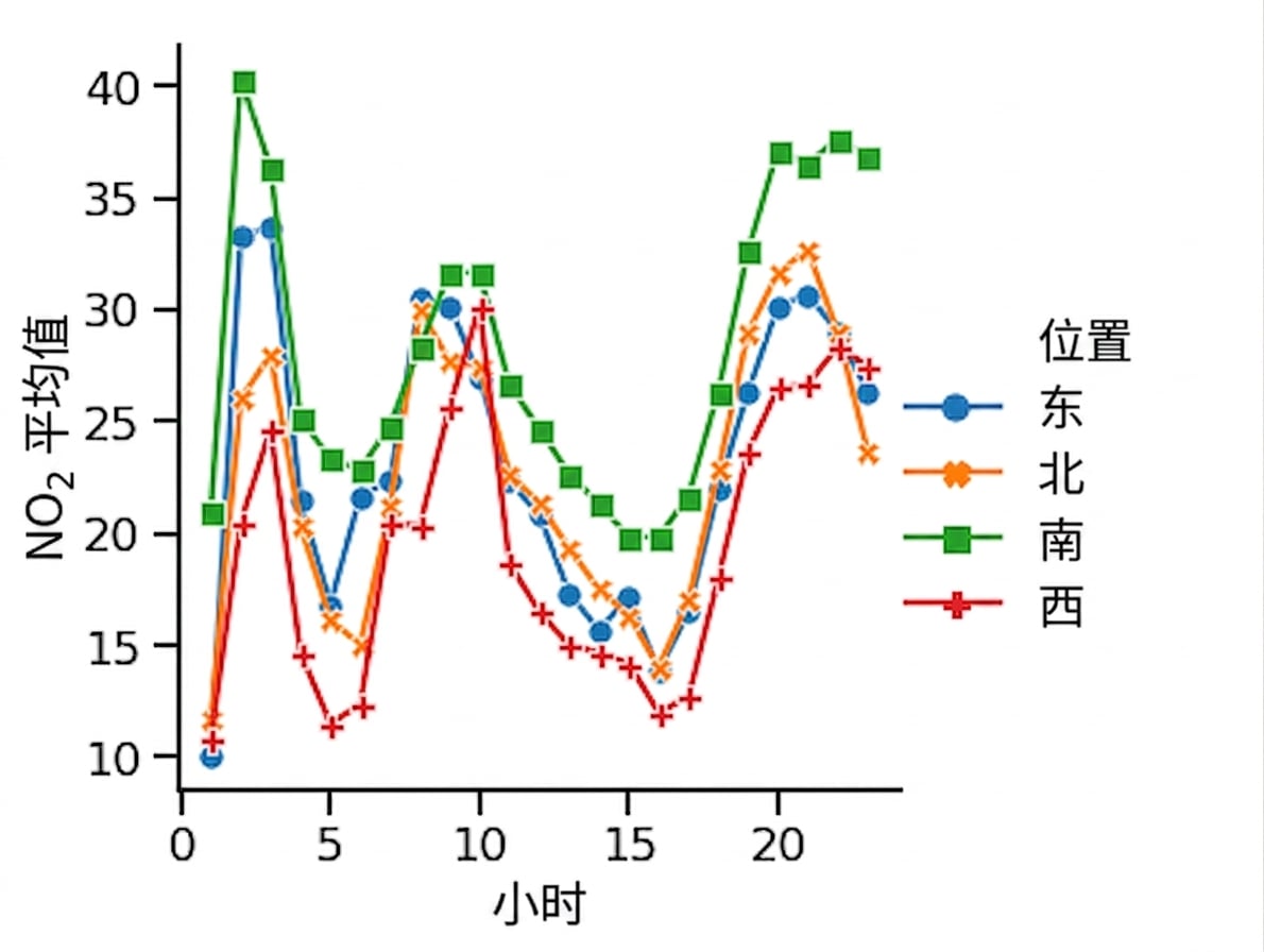
带标记和实线的折线图

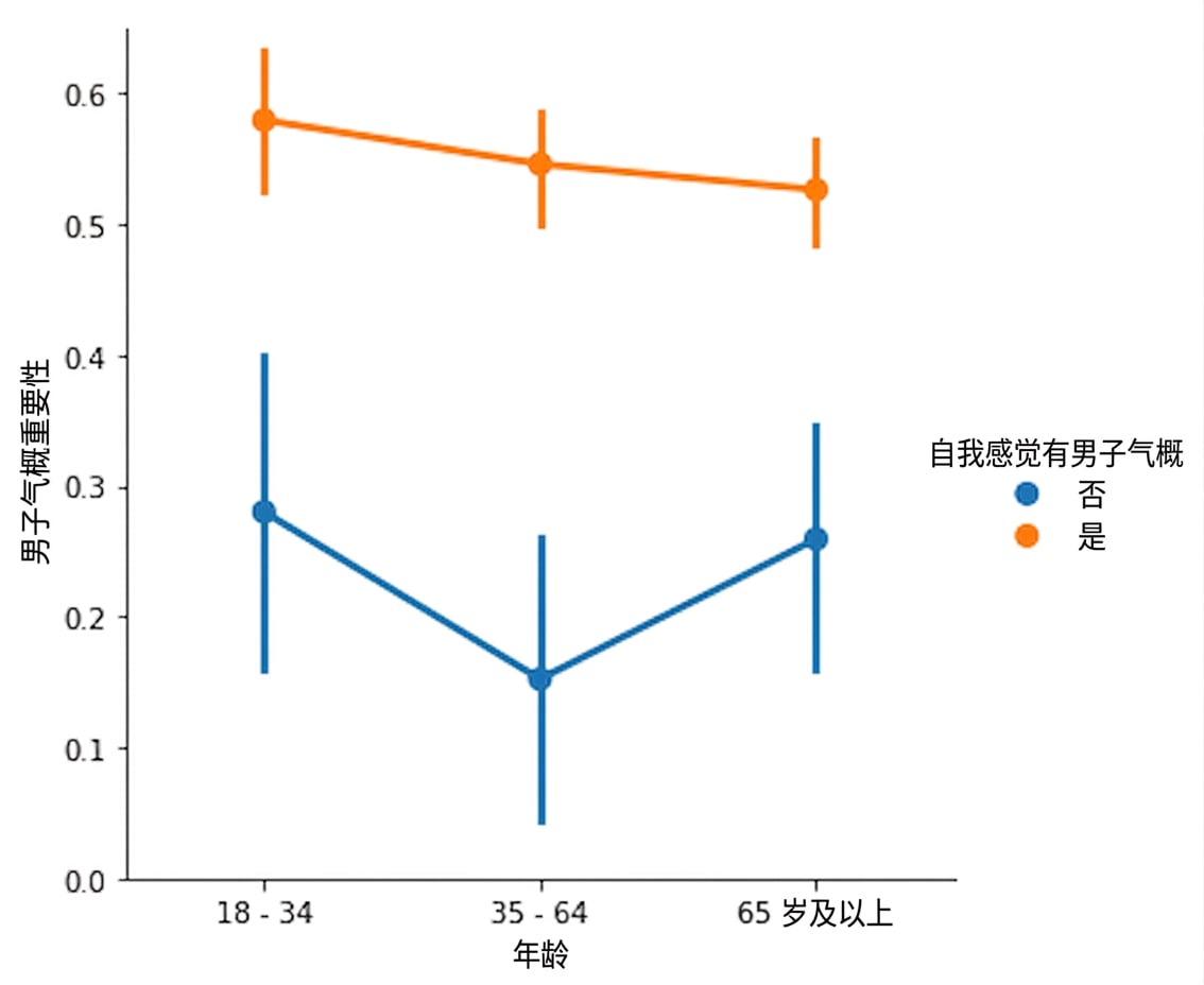
带色相的男性气质点图

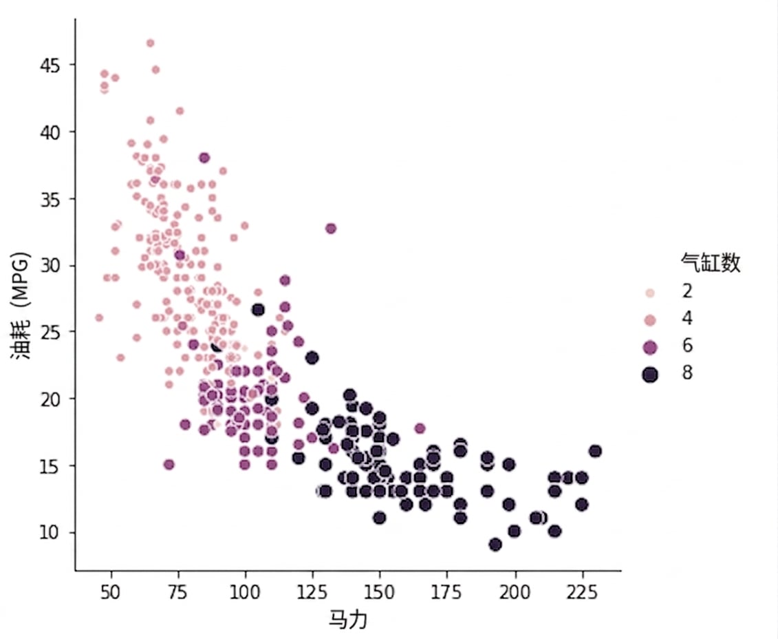
马力与 mpg 的散点图,顺序调色板

1 Waskom, M. L. (2021). seaborn: statistical data visualization. https://seaborn.pydata.org/
Seaborn 数据可视化入门

让我们练习!

Seaborn 数据可视化入门

Preparing Video For Download...