计数图与条形图
Seaborn 数据可视化入门

Content Team
DataCamp
分类图
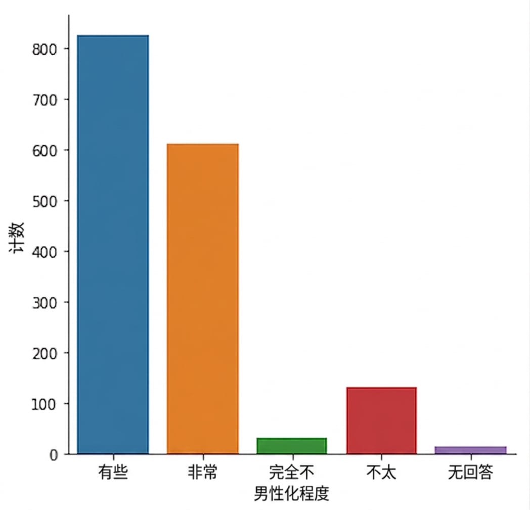
countplot() 与 catplot()
countplot() 与 catplot()
更改顺序

条形图
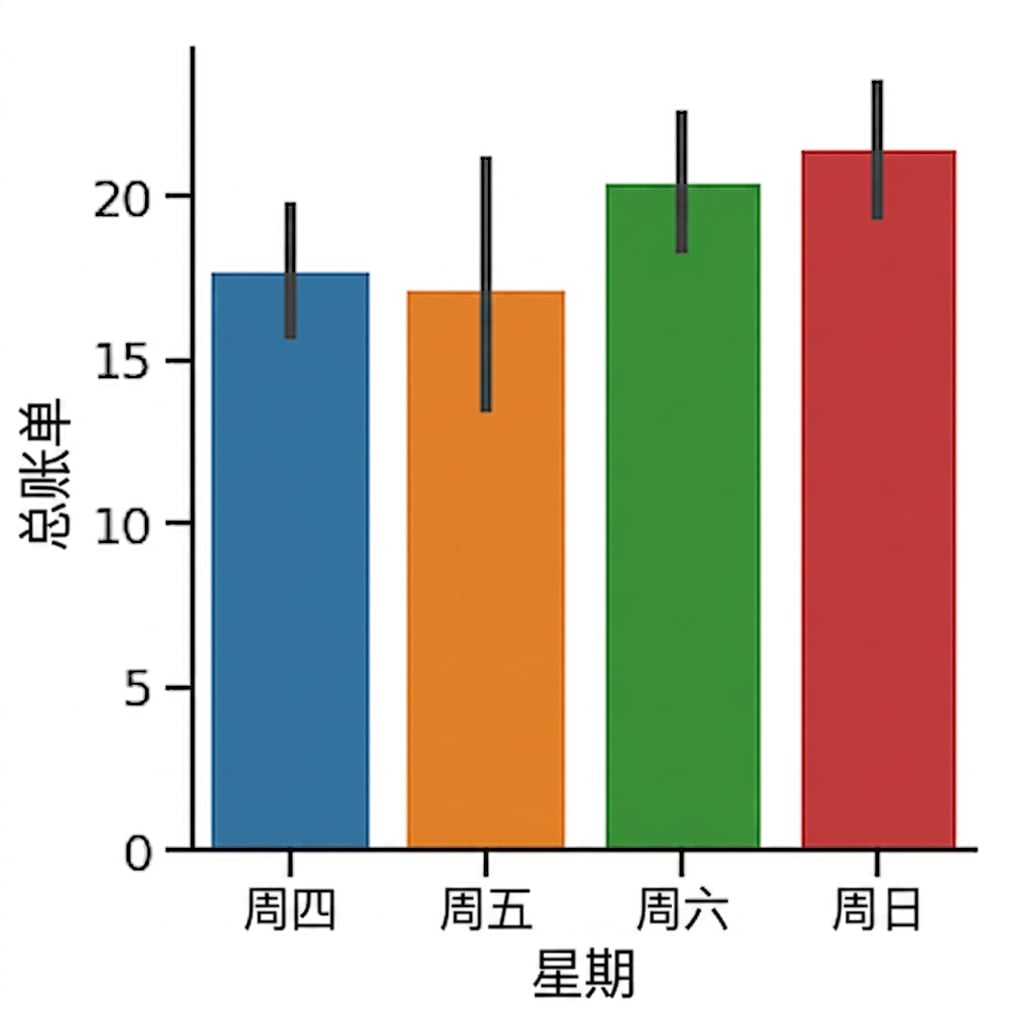
1 Waskom, M. L. (2021). seaborn: statistical data visualization. https://seaborn.pydata.org/
置信区间
1 Waskom, M. L. (2021). seaborn: statistical data visualization. https://seaborn.pydata.org/
关闭置信区间
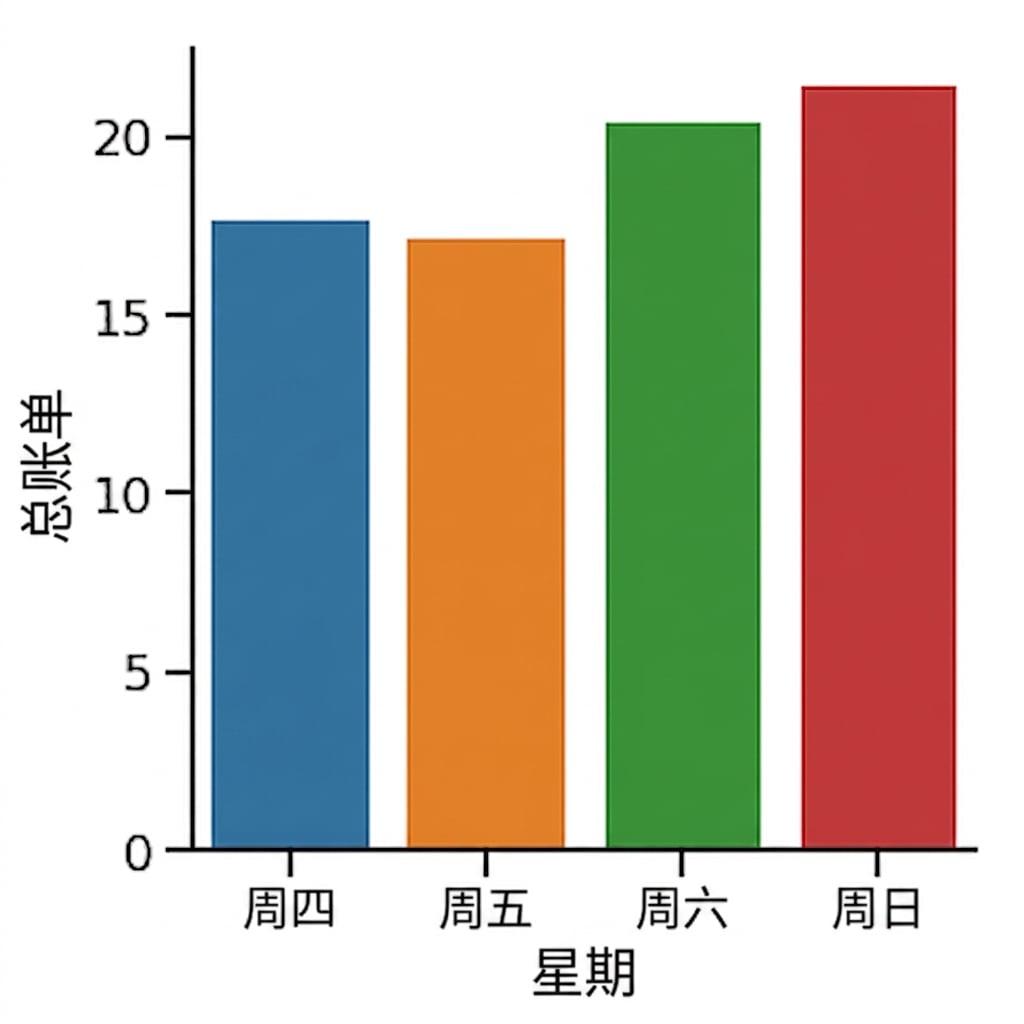
1 Waskom, M. L. (2021). seaborn: statistical data visualization. https://seaborn.pydata.org/
更改方向
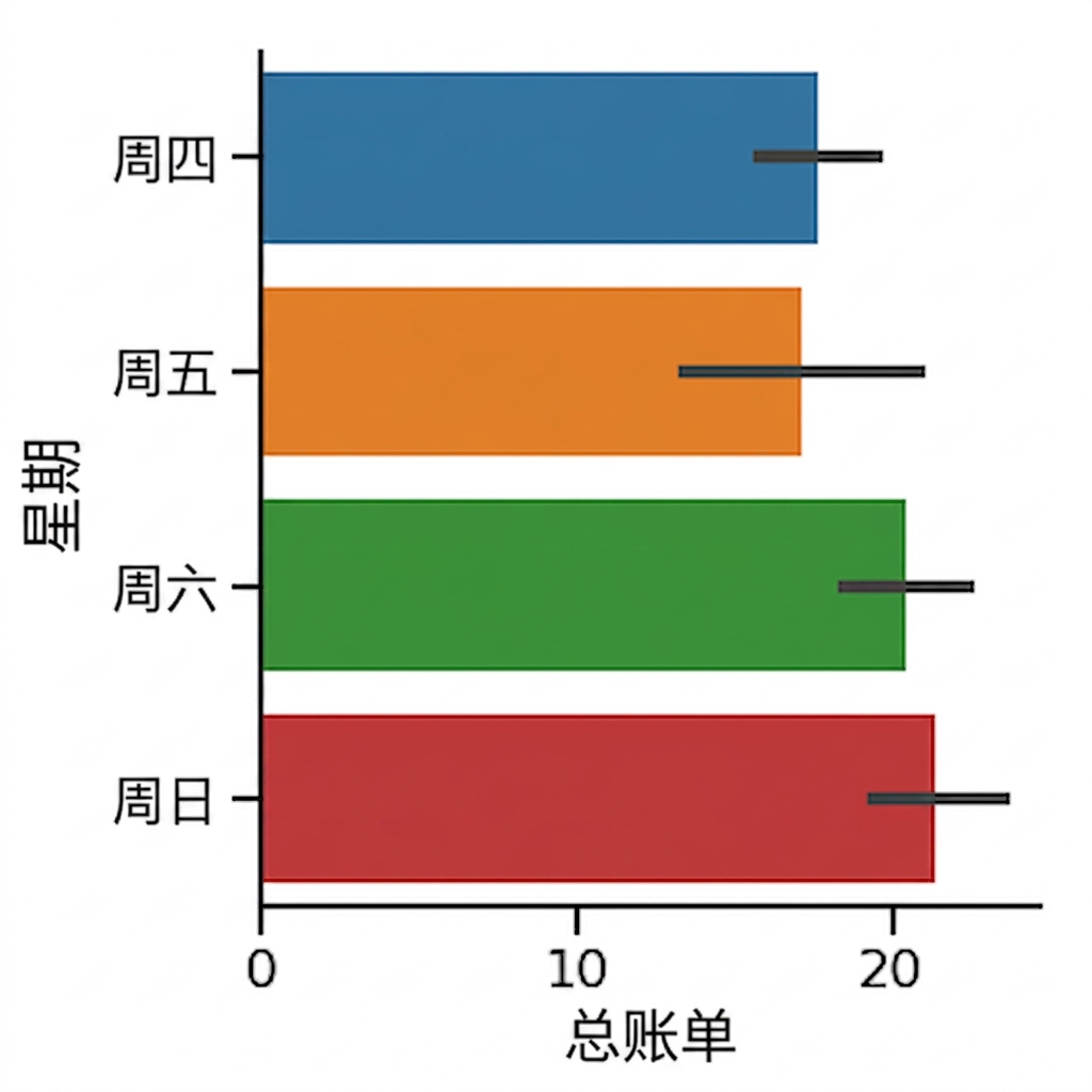
1 Waskom, M. L. (2021). seaborn: statistical data visualization. https://seaborn.pydata.org/

