Seaborn 数据可视化入门
Content Team
DataCamp
导入 Seaborn:
import seaborn as sns
导入 Matplotlib:
import matplotlib.pyplot as plt
显示图表:
plt.show()
sns.relplot(x="x_variable_name",
y="y_variable_name",
data=pandas_df,
kind="scatter")
sns.catplot(x="x_variable_name",
y="y_variable_name",
data=pandas_df,
kind="bar")
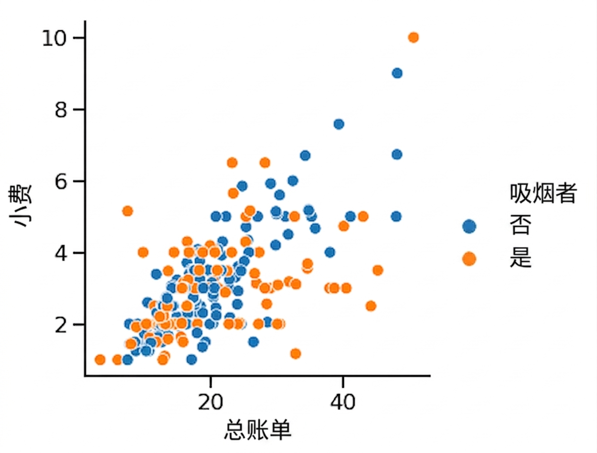
设置 hue 可创建子组,并在同一图中以不同颜色显示。

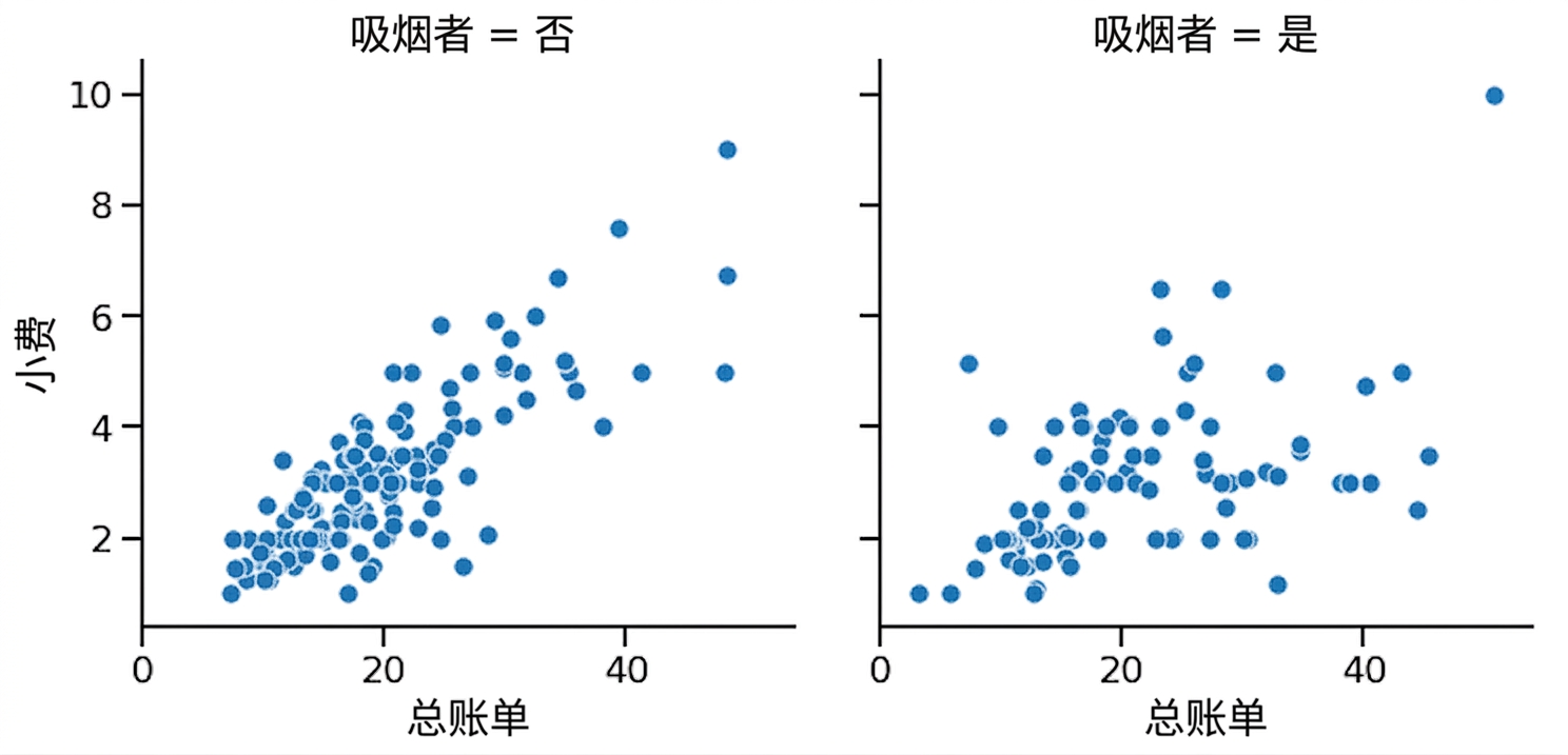
在 relplot() 或 catplot() 中设置 row 和/或 col 可创建子组,并在独立子图中显示。

sns.set_style()sns.set_palette()sns.set_context()| Object Type | Plot Types | How to Add Title |
|---|---|---|
FacetGrid |
relplot(), catplot() |
g.figure.suptitle() |
AxesSubplot |
scatterplot(), countplot(), 等 |
g.set_title() |
添加 x/y 轴标签:
g.set(xlabel="new x-axis label",
ylabel="new y-axis label")
旋转 x 轴刻度标签:
plt.xticks(rotation=90)
Seaborn 数据可视化入门