使用 Matplotlib 进行数据可视化简介

Matplotlib 数据可视化入门

Ariel Rokem

Data Scientist

数据可视化
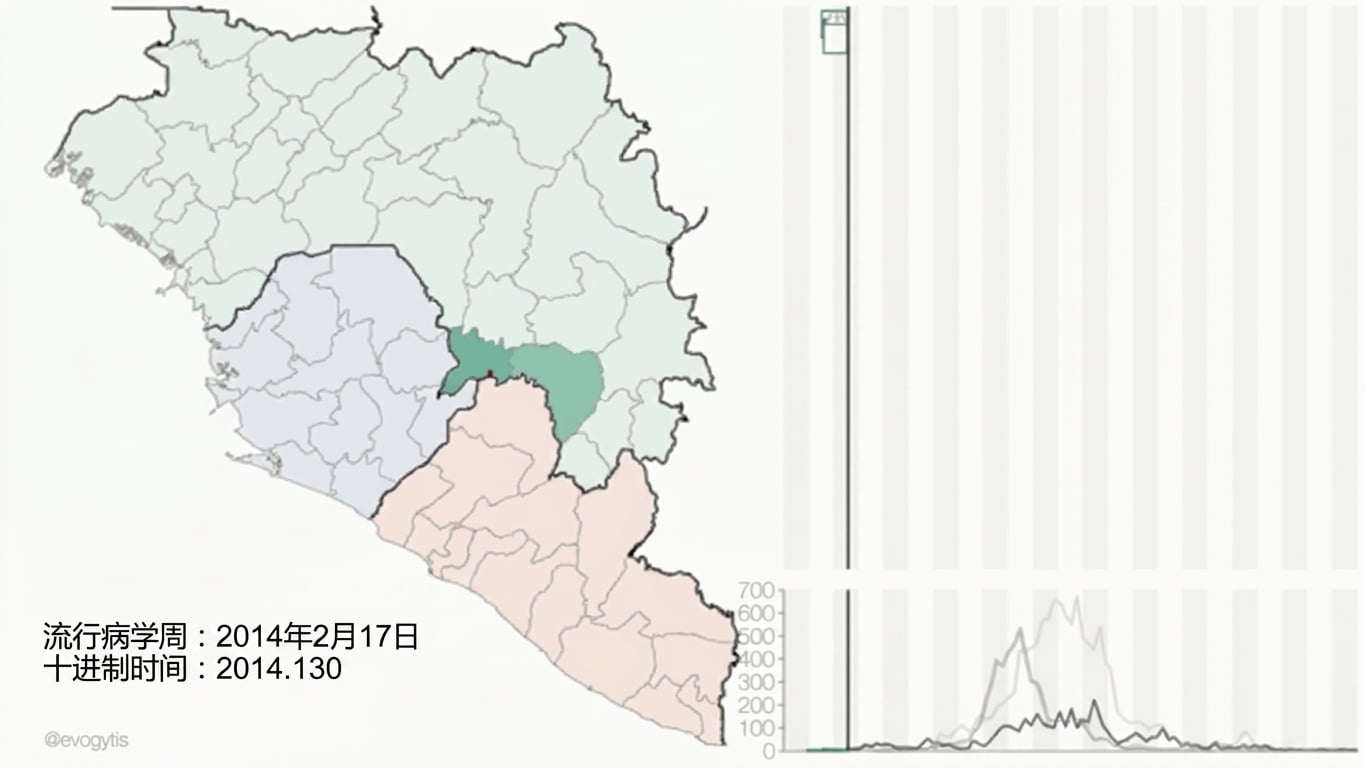
图片来源:Gytis DudasAndrew Rambaut

Matplotlib 数据可视化入门

pyplot 接口简介

import matplotlib.pyplot as plt

fig, ax = plt.subplots()
plt.show()

Matplotlib 数据可视化入门

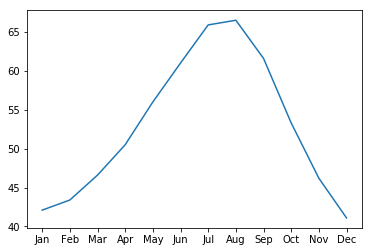
向坐标轴添加数据

seattle_weather["MONTH"]
DATE
1     Jan
2     Feb
3     Mar
4     Apr
5     May
6     Jun
7     Jul
8     Aug
9     Sep
10    Oct
11    Nov
12    Dec
Name: MONTH, dtype: object
seattle_weather["MLY-TAVG-NORMAL"]
1     42.1
2     43.4
3     46.6
4     50.5
5     56.0
6     61.0
7     65.9
8     66.5
9     61.6
10    53.3
11    46.2
12    41.1
Name: MLY-TAVG-NORMAL, dtype: float64
Matplotlib 数据可视化入门

向坐标轴添加数据

ax.plot(seattle_weather["MONTH"], seattle_weather["MLY-TAVG-NORMAL"])
plt.show()
Matplotlib 数据可视化入门

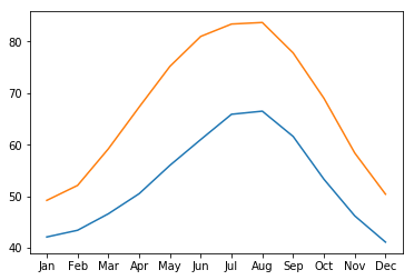
添加更多数据

ax.plot(austin_weather["MONTH"], austin_weather["MLY-TAVG-NORMAL"])
plt.show()
Matplotlib 数据可视化入门

综合示例

fig, ax = plt.subplots()
ax.plot(seattle_weather["MONTH"], seattle_weather["MLY-TAVG-NORMAL"])
ax.plot(austin_weather["MONTH"], austin_weather["MLY-TAVG-NORMAL"])
plt.show()

Matplotlib 数据可视化入门

练习制作图形!

Matplotlib 数据可视化入门

Preparing Video For Download...