自定义图表
Matplotlib 数据可视化入门

Ariel Rokem
Data Scientist
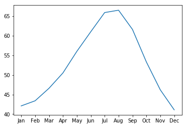
自定义数据外观
ax.plot(seattle_weather["MONTH"],
        seattle_weather["MLY-PRCP-NORMAL"])
plt.show()
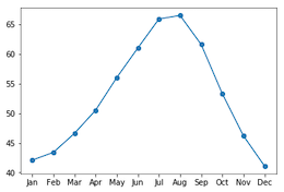
添加标记
ax.plot(seattle_weather["MONTH"],
        seattle_weather["MLY-PRCP-NORMAL"],
        marker="o")
plt.show()
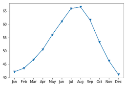
选择标记
ax.plot(seattle_weather["MONTH"],
        seattle_weather["MLY-PRCP-NORMAL"],
        marker="v")
plt.show()
设置线型
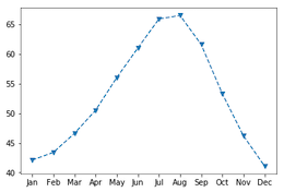
fig, ax = plt.subplots()
ax.plot(seattle_weather["MONTH"],
        seattle_weather["MLY-TAVG-NORMAL"],
        marker="v", linestyle="--")
plt.show()

用线型去除连线
fig, ax = plt.subplots()
ax.plot(seattle_weather["MONTH"],
        seattle_weather["MLY-TAVG-NORMAL"],
        marker="v", linestyle="None")
plt.show()

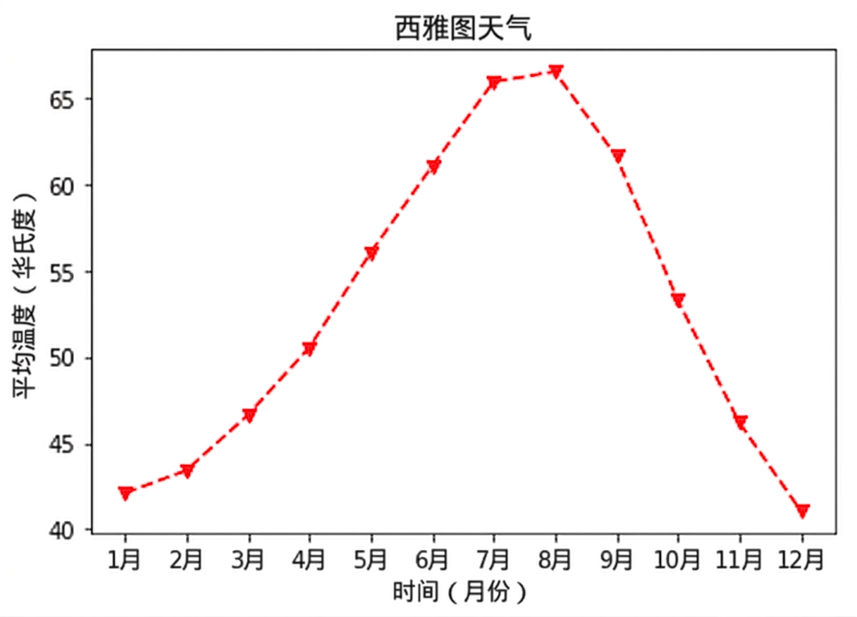
选择颜色
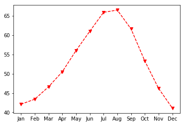
fig, ax = plt.subplots()
ax.plot(seattle_weather["MONTH"],
        seattle_weather["MLY-TAVG-NORMAL"],
        marker="v", linestyle="--", color="r")
plt.show()
自定义坐标轴标签
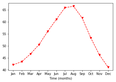
ax.set_xlabel("时间(月)")
plt.show()
设置 y 轴标签
ax.set_xlabel("时间(月)")
ax.set_ylabel("平均气温(华氏度)")
plt.show()

添加标题
ax.set_title("西雅图天气")
plt.show()