定量比较:散点图

Matplotlib 数据可视化入门

Ariel Rokem

Data Scientist

散点图简介

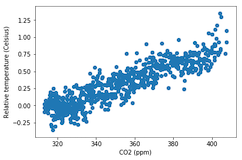
fig, ax = plt.subplots()

ax.scatter(climate_change["co2"], climate_change["relative_temp"])
ax.set_xlabel("CO2 (ppm)") ax.set_ylabel("相对温度(摄氏度)") plt.show()
Matplotlib 数据可视化入门

自定义散点图

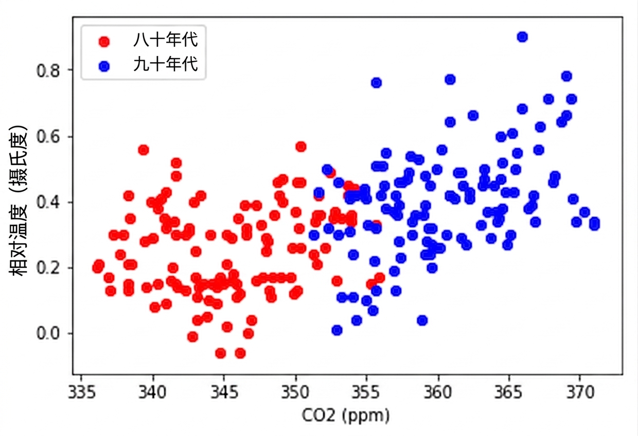
eighties = climate_change["1980-01-01":"1989-12-31"]
nineties = climate_change["1990-01-01":"1999-12-31"]

fig, ax = plt.subplots()
ax.scatter(eighties["co2"], eighties["relative_temp"], color="red", label="eighties")
ax.scatter(nineties["co2"], nineties["relative_temp"], color="blue", label="nineties")
ax.legend() ax.set_xlabel("CO2 (ppm)") ax.set_ylabel("相对温度(摄氏度)") plt.show()
Matplotlib 数据可视化入门

用颜色编码比较

Matplotlib 数据可视化入门

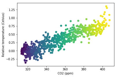
用颜色编码第三个变量

fig, ax = plt.subplots()

ax.scatter(climate_change["co2"], climate_change["relative_temp"], c=climate_change.index)
ax.set_xlabel("CO2 (ppm)") ax.set_ylabel("相对温度(摄氏度)") plt.show()
Matplotlib 数据可视化入门

用颜色表示时间

Matplotlib 数据可视化入门

练习制作自己的散点图!

Matplotlib 数据可视化入门

Preparing Video For Download...